
Solar Wave is the latest offering from Sharp’s Brewery, bringing a craft beer sensibility to their freshest contemporary cask beer to date. This hazy, hoppy, golden beverage is summer sunshine in a pint, so when we were asked to design an identity and on-trade livery we grabbed our boardies and made a dash to the beach for a proper immersion.

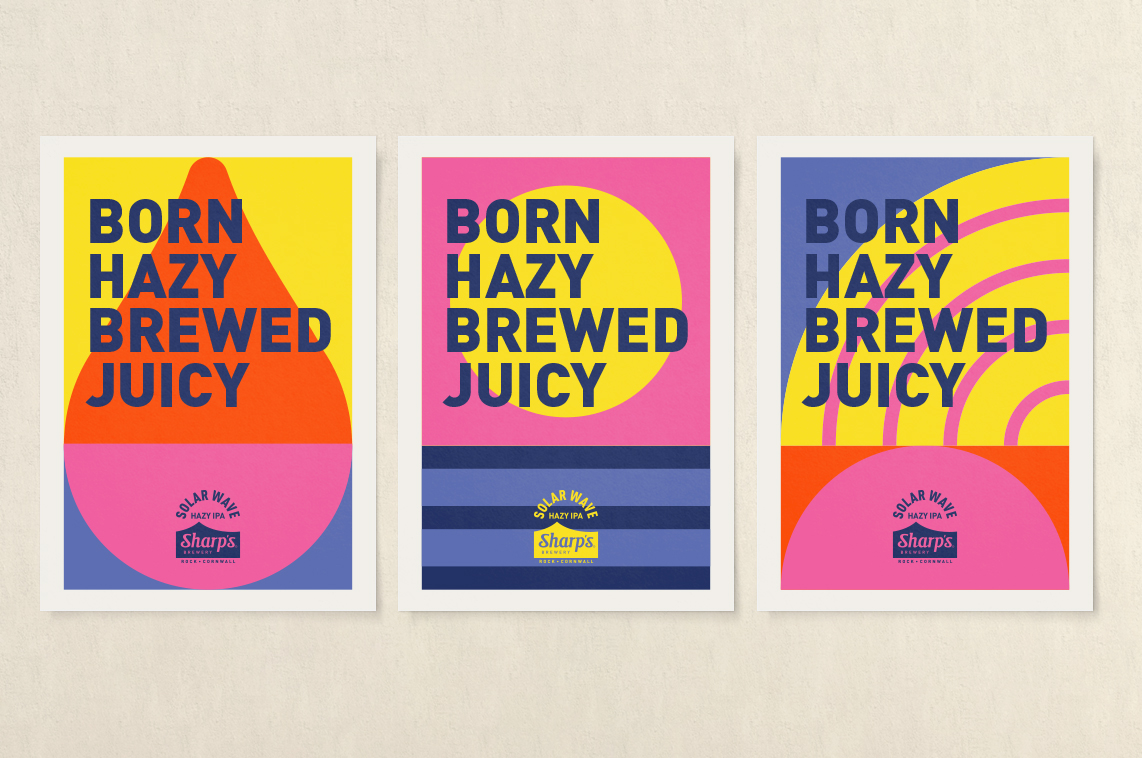
This being the Southwest in spring, we dipped our toes in and hurried back to our desks awash with bright ideas. Refreshed and raring to go, we delved deeper into the origins of the name. Solar Wave is a natural phenomenon that occurs around the sun. And there, in the wonders of the universe, we found our inspiration. With a bold, fresh graphic depiction using simple shapes, drops and dots in explosive colourways, we translated this out-of-this-world occurrence into an unforgettable visual experience.
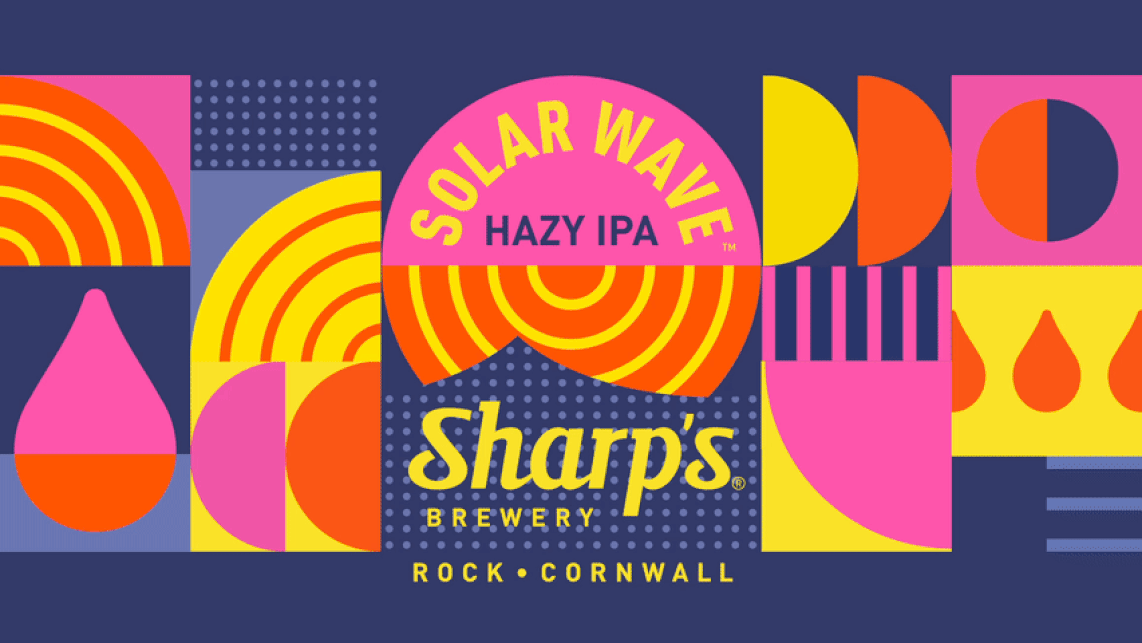
Pops of juicy colour zing from the pump clip and lenses and when it comes to the beer engines, we’ve employed some subtle tricks and disruptive details in keeping with Solar Wave’s contemporary taste profile. On the traditional beer engine design, the pump clip (made from sustainable ply) sits in line with those of the craft beer keg taps. Whilst on the keg fonts (still serving cask Solar Wave) illuminated logo and custom-designed pillars nod to a fresh approach that marries distinctive taste with a desire to break out of the ordinary and create something fun, funky and sublimely summery.
The identity basks gloriously in its bright, sunny vibes, delivering all the glory of bright tropical island dreaminess on tap. Mission accomplished: chill thrills translated from the beer to the branding.


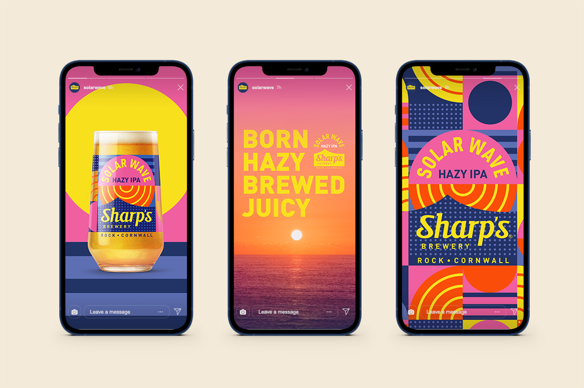
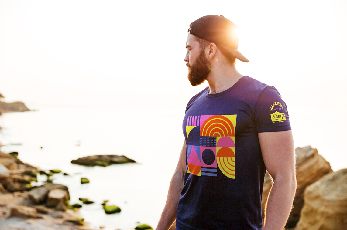
The multi-talented team at Buddy continue to be co-custodians of our brewery, beers & branding. A vibrant, disruptive beer and an evocative name gave us full permission to brief Buddy to match that energy with the visual identity … and boy did they deliver. Working with real purpose, their unique approach ensured that the outcome was neither derivative or try-hard, instead engaging in deep collaboration with us to root the creative in our sense of place, personality and the bursting flavour profile of the beer itself. The result is there for all to see, not only a strikingly layered central identity, but also rich, expansive visual language. A language that speaks to the drinking experience whilst immersing you in a bold an graphic representation of both our coastal elements and the standout character of this juicy, hazy cask IPA – Nick White, Brand Activation Manager, Sharp’s Brewery
Source: Buddy
You must be logged in to post a comment Login