
The sweet smell of Fudge Kitchen goodies is known to waft through the air in the UK’s finer tourist towns from Bath to Edinburgh, drawing visitors in to witness the big slabs of fudge being theatrically rolled and chopped. And after seeing this, who could resist a purchase? But when lockdown caused a pause in these proceedings, it gave the company time to reflect on the entirety of its business. The premium gifting positioning of the wholesale and eCommerce side of the business seemed out of kilter with the personality of its retail shops. The company wanted to align, refresh and was keen to explore more sustainable packaging options.
Fudge Kitchen enlisted creative consultancy Smith+Village to help redefine its identity, not just visually but from the ground up. The result is a whole new look and feel with a gorgeous colour palette and expressive tone of voice, as well as an innovative and sustainability-led packaging overhaul. The new product packaging range uses only FSC certified boxboard, there’s no use of spot-UV finishes or coatings that limit recyclability and it’s all printed in the UK. As part of this new direction, the company is phasing out the use of internationally grown cane sugar in favour of UK-grown beet sugar.
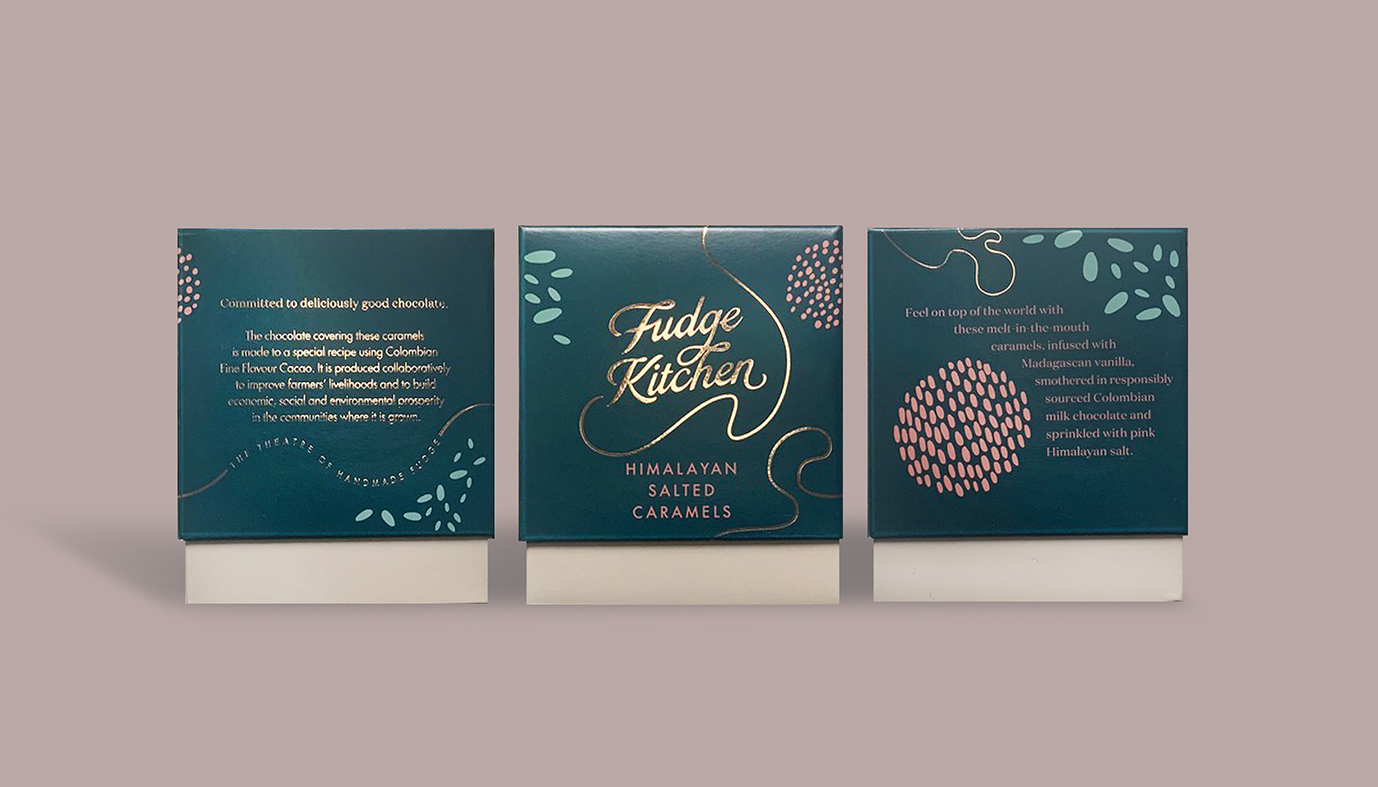
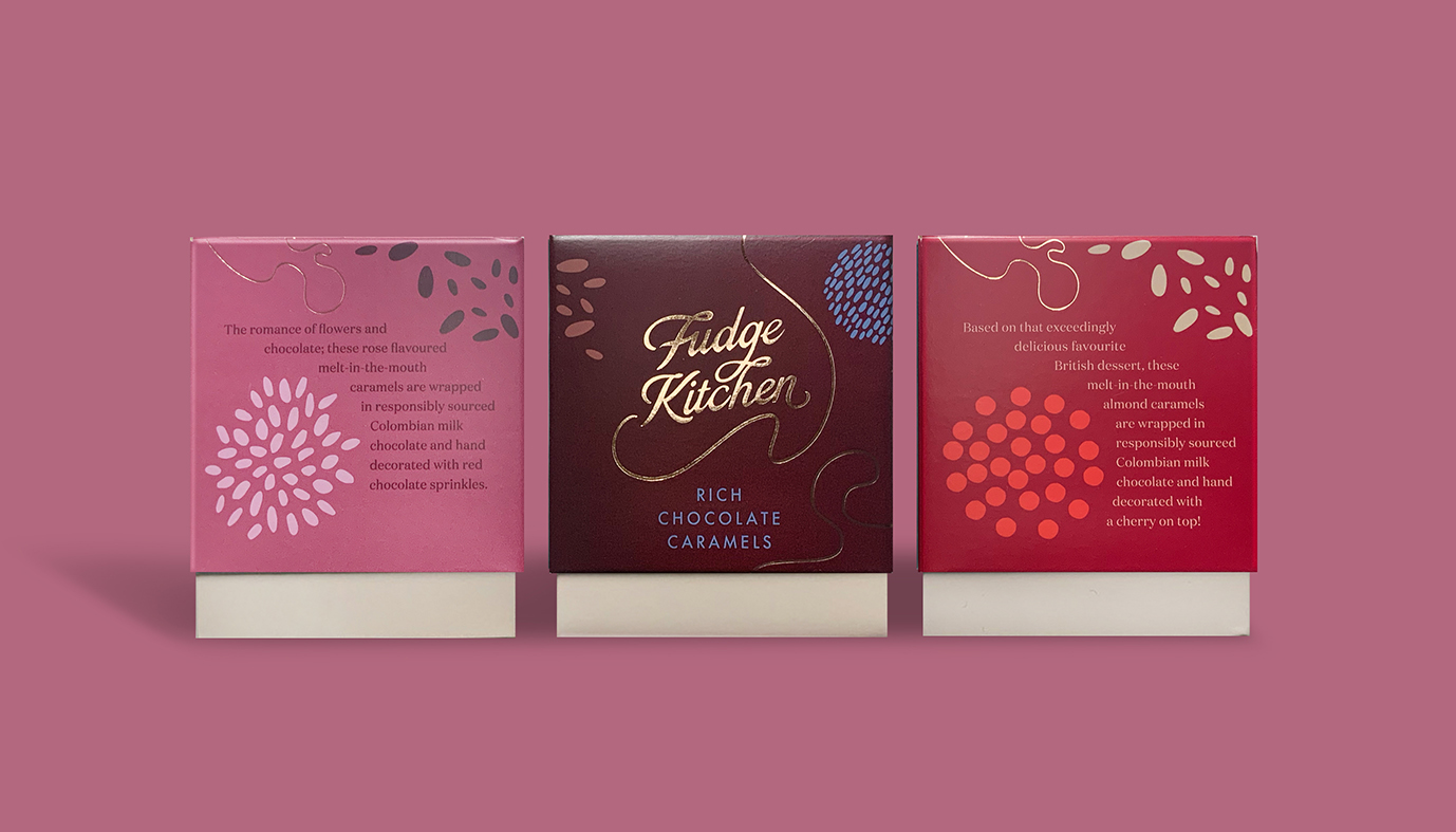
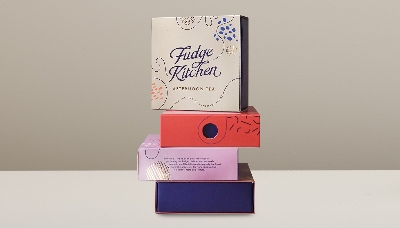
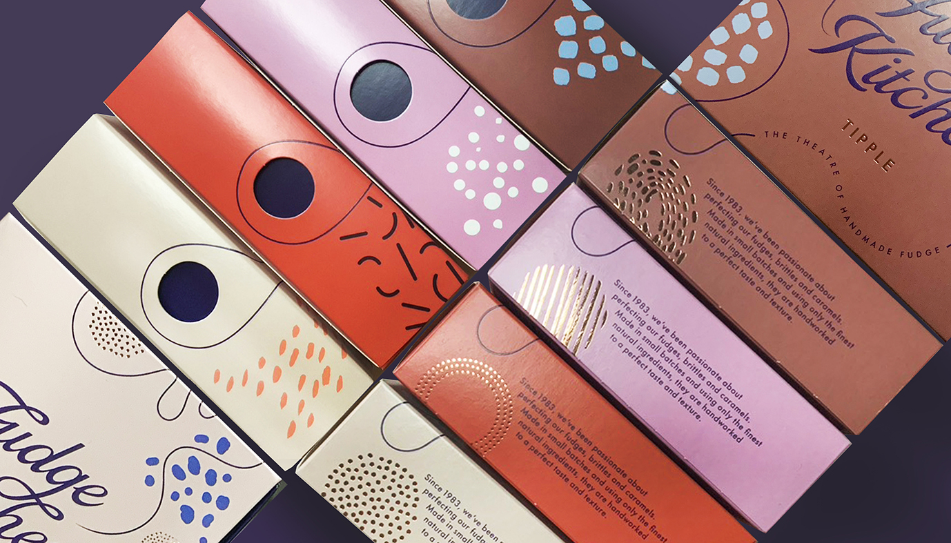
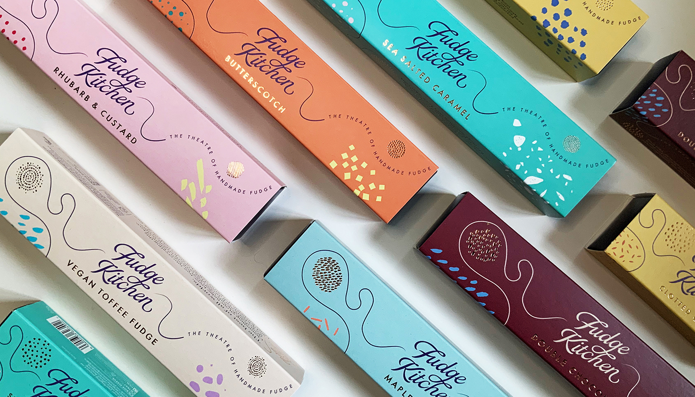
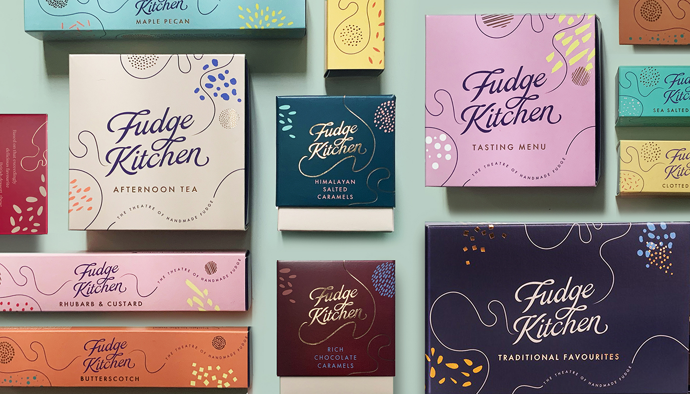
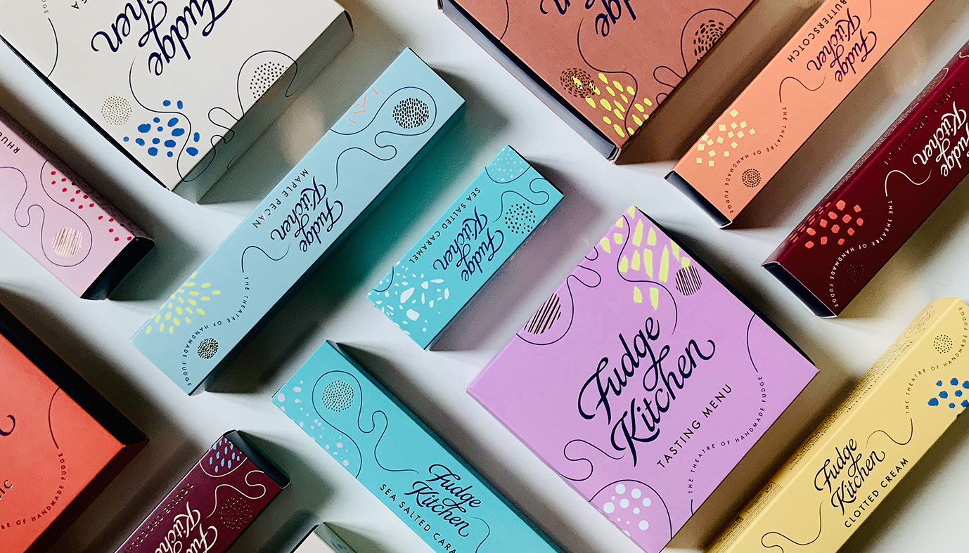
To express the full personality of Fudge Kitchen on packaging and beyond, Smith+Village developed a sign off ‘the theatre of handmade fudge’ which sits within a swirling line that suggests the fudge being made in the stores.
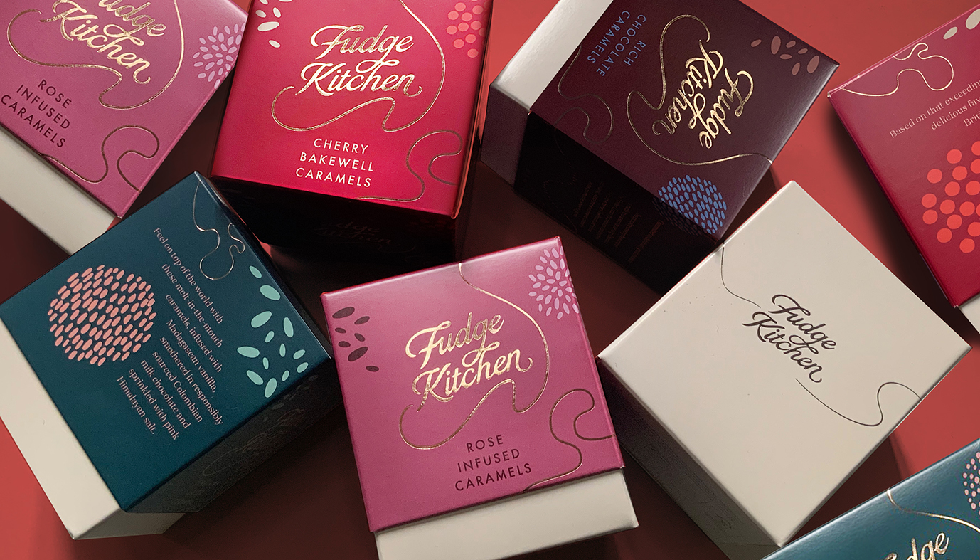
“The design was very much trying to capture the pouring of fudge and swirling and stirring, sprinkling ingredients and decorating with textures.” says Smith&+Village Creative Director Debrah Smith. “It needed to have that kind of fluidity. We built in this curvy line that goes all the way round the pack and patterns that could be salt crystals or little flavour pops.”
“Since we were stepping over into sustainable materials, there were not as many finishes are one had been used to in the past,” Debrah continues “This was another reason to amp the colours up for a theatrical feel. We also banned brown – which obviously just doesn’t work online. We changed it over to a bluey purple colour for the internal tray, which nicely sets off the fudge inside.”
The project started with an analysis of where the brand was, and the realisation that there were two very divergent parts of the business. “We needed to find something that unites the retail side with wholesale and eCommerce, says Richard Village, Smith+Village Strategy Director, “that could then be very positive and directional in the future. We looked at the experience in their shops, which is very performative. Fudge is made in front of you – it’s all boiling away and being rolled out, and you’re being tempted by people with free samples. This ‘theatre of handmade fudge’ is the element which gives Fudge Kitchen a uniqueness and we drew on this to help them own the category.”
The new tone of voice and product naming strategy uses playful language that is expressive, individual and fun. Statements such as “Get the Fudge out of here” and “Thank Fudge it’s Christmas” tell the story on packs and in-store communications and are highly motivating for customers. The same principles are used on the wholesale side and online to create a coherent and compelling brand universe.
The new range is going down a storm with shoppers and retailers alike, who appreciate that its pleasing sustainable credentials haven’t detracted from its energy and flamboyance.
“We wanted to communicate that we are a luxury gifting brand with a conscience,” says Sian Holt, MD of Fudge Kitchen, “Smith+Village have helped us do this with a dynamic identity that has star appeal.”
Source: Smith+Village
You must be logged in to post a comment Login