
In this brand creation for a boutique coffee shop in Brooklyn, NYC, the design system is inspired by the founder’s distant family connections to criminals in the Sydney underworld in Australia (a man by the name of Norman Bruhn). The brand and its founder were born in Australia but made in NYC.
bruhn coffee sizzle from Asa Cook on Vimeo.
We created a brand identity concept that’s about living on your wits and doing whatever it takes to get ahead day by day. The criminal lifestyle serves as a metaphor for the mentality required to make it in modern day New York, with the coffee itself being much needed boost in that equally competitive world, and a reward for a ‘hustlers’ accomplishments.
The brand idea is a tongue-in-cheek reference to its Australian founder’s determination to make great coffee available to ‘regular folk’ and a playful reminder of the intensity of the New York scene. Most New York coffee aficionados are aware that some of the best coffee innovations (such as the flat white) were invented in Sydney Australia for a crowd of coffee drinkers with exacting standards.

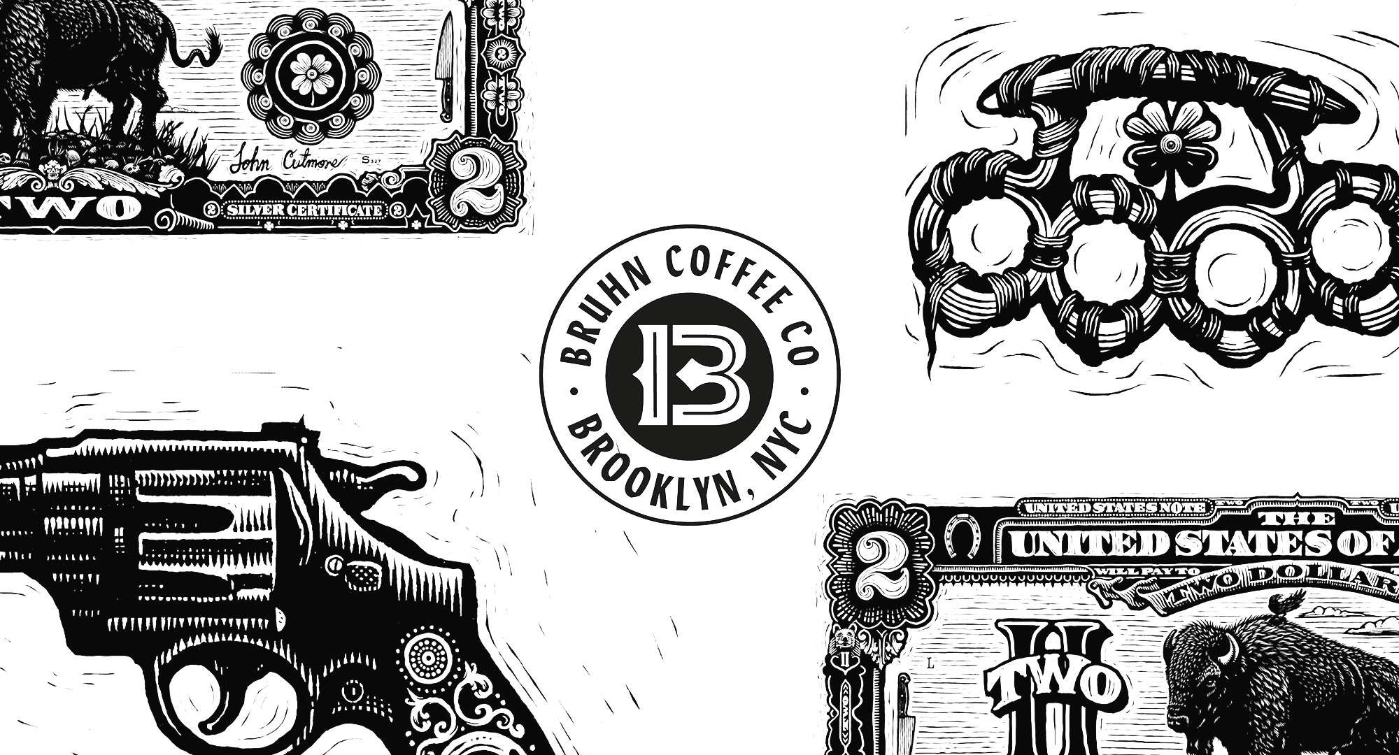
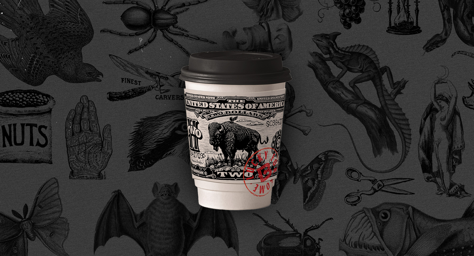
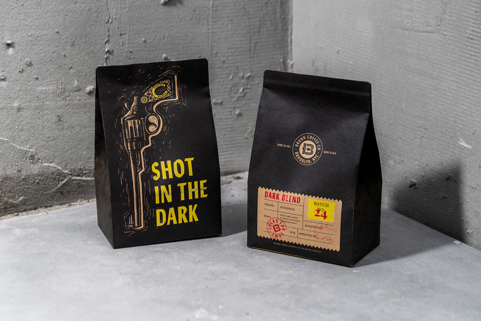
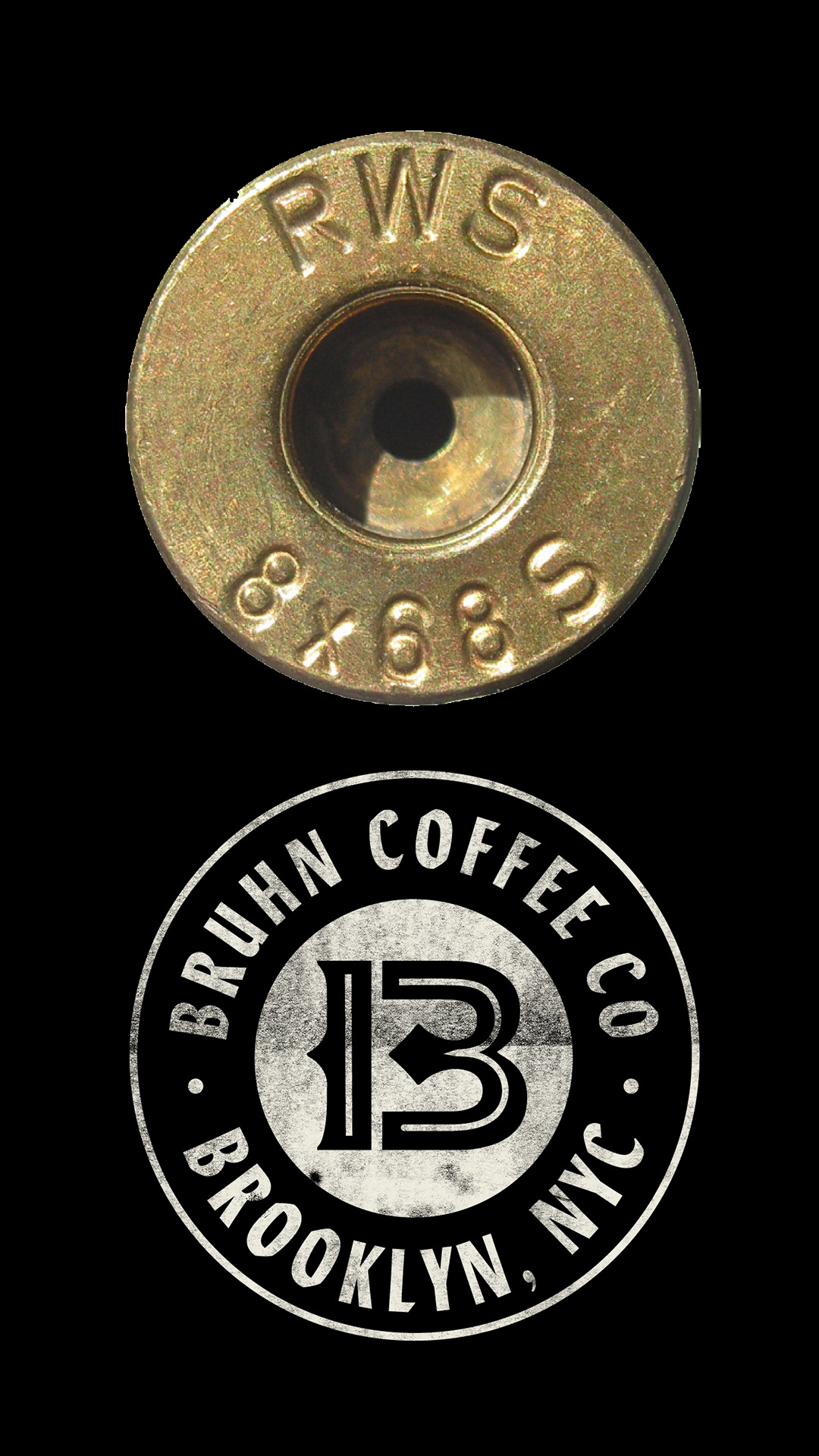
The ‘B’ of the brand icon was created to read as a ‘13’ on closer inspection, and the logo lock-up was inspired by the markings on bullet shell casings. Iconography referencing the concept of ‘luck’ are hidden throughout the branding system and illustration palette to connect to the crime family’s superstitions around the life of crime.
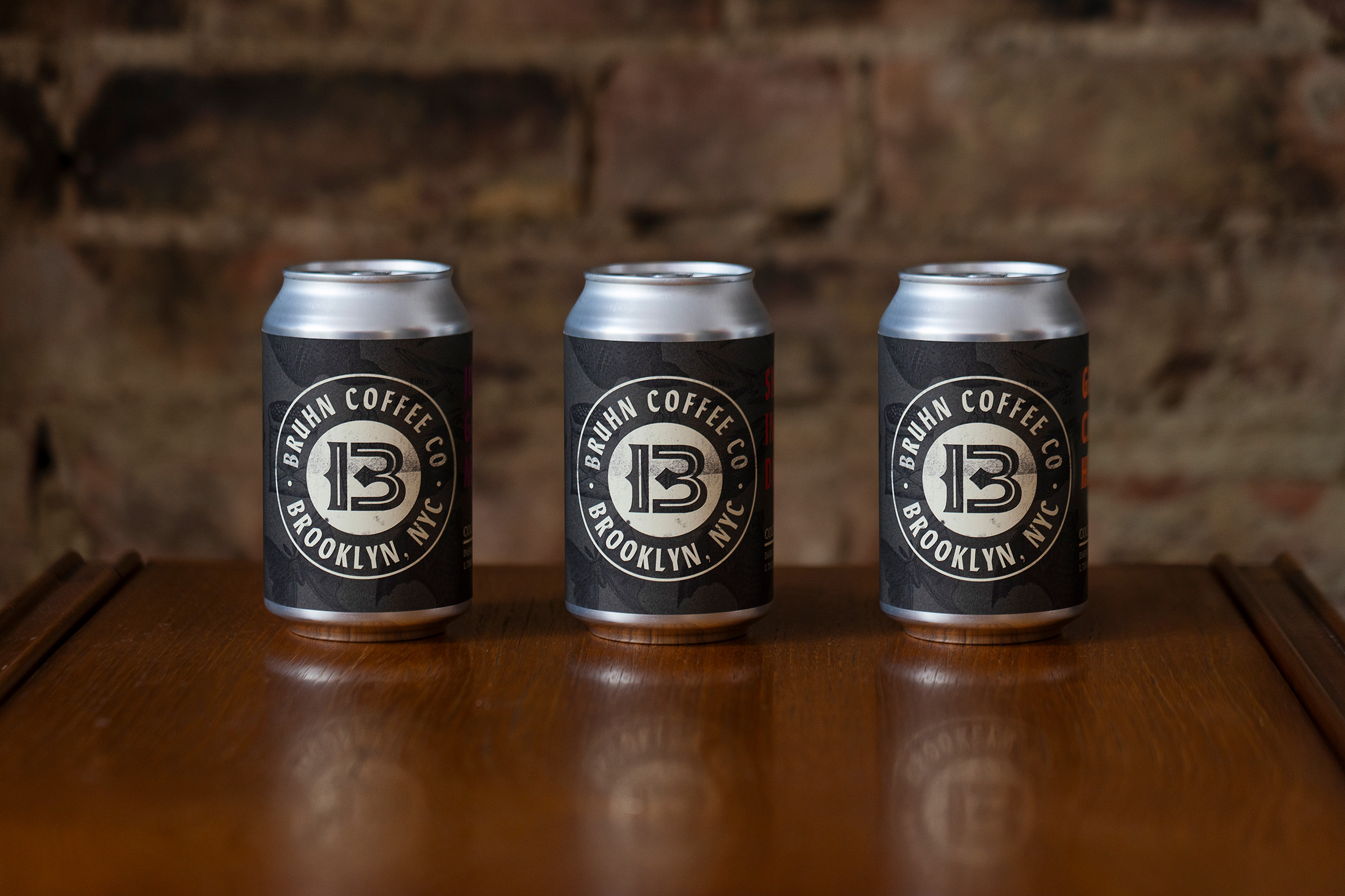
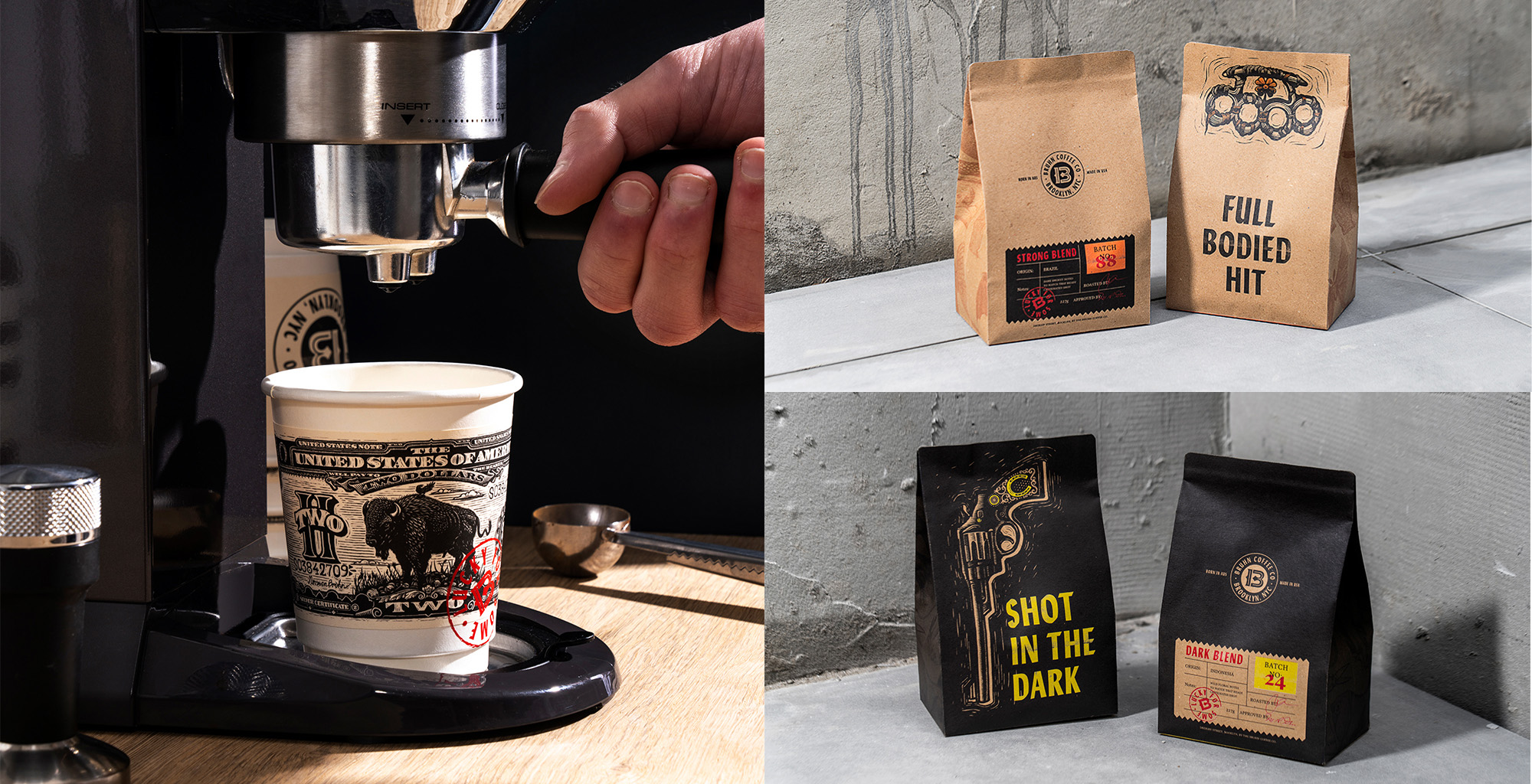
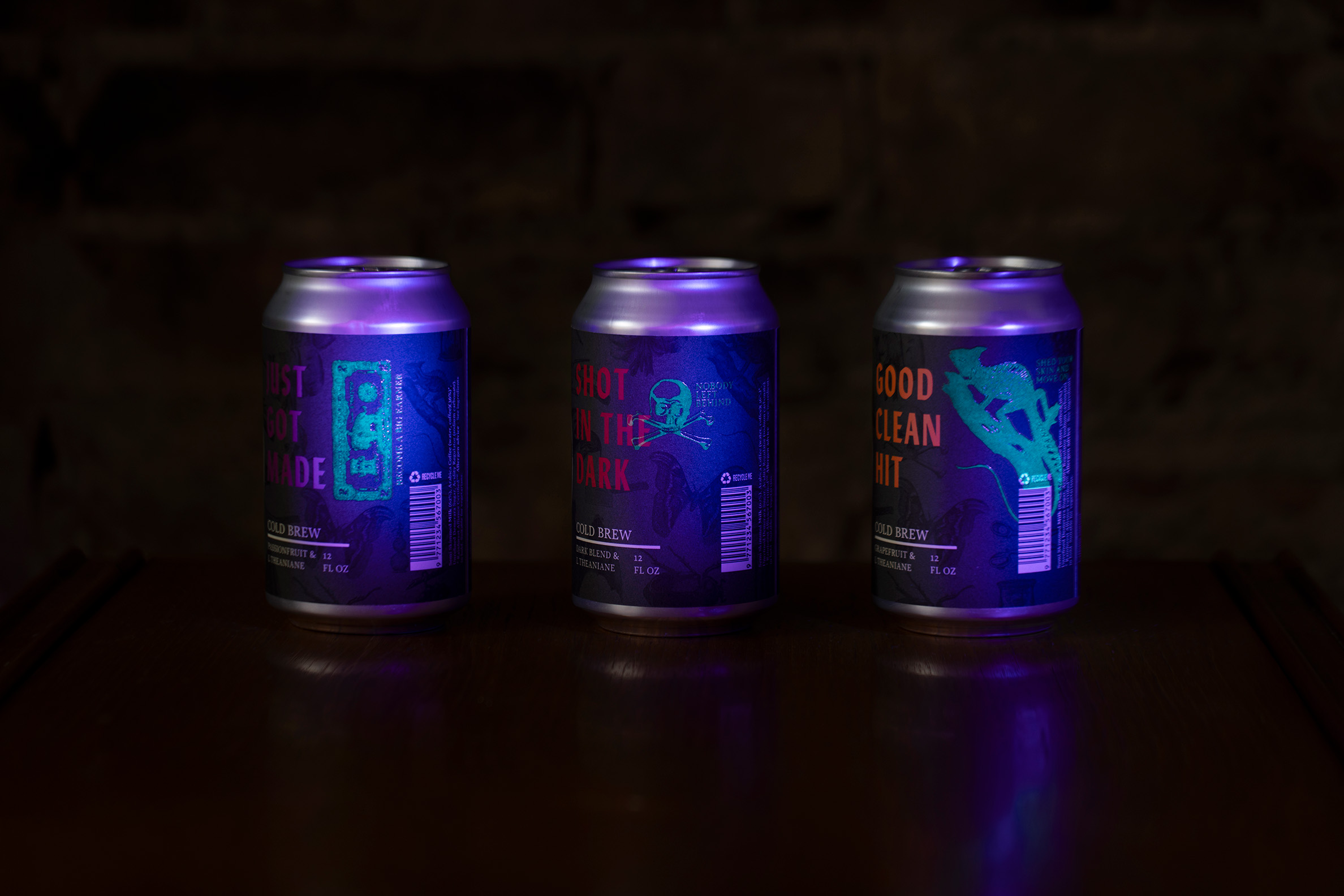
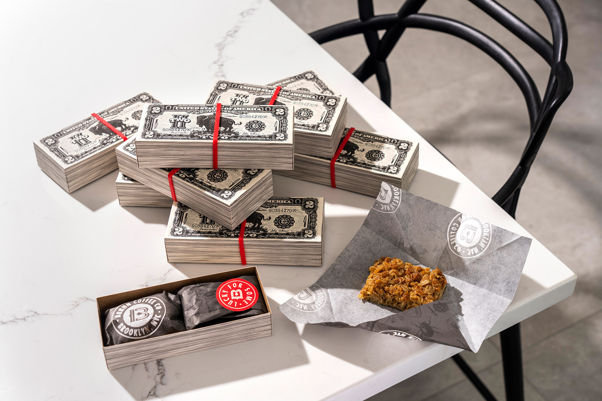
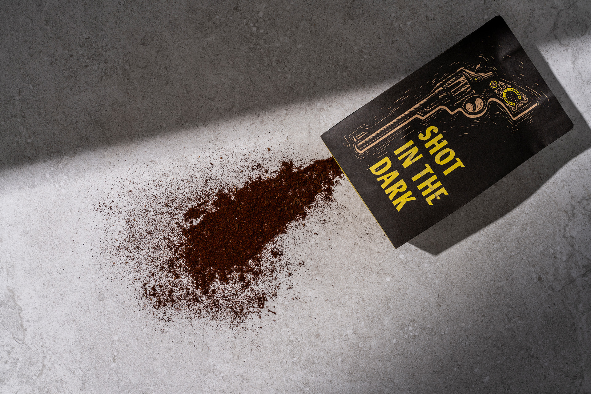
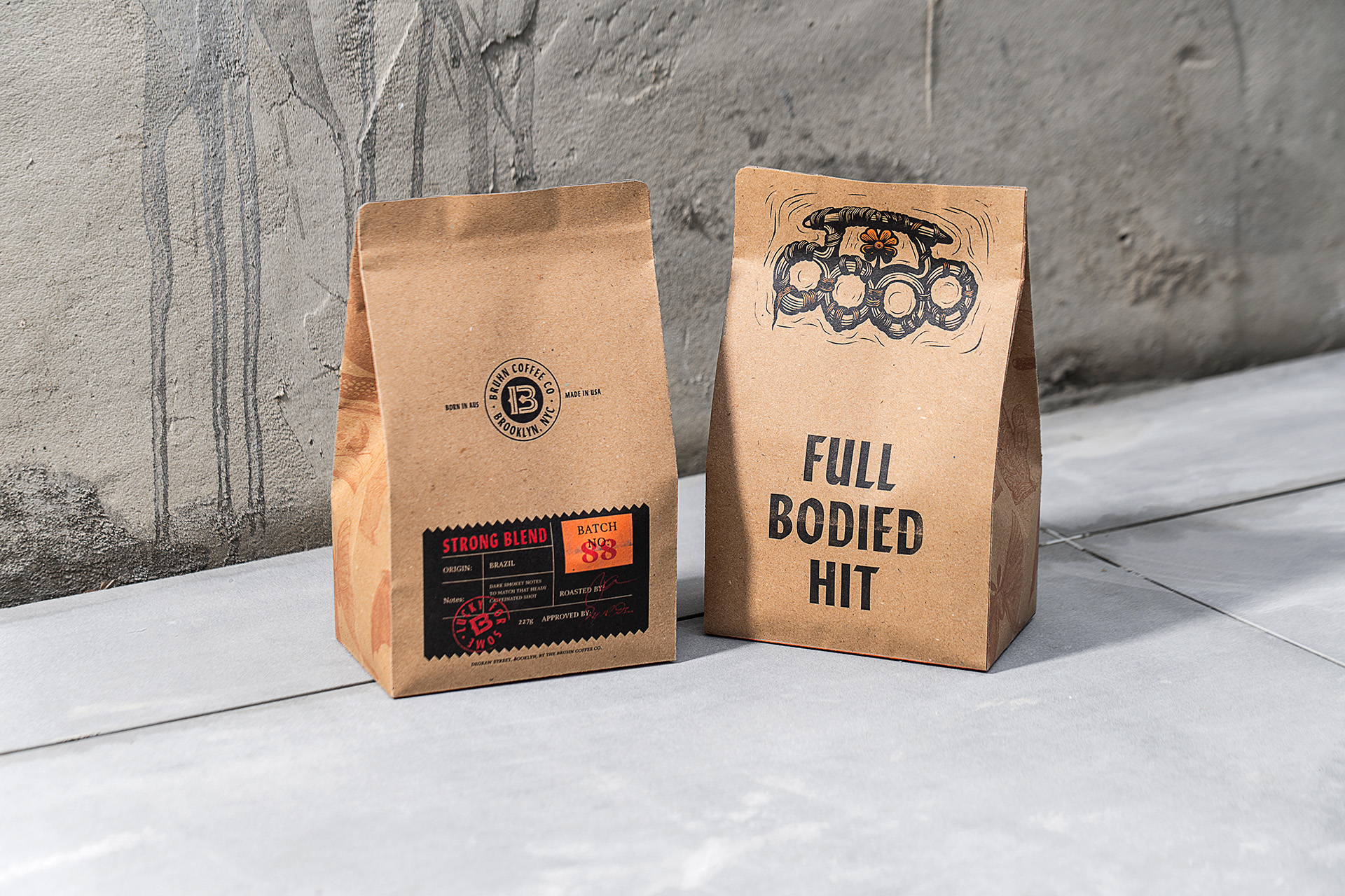
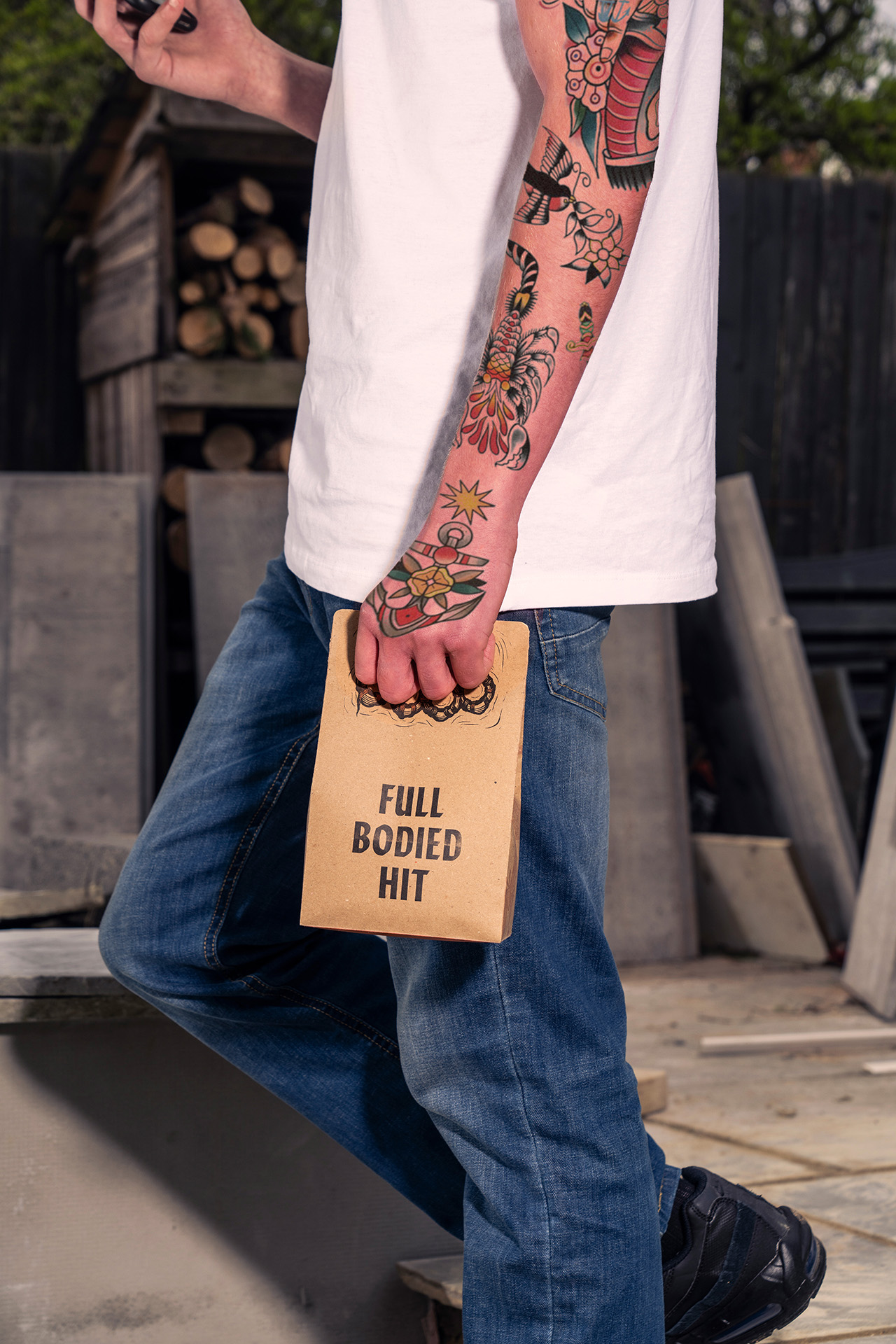
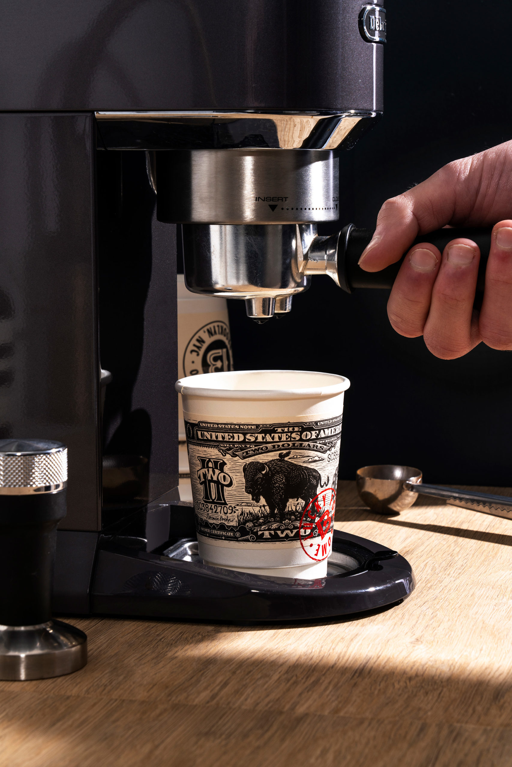
The packaging designs play on the criminal inspiration in a multitude of different ways. A bag of coffee beans looks like a knuckle duster when clasped in the hand, the boxes of baked goods sold in store resemble stacks of cash (the gangsters loot), whilst the on-pack copy writing plays on the parallels in language between criminal life and the coffee itself – a ‘hit’, a ‘shot’ and getting ‘made’ being key examples. The cold brew coffee cans feature secret messages to those ‘in the know’ which are revealed under UV light. The stores loyalty card uses a fingerprint collection system to rewards frequent visits.
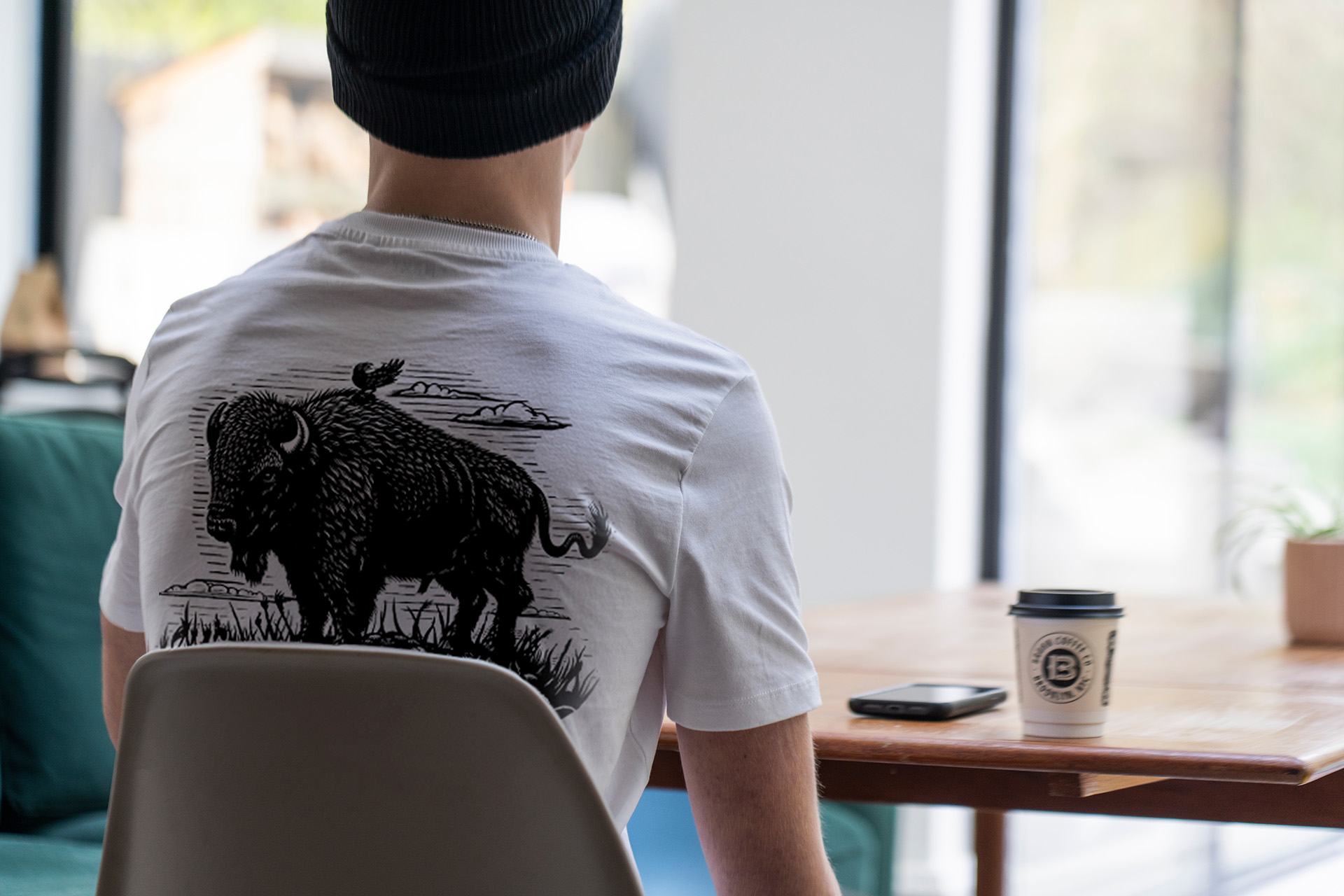
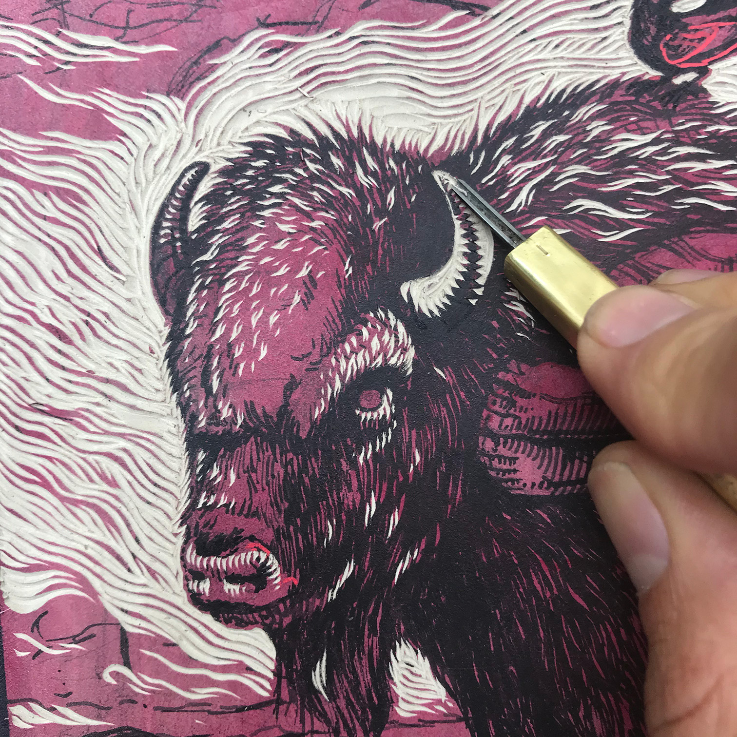
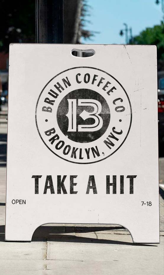
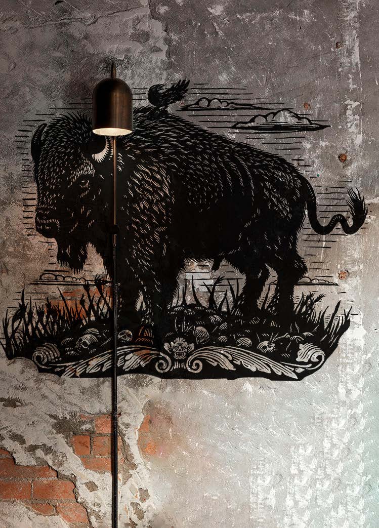
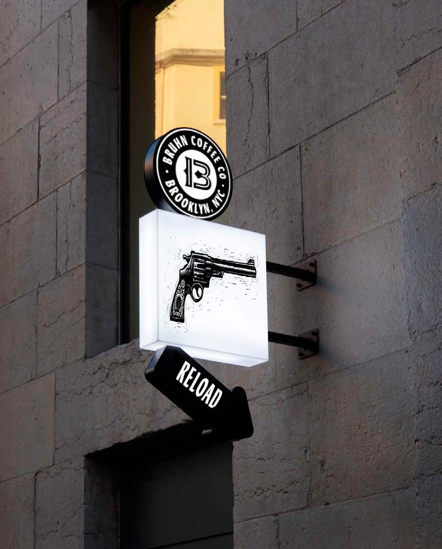
The exterior signage encourages customers to ‘reload’ or ‘take a hit’. The designs use a palette of hand carved lino cut illustrations, which emphasise the crafted quality of the coffee itself. The coffee drinking environment provides the time to appreciate hidden detail, so the design provides layers of discovery to those who wish to seek it out.

The storytelling revealed through every detail of the branding system builds a unique and memorable identity, which is a valuable conversation starter for a small local brand to make a big noise in a crowded New York coffee scene.
Source: Intertype Studio
You must be logged in to post a comment Login