
Burts Snacks asked Biles Hendry to help them to reimagine their brand, giving it more meaning, presence and appeal. The brief included evolving the logo, the core crisp ranges and NPD, as well as brand partnership limited editions with the likes of the RNLI. The strategic and creative teams at Biles Hendry were tasked with helping to deliver Burts’ ambitions to grow brand clout within the craft snacks category.
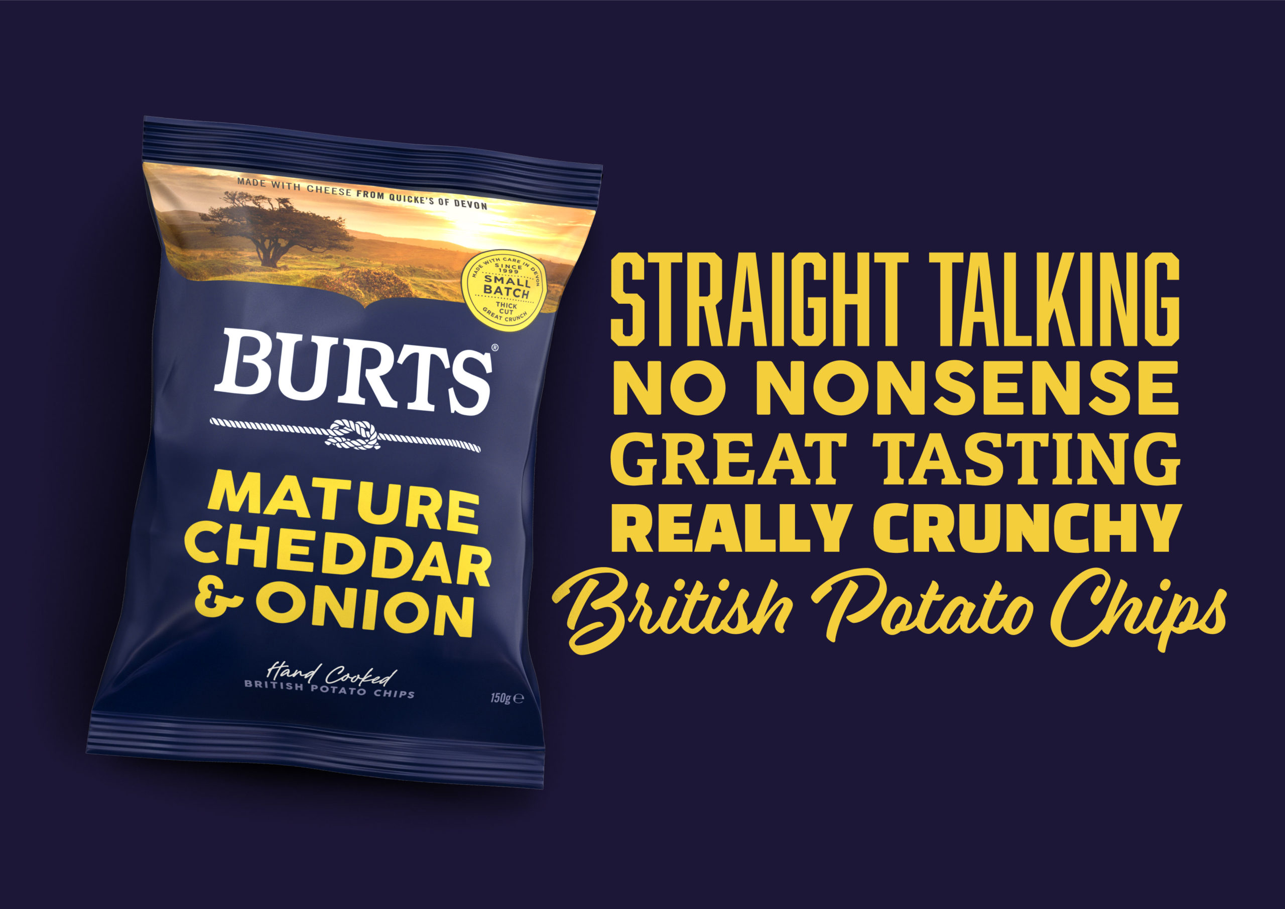
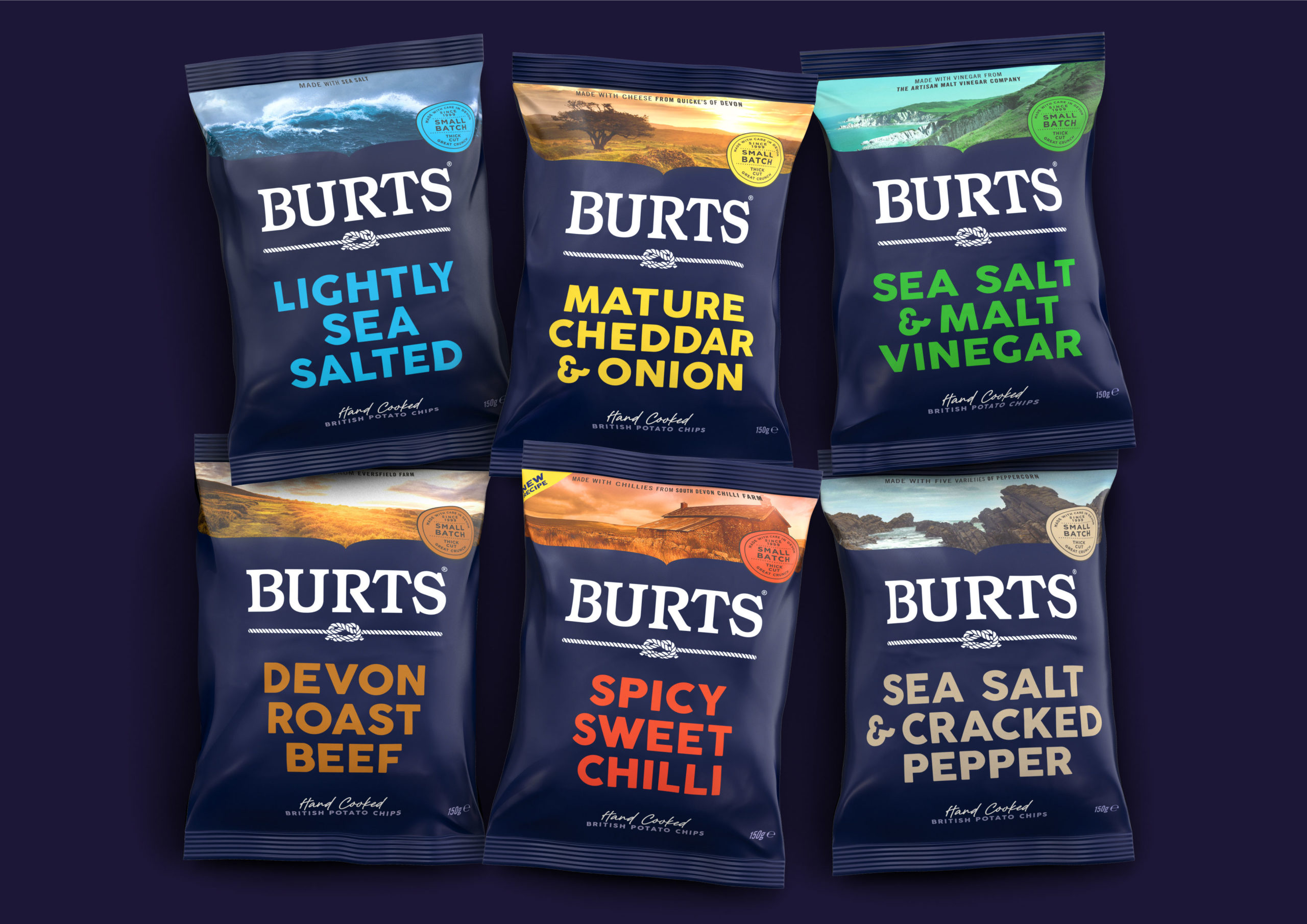
In teasing out the brand essence, Biles Hendry has captured the honest, straight-talking passion that Burts exudes, and the emotional connection the business has to people and place; while augmenting its position as high quality and hand-cooked in small batches.
The packaging features photography of Devon’s farmland and landscapes, a reflection of the fact that not only are Burts Chips made in Devon, but its seasonings feature ingredients locally sourced from independent businesses like Spoilt Pig Farm, Quicke’s Cheese and South Devon Chilli Farm.
The language on the pack is straight-talking and the flavour descriptors are presented in big bold honest text. Biles Hendry chose to reinvigorate dark blue as a brand colour, helping to bring brand cohesion and a strong shelf presence.
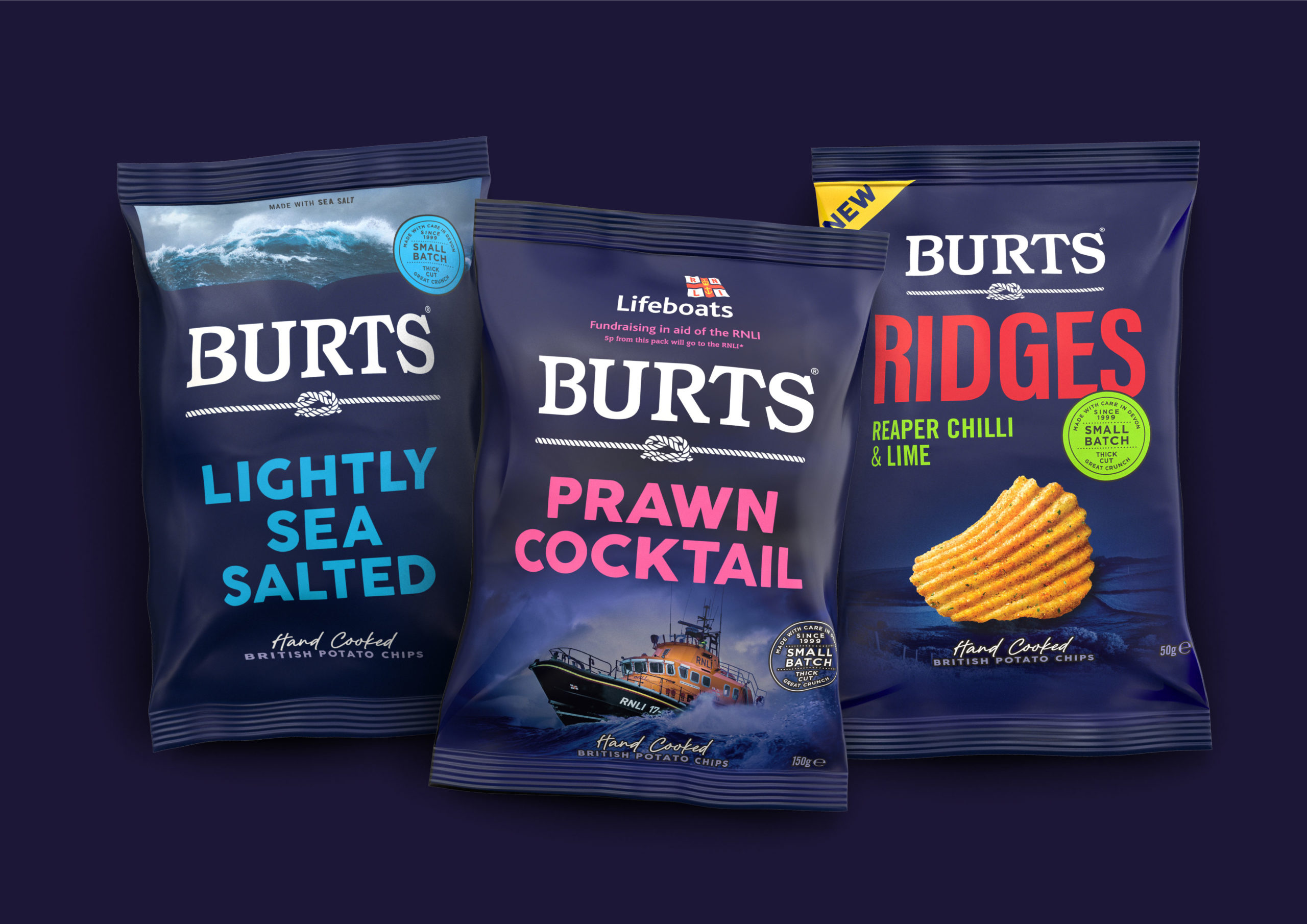
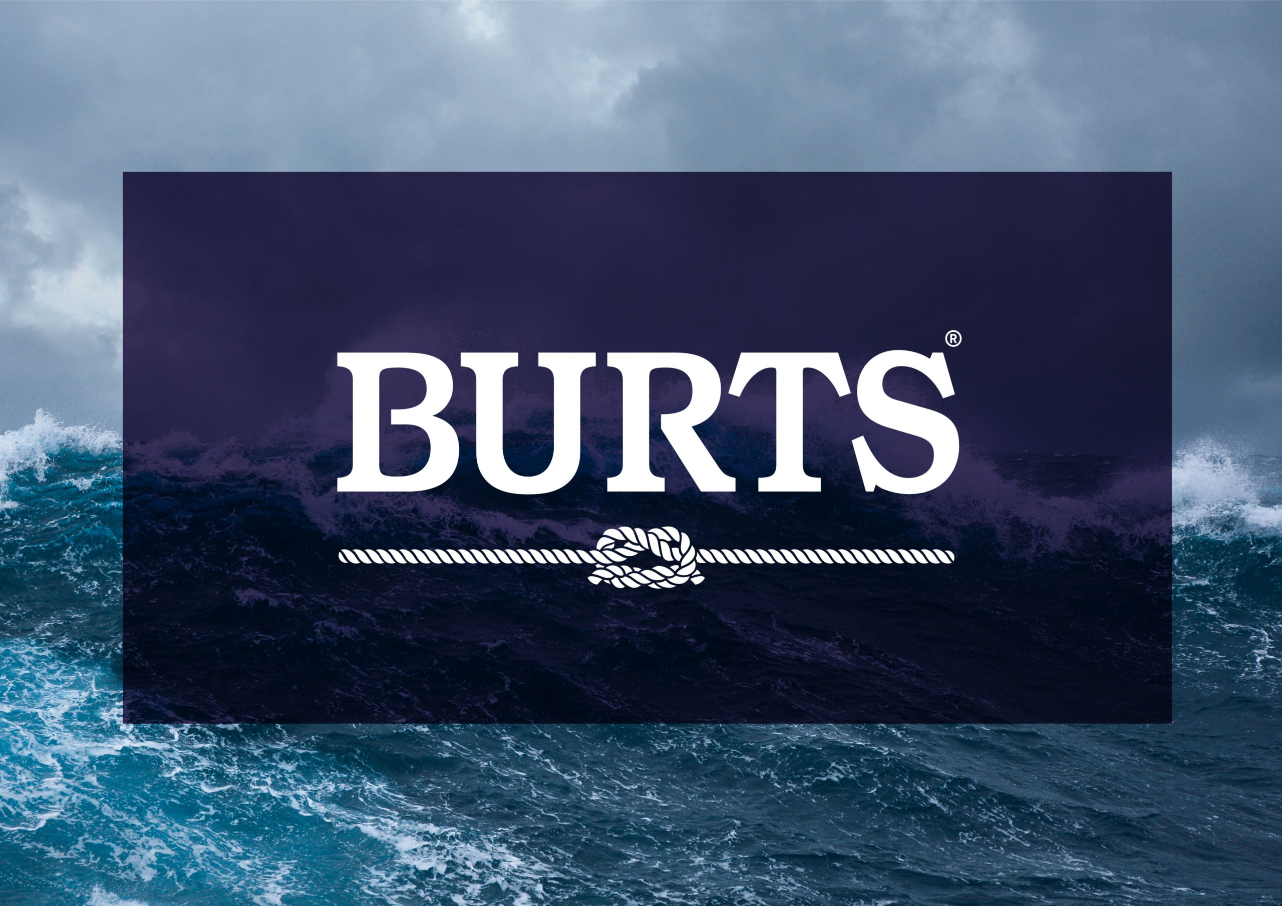
The logo has been redrawn to add craft to the letterforms and instead of the previous generic underline, a knotted rope has been introduced. The two ropes, joined with a knot, are symbolic of both Burts’ strong connection to people and partnerships, and of its south coast roots and Plymouth home, which is famed for its naval history.
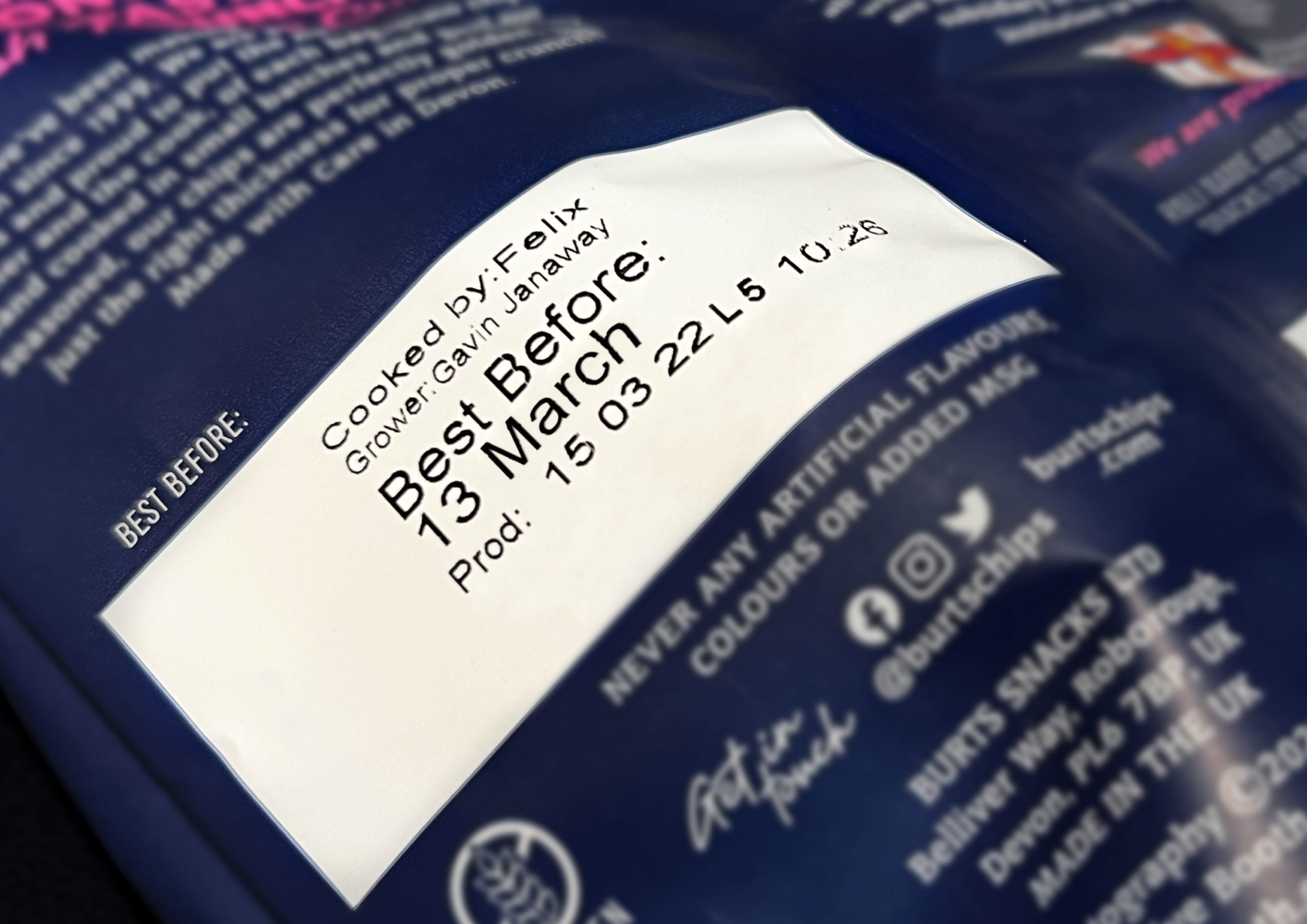
Further celebrating Burts’ keen eye for quality, dedication, care and connection to people, the back of the packs feature the name of the potato farmer, and also that of the person that hand-cooked the chips in each bag.
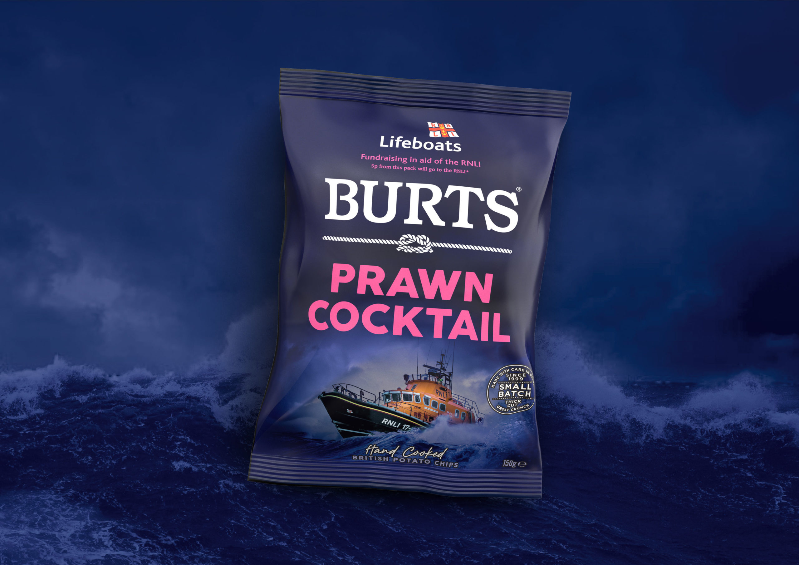
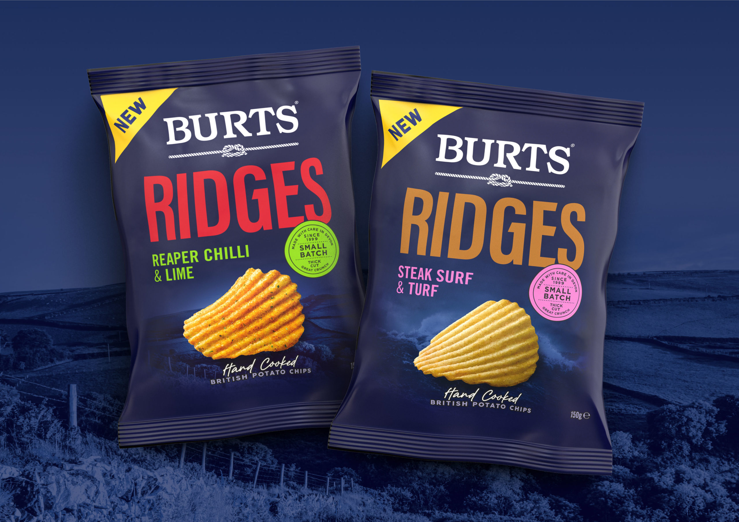
In addition to the hand-cooked chips offering, the business is leveraging its manufacturing capabilities with the launch of innovations such as lentil chips in the ‘better for you’ segment and also ridge cut chips. The new products are part of the Burts family, yet carry a distinct proposition from the core range design. Biles Hendry also created a unique packaging design for Burts’ brand partnership with the Royal National Lifeboat Institution (RNLI) for their new limited-edition Prawn Cocktail flavour chips.
Dave McNulty CEO at Burts said “We are absolutely thrilled at Burts with the new packaging. The design looks truly amazing, and we have already received a universally positive reception so far. It’s recognisably Burts, but communicates so much more than the old design, ensuring that consumers get a sense of exactly who we are.”

Anthony Biles Creative & Strategic Director at Biles Hendry said “The new logo and packaging reflect Burts’ care and craft, with care and craft in the design. Burts goes to great lengths to ensure their snacks are the best tasting and of the best quality: they are real experts. What comes across is how much they genuinely care about their consumers, their suppliers and their own team; and the importance to Burts of their Devonshire roots.
The new brand livery is launching in May across the UK and export channels.
Source: Biles Hendry
You must be logged in to post a comment Login