
New Look To Support ‘Get The Job Done’ Positioning
Nomadic has marked its 25th anniversary with a bold new look and an ambitious growth plan. It follows an impressive twelve months for the company, with continued double-digit growth. Nomadic has also maintained its No.1 position in convenience (source: IRI, Adult Yogurts, Total Convenience, w/e 22.01.23).
The news comes after the successful January launch of the company’s first non-yogurt products, two protein puddings. First stocked in Morrisons and Spar, these are now set to be rolled out across a wide range of retailers.
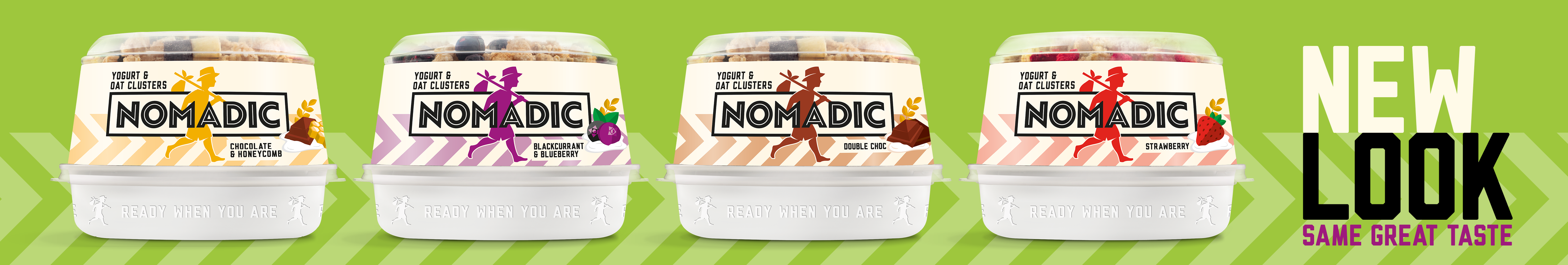
The new look adds a dynamism and energy to its packaging, with a bolder logo and simplified visual approach. It features a variety of coloured chevrons to not only indicate the flavour, but also to add a sense of momentum – while enhancing its iconic ‘nomad’ striding figure.
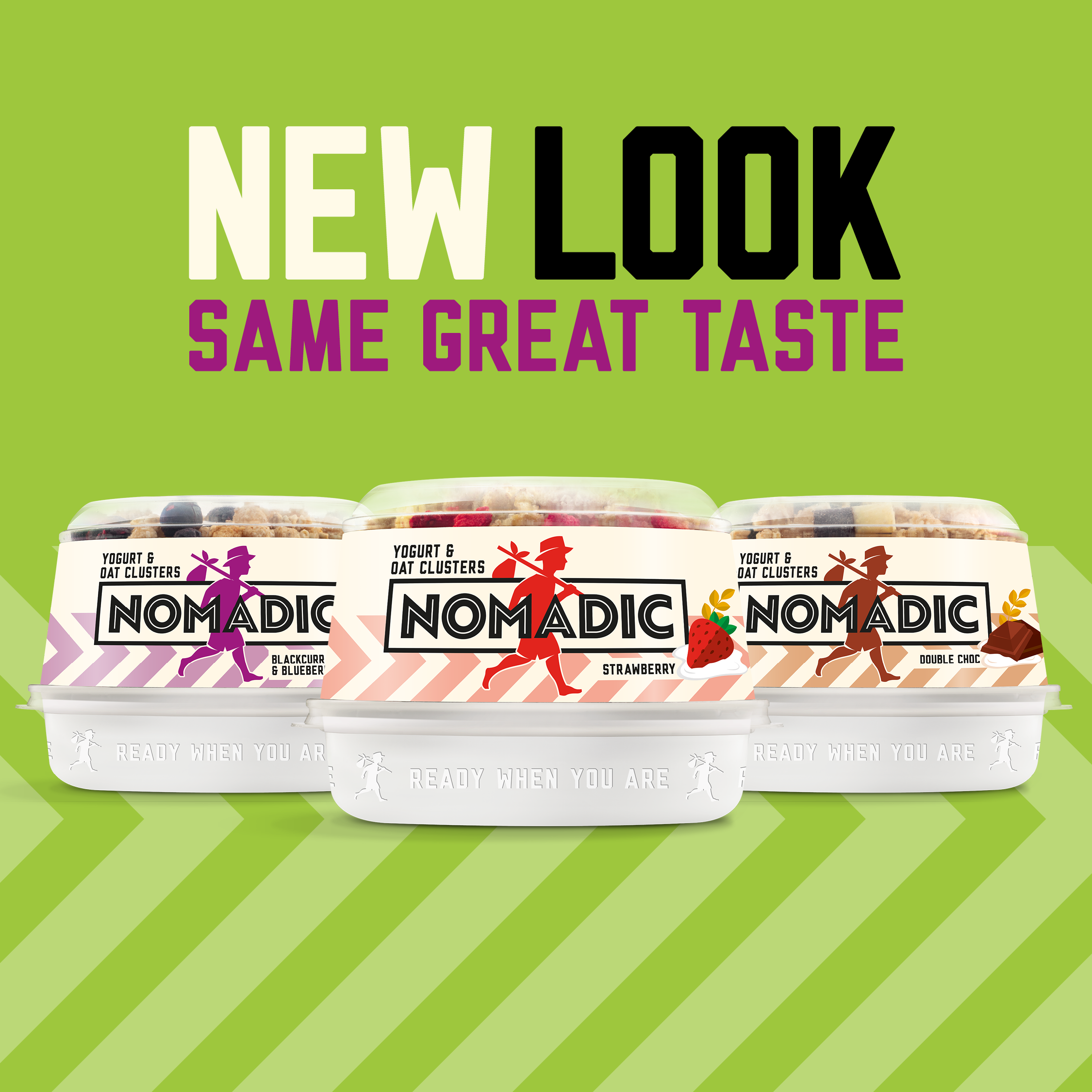
Crucially, the redesign reinforces Nomadic’s positioning of ‘Nourishing convenience food for people who need to get the job done’. The company believes this appeals particularly to those on their feet and on the move, going from task to task.
Nomadic has also dropped ‘dairy’ from its branding, indicating a willingness to extend into new categories.
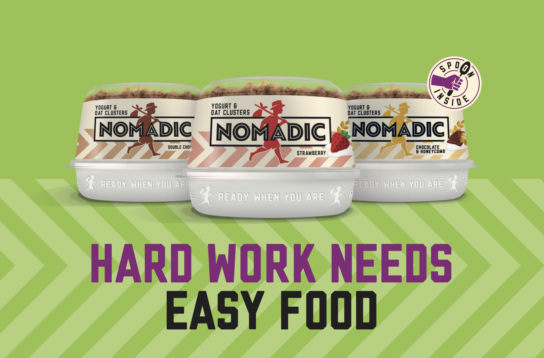
Bethan Miles, Nomadic’s Brand Manager, said: “Hard work of any kind needs easy, nourishing, food and we’ve already got a range of products that fulfil this – whether it’s for on-the-go satisfaction, or when people have a little more time. This new design now gives us maximum shelf stand-out.”

The company is supporting the new look with in-store activation and an ATL campaign, set to launch nationwide in early summer.
Source: Nomadic
You must be logged in to post a comment Login