New Brand Mark, Name, Packaging, and Creative Assets Designed to Help the Brand Expand Nationwide
Protein Puck, a modern, plant-based food company built around empowerment, is undergoing a rebrand as it looks to expand its audience beyond the athlete and outdoor adventurer to scientists, artists, entrepreneurs, and anyone else who needs a powerful way to fuel both body and mind.
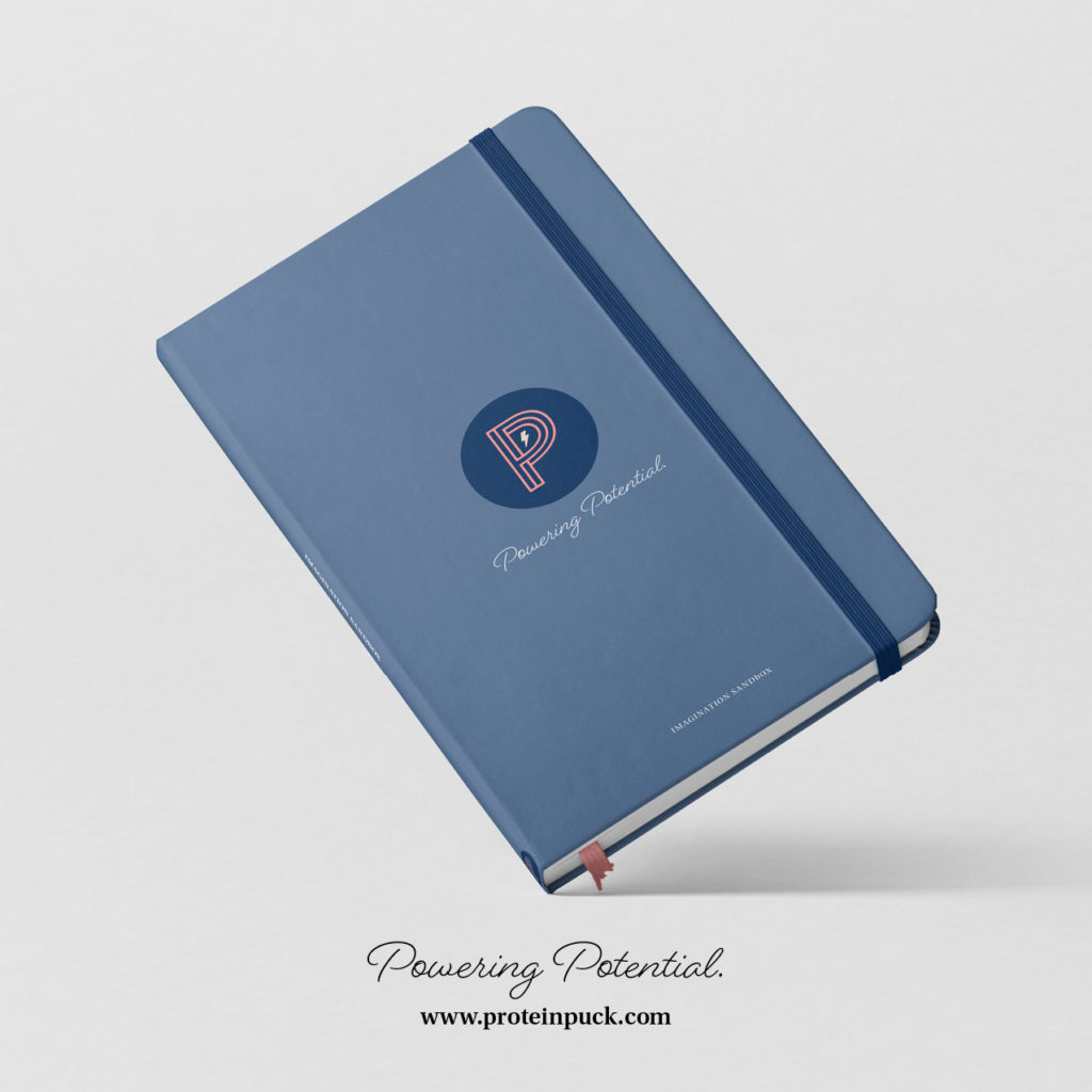
Noun Ventures partnered with the company to bring the new branding to life visually with a new brand mark, name, and all new creative assets including packaging, writing, design, and photography to upgrade the brand’s overall look and feel with the goal of helping it to expand into new markets nationwide.
The company has plans to expand into Canada and when they do, intends to use the name Power Puck, which reflects a move away from the generic protein bar category and a move towards the inclusionary aspect of “power” and fueling all of your nutritional needs in a clean way. Canada provides an excellent proving ground and test market for this more expanded naming approach. This naming strategy may extend to playing a bigger role in the U.S. market.
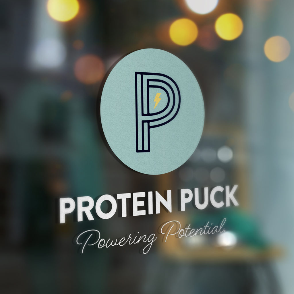

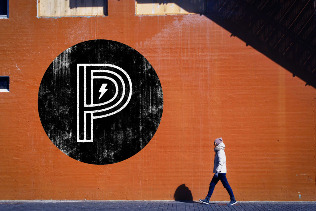
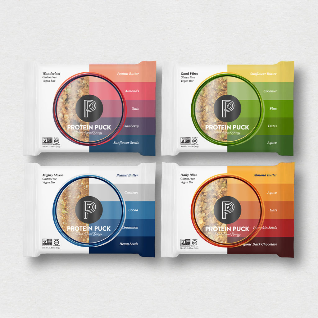
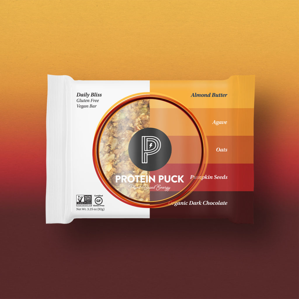
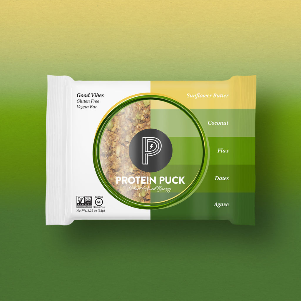
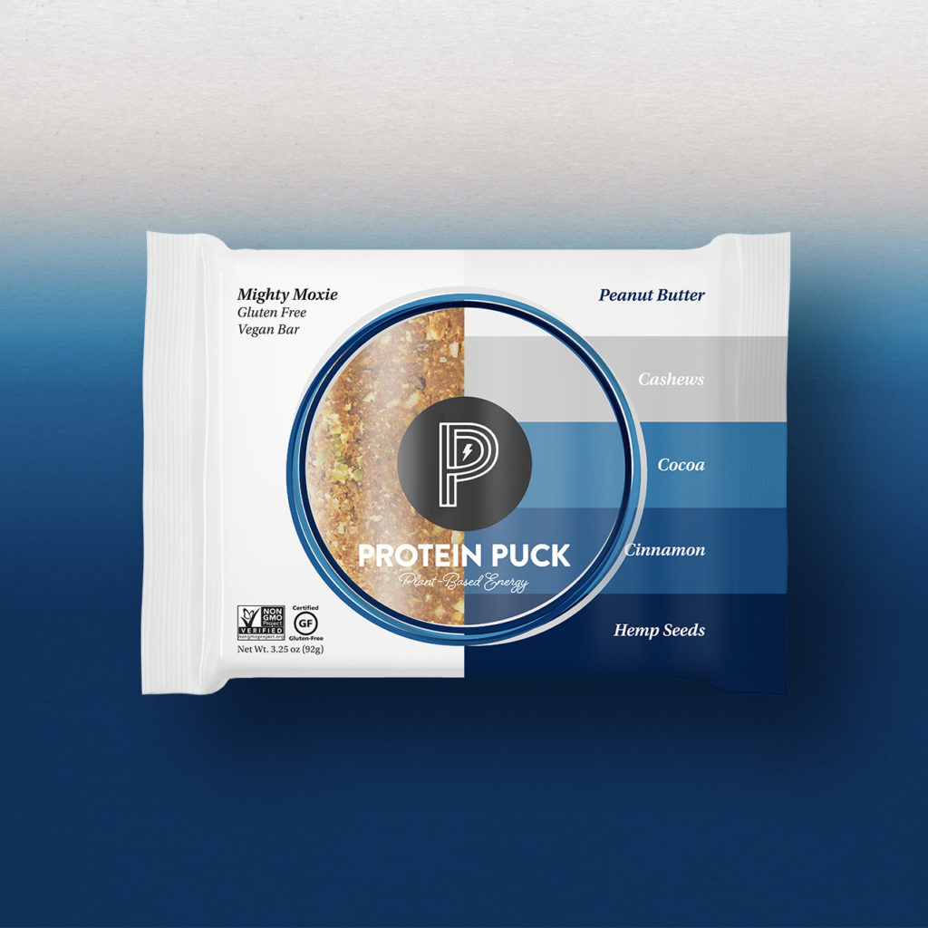
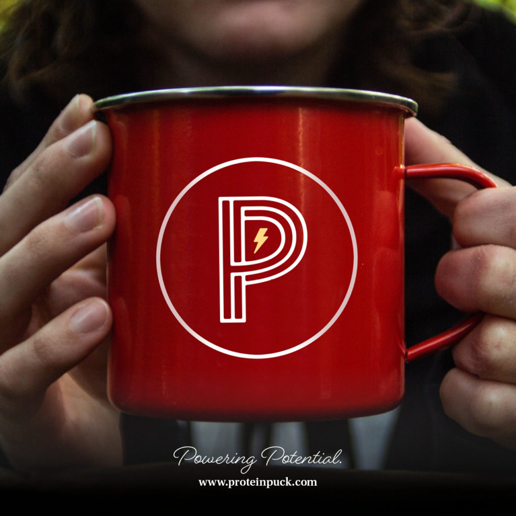
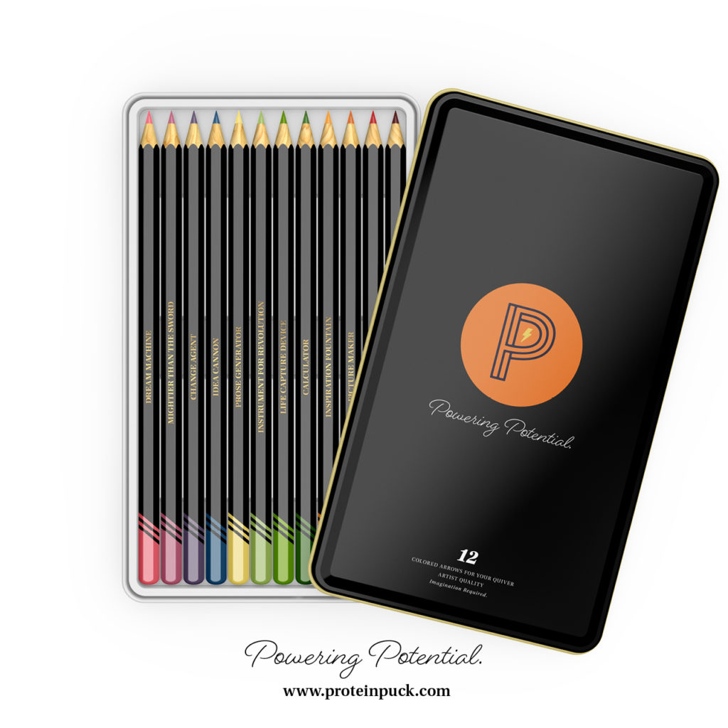
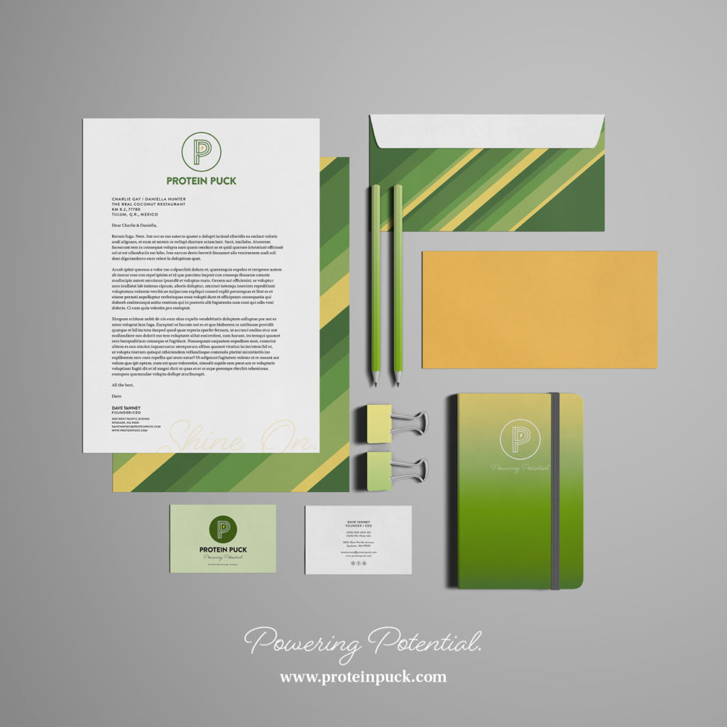
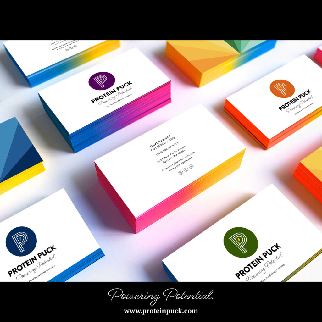
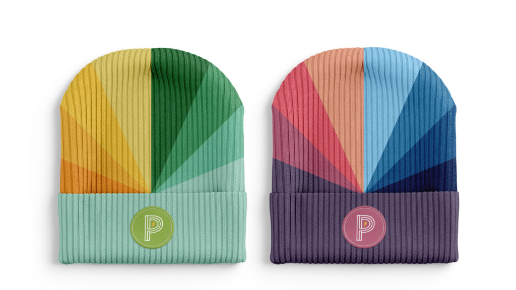
Noun focused on the idea of energy as an icon when reimagining the brand design, and the new brand mark features subtly intertwined P’s to represent the Protein Puck/Power Puck name. The P’s are situated inside a circle that references the product’s form, with an energy bolt in the center for a small, electric touch that gives a nod to what the brand provides to customers. Besides referencing the form factor of the product, the circle will also function as a portal of expression for the brand going forward and serve as a thematic creative element used to highlight, accentuate, or focus the viewer’s attention through photography, illustration, and design. For the word mark, the team chose Brandon Grotesque Black, an understated, yet distinctive typeface with a friendly spirit due to the subtle rounded corners on each letter- form. They paired Beloved Script with it as a secondary typeface to introduce a spontaneity and playfulness, signaling the brand doesn’t take itself too seriously (key in a category that is heavy on technical jargon with ingredients and overpromising results).
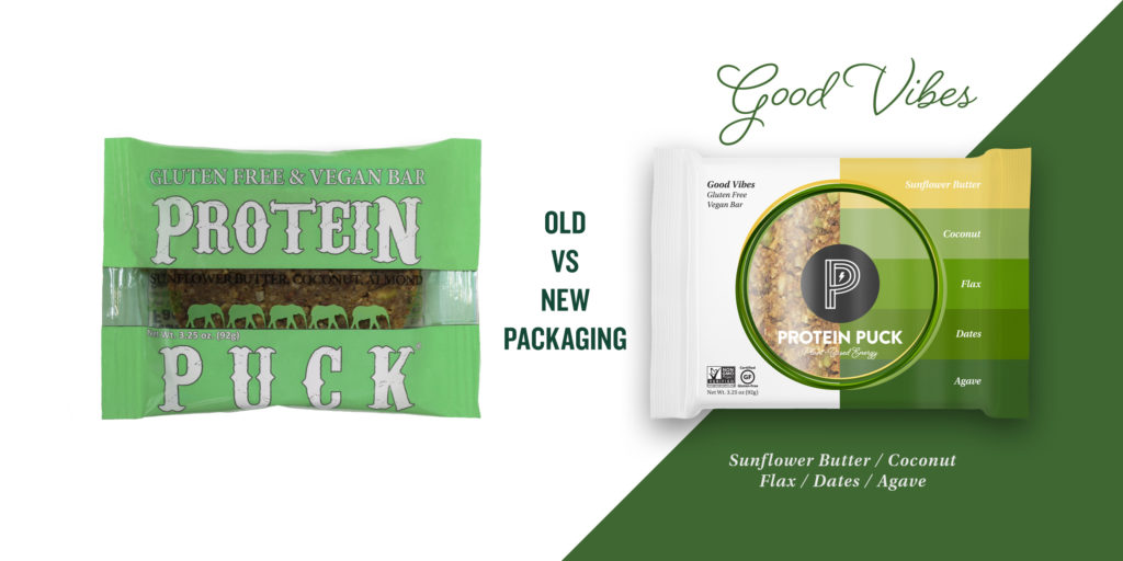
While other brands traditionally utilize a single mark, single tagline, and rigid POV and structure, Noun embraced a modern interpretation of brand systems for Power Puck that allows for a broader range of expression to give the brand more depth, dimension, interest, and potential for connection with different audiences by utilizing a variety of brand mark colors, textures, and pieces of ownable language. The rebranding will launch with two new tag lines or brand statements—“Powering Potential” and “Energy for Good.”—both speak to empowerment and championing people doing meaningful things.
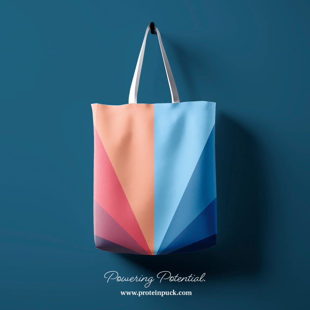
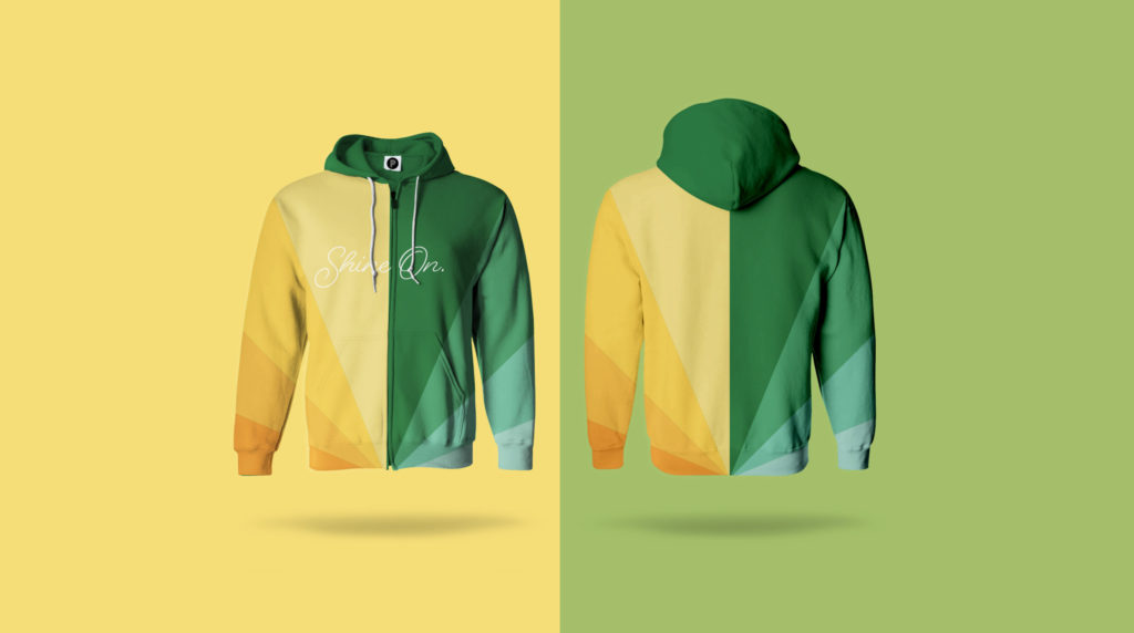
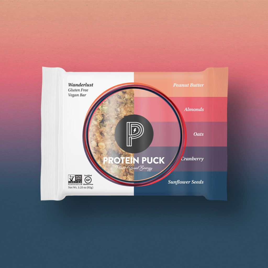
Noun further embraced color as a key brand element, creating a backdrop that serves to inspire, provoke thought, and encourage experimentation. Since each Puck is a power source providing whole-food plant-based vitality, each of the brand’s four flavor profiles were endowed with their own corresponding color spectrum, creating a visual representation of their unique energy:
- Warm pinks, purples, and blue for Wanderlust, a Plant Based Energy Bars with Peanut Butter, Almonds, Oats, Cranberry, and Sunflower Seeds.
- Earthy browns, oranges and red for Daily Bliss, an Organic Dark Chocolate Protein Bar with Almond Butter, Agave, Oats, Pumpkin Seeds and Organic Dark Chocolate.
- Cool blues, grays and white for Mighty Moxie, a High Protein Vegan Peanut Butter Bar with Peanut Butter, Cashews, Cocoa, and Cinnamon.
- Vibrant yellow and greens for Good Vibes, a Vegan Plant Based Protein Bar with Sunflower Butter, Coconut Flax, Dates, and Agave.The new visual identity is being rolled out across all packaging and on e-commerce and digital channels for both Full-size Pucks, which are designed to be the perfect mini-meal, big enough to fill you up, but still small enough to be a snack, and Mini Pucks, designed to be the perfect little snacks, delivering plant-based energy to power you through your day.
“Our consumer is a deeply well-intentioned individual who wants to contribute and grow in
a rapidly changing world, and our products are the perfect building blocks to nourish human achievement wherever that may be—on the side of a mountain, in a lab, or in front of a canvas,” said Paul Pennington, CEO of Protein Puck. “Shifting our name from Protein Puck to Power Puck takes things from literal and generic to a broader expanse of possibility that aligns with our strategy for the brand going forward. We’re eager to test this approach in the Canadian market. I also love that it keeps the double ‘P’ alliteration while taking that a step further with a strong new brand mark and a significantly elevated design profile that will appeal to a wide range of people.”
“We wanted to open the aperture of the brand’s target audience to include those that need tasty, truly healthy brain food that checks all the boxes this great product does. Folks that are moving the needle in business, changing culture for the better, and redefining industries. What we’re really selling beyond the functional nutritional elements is empowerment. The real value of the brand is what it allows you to do with the energy it provides,” said Neil Riddell with Noun Ventures. “I think Protein Pucks have the potential to be the next cultural meteor in the natural foods space, and we look forward to exploring new creative territories as we continue to bring the brand to life.”
SOURCE: Noun Ventures

You must be logged in to post a comment Login