
Hearth was founded by a health-conscious couple determined to capture the very best of the Earth’s natural resources. Their first product is a duo of canned yerba mate drinks – an ancient South American tea. Which up until now has had niche appeal in the rest of the world, due to a lack of accessibility to all but the most health conscious. Sold through health stores, gyms and coffee shops, Hearth Yerba Mate was attracting some attention. Both for its product and colourful design. There was a slight issue: it looked like the brand was called Yerba Mate, not Hearth. And, if you weren’t in the know you didn’t know what the product was!
Hearth came to us for a refresh. We re-drew the existing logo mark, making the Hearth word mark more distinct and interlocking ‘H’ heart shape more obvious. An ownable device that can be used beyond packaging; across digital and social.
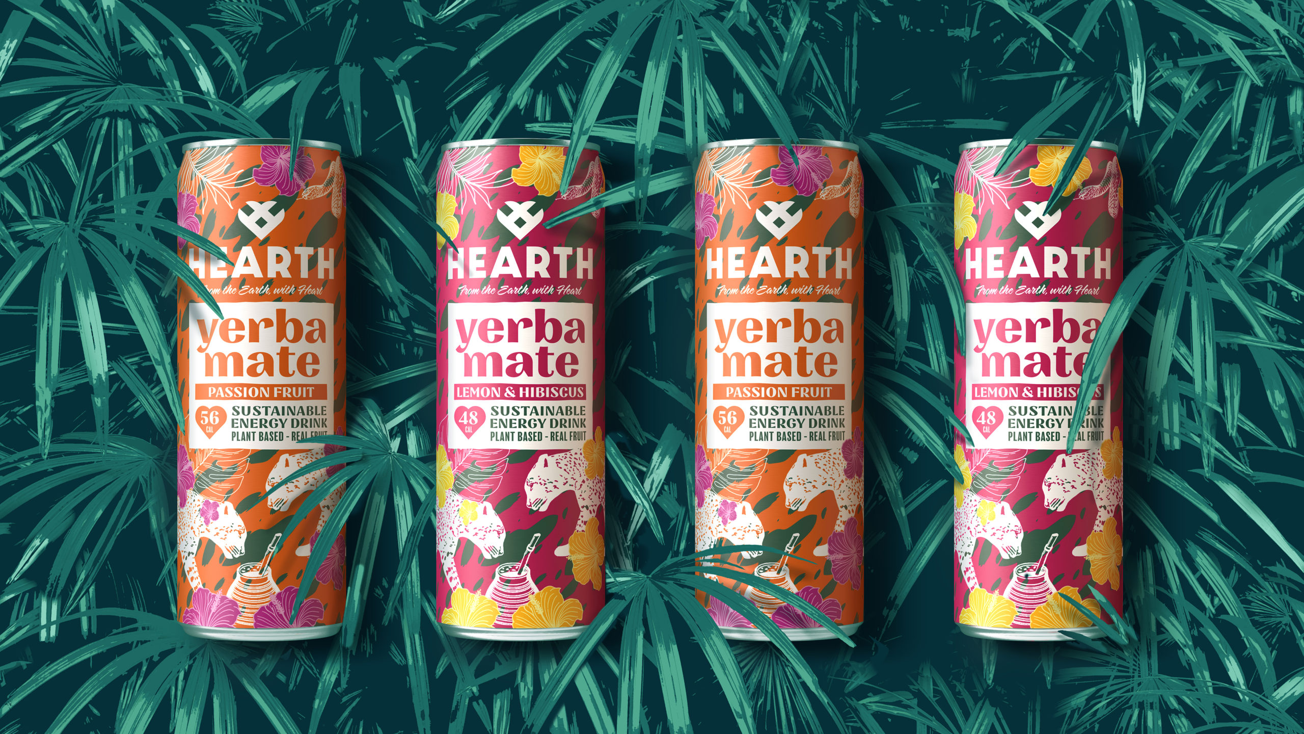
On pack, the existing message wasn’t conveying the true long-lasting benefits of yerba mate. We changed this to ‘sustainable energy’, a dual reference to both yerba mate’s benefits and Hearth’s ethos of capturing the best of nature’s resources. Hearth is proud of its low calorific value, which comes from being made with natural fruit juices, rather than artificial flavours and sweeteners. So we put these into heart-shaped standouts.
The colourful illustrations were refined, and we introduced a new natural colour palette to better reflect the flavours (Lemon & Hibiscus and Passion Fruit). By changing the print finish of the cans to a more ‘health category’ matt, it gave the brand a more premium feel.

The typography was developed to add character and stand out. Bringing more balance and consistency. The brand name was supported by the addition of the tagline ‘from the earth with heart’ in a flowing hand script. Distinctive and ownable, it was now much easier to see the brand name, Hearth, and the product name, Yerba Mate.
Hearth Yerba Mate can now be found in Planet Organic and Harrods. Charlotte Theaker, Senior Buyer at Harrods commenting, “the new packaging looks fab and really stands out on the shelf… I find the two flavours far more distinct now.”
Sustainable energy, here to stay.
“Butterfly Cannon have kept all that we loved about our original design but made it distinctively Hearth. It feels totally fresh but completely ours. Seemingly small changes made such a big positive impact, that set us up for our future development. They thought deeply about every detail, really immersing themselves in our brand and even put some mock cans in a taxi so that they could check that we were absolutely happy with how they looked ahead of our somewhat tight production deadlines. Thank you, Butterfly Cannon, from the bottom of our Hearth!”
Charan & Pavan Gill, Founders, Hearth
Source: Butterfly Cannon
You must be logged in to post a comment Login