
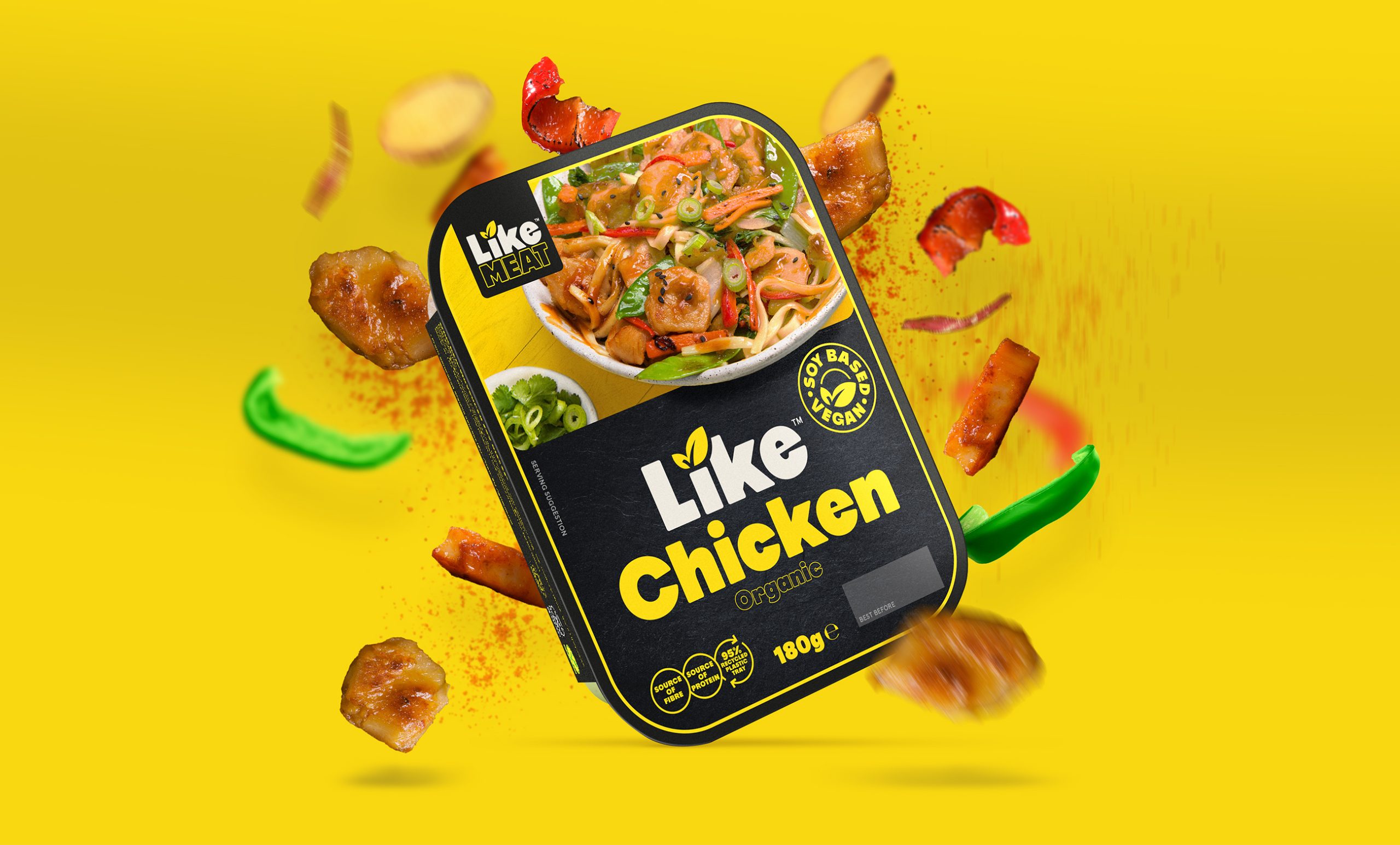
Independent design agency Sunhouse has redesigned LikeMeat, a range of delicious plant-based products made to satisfy even the meatiest of cravings. With a saucy new attitude and finger-licking photography, the new identity and packaging design oozes with personality, positivity and punch.
Part of The LiveKindly Collective portfolio, LikeMeat is pioneering the pleasure of meat with no harm. Uniquely catering to local food culture, it offers comfort and choice to mindful meat-lovers. This audience of ‘carnivores with a conscience’ are ready to eat more plant-based foods but don’t want to deprive themselves of the ‘tasty good times’ and satisfy the cravings of their favourite dishes.
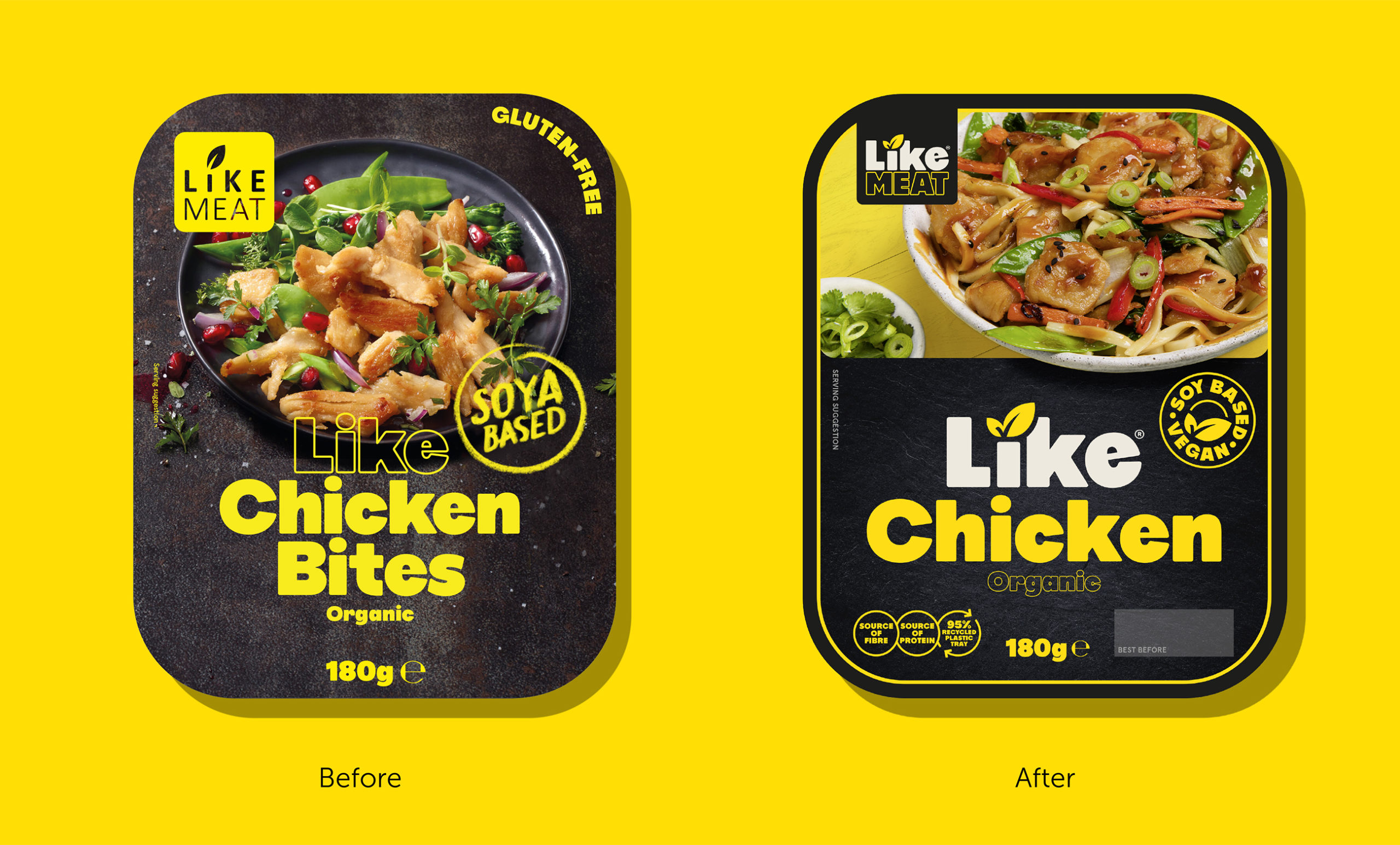
Sunhouse was tasked with evolving LikeMeat’s brandmark and packaging design to align with a bold new strategy that shifted the brand from a humble alternative to a pleasurable choice. Though encouraged to explore the possibilities of LikeMeat’s new creative approach, the design solution needed to also powerfully land its ‘double the pleasure’ point of view: Eat what you like and like what you eat.
“LikeMeat is a brand full of paradoxes; offering the familiar, traditional comfort foods that people love in a surprising way that fits the future of conscious eating,” comments James Giles, Creative Director at Sunhouse. “Our challenge was to see we could visually bring this duality to life, exploring how far we could push it on packaging to create distinction in a category that is still a bit creatively stuck in an expected sea of green”.
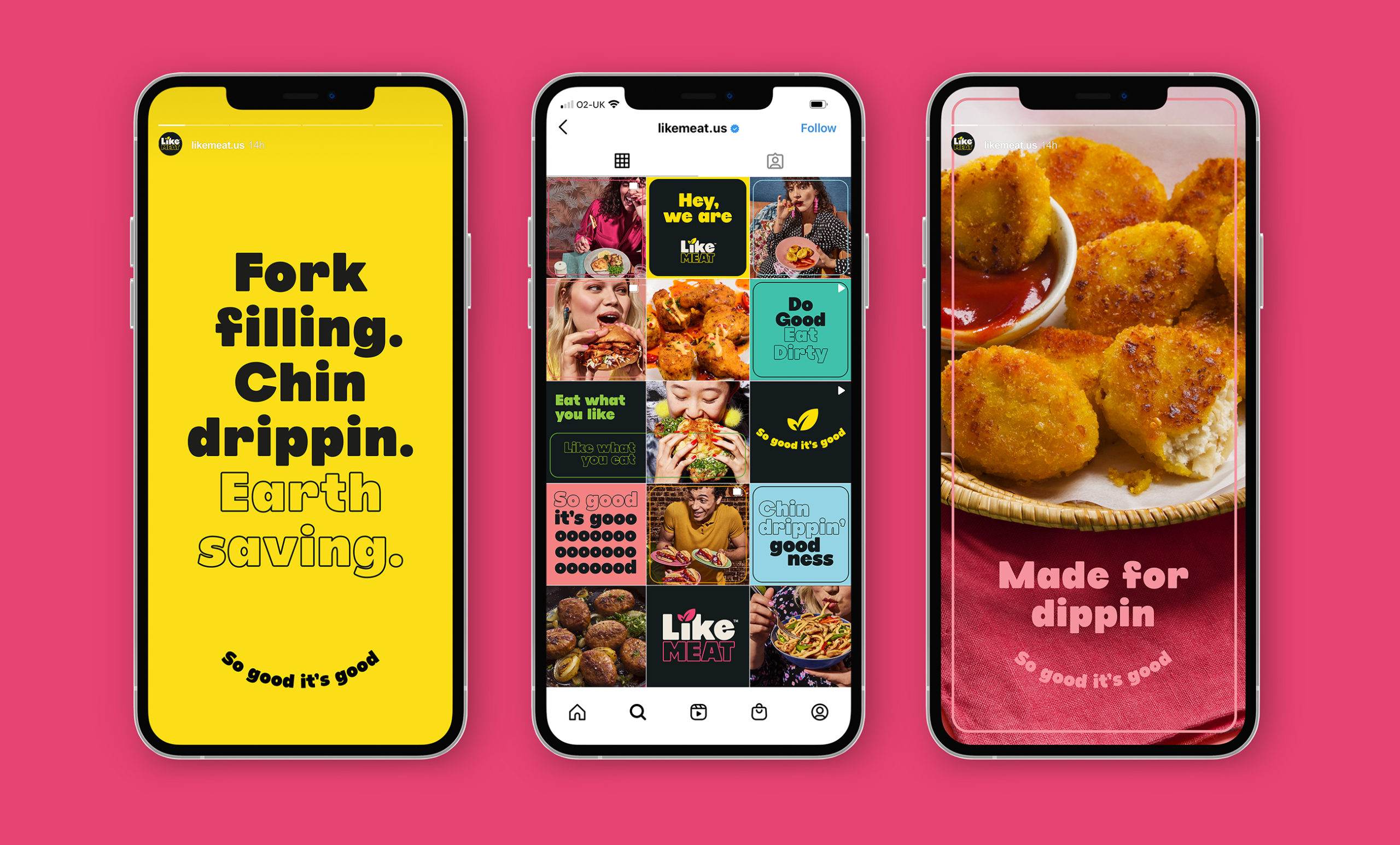
LikeMeat’s logo has been evolved with colour and typography that is bold, yet friendly, bringing out the playfulness of the brand. The leaf, which has been carried over from the previous logo, is now more distinctive with a positive tick hidden within. Literally dotting the “I” on the brand’s plant-conscious credentials, this simple icon now has a life of its own, conveying the fact that LikeMeat is ‘sprouting’ a new movement in food, across all brand communications.

The new photography style is the star of the show with a drool-worthy approach that seductively showcases LikeMeat’s products in all its honest glory. Perfectly imperfect, the photography gives the brand a human touch, making it relatable to people who want to celebrate the beautiful mess of enjoying good food.
“LikeMeat invited us to be as brave with our design as they are with their products,” comments Tom Maurice, Founder at Sunhouse. “The result is a brandmark and packaging that are purposeful and proud, but also full of positivity, personality and love for good food – an awesomely delicious antidote from the more preachy players that are crowding the plant-based space.”
“LikeMeat is a member of the ground-breaking pioneers who are engineering the future of food, and as such, we were ready and willing to make a bold visual statement in the plant-based category that was strikingly different,” comments Karola Kentner-Schütz – Head of Marketing DACH. “Sunhouse helped us bring out our unique edge without sacrificing that sense of familiarity and warmth that’s so important to our brand. We’re super-excited to re-launch with our new packaging that will surely tantalise the plant-curious masses.”
Source: Sunhouse
You must be logged in to post a comment Login