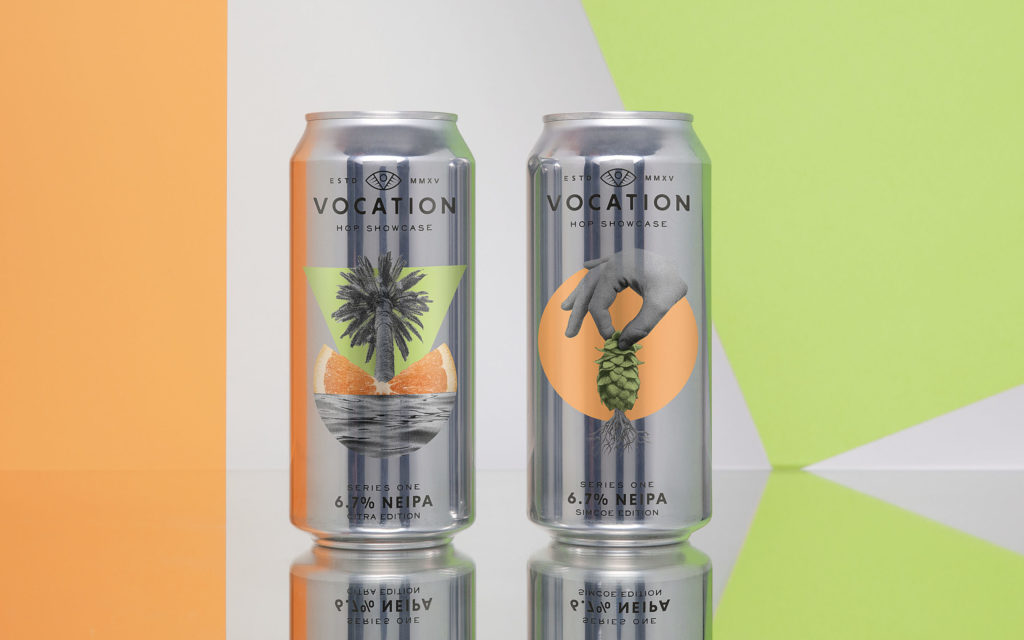
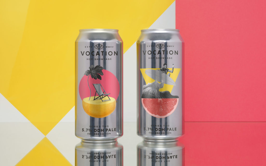
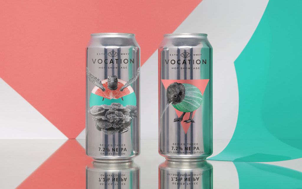
Released in three instalments, each pair of juicy single-hopped beers are brewed in exactly the same style but all contain a different hop variety. Putting flavour centre stage, drinkers are challenged to try both beers in the pair, then compare, contrast and crown their winner.

To capture the distinct personality of each hop, Robot Food chose to create six unique can designs, drawing inspiration from both the origin of the hops and the flavour they add to each brew. The Robot Food team opted for a retro, collage-style aesthetic for the overall look and feel, using tropical imagery to create visual puns that celebrate the juicy flavour profiles of each hop variety. The decision to stick to the same colour combination per drop helps to clearly identify the beers as a pair and adds collectability to the series, whilst the contrasting metallic can adds a quality feel to the drinking experience.
The agency worked with UK-based label manufacturer, The Label Makers, to achieve the striking finish. The designs were printed digitally onto a metallic silver label with a high lustre to create the illusion of a direct printed can. A white base coat layer was printed first, with a number of tinted areas that allowed levels of metallic lustre to shine through, then the design was layered over the top. Areas of colour were Pantone matched for accuracy and varnishes were avoided to maintain as much metallic lustre as possible.
Source: Robot Food


You must be logged in to post a comment Login