
Since 1928, eating a Nestlé Drumstick sundae cone has been an adventure involving a multitude of senses. From the crunchy sound of the peanuts to the creamy vanilla, and down to the chocolatey nugget, it’s truly “America’s Favorite Sundae Cone.” When competitors, including many private labels, started imitating the lineup and visual brand cues, creating a homogenous sea of blue at shelf, it was time to redesign the entire portfolio.

The brand team at Dreyer’s Grand Ice Cream determined that they needed to refresh the brand, bring its values and personality to life, drive differentiation, and tap into the strong emotional connection consumers have with the brand. They called on creative agency, Chase Design Group, to work with them on this icon in the ice cream category and leader in the $3.6 billion all-family snack category.
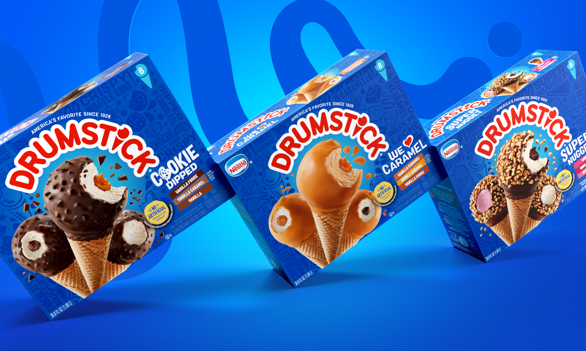
“We looked for ways to break through the sea of blue by strengthening the assets the brand could own and focusing on its values: adventurous, original and energetic,” says Melinda Turner, senior account director, Chase Design Group. Unique pattern illustrations, customized for each flavor/texture/coating, help highlight the adventurous eating experience. The iconic logo was maintained but positioned in an upward angle on the package to
bring more energy to the brand. Vibrant product photography, more authentic to the product experience and secondary typography were designed to reinforce the bolder appearance and enhance appetite appeal.
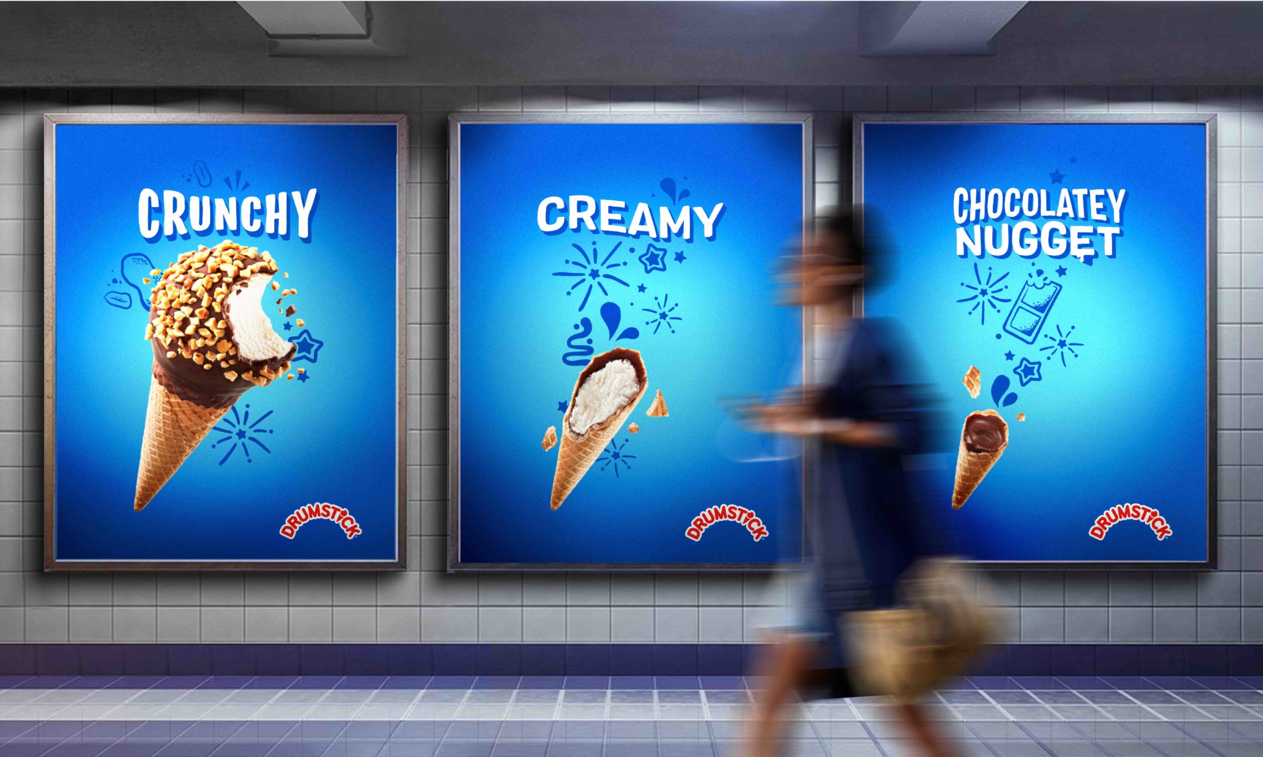
“While the blue background color was a critical part of the Drumstick brand and category cue, we moved beyond to differentiate it with photography, texture, patterns, and clever copywriting that defines the unique aspects of the eating experience,” says Jon Arriaza, senior design director, Chase Design Group. To further distinguish the various flavors, colorful, bold, simple repeat patterns that highlight the new cone illustrations were developed for the inner wraps. “The new brand design system was then applied across the spectrum including merchandising and digital assets resulting in a fun, playful experience from shelf to consumption,” he adds.
“Thanks to the redesign, our packaging now reflects a bolder personality that differentiates us from competitors and will be carried through on future innovations,” says Elmer Gonzalez, Brand Manager, Dreyer’s Grand Ice Cream.
All 23 skus are rolling out to major supermarkets and groceries nationally.
Source: Chase Design Group
You must be logged in to post a comment Login