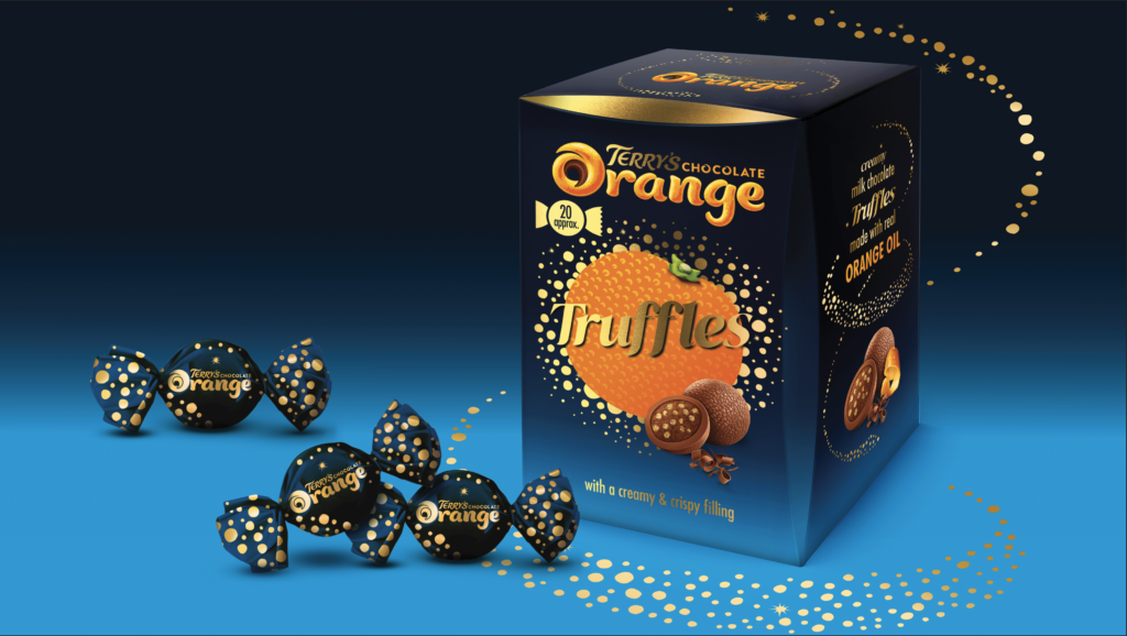
BrandMe have designed the packaging for Terry’s Chocolate Orange new Truffles innovation, entering the indulgent pralines category. The Truffles have been developed in line with the new Terry’s positioning as a brand for all chocolate moments.

Today’s consumers look for an indulgent touch in the everyday, and upgrading their eating occasions presents the perfect means to do it. BrandMe have designed Terry’s Truffles to offer consumers an extra special and indulgent experience as well as an affordable, giftworthy treat.
BrandMe have designed the packaging to stay true to the iconic Terry’s Chocolate Orange branding, with a new twist. Terry’s Truffles feature a darker colour palette, with a deeper, blue that is richer and emphasises the gold sparkles. The intricate details and finishes, including an embossed logo as well as gold foiling, help communicate the indulgent proposition of the product. Each truffle is individually foil wrapped to further deliver a luxurious and giftworthy experience for all the senses.
BrandMe have been able to maintain the playful tone of voice and key elements of the core Terry’s Chocolate Orange while creating a more sophisticated look to emphasise the extra indulgence of Terry’s Truffles.
Source: BrandMe

You must be logged in to post a comment Login