
 Starting January 2016, McDonald’s will phase in new packaging design featuring minimalist typography.
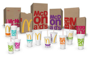
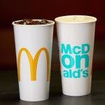
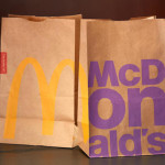
It is a major deviation from its graphic-heavy packaging previously introduced in 2013, which had the emphasis on storytelling. This time, they have taken a less-is-more approach with the intention of creating a modern and progressive brand image.
Working with Chicago-based firm Boxer Brand Design, the fast food giants have stripped down the packaging design of their bags, cups and boxes to highlight the brand’s core assets, which features the wordmark, golden arches, and menu items like the Big Mac.
These are emblazoned prominently in bright colors, making them instantly recognizable from afar. With these, they hope to portray the brand as “colorful”, “bold”, and to an extent, “fashionable”. There are also plans to scale the designs across other media such as menu boards, ordering kiosks and their mobile app.
You must be logged in to post a comment Login