Despite being the oldest-known alcoholic beverage in the world, saké is still in its infancy in the United States. The rice-based beverage is steeped in the tradition of its Japanese roots, as evidenced by the visual storytelling and typography common to most saké labels. In the US, however, this strong association with tradition has perhaps hindered saké from growing beyond the restaurant experience with which it is most commonly affiliated. Thus, inspiring the question, how can we shine a light on saké for American consumers?
SoGood Saké is a super-premium, American-made saké aiming to jumpstart the category by promoting new occasions and food-pairing experiences. Made with rice that is grown, milled and perfected in California by the founders, the SoGood brand controls production end-to-end.
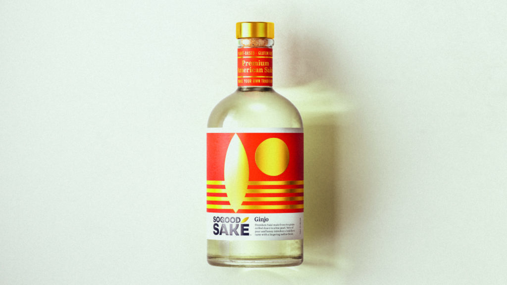
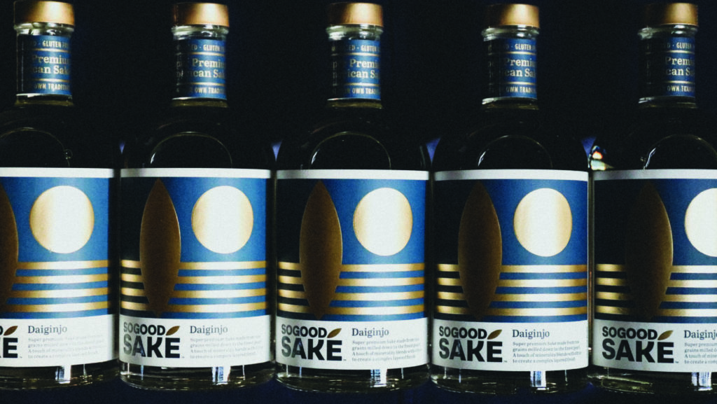
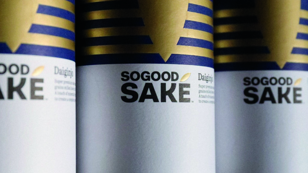
SoGood Saké produces two types of premium saké – Ginjo (Premium) and Daiginjo (Super Premium). Each of the varietals offer a smooth, crisp and refreshing flavor as all natural and gluten free options.
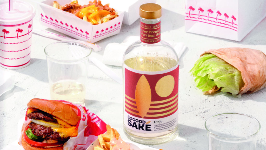
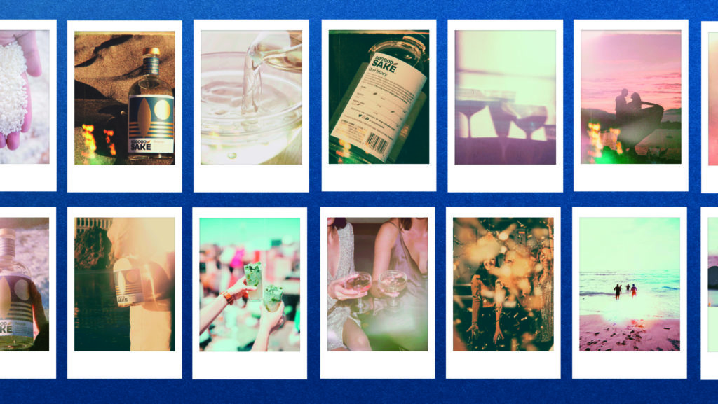
“Creating the brand was about telling a simple story that made saké more approachable to the American consumer,” said Peter Geiszler, Strategy Director at Pearlfisher. “We wanted to create something that was respectful of saké heritage and tradition, while in a way distancing ourselves from the typical visual cues that American consumers have come to expect. For us, it was important to create new associations and emotional triggers, so maybe a person doesn’t go to the beach and think ‘Corona,’ instead they think ‘saké.’”
With a vision to move saké beyond the restaurant and attract adventurous and easy going drinkers alike, Pearlfisher’s new identity and design system tells a vibrantly layered and symbolic story of saké with a bold, straight-up American-made offer.
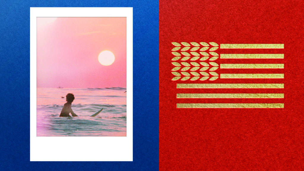
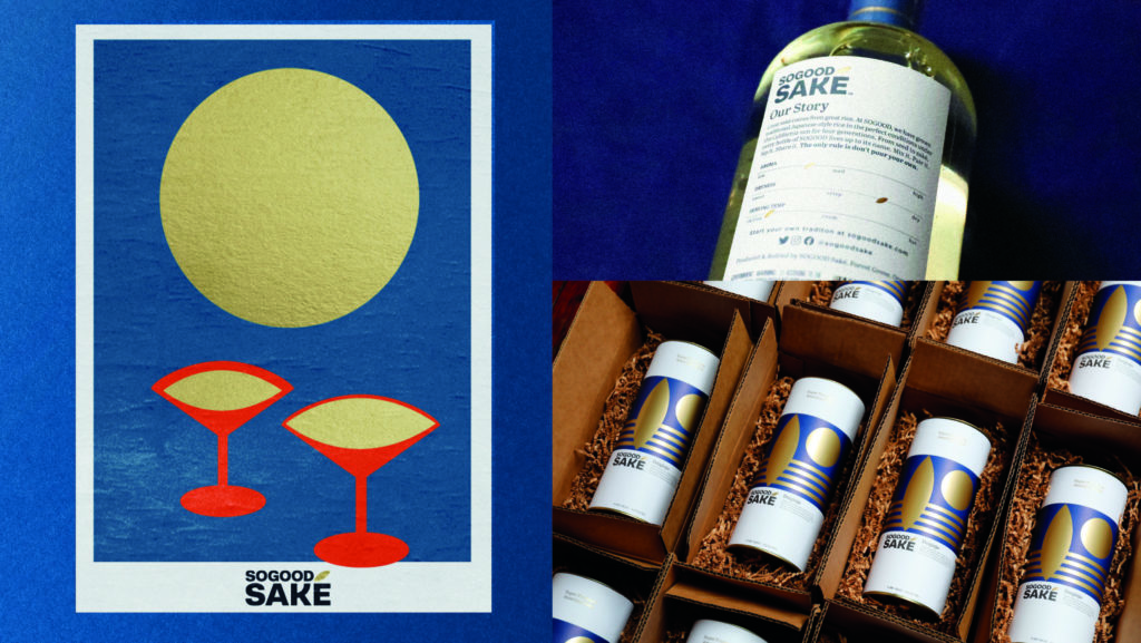
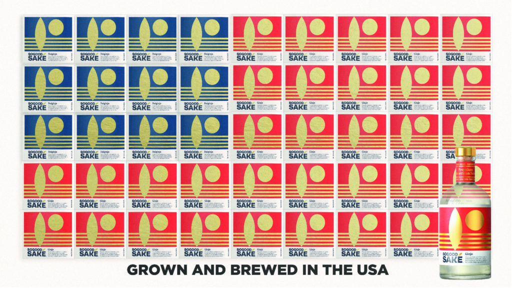
Implicit in the design are symbols that tell the story of the SoGood Saké brand and lifestyle.
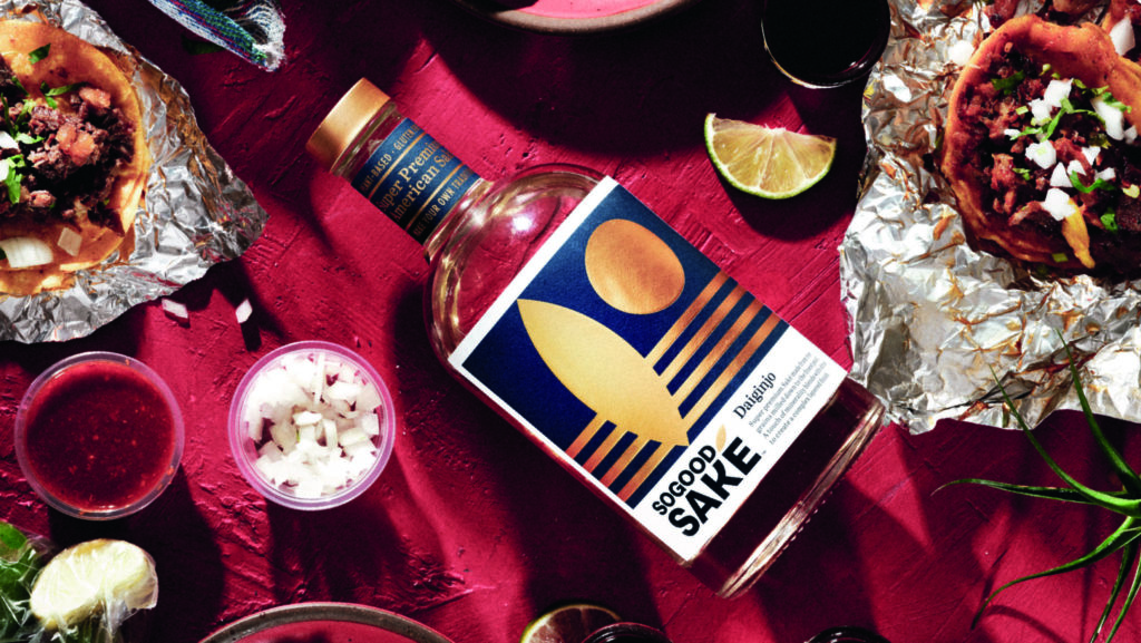
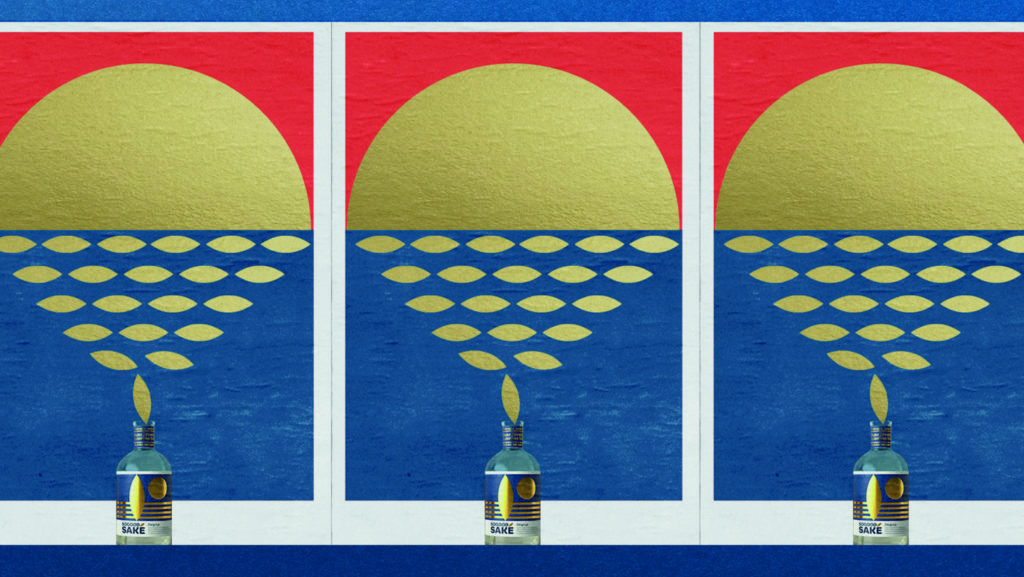
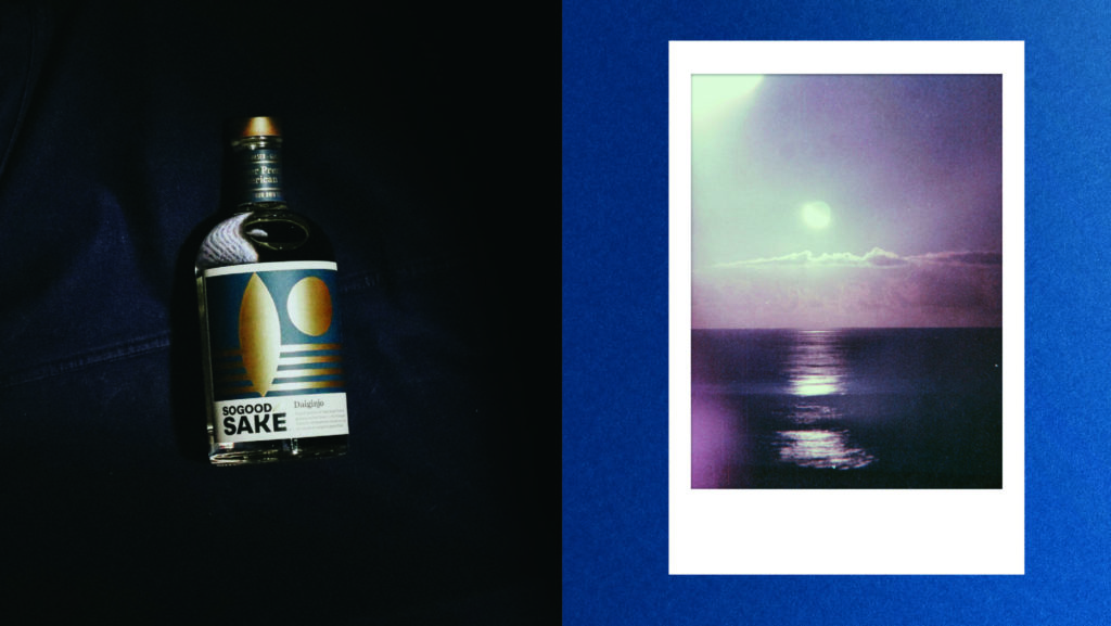
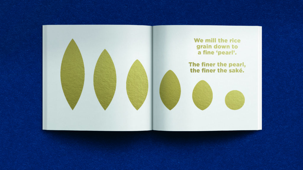
“We began with the rice grain as the inspiration – by celebrating it and activating it as the accent over the ‘e’,” said Jon Vallance, Executive Creative Director at Pearlfisher. “The duality of the design continues on the front-of-pack where the labels’ graphics create a scene from the makings of the drinks. Golden fields of rice are depicted as waves, a rice grain stands upright like the silhouette of a surfboard and the setting sun symbolizes the milled grain of rice after fermenting saké, known as the pearl. This scene and the saké story inform the sunset and gold colors of each bottle.”
SoGood Saké reflects the eclectic desires of American drinkers in a design that plays to both traditional craft and the idea of discovery. Above all, visualizing the idea of shining a light on a new tradition of an iconic Japanese brew.
“The new bottle design is incredibly impactful. It tells a story and, we hope, invites people to discover or maybe re-discover what great quality saké really can be. Saké is an incredibly versatile beverage, and that’s something we wanted to highlight. Ultimately, we encourage people to fit SoGood into their own lifestyles and create their own traditions for when, where and how they enjoy saké,” said, Jess Thomas, co-founder & CEO at SoGood Saké.
SoGood Saké is available online at sogoodsake.com and in partnership with online alcohol delivery service Saucey, it will be released in select markets in retail stores, bars, and restaurants.
Credits:
Executive Creative Director: Jon Vallance, Pearlfisher Strategic Development Director: Paula Murray, Pearlfisher Head of Realization: Jonathan Fisher, Pearlfisher
Senior Designer: Sam Thrush, Pearlfisher
Designer: John Nelson, Pearlfisher
Strategy Director: Peter Geiszler, Pearlfisher
Senior Client Manager: Mike Osgood, Pearlfisher
Source: Pearlfisher.

You must be logged in to post a comment Login