
Pearlfisher London has revitalised iconic port brand Cockburn’s with a new identity, creative strategy, structural and graphic design across the family of Special Reserve, Fine Ruby & Fine Tawny and Porto Branco.
The brands’ aim was to strengthen its relationship with existing customers and recruit new consumers to the category. The rebrand has allowed Cockburn’s to revitalise the perception of its rich heritage and award-winning pedigree to invigorate interest in this unique, classic and historic drink.


Kristoffer Fink Parup, Pearlfisher Head of Strategy, said, “We wanted to move away from a residual snobbery and democratise the idea of port as a drink for so many occasions other than just Christmas. Our idea was to focus the port moment as one of enriching connection – a drink that allows us to savour connections and social engagement across many audiences and locations. This meant focusing our creative strategy on attracting two types of consumer – both the traditionalists and the modernists – this informed our overarching brand vision for Cockburn’s to be ‘Bold in a world of old’. Our idea comes to life through a more welcoming and light-hearted tone of voice and a design still rooted in history but with a striking graphic language to appeal to the more discerning drinker looking for any occasion to try out a different drinking experience.”
The creative approach focused on liberating the character of the master brand and creating a visual identity system that would unite the portfolio while communicating the unique offer of each variant in the Cockburn’s family.
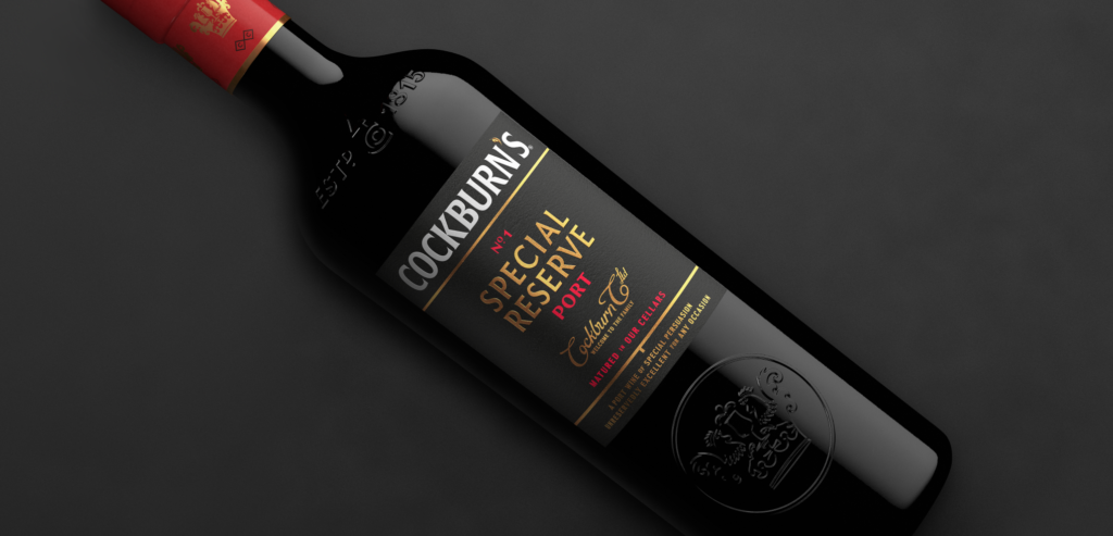
Stuart Madden, Pearlfisher Associate Creative Director, said, “Cockburn’s crest, has been modernised and simplified but remains a symbol of quality and distinction. Two cockerels and a glass of port make the shape of a crown to reinforce the idea of welcoming you into the family – both the Symington family and the connections you make with your own family and friends while you enjoy Cockburn’s port. The wordmark is now bold, iconic and communicates heritage in a modern way and the feather apostrophe is a playful and witty touch to reflect the spirit at the heart of the Cockburn’s brand.
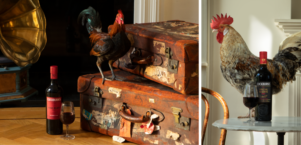
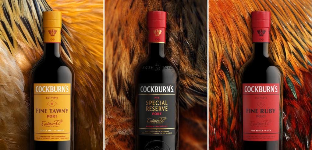
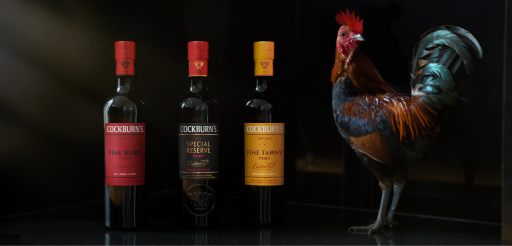
Stuart continued, “Within the packaging design, we rationalised all elements of the bottle and restructured all equities to create the strongest positioning and a contemporary aesthetic. The use of numbering has been reinstated with a nod to Cockburn’s archival designs. The addition of ‘No. 1′ now asserts the premium positioning of Special Reserve with a Cellar Masters’ mark providing a seal of quality and craftsmanship. Cockburn’s Fine Ruby & Fine Tawny remain linked in style but with different bold and complementary colours – Red for Fine Ruby and Orange for Tawny – and each has a corresponding Cellar Masters’ mark. Structurally, Cockburn’s now stands tall and proud, reflecting the pride in, and quality of, its contents.”
Charlotte Symington, Marketing Manager at Symington Family Estates, said, “We are still recognisably Cockburn’s, but we worked with Pearlfisher to develop a bolder and more premium identity and positioning across the core range of our portfolio. It will inevitably help drive our ambition to reassert the status of port – and Cockburn’s as the definitive choice – as we look to draw in a new crowd to immerse themselves in the many different tastes, occasions and connections that the Cockburn’s experience has to offer.”
The new-look family of Cockburn’s Port is available on shelf nationwide now.
Source: Pearlfisher
You must be logged in to post a comment Login