Republic Restoratives, the largest crowd-funded, women-owned distillery in America, has unveiled its new brand identity.
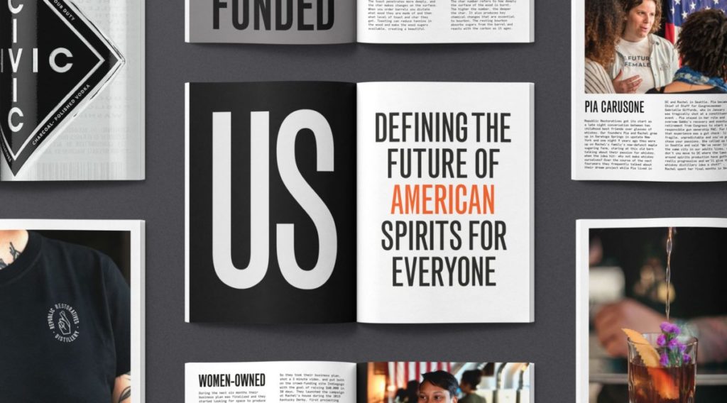
Designed by Midday, a creative agency based in London and Vancouver, this new identity and positioning is a pivotal moment for the distillery. It not only sets the foundation for its expansion beyond its DC community roots, but it also gives visual expression to the distillery’s bold reimagining of what it is to be American.
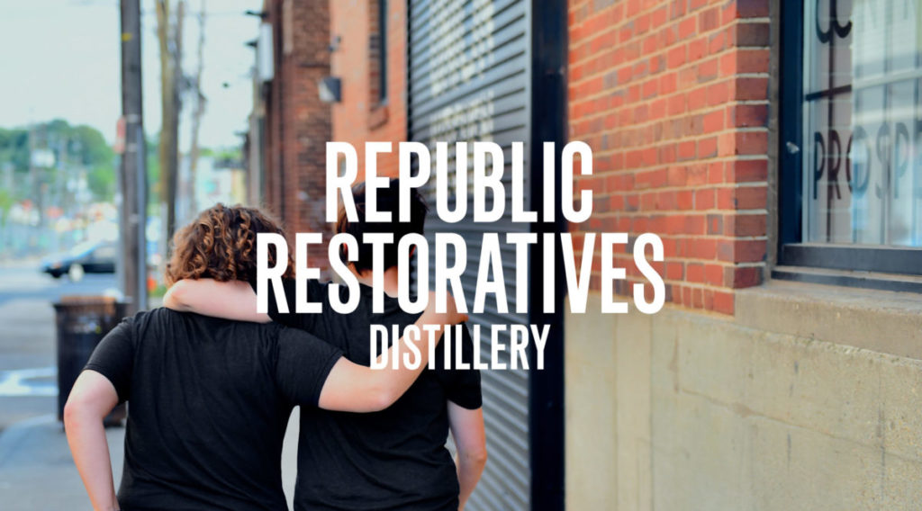
Redefining America
Founded in 2015 by Pia Carusone and Rachel Gardner, Republic Restoratives now produces a range of high quality American spirits – bourbon, vodka, rye and apple brandy – from its distillery in the heart of DC’s Ivy City.
Crowd-funded from the start, this is more than a drinks company; this is a diverse, vibrant community of people brought together by their love of quality American spirits. Recent investment means it can now take what it has built in DC to a new audience right across America and beyond.
“Our product portfolio has grown rapidly, says Carusone. “Each product has a strong look and feel, but we needed to create a master Republic Restoratives brand to unify them as one house of brands. We wanted to reposition our brand so that people across the country can feel as much a part of our community as the regulars in our Ivy City tasting room do.”
She adds: “Midday was the obvious partner to help us achieve that repositioning. Like us, the team there sees things differently. And with hubs in London and Vancouver, they’re well positioned to bring a perspective beyond DC.”
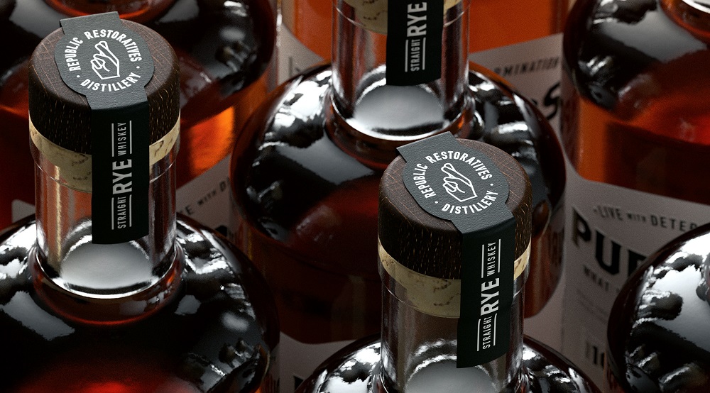
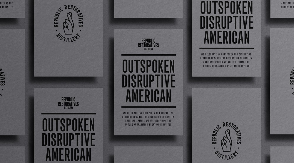
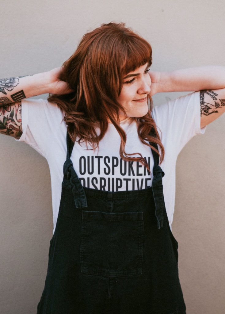
Outspoken, Disruptive, American
The Midday team visited DC in August 2019 and immersed themselves deeply in the Republic Restoratives brand and community.
“Our visit left a profound impression on us,” reports Will Gladden, Creative Partner at Midday. “Republic Restoratives is rooted in tradition but you get a real sense of intent to redefine the future of quality American spirits, for everyone. They’re outspoken and full of passion – everyone’s made welcome at the Republic Restoratives table.”
Back in their studio, the Midday team set about evolving the brand and brand world to reflect these values.
Tomorrow’s people
The launch has laid the foundations for growth. Representing the brand’s overwhelming sense of community, togetherness and hope, a human-focussed brand icon sits at the centre of a powerful, no nonsense typographic brand which gives volume to the brands voice. The industrial colour palette and material choices are inspired by the distilleries urban roots whereas the outspoken personality comes directly from character of its team.
This is a flexible identity that can be used across a wide range of print, digital, retail and product environments. A social campaign will feature striking photography of the people you see hanging out in Ivy City and beyond. These are the fearless, the imaginative, and the socially aware. They are the people who will shape the America of tomorrow.
A new phase of the journey
“Five years ago we launched in a derelict part of a car park in DC, and we built a distillery from scratch,” says Carusone. “The journey to here has been incredible, and we’re now at the start of the next phase. The new brand identity you see today will play a key role in taking our drinks and our message to a new audience.”
Source: Republic Restoratives

You must be logged in to post a comment Login