
Amstel introduces an updated visual identity that celebrates its origins and position as the quality beer for quality bonding. The new look modernises the design while highlighting elements of the brand’s Amsterdam heritage. The updated design delivers greater consistency across the globe to drive growth worldwide.
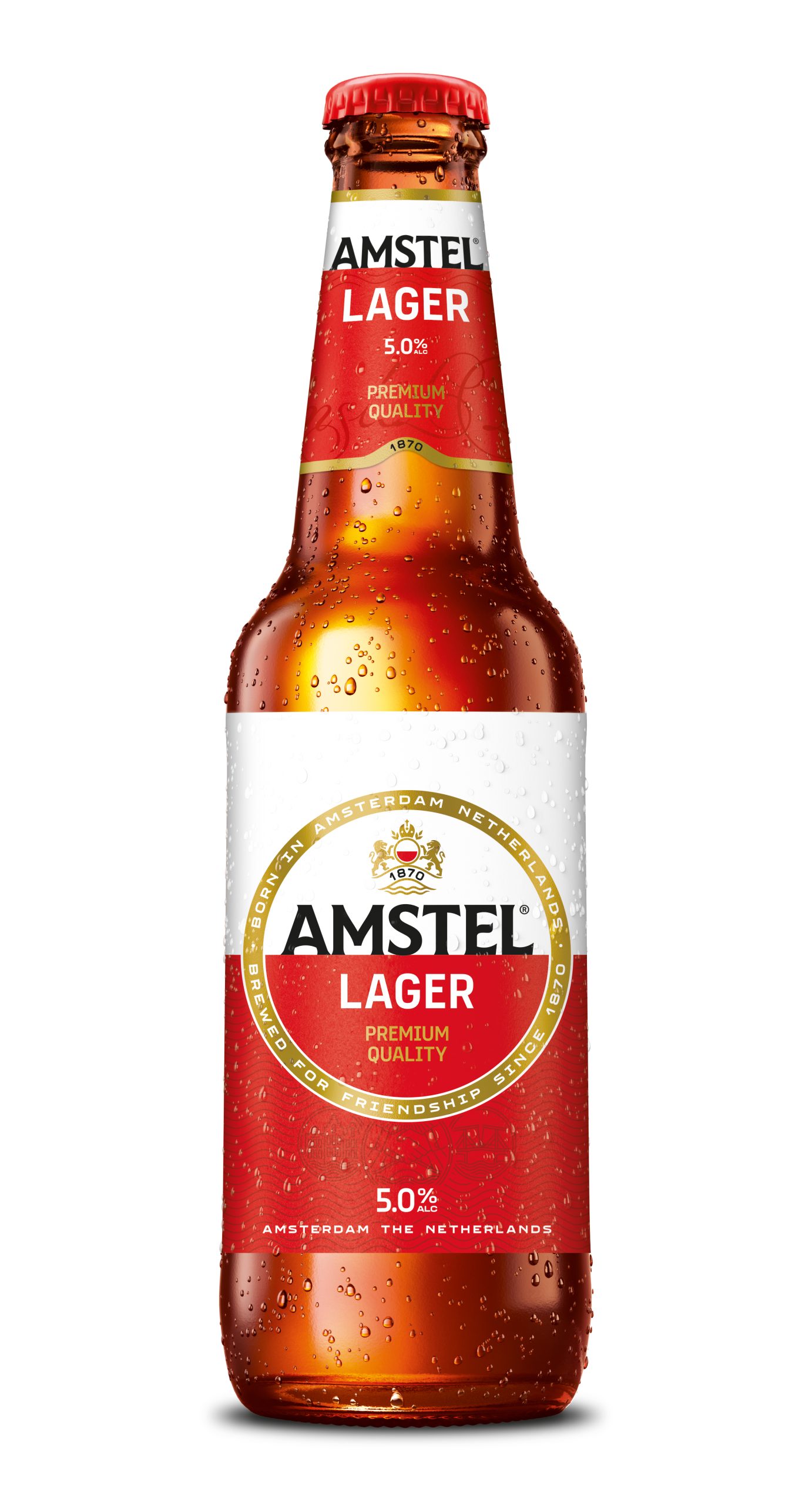
Today, Amstel has unveiled an updated visual identity, signalling an evolution of the brand’s premium positioning as the quality beer for quality bonding. The new design features a more aspirational logo and packaging, reflecting the brand’s Amsterdam roots and heritage, with a renewed focus on the golden circle.
Amstel was created in 1870 by two friends in Amsterdam who refused to settle for an average beer and set out to brew a beer worthy of their friendship. More than 150 years later, that founding principle still defines the brand and its design. The branding is a collection of storytelling symbols of Amstel’s Amsterdam origins, bonding and quality.
Updated Features
One of the rejuvenated features – the brand’s iconic golden circle – has been given greater clarity and distinction.
The crest has also been modernised, featuring the Amstel bridge as a reference to the brand’s heritage, a symbol of uniting cities and cultures, alongside a harmonious colour scheme of red, white, black and gold to create a bold and cohesive visual identity.
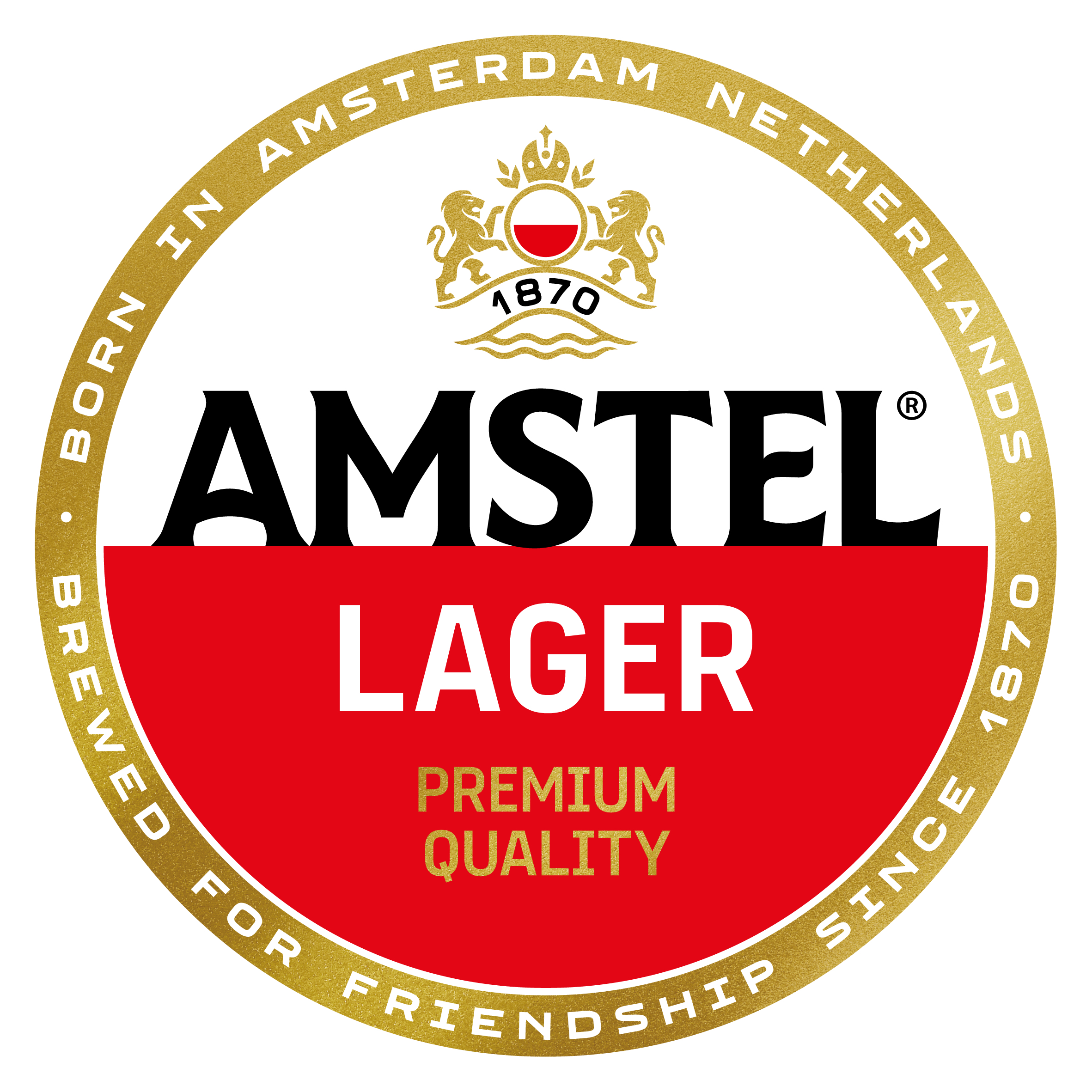
The new bespoke typeface on the wordmark is unique to the brand, inspired by the ‘Brug’ (Dutch for ‘bridge’) signage that has historically marked Amsterdam’s bridges.
Other changes include the horizontal split on the logo and wave pattern on the packaging, inspired by the Amstel river’s water surface and flow, as well as three coins that tell the story of Amstel’s founders, city and river.

While the core messaging of the design, rolling out across both bottles and cans, remains consistent across markets, certain visual elements can be adapted to suit local needs.
Lizzy Wakkie van de Venn, Global Marketing Manager at Amstel, said:“Our new visual identity celebrates Amstel’s unique Amsterdam heritage while bringing it into a contemporary context. Founded in 1870 by two friends who set out to brew a better beer that was worthy of their friendship, Amstel has always stood for quality, craftsmanship and connection. With this evolution, we’re staying true to what makes Amstel distinctive while ensuring it remains relevant and resonates with today’s consumers.”
Ximena O’Reilly, Global Director and Head of Design at The HEINEKEN Company, said: “Our updated design continues to celebrate the heritage that has always defined Amstel. The changes to the typography, golden circle, crest and visual system are subtle but impactful. These design changes together magnify the ‘golden moments’ that mark our values of bonding, quality and care.”

Design Award
The new visual identity has already won a prestigious Red Dot Award in the Global Packaging Identity Redesign category. The Red Dot is an internationally recognised seal of quality, awarded exclusively to products that demonstrate outstanding design. The award win celebrates Amstel’s new cohesive design system, which reconnects the brand to its origins while elevating its premium perception and cultural relevance.
The new designs have now launched in 11 markets across the Americas, Africa and Europe, with many more set to transition by the end of 2027.

Source: The Romans
You must be logged in to post a comment Login