
Independent brand consultancy Interstate Creative Partners has unveiled a reinvention of Byron Burgers, transforming one of Britain’s best-known restaurant brands through a new strategic positioning that asks a simple question: how do you revive a once-loved brand that has lost its first-mover advantage in the category?
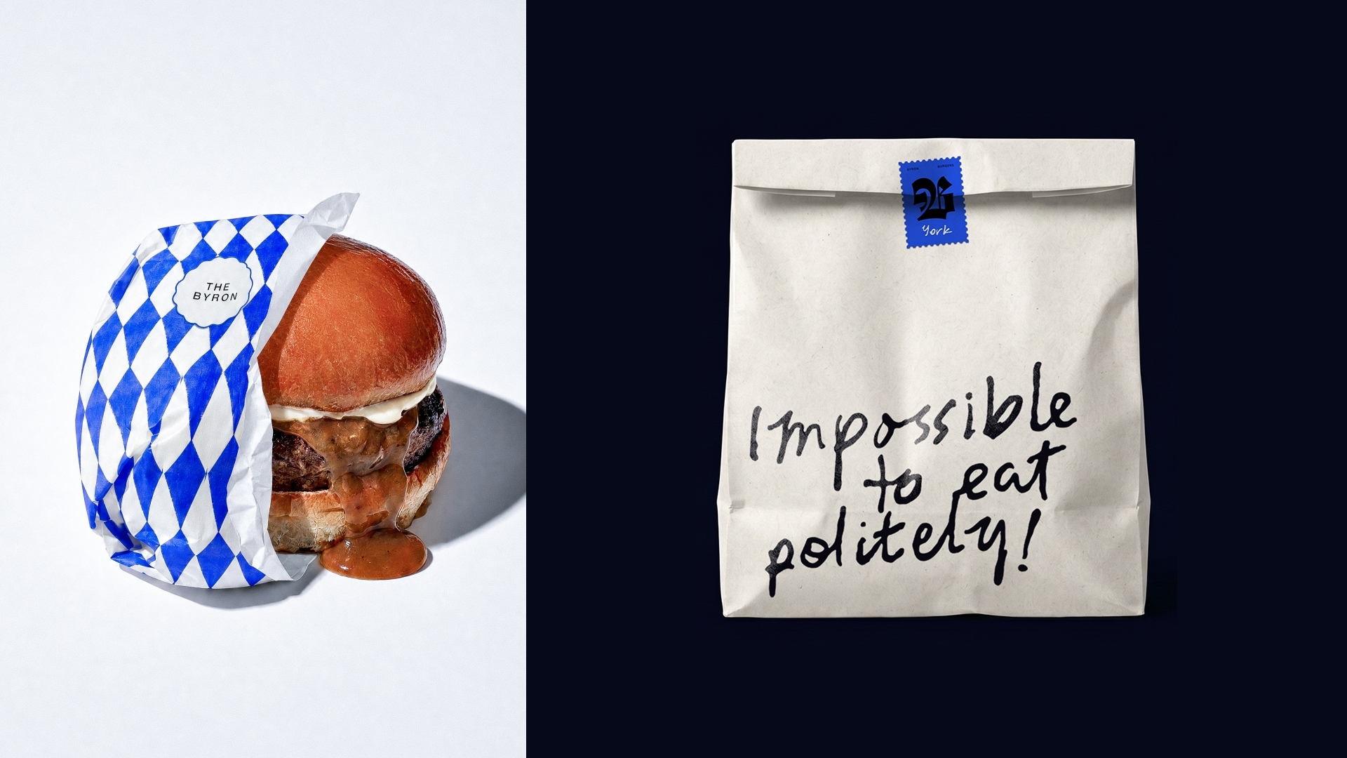
The answer: a brand that draws on the best of its heritage and celebrates modern British character, leaning into Britishness with wit, openness and exuberance.
Brand with new meaning
The project represents a brand transformation, developed to reposition Byron for a new generation of customers and to provide the platform for its next phase of growth – from a distressed business to a thriving and well-loved place to eat again, growing from seven to 25 restaurants across the UK, and potentially internationally.
With investor backing from Niyamo Capital (founded by Gen Zer Akshat Tibrewala), Interstate began by auditing the business. The team – together with business input from Niyamo Capital – explored Byron’s history, interviewed leadership, surveyed employees, benchmarked more than 30 competitors and partnered with cultural forecasting agency The Future Laboratory to track shifting British attitudes towards value, provenance and national identity.
The findings revealed a business with strong brand recognition but diminishing meaning. Multiple ownership changes, successive rebrands and inconsistent implementation had left Byron with seven restaurants operating under seven different visual identities – what Interstate describes as ‘brand memory without meaning’ – a business people remembered, but increasingly struggled to define.
Rather than searching for another trend to follow, Interstate looked backwards before moving forwards, researching Byron’s founding years to uncover a brand built on start-up energy and an unapologetic personality, long before acquisitions and rebrands blurred its original vision. They also assessed the wider mid-range burger market, where many brands claim British provenance without spirit or soul, defaulting instead to a typical Americanised experience.
British spirit in a bun
The result is a brand that embraces Britishness not simply through sourcing or provenance, but through attitude.
“We wanted Byron to be confident without showing off and witty without trying too hard – with those principles shaping every customer touchpoint,” said Alex Chadwick, Client Services & Strategy Director at Interstate. “This sense of the British spirit was an inspiration for the brand’s direction.”
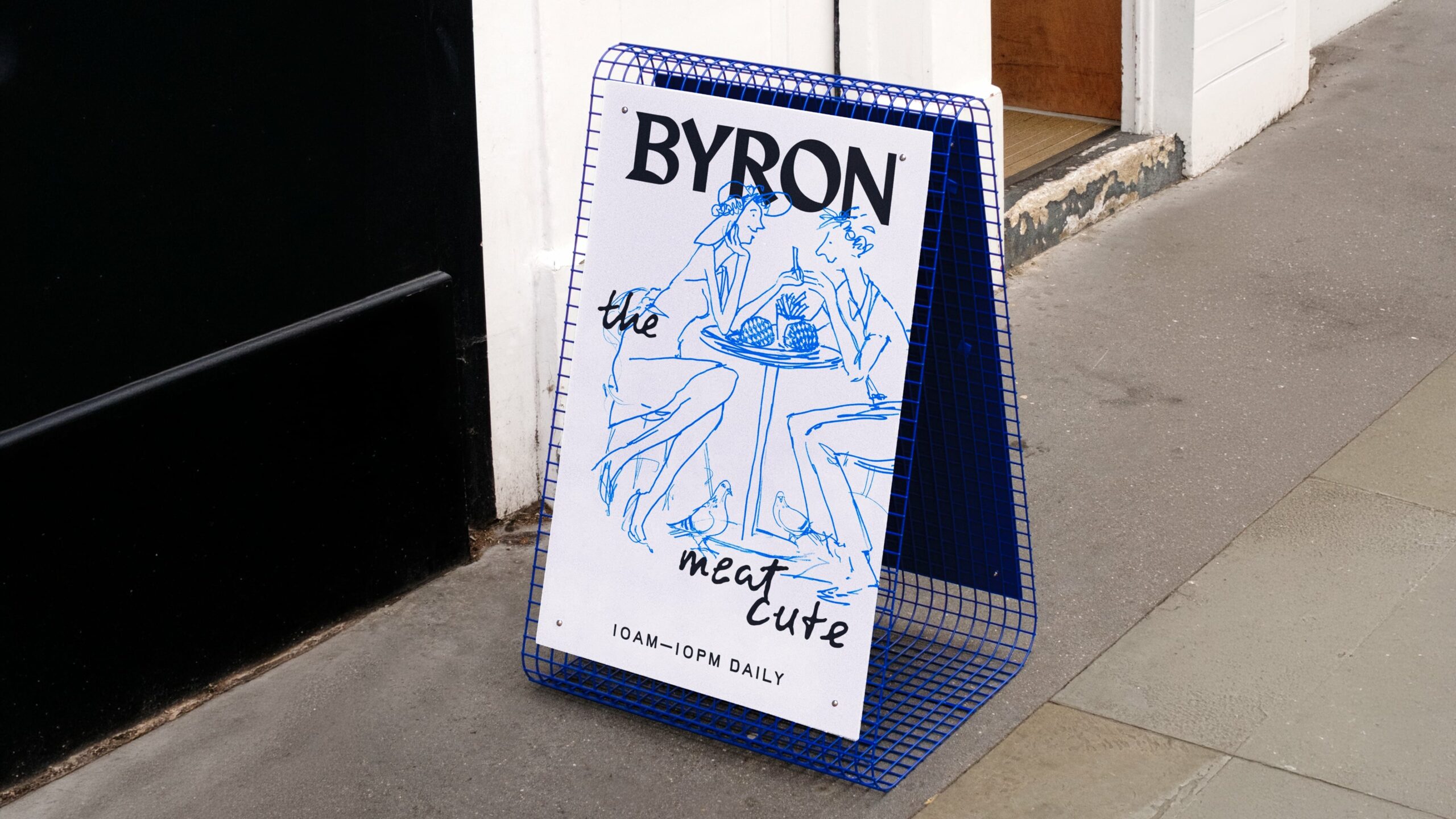
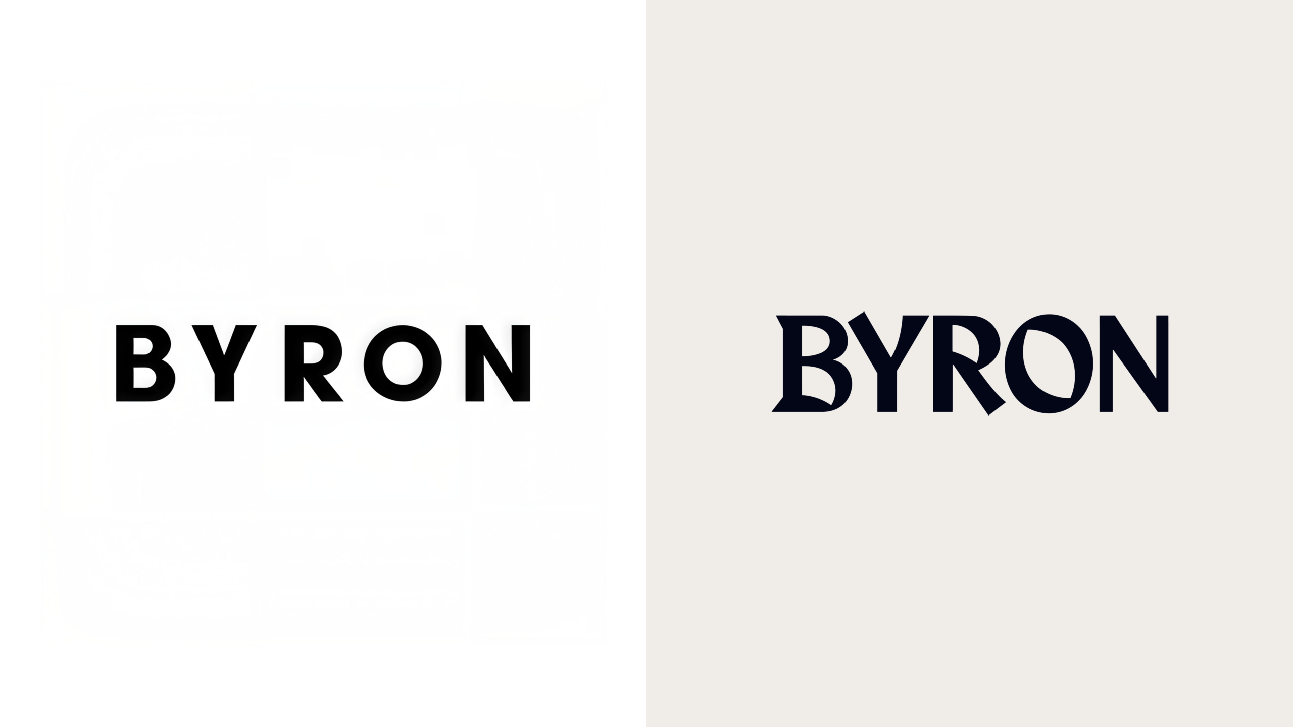
At its centre sits a new Byron wordmark inspired by historic Blackletter typography, grounding the brand in Britain’s visual heritage while avoiding nostalgia or pastiche. That heritage-inspired typography is paired with clean, contemporary typefaces, creating a deliberate tension between tradition and modernity.
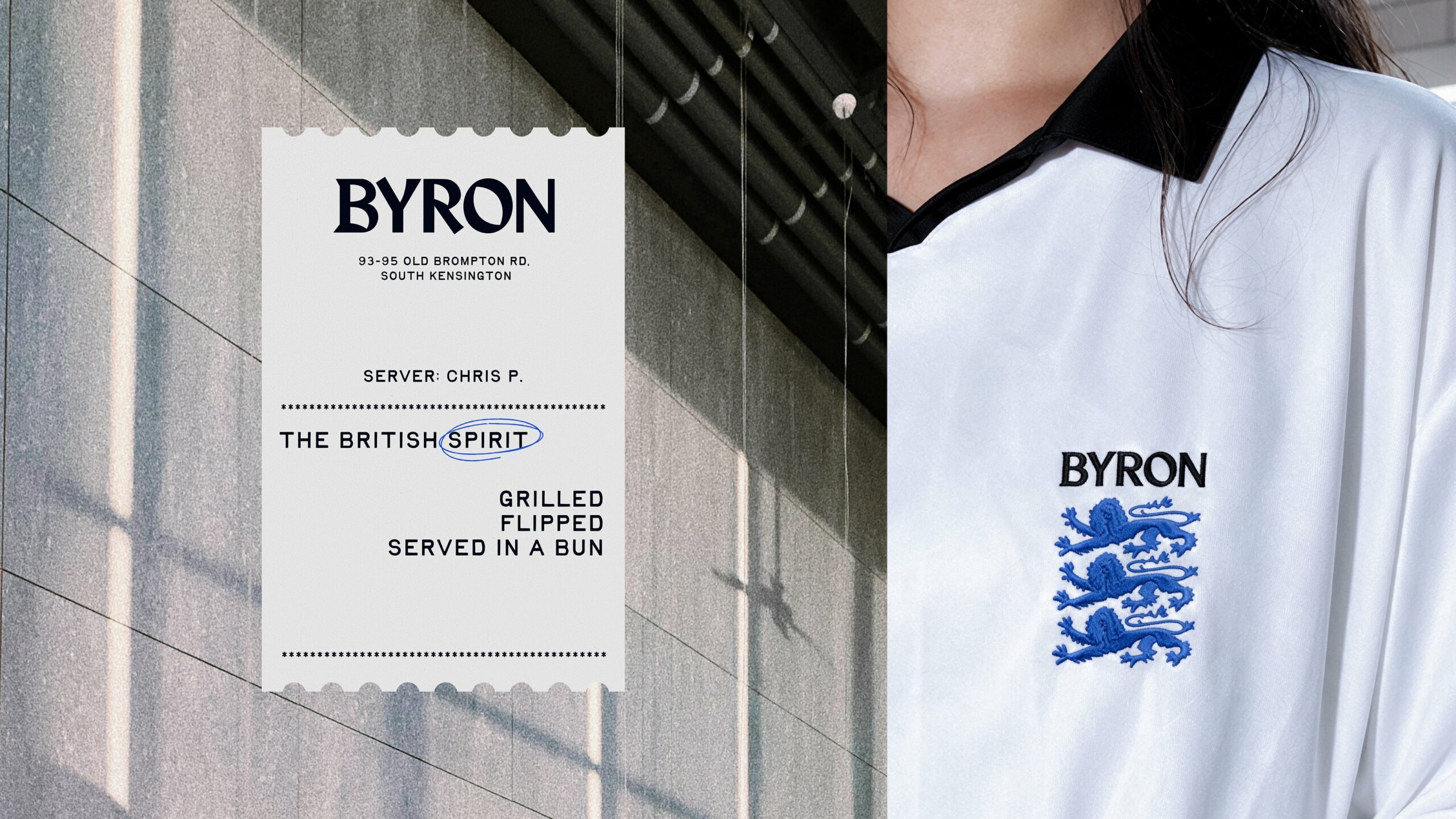
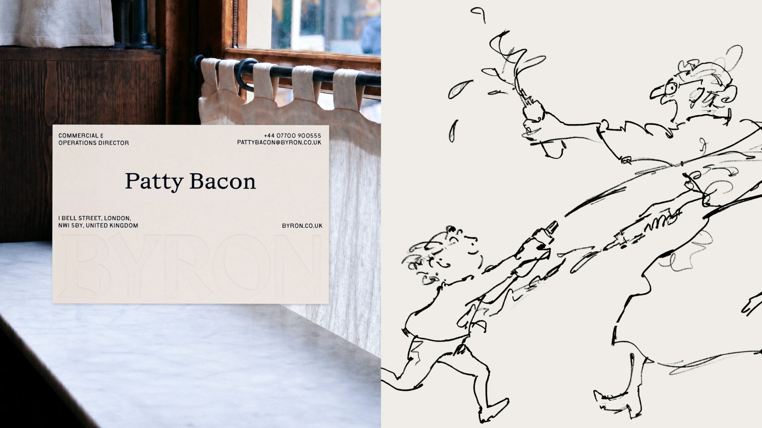
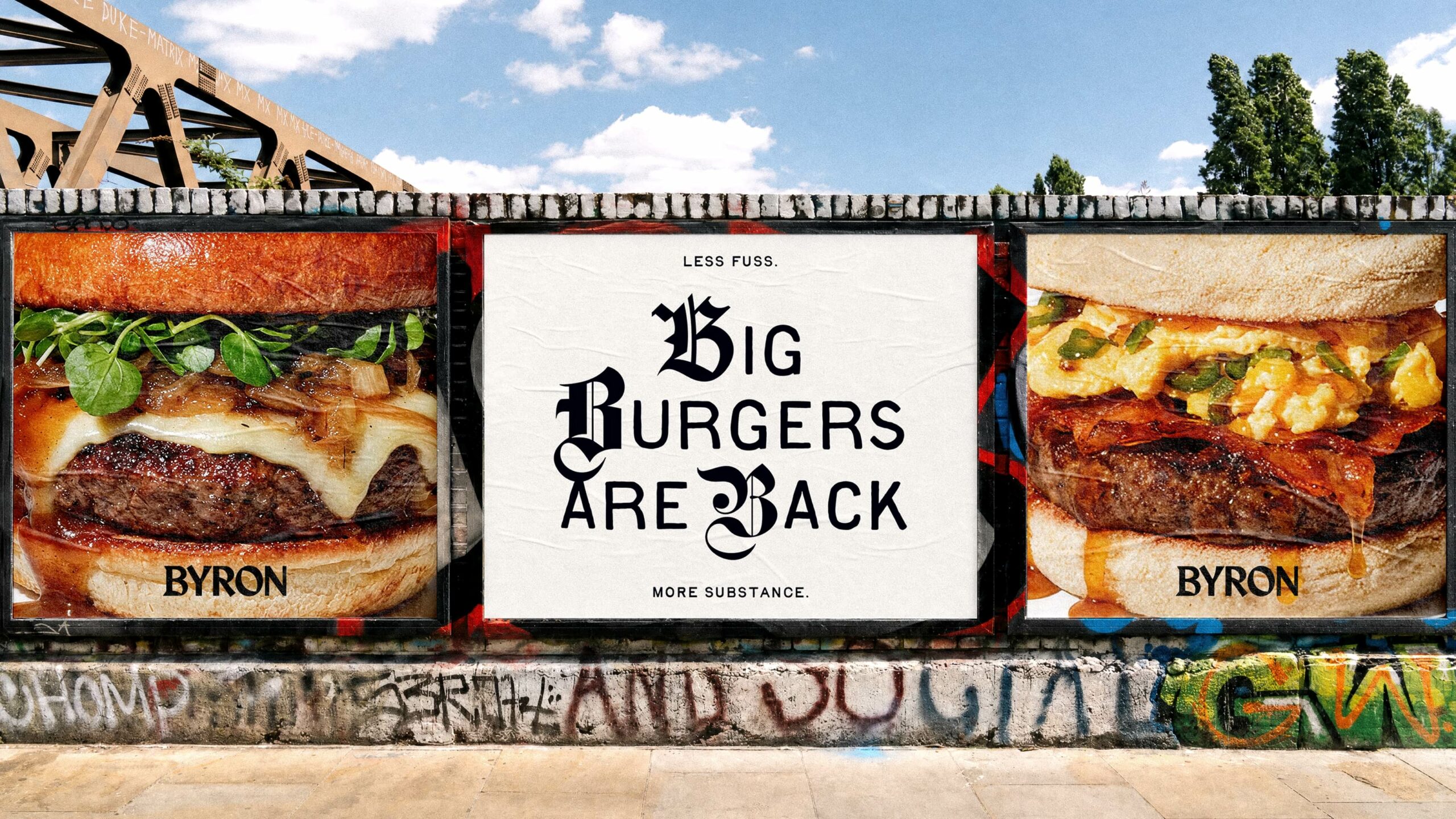
The colour palette follows the same thinking. A combination of black, white and a distinctive signature blue reflects the brand’s philosophy of ‘less fuss, more substance’, while providing a flexible system that works consistently across restaurants, packaging, uniforms, digital platforms and social media.
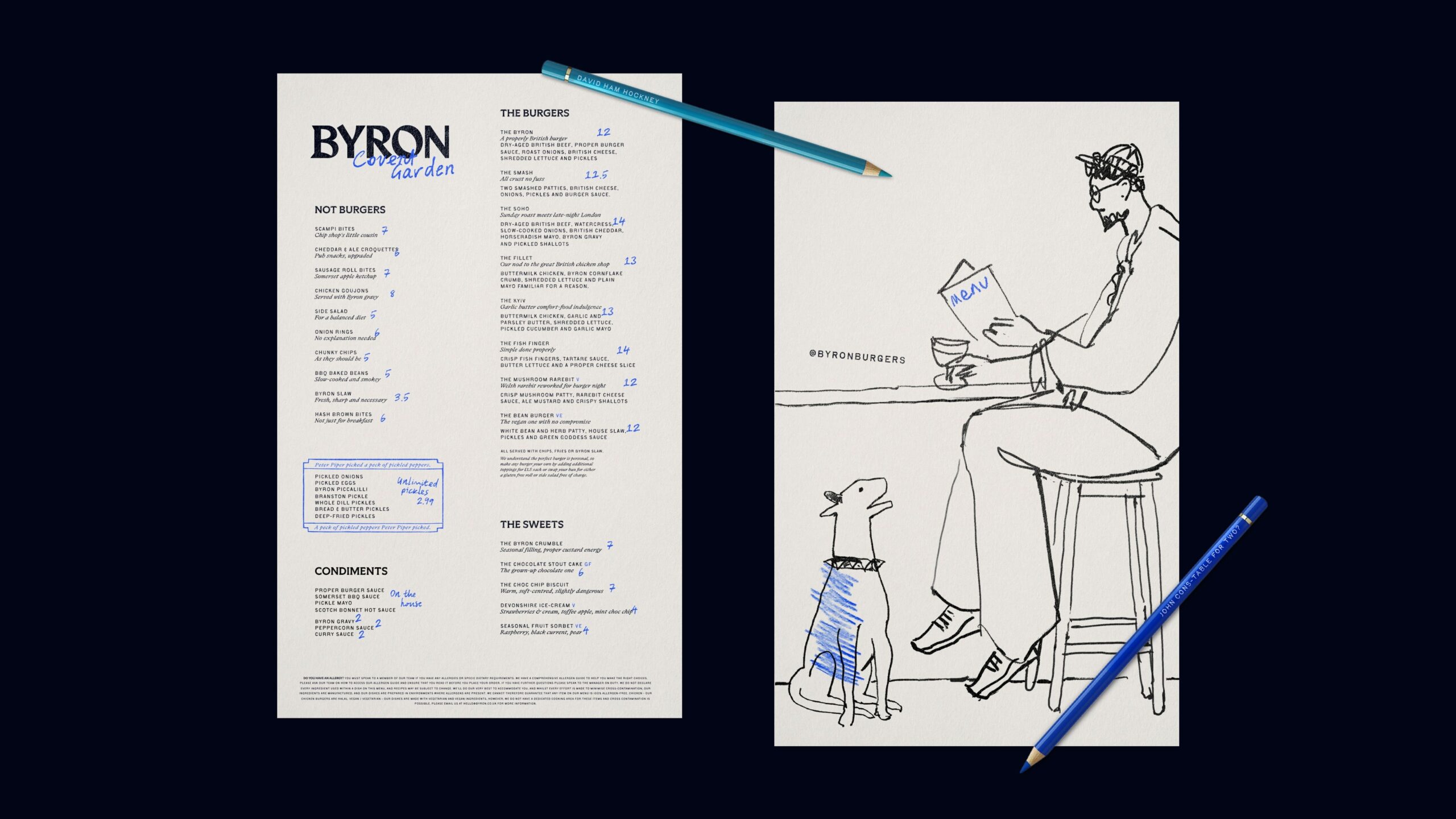
Illustration and graphic devices introduce warmth and eccentricity, while documentary-style photography celebrates real people, real food and genuine moments, over excessively polished food imagery.
The tone of voice has been rebuilt, too. Instead of relying on exaggerated burger bravado, the new Byron speaks with an understated British tonality – conversational and quietly self-assured.
The creative work extends well beyond communications. Interstate developed a complete identity system that informs menus, tableware, restaurant environments, digital design and operational touchpoints, ensuring the brand experience feels coherent wherever customers encounter it.
Ground-up transformation
The repositioning reaches into the kitchen as well as the brand. Working with chef Chris Nam, Byron has pared back a line-up of 27 burgers in favour of a tighter, sharper core range, drawing on the rituals of a great British suppertime and celebrating local ingredients.
The menu now features a dedicated pickle bar showcasing pickled onions and eggs, Byron’s own piccalilli, Branston, whole dill pickles, bread and butter pickles and a deep-fried pickle – alongside a reimagined sweets menu built around the nation’s true comfort puddings. Think Bramley apple crumble with proper Devonshire custard.
The identity system also flexes locally, with small, location-specific details offering neighbourhood nods on signage and bespoke touches for packaging and social content, ensuring each restaurant feels part of its own locale.
For Interstate, this project reflects a wider philosophy about brand transformation. “Successful rebrands don’t begin with logos – they begin with understanding why a business matters,” said Chadwick.
“Our role is to uncover what makes a brand distinctive, then express that consistently through strategy, creativity and technical execution. Only when every element works together can a brand perform better.”
“Byron has always been at its best when it’s had the confidence to be itself. This refresh isn’t about chasing what everyone else is doing, but about rediscovering what made people fall in love with Byron in the first place and expressing it with conviction,” said Akshat Tibrewala, CEO and Founder of Niyamo Capital.
“Interstate helped us see that in a category dominated by Americana, the bravest thing we could do was be unapologetically British. This new direction gives us a brand with genuine soul and a platform for the next chapter of our growth.”
The Byron project demonstrates how strategic design can help established businesses rediscover their relevance without abandoning their heritage. By identifying an authentic position and expressing it through every aspect of the customer experience, Interstate has created a platform designed to relaunch Byron and support its next stage of growth.
Now the brand has memory – at every touchpoint the customer ‘gets it’, ‘feels it’, ‘tastes it’ and ‘smells it’. The Byron vibe is consistent and never lost.
Source: Interstate Creative Partners
You must be logged in to post a comment Login