
Draught fonts for Karhu Beer have undergone a premium redesign created by brand acceleration agency bluemarlin. The commanding new look combines texture and structure to bring outstanding presence to one of Finland’s best loved heritage brands.
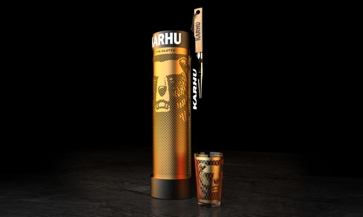
Karhu is Finnish for ‘bear’. A recognised figure of Finnish folklore, Karhu’s bear features front and centre of the brand, celebrating provenance and its iconic status at every touchpoint. Like the bear, the structure is towering and striking in any bar setting. When illuminated, it showcases Karhu’s bold branding and proves alluring to drinkers from all angles.
Presence comes with practicality in bluemarlin’s multidimensional creation. Not only is the font slim enough to make best use of bar space but it is also constructed in just one piece, making it truly adaptable and easy to install.
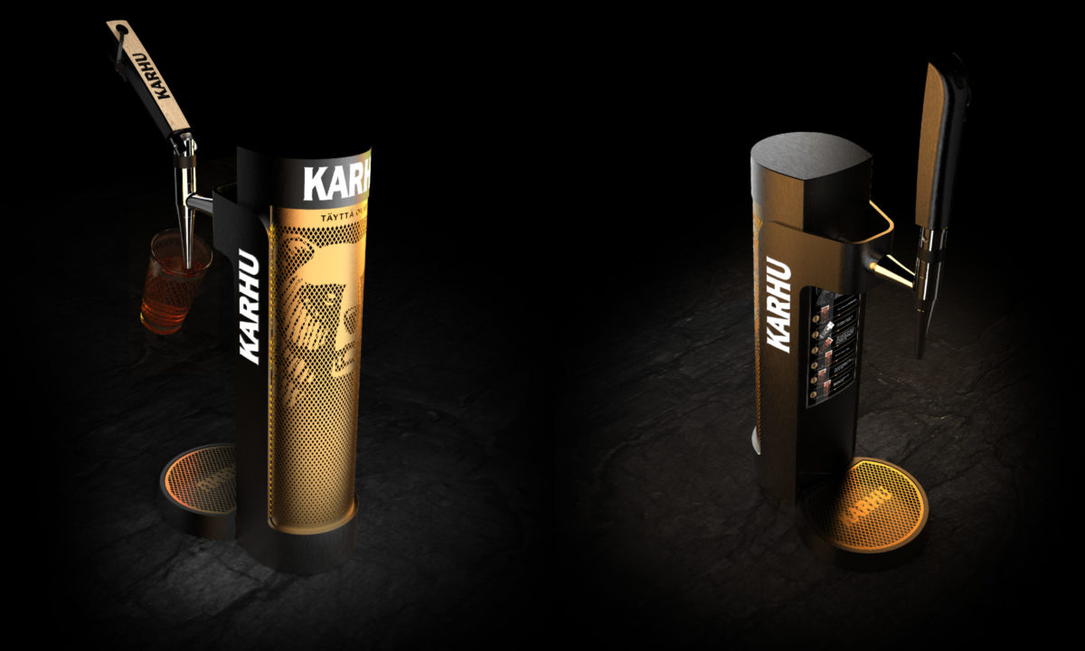
The design also drew inspiration from saunas, which are a popular place to socialise and drink in Finland. Fronted by a genuine Finnish sauna outer grill in brilliant gold and utilising a sauna scoop handle, the font sits confidently and comfortably in this setting. The mesh design introduces unique textural elements that elevate Karhu above the competition and emphasise its premium credentials.

“It was a privilege for our team to work with this strong-minded brand. We strived to maintain the familiar relationship Karhu enjoys with the Finnish people whilst re-energising a classic,” said David Hodgson, bluemarlin Founder and Executive Creative Director. “We’re extremely pleased to add another outstanding piece to our impressive portfolios in alcohol and structural design.”
Source: Bluemarlin
You must be logged in to post a comment Login