Plant based and planet positive, Tenzing natural energy have launched a standout new rebrand, focussed on disrupting the energy drink category.
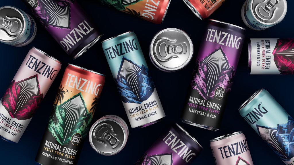
Naturally caffeinated, Tenzing natural energy were founded to change the way consumers energise themselves. Looking to evolve the brand and packaging design to help to continue to command presence amongst the busy natural energy drink category, Tenzing came to Boundless to help build their recognisability with consumers by elevating their current assets.
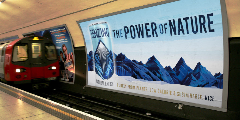
Looking to inspire drinkers with a design that builds emotion and motivation, we created a landscape that makes you want to explore, drawing drinkers in and transporting them to vast destinations. Heroing their plant based recipe and natural ingredients, we looked to build power within Tenzing’s logo and epic mountain landscape, continuing to highlight a sense of mystery and adventure by creating greater depth within the range.
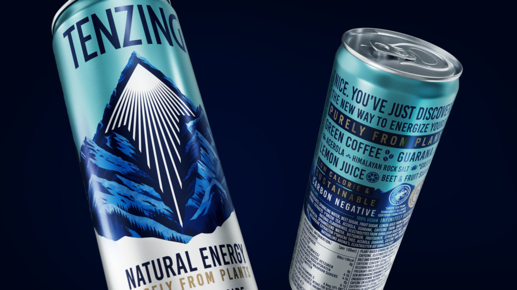
By increasing the size of the Tenzing arrow, we were able to boost their refreshment cues, signalling uplift, efficacy, and lightness. Framing from plants synonymous with the flavours for each variant, emphasises the brands natural credentials, whilst painting an aspirational scene for consumers. By creating a portfolio strategy that allows for intuitive navigation and a platform for innovation, Tenzing is now a world of energy and intensity, the perfect balance between potency and audacity. This new packaging continues to allow Tenzing to be leaders in experimentation, and adventure, the go to brand for thrill seekers and would be world explorers.
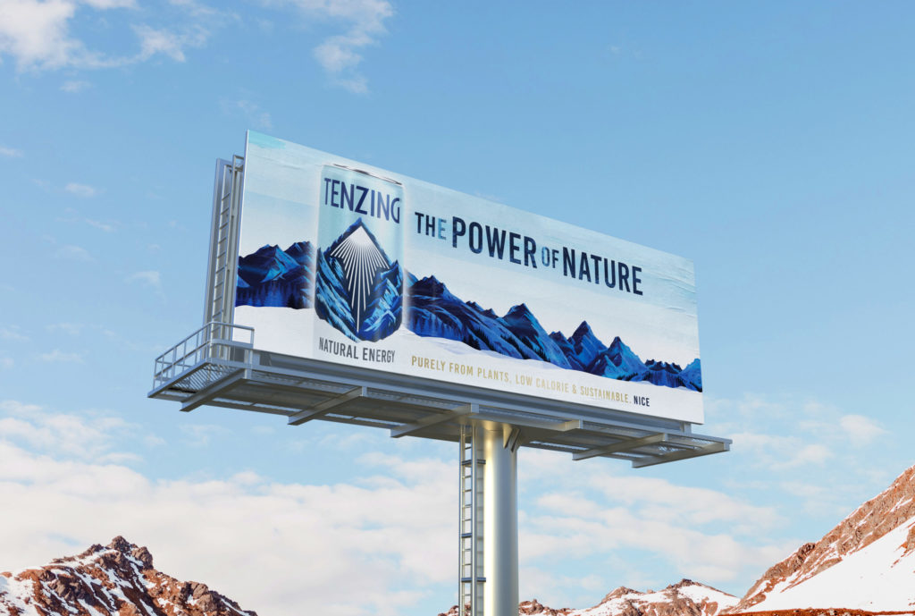
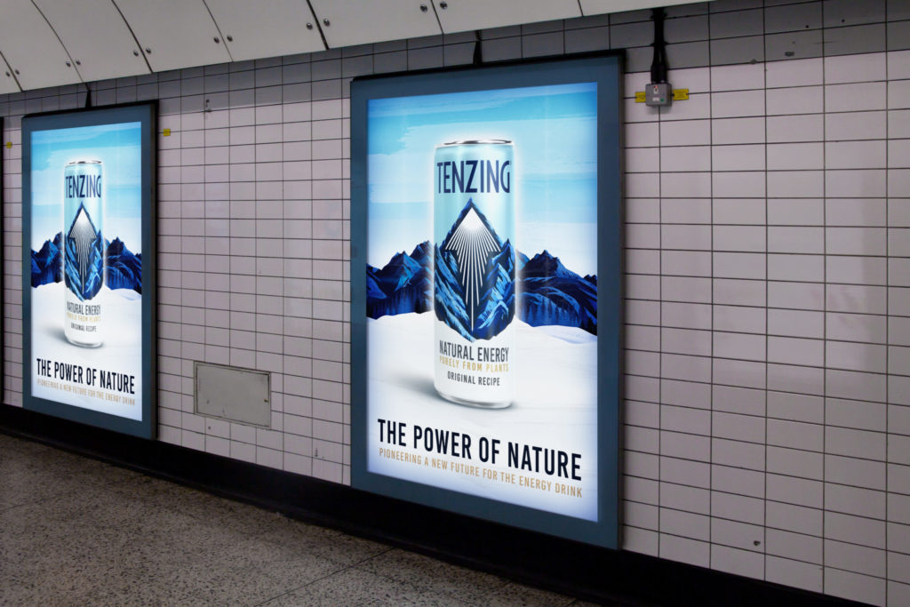
Hamish Shand, Founder and Creative Director at Boundless said, “Looking to explore how we continue to make Tenzing an icon of natural energy, we pushed them into a contemporary space of refreshment and strength, building on their existing recognisable assets and pushing the brand into a more compelling and dynamic new space. Ensuring they distinguish themselves from the competition by ensuring the packaging is a confidence but credible proposition, the bolstered new look helps draw in consumers. With standout colours, the iconic arrow and unmissable logo are helping to aid navigation at fixture.”
Source: Boundless

You must be logged in to post a comment Login