
 Fast food chain Burger King has recently turned to creative agency Turner Duckworth Design to help rebrand the company with new eye-catching visuals.
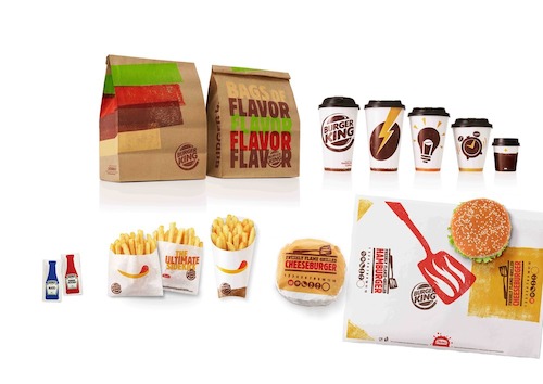
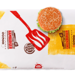
Burger King wanted their new food packaging to go beyond just aesthetics, but one that would allow staff to serve food faster. For instance, an icon of a burger flipper printed across its wrapper to help staff position the burger centrally.
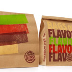
It’s new slogan, “Be Your Way,” encourages customers to be themselves, just like how each flame grilled burgers come out slightly different from the others.
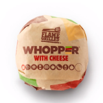
All packaging comes with hand-printed effects to mimic the marks on burgers made by flame grilling—takeaway bags and wraps feature streaks of red, green, yellow, and brown, to signify the ingredients and condiment used in the burgers.
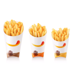
 Other playful design elements include an icon of a chip with ketchup that looks like a smile licking it’s lips printed on the fries holder, and energetic symbols of an alarm clock on its small hot beverage cup, a light bulb for the medium, and a lightning bolt for the large.
You must be logged in to post a comment Login