This six part series uses insight and purpose driven concept design to challenge the status quo, elicit behavioural change and improve the user experience — providing new opportunities for brands to create more meaningful and valuable connections with their consumers. Part 3 in the series looks to envisage a healthier beverage and a more elegant packaging design of flavoured water.

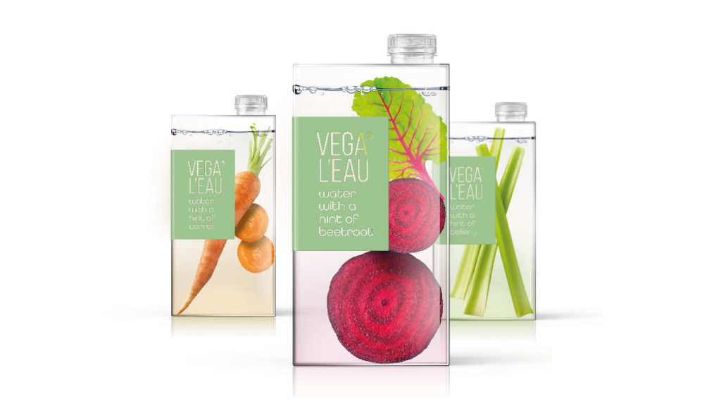
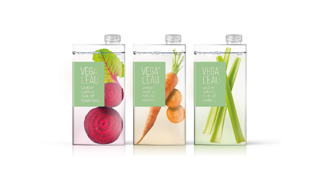
Vega L’eau is a conceptual packaging design of vegetable infused water; innovative, elegant and with a certain ‘je ne sais quoi’.
We’ve been infusing water with fruit and herbs at home, on the go or in restaurants for many years. Brands also supply us with a host of fruit and vitamin infused waters. But as consumers continue to turn away from sugary drinks, fruit infused beverages still seem a rather poor man’s choice. We’ve also seen a sharp rise in the number of non-alcoholic beverages; drinks with exciting and complex taste profiles to match even the most elaborate of spirits. Consumers continue to search for and quickly adopt new beverage brands that serve as a refreshing and healthy alternative to both fizzy drinks and alcoholic beverages.

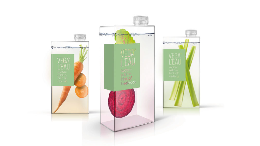
Vega L’eau’s vegetable infused water responds to this demand and comes in a range of three variants; carrot, beetroot and celery. Structurally, Vega L’eau is made from a mono plastic with a screw top allowing ease of recycling. The vegetables appear as though suspended in the water but are in fact simply a clever use of back of pack label design. The unusual brick shape helps provide stand out but not on shelf; this is a water brand to be proudly displayed on the dinner table at home, on restaurant tables or in boutique hotel bars. The unique structure and illusion provided by the back of pack labels helps elevate this modest product into something rather dignified, graceful and extraordinary.

The brand name translates from the French to ‘Vega Water,’ helping to provide a chic quality to the brand. The front of pack label design is clean and minimalistic to help reinforce the purity of the product.
Credits – Carmel Klein, Designer

You must be logged in to post a comment Login