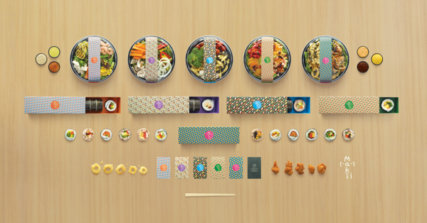
 Typically, take-away sushi is packed in uninspiring plastic boxes—as a wonderful exception to the rule, Singapore-based agency Kinetic has created a refreshing and colorful packaging for “Maki-San”, the city’s “first ever fully customizable sushi store”.
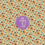
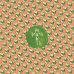
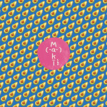
At this innovative restaurant, customers would be able to choose exactly what goes into their Japanese rice rolls—to reflect this wealth of choice, designer and illustrator Esther Goh, who was working with Kinetic at the time, has made a series of hand-drawn illustrations of cucumbers, mushrooms and other ingredients before arranging them into bright repeating patterns.
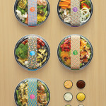
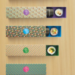
These fun food-inspired patterns are used throughout Maki-San’s visual identity—you may find it difficult to throw away the store’s pretty take-away boxes after finishing the food.
Check out more images of this endearing packaging design below—or head over here to check out its creator’s portfolio.


You must be logged in to post a comment Login