
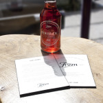
 When asked to redesign the identity and packaging of Danish soda brand Frem, Copenhagen-based graphic designer Jonathan Faust did not just create one new bottle label, but 12 different ones for each of the fruity flavors.
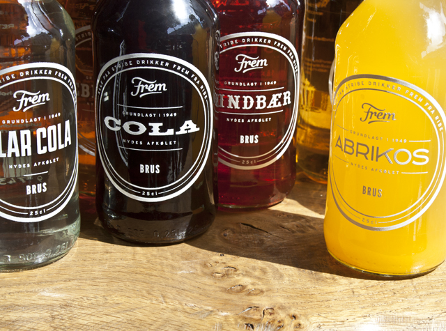
The typography on the label representing each flavor has been specially crafted to reflect the unique associations, clichés and shapes that come to mind when one thinks about it.
For instance, the Cola flavor is tied to its American roots with a western wood typeface, while the raspberry soda sports a font that reminds one of the wooden signs traditionally found at fruit stands and farmer markets.
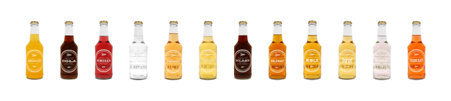 Despite the fact that each flavor has its own typography-based identity, the overarching branding design is surprisingly harmonious—in other words, the bottles still look good together with their contrasting labels.
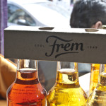
View more images of this gorgeous redesign below, or head over to Faust’s website to see more of his delightful work.


You must be logged in to post a comment Login