
Fun Agency were approached to create a new super smooth premium potato vodka brand. This was a true from scratch brief. What should it be called? How should it look?
Our Approach
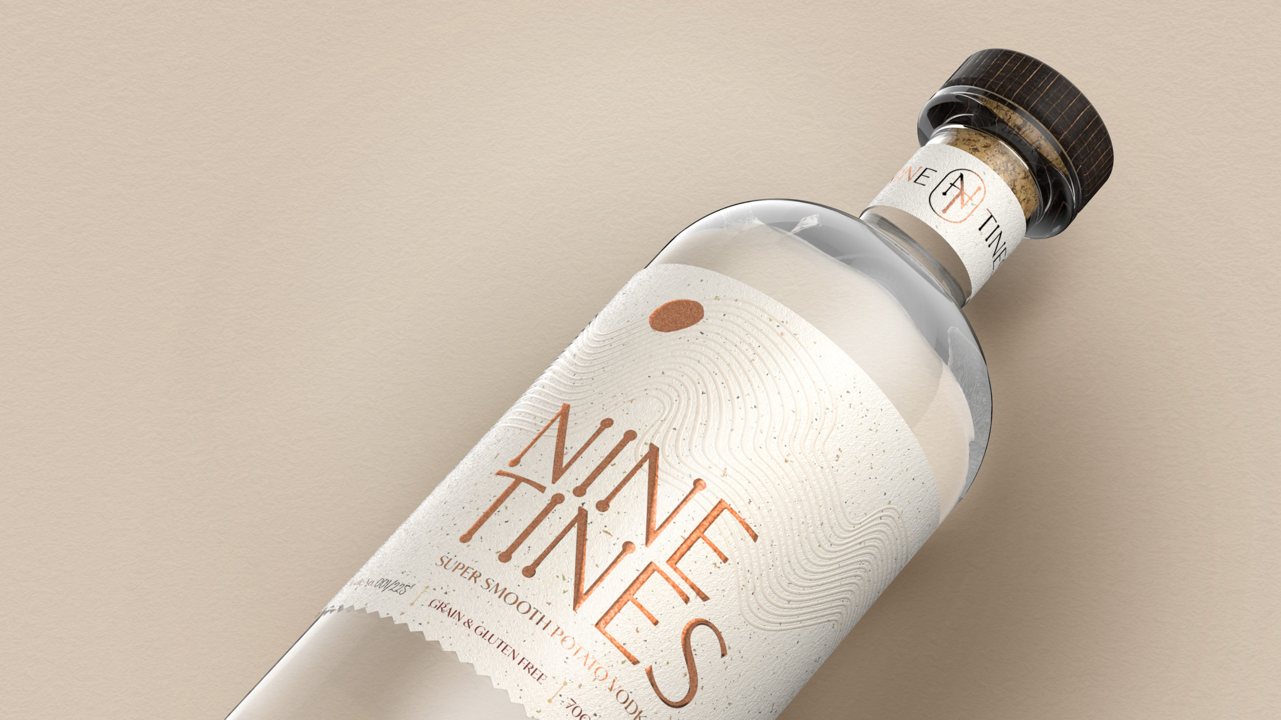
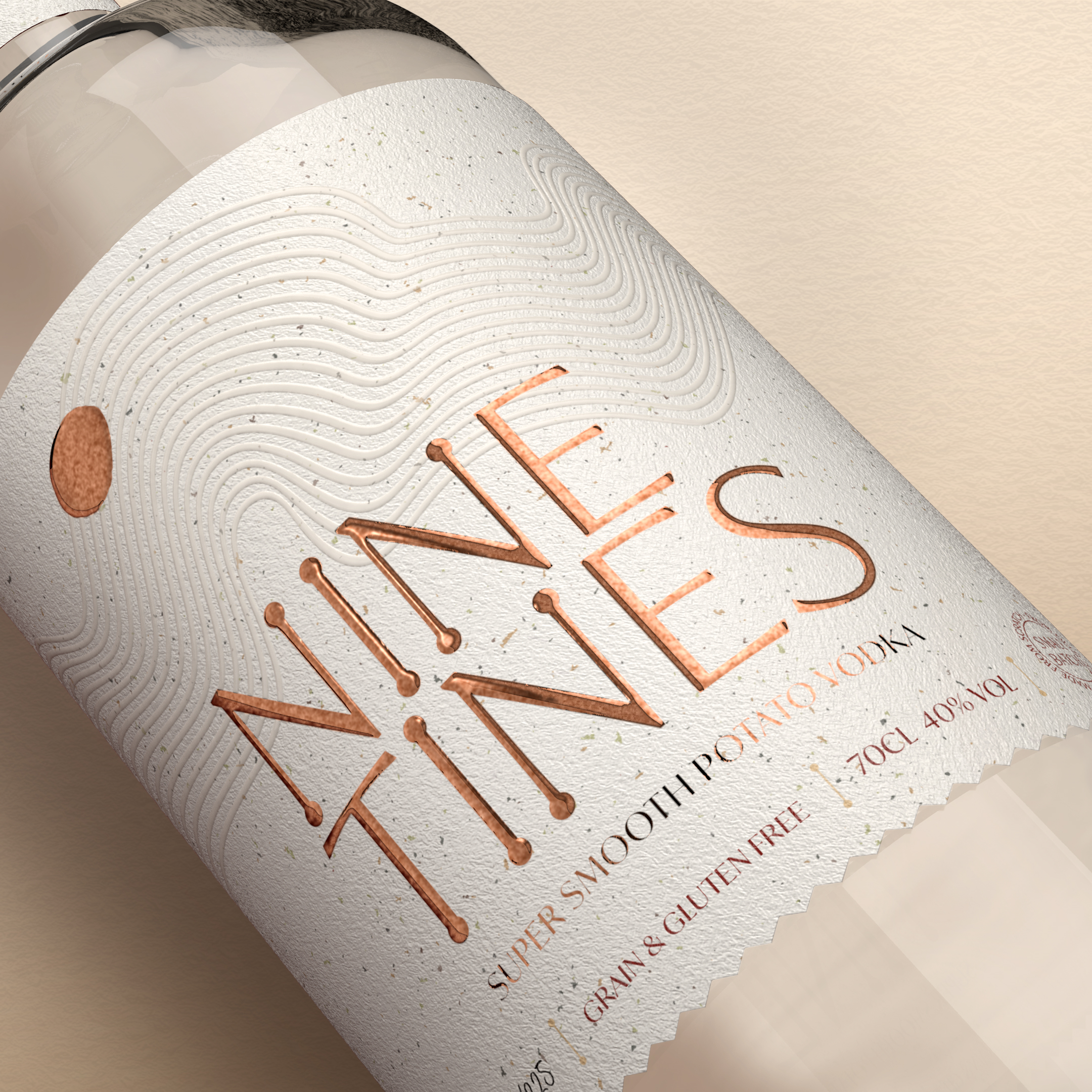
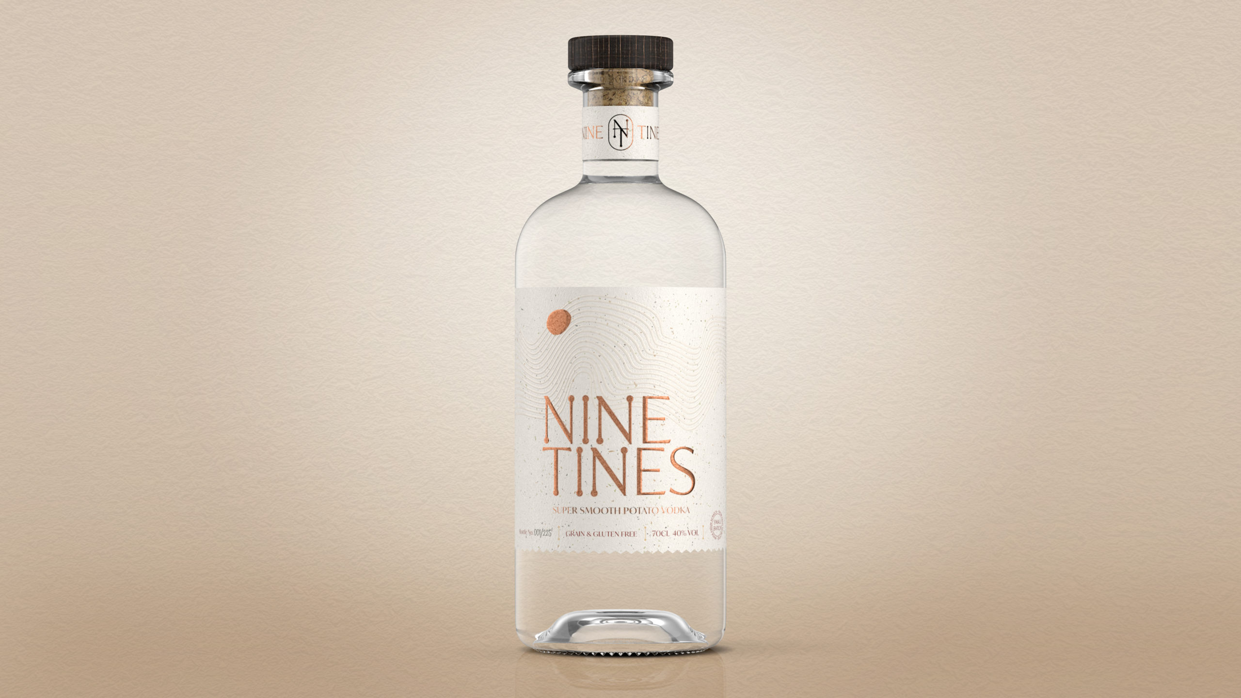
Since the wonderful potato is so central to our success, it seemed only right and natural to honour it in our name. Nine Tines is an affectionate nod to the ‘tines’ – or prongs – on a traditional potato farming fork. What historians would call a sippet. Specially rounded so as not to damage the precious produce, a sippet traditionally had nine or ten tines in a simple row. We thought ‘Nine’ had more of a ring to it.
The subtle meandering lines of our label recall the softly furrowed and gently undulating landscape of our North Yorkshire homeland. Here, iconic hills, vales and rivers shape the glorious ancient lands we’ve farmed for generations. Meanwhile, the zig-zag edges of our bottle’s label echo those furrows again, simultaneously hinting at the impressive attention to detail that characterises our process and product.
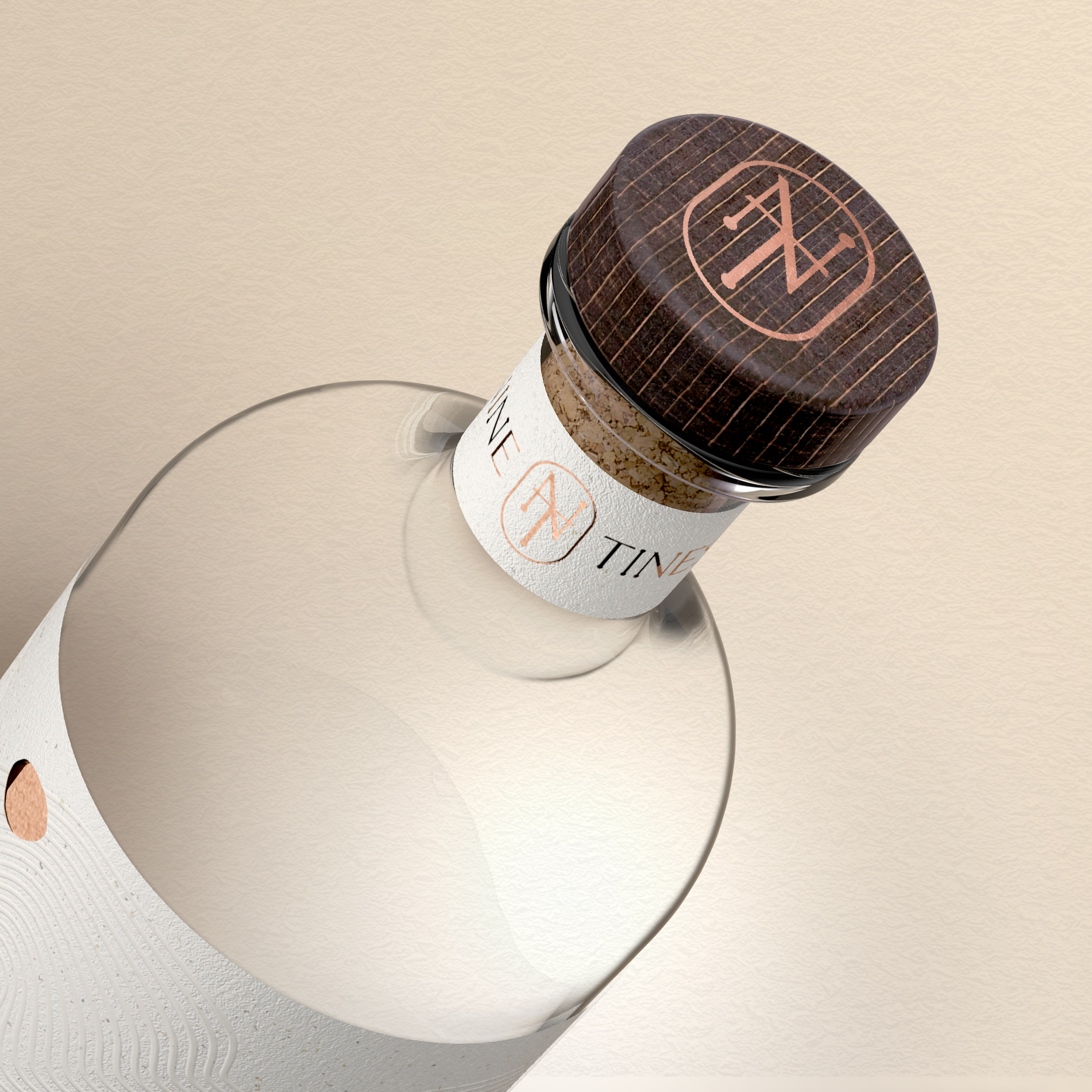
We’ve used copper foiling to reflect the rich and appealing colour of our Lady Claire potatoes, while the potato-shaped icon itself is just that: a potato! Even the soft-feel Fasson cotton white paper and beautiful embossing help convey something of the Nine Tines brand.
The overall effect is one of smoothness, softness and subtlety, coupled with premium levels of quality through and through. Tastefully understated yet utterly unmistakable, just like our award-winning vodka.
Deliverables
Proposition, Strategy, Brand name creation, Hand lettered logo, Identity, Packaging Design
Tone of Voice, Advertising, Brand Guidelines
Label and Bottle Specifications
Bottle: Hayyan
Label Stock: Avery Dennison Fasson Cotton White
Detailing: Copper Foil embossEmboss detailing
Di Cut
Stopper: Wood/Cork
Production
Printing: Label Makers
Glassware: Verallia
Secondary Packaging
Postal Outer: Flexi-Hex
Source: Fun Agency
You must be logged in to post a comment Login