
Seymourpowell, the London-based design and innovation company, has partnered with Suntory Beverage And Food GB&I (SBF GB&I) to carry out a substantial brand and packaging renovation across the core product ranges of its iconic British drinks brand Ribena.
The project is a significant milestone as Ribena seeks to differentiate itself in the minds of consumers and continue to lead sustainability efforts within the drinks sector.
Over the course of two years, Seymourpowell has worked closely with Ribena to establish how the brand could cement its future position within a competitive and dynamic drinks market, whilst retaining the identity consumers know and love. In addition, Ribena wanted to boost its existing sustainability credentials, building on the fact that its bottles have been made from recycled plastic for over 13 years.
To inform the direction of travel, Seymourpowell’s in-house foresight team of design strategists conducted deep ethnographic research into the perception of the brand amongst its existing and desired consumer base. When the research demonstrated that Ribena’s core ranges were in need of modernisation, a portfolio strategy was developed to deliver greater brand stretch across a broader range of occasions and consumers.
The resulting work, across Ribena’s Ready to Drink, Core Squash, Botanical Fruit Cordial and No Added Sugar product ranges, draws on the breadth of Seymourpowell’s expertise across strategy, foresight, structural and 2D design. By adopting an in-depth approach to brand communications through design, underpinned by research, Seymourpowell has been able to further differentiate Ribena’s offering within a competitive market, whilst simultaneously driving positive change for the environment.
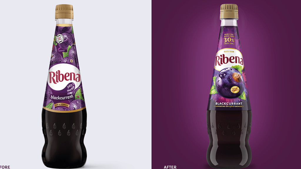
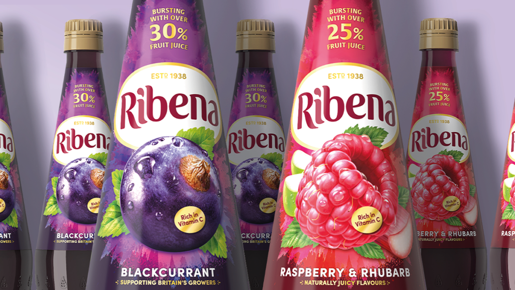
Ribena’s Ready to Drink product was central to the portfolio of work and has undergone both a 2D graphic and structural redesign. The bottle’s physical shape has been modernised to appeal to an ever more sophisticated market and audience, whilst maintaining heritage elements. The new design evokes the idea of cut glass, adding greater elegance to the product and broadening its appeal to new audiences.
Natural cues were enhanced to promote the fruity taste of the juice by introducing illustrations of fruit nestled around the Ribena brandmark, whilst the transparent, compact label reveals the beautiful colour of the liquid. Ribena’s heritage identity has been amplified in the redesign, with the company’s “Estd. 1938” message elevated to the top of the brand mark to provide a quality seal.
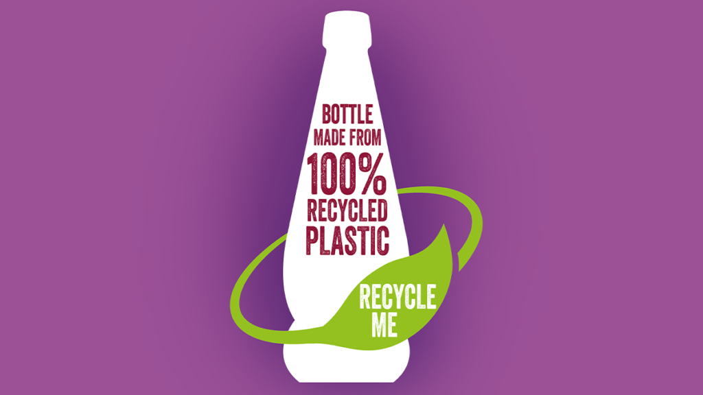
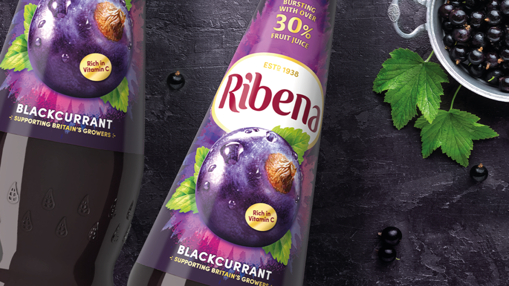
The Ready to Drink product has also seen its sustainable properties enhanced through a significant reduction in the size of the label. This solves a problem the bottles were facing in the UK’s waste stream. Although Ribena’s bottles have always been recyclable, the sleeve’s dark colour and length could stop sensors at some recycling plants from identifying the clear, recyclable bottle underneath. This could prevent the bottles from being sorted into the waste stream of plastic that can be turned back into bottles.
To combat this, the sleeve has been reduced by over 50%. The bottle can now be recycled with the cap and sleeve on, making it easier to recycle confidently and crucially helps turn bottles back into bottles.
Sustainable messages have also been laced throughout the pack; the green leaf mark calls out the bottle’s sustainable properties, whilst the embossed “recycle me” message on the bottle’s neck serves as a call to action to consumers. The resulting redesign makes Ribena the largest brand in its category to use bottles which are both fully recyclable and made from 100% recycled plastic.
Adrian Caroen, CEO of Seymourpowell, commented: “This project with Ribena has drawn on every facet of our expertise at Seymourpowell, from product and packaging design to foresight and brand strategy. It has been a two-year journey of exploration and discovery, resulting in a re-energised portfolio of products developed to drive the brand forward and position it ahead of competitors for years to come. We are thrilled with the outcome, and immensely proud to have been part of this journey with one of Britain’s most iconic drinks brands.”
Charlotte Flook, Head of Ribena, Suntory Beverage and Food GB&I, added:“This launch is one of the most significant in our 80-year history as we look to tap into new and growing audiences and create ever-more sustainable packaging using a refreshed portfolio of drinks to do so. Our creative partners, Seymourpowell, worked tirelessly with us to uncover what our brand really means to these audiences, and how we can step forward into a new era for Ribena. This is one of the biggest challenges the brand has undertaken and we are incredibly proud to begin showcasing the results this year and next.”Seymourpowell has also carried out brand redesigns for Ribena Botanical Fruit Cordial, Core Squash and No Added Sugar product range.
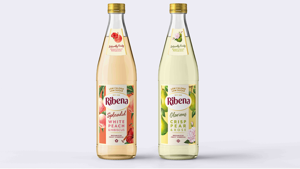
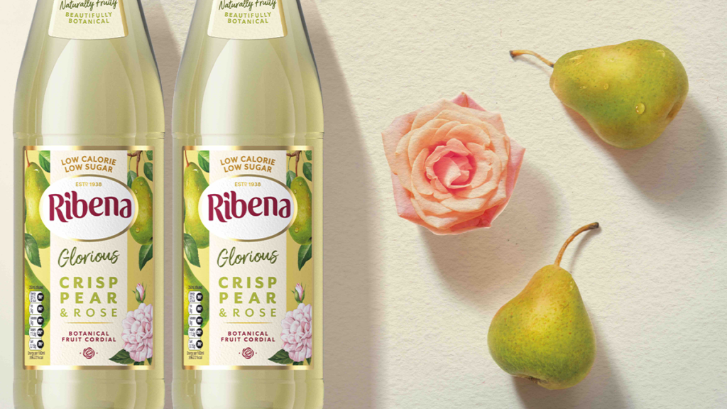
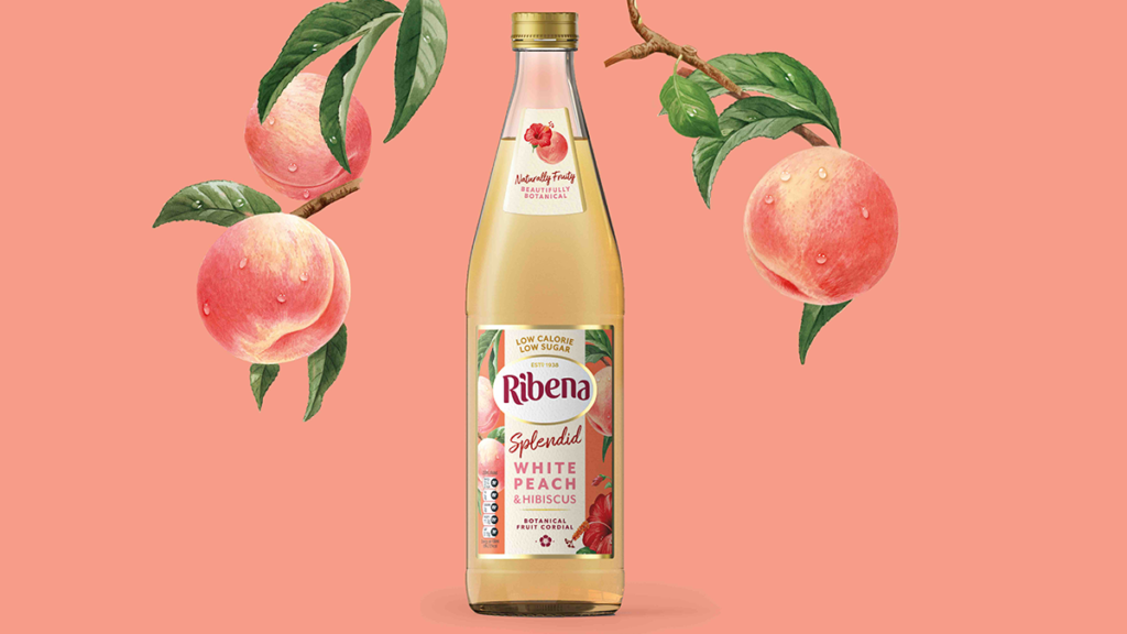
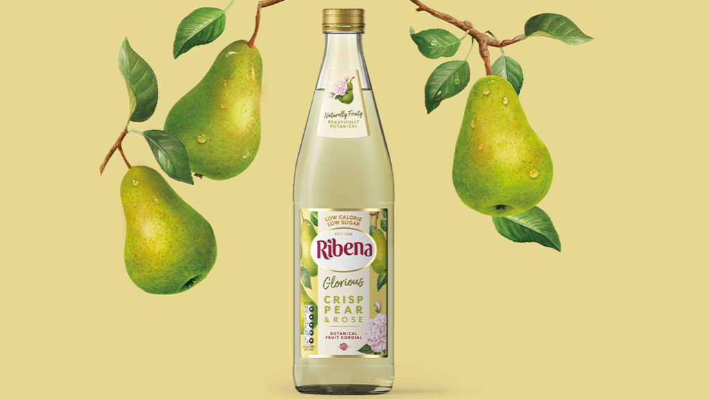
Botanical Fruit Cordial – For the Botanical Fruit Cordial, Seymourpowell opted for a softer colour palette and textured paper for the label featuring illustrations of fruit and botanicals to provide lighter and more natural cues for the consumer. The gold accents elevate the occasion, suggesting the premium offering of this drinking experience, and the label highlights the unique flavour pairings of each drink Ribena has created to provide something new and different for its customer base.
Core Squash – As one of the most iconic products in the Ribena range, the Core Squash pack has been redesigned to magnify the rich and juicy flavours bursting within each bottle and to further enhance the proposition of the original Ribena drink.
The bold background reflects the fruity and impactful taste, while the percentage of real fruit juice has been elevated to the top of the pack to highlight what makes Ribena Squash such a deliciously fruity soft drink.
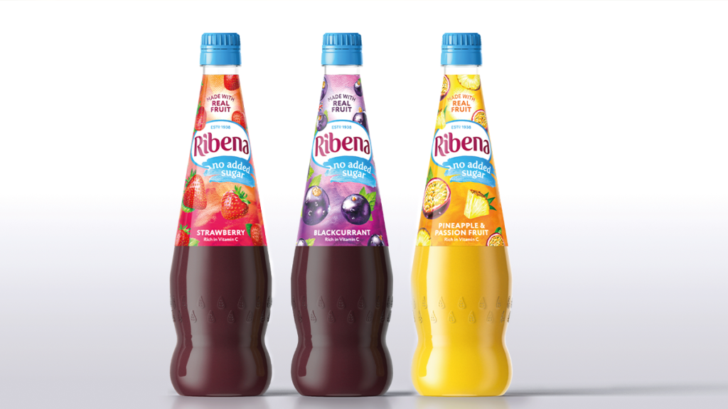
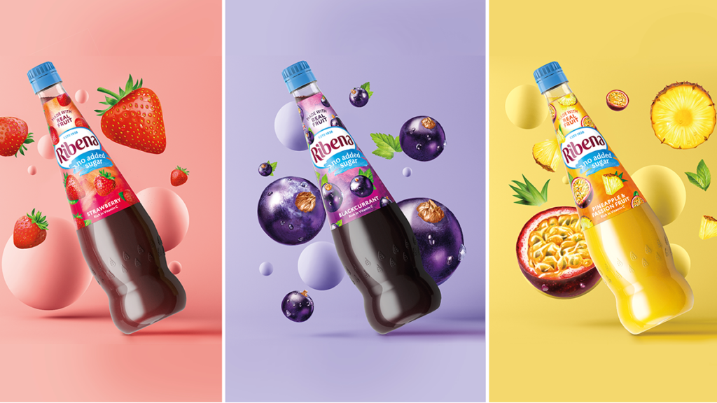
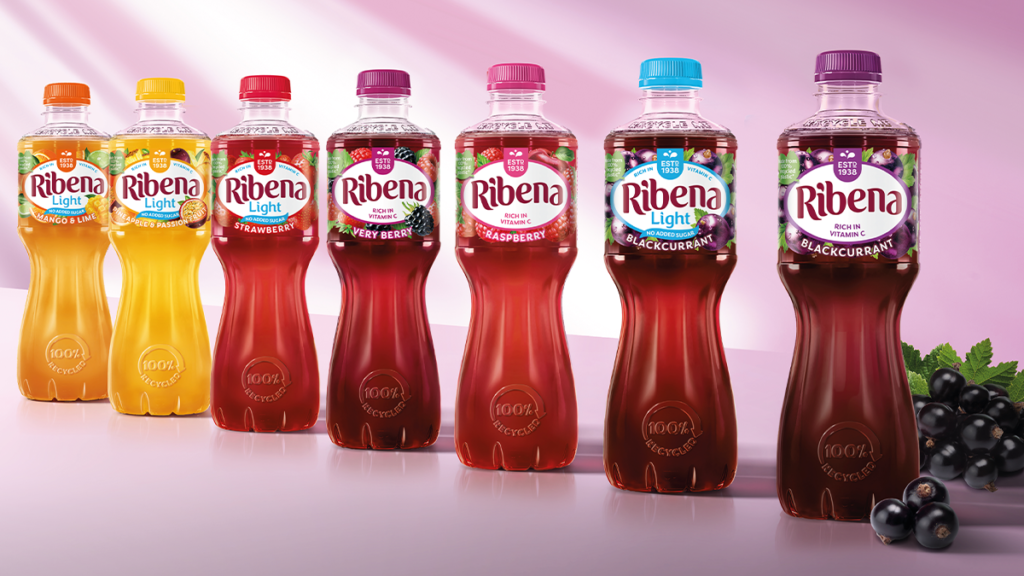
No Added Sugar (NAS) – A lighter offering to the wider range, No Added Sugar is lower in calories and sugar. Seymourpowell sought to celebrate this suitability for family occasions, communicating a lighter nature for the product, with a sky blue brandmark set on a watercolour background. This reflects the moment where the squash and water combine to form a light and refreshing beverage.
Ribena’s fresh product range will be rolled out across UK supermarkets from November 2020, into early 2021.
Source: Seymourpowell
You must be logged in to post a comment Login