
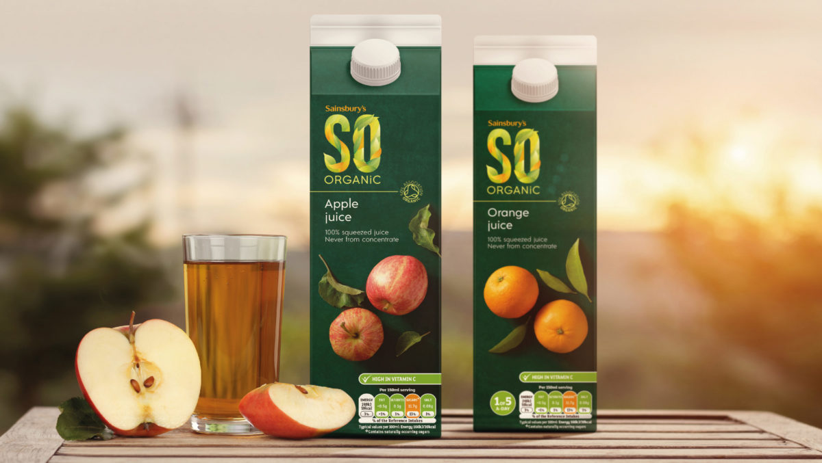
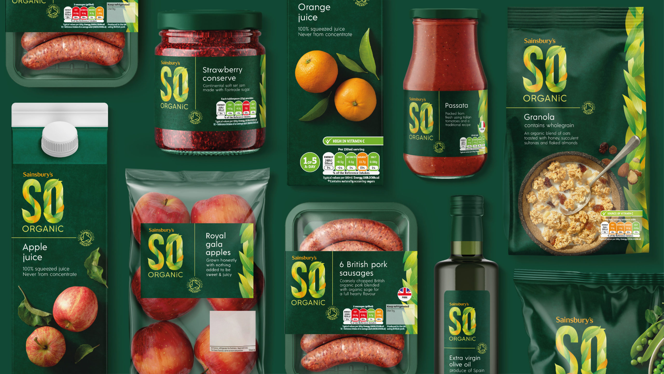
BrandMe have created a new look for Sainsbury’s SO Organic range establishing a strong, iconic brand mark that brings the brand in line with the modern consumers’ attitude towards the organic category. The new, bold and enticing look and strong tone of voice stand out in a world of developing food trends that ooze personality, character and warmth.
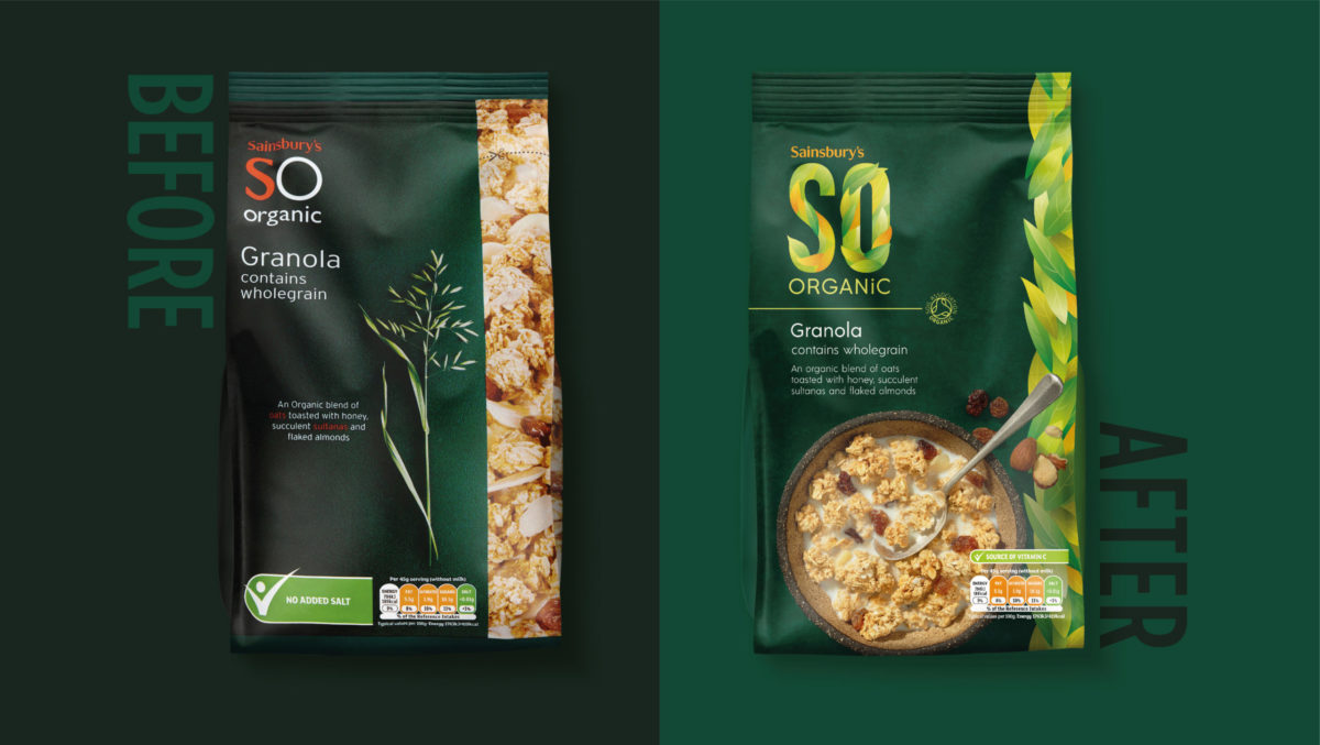
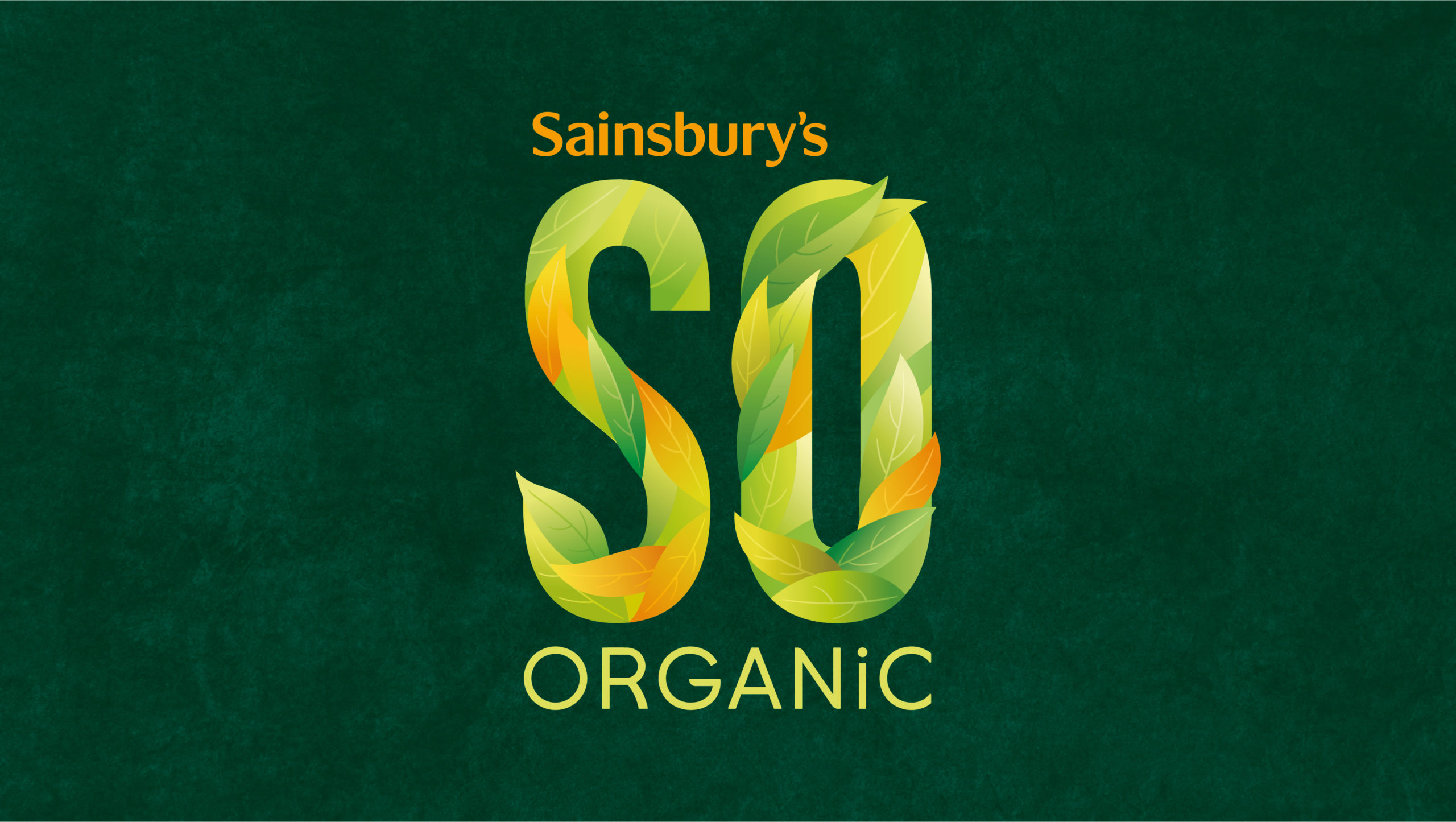
The identity-led redesign focuses on building a more appealing brand positioning. The logo encourages consumers to live in harmony with nature and celebrate the genuine imperfection of organic produce, whilst the recognisable colours and iconic brand mark reassure them of the premium quality and expertise that the Sainsbury’s name brings to the range.
Coulter Patton, Associate Director at BrandMe says: “It became clear that what SO Organic needed was more warmth and emotion to hook consumers back into the category. We wanted the new brand mark to carry the story of nature’s abundance and imperfectly honest products, to tap into the growing need to live in harmony with nature”.
Source: BrandMe
You must be logged in to post a comment Login