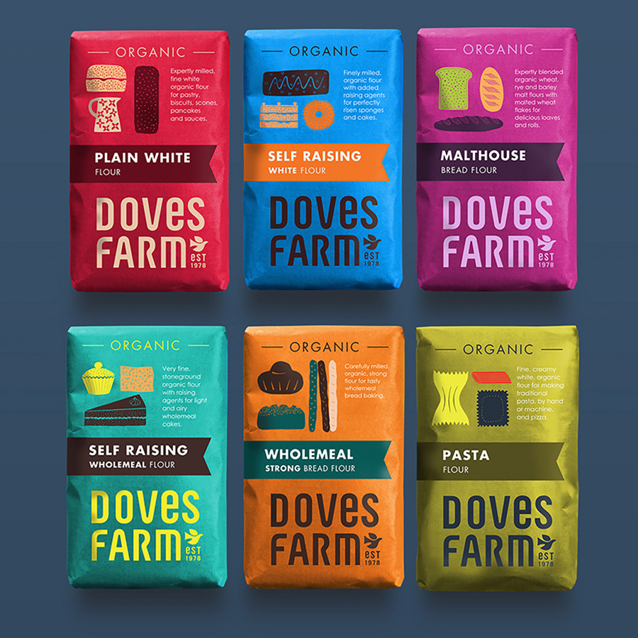
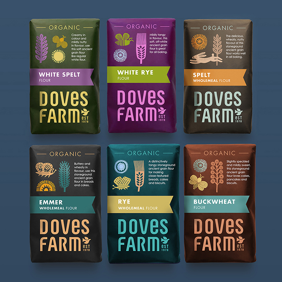
Studio h has created new branding and packaging design for Doves Farm, producers of organic flours with a unique character milled from a range of grains and seeds. Studio h was tasked with contemporising the brand whilst retaining their artisanal essence and ethical values. Increasing their organic credentials and making organic an everyday choice was also an important element of the redesign.
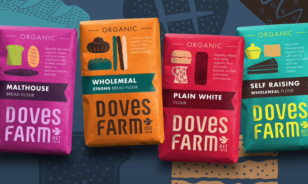
The new Doves Farm logo, unusually dominating the base of the pack, has a contemporary twist with traditional roots. ‘The dove symbol which has become an iconic and important part of Doves Farm’s visual heritage was integrated into the new branding, albeit in a smaller way’, says Rob Hall, Creative Partner, Studio h. ‘We’ve worked with Doves Farm for many years and felt it was also important to continue the legacy of striking illustrated packaging’.
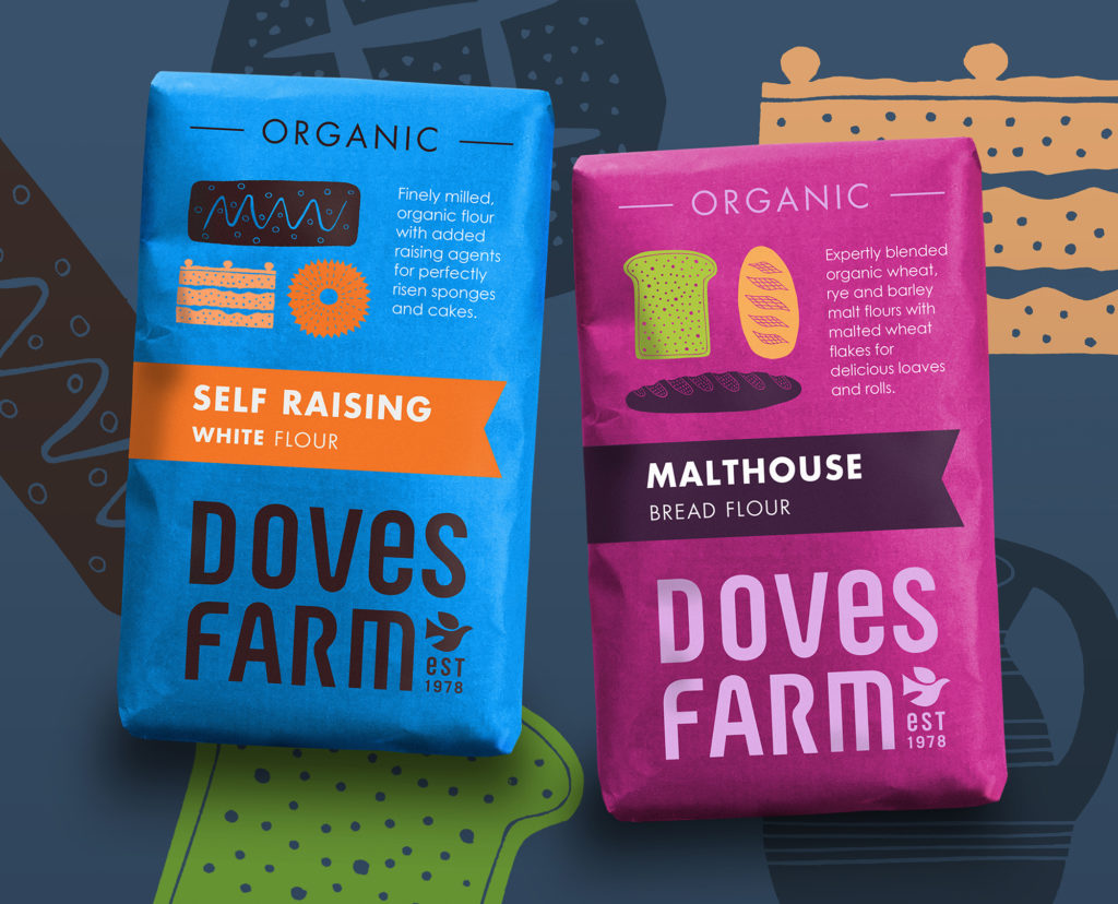
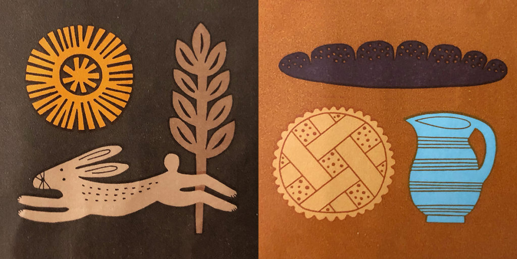
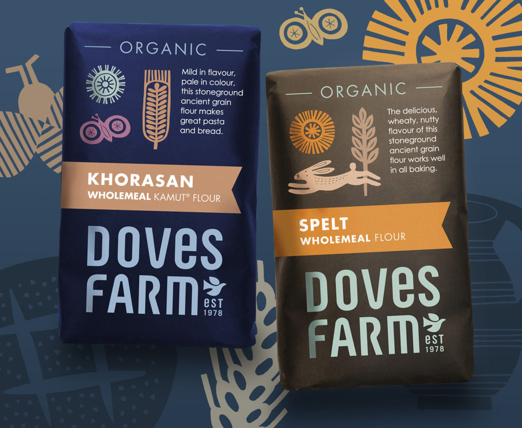
A warm and vibrant colour palette was chosen for the everyday range, alongside quirky linocuts illustrating baking recipes to inspire bakers of all levels. Richer, darker colours are used on the Ancient Grains range, with linocut icons depicting the specialist grains and telling a simple story about the natural environment of organic farming. A design that celebrates the joy of baking.
Source: Studio H

You must be logged in to post a comment Login