
Easter celebrations will still be going ahead for families and individuals across the globe, but due to the COVID-19 pandemic they are going to be a little different this year. Despite not being able to freely immerse themselves in family or religious gatherings, there is one popular ritual that can be enjoyed by all this Easter: the humble chocolate Easter egg. It can also provide a welcome reprieve from the current reality.
The chocolate egg has always been a notch above all other sweet treats at this time of year. But this Easter by combining its ‘popular; and ‘traditional’ symbolism, it can provide much needed emotional comfort in these uncertain times. Chocolate has a popular association with indulgence and the Easter Egg has been a traditional treat for children in Britain since 1875 – linked to the breaking of the Lent Fast. And the egg, since ancient times, has always been a symbol of birth, growth and renewal.
It is not just what’s on the inside, but also the outside that counts
However, it is not just the job of the chocolate egg to communicate these values to the consumer, the responsibility also lies with its packaging. Chocolate egg packaging can communicate additional values of nostalgia and playfulness. Nostalgia for simpler times experienced in youth provides solace and emotional comfort in the midst of uncertainty. Playfulness, on the other hand, offers temporary ease and escape from daily stresses. Both are increasingly relevant to the millennial generation. They reflect pre-existing anxieties around job security, homeownership and financial fragility that underpin millennials’ lives.
Increasingly, food and beverage brands are appealing to these consumer’s values through their packaging to gain a competitive advantage. Chocolate eggs are no different. While typically categorised as a child food product, more brands are revisiting these childhood treats and tailoring both products and packaging for this older demographic.
As these consumers are increasingly looking to brands for emotional comfort, some insights to the art of the perfect Easter egg packaging can be found in the current Easter offerings. It is interesting to see how all brands – from the supermarket’s own offering, to the popular confectioners and the luxury brands have been able to communicate Refined Nostalgic Comfort; Youthful Playfulness; and Natural Renewal and Calm, via packaging and product.
Refined Nostalgic Comfort: Hotel Chocolat’s Eggs & Soldiers and Sainsbury’s Humpty Dumpties packaging are two stand out examples of how to encapsulate a refined nostalgic comfort.
Nostalgia is evoked by Hotel Chocolat from their direct reference to ‘Eggs & Soldiers’, a British child’s classic breakfast. Sainsbury’s offering taps into childhood memories from the illustrated style imagery of the classic Humpty Dumpty nursery rhyme, typically seen in children’s story books.
Both brands feature clean, simple designs. Hotel Chocolat employs visual harmony from its symmetrically arranged sticks of chocolate around the prized egg. Sainsbury’s displays negative space with an uncomplicated illustrative style – both recalling modern minimalist aesthetics. There is also a predominance of cream livery which connotes comfort foods like thick yoghurt or ice cream.
Through their combination of minimalist aesthetics and childhood references, they signal an adult comfort and nostalgia, rather than one for children. Their visual refinement of nostalgic references connects to millennial customers looking for comfort that feels age appropriate.

Youthful Playfulness: Cadbury’s Creme Egg and Hotel Chocolat’s Vegan egg packaging communicate playfulness through their use of splash or splat designs, reminiscent of the Nickelodeon kids’ channel or Art Attack logo. This imagery communicates to consumers that they can engage in messy, carefree enjoyment, with license to ‘play’ with their food.
Looking more closely at Cadbury’s livery, we can see that their Red and Yellow primary colours connote kid friendly brands, like McDonald’s. Cadbury’s sunburst pattern along with imagery of mini eggs springing outward from the base of the broken egg, connotes energetic release. Together, this codes Easter eggs as also a source of youthful energetic fun encapsulated in every bite. However, youth is also combined with adult taste, as its deep purple livery and cursive typeface cues traditional luxury and elegance.
Unlike Cadbury’s bright primary colours and deep purple, Hotel Chocolat’s tertiary metallic purple shade with a slightly raised texture connotes the nuanced complexity and multisensorial experience of emergent premium products for adults. Its splat image set on a pared back white background, connotes ‘messy minimalist’ art design known for its display of simultaneous chaos and control. This amalgamation appeals to a sophisticated ‘adult’ playfulness in the target demographic.
Natural Renewal and Calm: what is particularly noticeable about how emergent Easter packaging signals comfort – particularly renewal and calmness – is through an unexpected and sophisticated reinvention of what an Easter ‘egg’ can be.
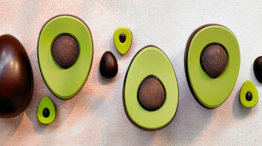
For instance, Waitrose’s ‘avocado’ chocolate egg still captures the newness and naturalness of spring in the light green livery egg, signalling sprouting vegetation and a ripening freshness. Its soft pastel palette alludes to spring colours often found in a familiar and accessible natural environment (e.g. plants, sun and soil). Furthermore, the mimicry of an avocado seed suggests the beginning of life, similar to an animal-based egg. Yet, by tapping into millennial’s fixation with avocados, Waitrose appears modern and culturally relevant, as they update tradition through a similarly oval shaped, yet unconventional food object in the context of Easter.
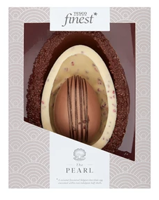
Similarly, Tesco’s Finest ‘The Pearl’ pack’s use of an untraditional food object – an Oyster – that bears similarities to an oval shaped egg, brings originality to a formulaic style. Additionally, the focus on more ‘remote’ nature represented in oceanic motifs in both Tesco’s and Chococo’s pack designs, appears to appeal to millennial’s increasing dissociation from established religions to spirituality and mindfulness practices. For example, the repetitive patterns of the curved lines on the Tesco pack, resemble ocean waves mimicking cyclical natural movement, and recalls popular yoga or meditative brands designs. Chococo’s blue colour schemes with imagery resembling light reflecting off ‘ocean’ waves connotes tranquillity in the midst of vastness.
The theme of calmness is also seen in Tesco’s design, from the solitary line drawn imagery of the open oyster revealing its pearl, surrounded by waves. This combination codes chocolate eggs as a modern, creative source of serenity and renewal.
The art of the perfect Easter egg packaging

Brands have the opportunity to provide some relief in these uncertain and challenging times. Pre-CoVID-19 confectionary brands – through the art of the perfect Easter egg packaging – were already communicating comfort to millennial consumers through playfulness, calmness and refined nostalgia. These modern and innovative ways that were challenging traditional Easter conventions, have potentially extended their consumer engagement wider to all, not just one, demographic. After all, there is a much greater need for comfort across all demographics right now.
This can go beyond this Easter week; brands should not be afraid to communicate in ways that are original and unexpected. Challenging category traditions can help them align with the ever-changing needs and desires of consumers in an uncertain world.
By Dr. Jennifer Simon, Semiotician at Sign Salad
You must be logged in to post a comment Login