Got McDonald’s?
For years, TBWA Paris has been on a mission to advertise McDonald’s in the most minimalist ways imaginable. This started in 2013 with extreme close-up photographs of the food, with almost zero branding whatsoever. (They don’t need any, was the point, the menu items being so instantly recognizable.) The following year, the agency introduced Pictograms, in which the food was reduced down to very spare illustrations.
Now, it’s disappearing altogether.
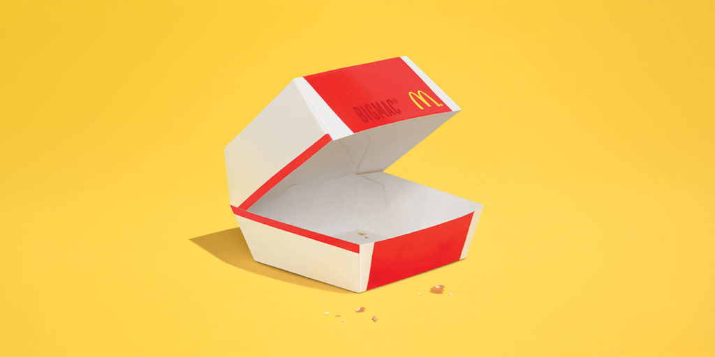
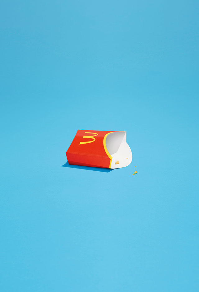
TBWA’s latest ads for the fast-food giant feature minimalist illustrations of packaging for top sellers like the Big Mac, french fries and Chicken McNuggets—with only a few crumbs of food seen in each ad, the rest having been devoured by an unseen diner.
There’s not much else in the ads either—just the Golden Arches and the product name (and not even that for the fries), against solidly colorful backdrops. The point, once again, is that McDonald’s food is so well known and understood that it speaks for itself, even in its absence. Also, as TBWA says, it’s “so good that in the end, there is only one crumb left.”
The campaign follows another artful series of print ads earlier this fall in which the agency used intricate light sculptures to create glowing facsimiles of menu items, to promote the chain’s late-night hours.
Credits
Client: McDonald’s
Agency: TBWA\Paris
Client: Xavier Royaux, José Jacinto, Benoit Kolb
Account Management : Luc Bourgery, Jonathan Serog, Julie Montagne,Matthieu Charles, Marine Letourneur, Matthieu Charles, Marine Let
Executive Creative Directors : Benjamin Marchal & Faustin Claverie
Art Director : Margaux Chalard
Photographer : Florent Tanet
Photofinisher : Xavier Cariou @Artifices
Source: AdWeek


You must be logged in to post a comment Login