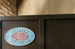
 Consultancy &Smith has designed the environmental branding for Indian restaurant Dishoom’s newest branch in London’s King’s Cross, which has an aesthetic reflective of a late 1920s railway transit shed.
This look is carried through to the interiors, which have been designed by Macaulay Sinclair, and takes inspiration from Bombay’s Iranian cafés.
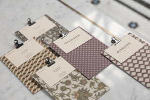
Each Dishoom restaurant is designed around a narrative inspired by its location and the typographic identity for each is unique. & Smith, which is the brand guardian for Dishoom, has designed a flexible identity system made up of a set of fonts so each branch can be given it’s own personality.
The King’s Cross branch imagines a young Irani (an Iranian immigrant to India) in 1928, who sees the opportunity to start selling Chai to railway workers “and slowly builds a ramshackle Iranian restaurant,” according to & Smith, which says: “Dishoom King’s Cross is this restaurant decades later, now established, even something of an institution, and still serving the local people, railwaymen and office workers of the  local area.”
The look and feel is drawn from Indian train paraphernalia and a vintage Bombay style, which is pervasive across the Dishoom brand and &Smith says: “We worked with Kalapi Gajjar-Bordawekar, an expert in Indian typefaces, to make sure our style felt authentic.”
& Smith has designed a location-specific logo, exterior signage, posters for the interiors, new bar and juice menus, revised main menu, invites and bottled cocktail labels.
The 250 cover restaurant is the largest Dishoom yet and also seats 92 in the bar and covers more than 800m².


You must be logged in to post a comment Login