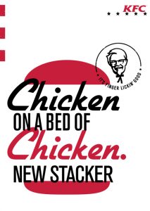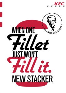
Mid-October sees the launch of a bold new visual identity for KFC advertising in the UK.
 Created by BBH London and inspired by KFC’s American heritage, the new work delivers a fresh, bold and modern feel for the brand. It aims to relaunch the brand’s most distinctive brand assets with a bang, creating consistency across all media and cut-through from competitors.
As part of the new campaign, KFC has released a provocative 96 sheet with the headline ‘It’s f***** *****n’ good’, bringing a whole new edge to the brand’s iconic ‘finger lickin’ good’ tagline.
The ad will be shown in selected outdoor locations across the UK, and has already caused controversy.
 The Out Of Home campaign launches across a wide range of outdoor formats, including 96 sheets and train station screens, and will be further rolled out across KFC’s social and digital channels.
The campaign launches this week in conjunction with a new burger, the Original Recipe Stacker, a big-eat that combines classic Original Recipe fillets with a new ‘baconnaise’ sauce. The burger is the first to be shot in the new photographic style, where products appear on white backdrops with clean, bold shadows and messy, indulgent food styling. The campaign also includes typography-led executions, and uses new fonts, graphic iconography and a Colonel stamp of quality. All communications are also characterised by the witty tone of voice.
Source: Little Black Book

You must be logged in to post a comment Login