Award-winning sourdough crispbread brand, Peter’s Yard, has worked with B&B studio on a strategic repositioning and redesign as it seeks to drive growth and extend its brand into new eating occasions.
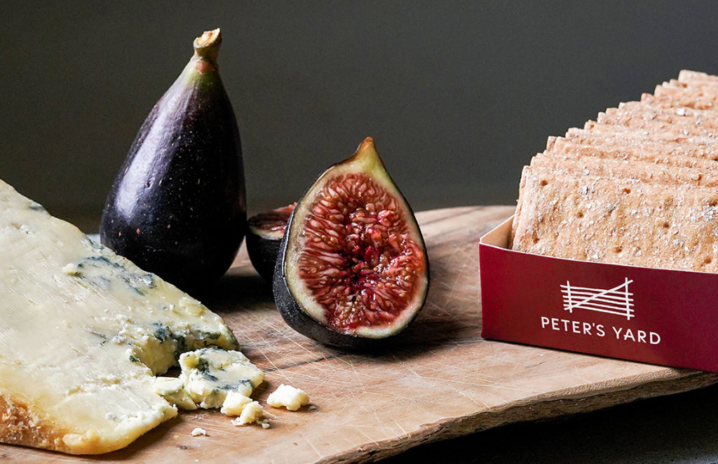
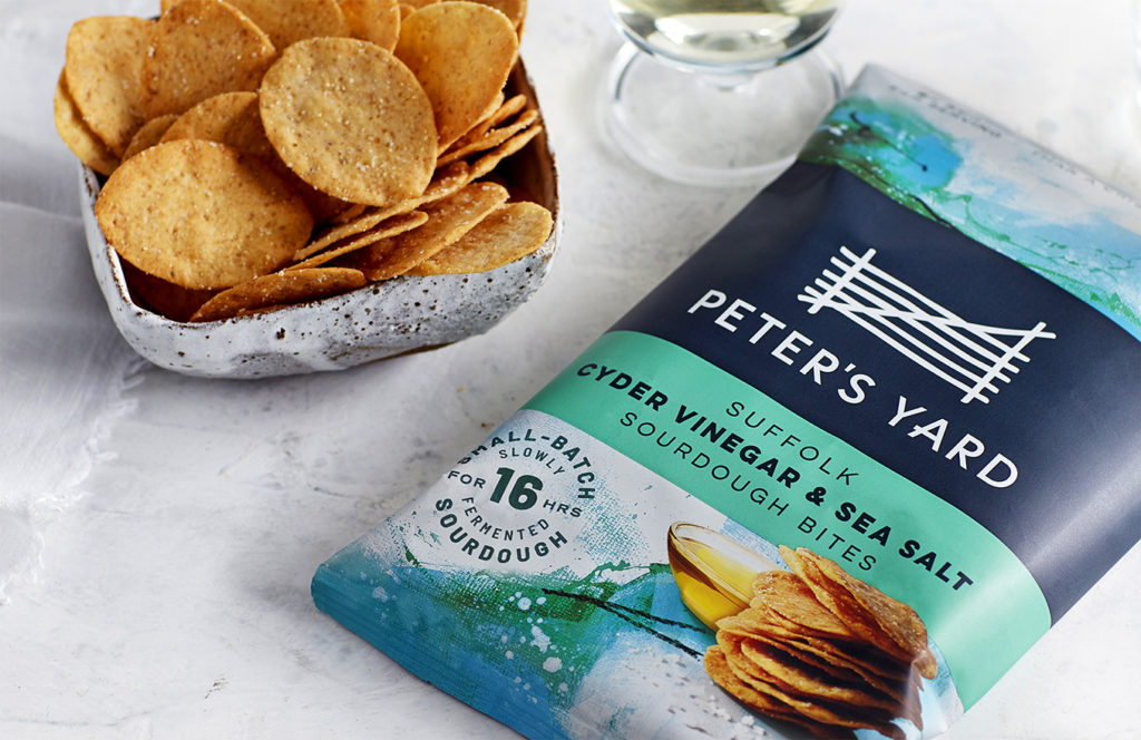
Founded in 2008, Peter’s Yard is a Swedish-inspired UK bakery brand, crafting premium quality crackers, crispbreads and flatbreads from its 45-year-old sourdough starter, and fermenting each batch for 16 hours. The redesign incorporates all the brand’s existing SKUs and sees the introduction of a new range of Sourdough Bites – an all-natural baked and seasoned bagged snack available in the snacking aisle.
Time Well Spent
B&B’s strategic approach focuses on the brand’s deliberately slow and shortcut-free production methods. Born from the belief that good things take time, the new brand heroes sourdough, and encompasses a Swedish-inspired pace of life in keeping with emerging trends towards deceleration, mindful wellness and the rediscovery of simple pleasures. As a result, the mood of the brand’s new aesthetic is calm, crafted and deliberate, evoking a premium product and a savoured eating occasion.
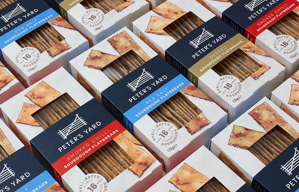
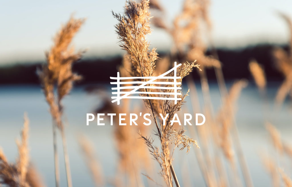
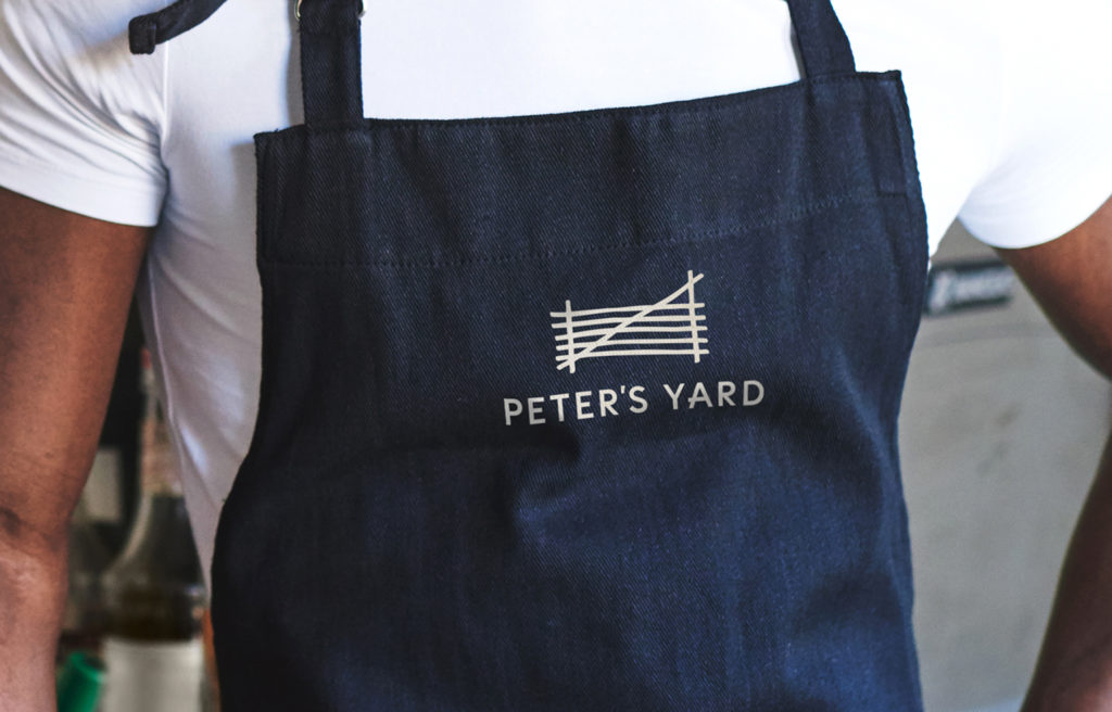
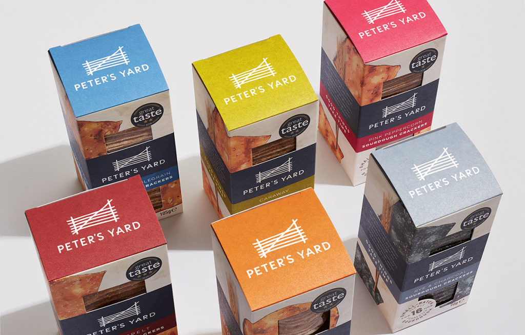
The brand’s existing logotype has been sympathetically modernised with a more contemporary sans serif font and the introduction of a small quirk to the A to echo the gate icon. Colours, including the brand’s signature blue, have been subtly refreshed to maintain a similar but bolder palette. Across packaging design, the introduction of a central branding band creates more interest and impact, while consumer-friendly windows are more successfully integrated into the overall layout.
The brand’s original illustrative pack imagery – derived from a photograph of crispbread – has been reimagined to more clearly represent the product, and now travels around the pack to interact with the brand and product story. Both ingredients and serving suggestions are represented through photography in varying ways across the range. Commissioned elements across the design reinforce the ‘Time Well Spent’ positioning, with product imagery derived from a new set of commissioned oil paintings.
Extending into snacking
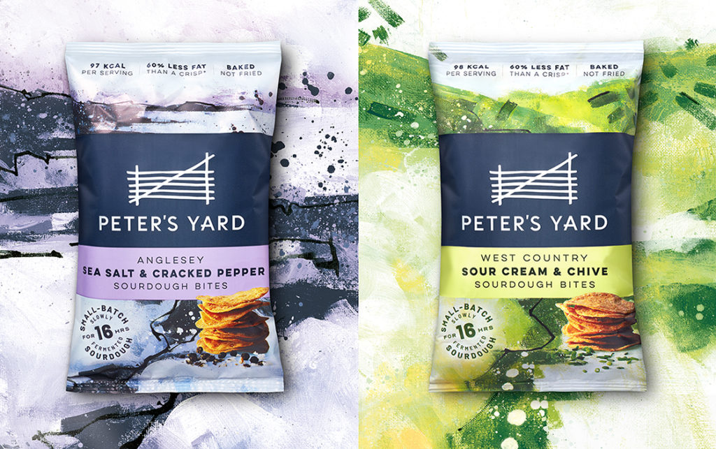
Enabling Peter’s Yard to move into the fast-paced world of snacking was a strategic challenge for B&B, who were keen to retain the brand story of time-honoured and unhurried craftsmanship for products that are designed to be savoured. Positioning the snacks as a relaxed moment of me-time rather than a hurried convenience led to packaging design that feels more contemplative within its competitive set. The background imagery – derived from the acrylic work of landscape painter Paul Bailey – subtly references the bold flavour codes of the category while evoking the provenance of ingredients and suggesting a more thoughtful eating occasion. The central band echoes the layout of the core cracker range, while allowing for the necessary calorie and health-based call-outs key to healthy snacking alternatives.
Shaun Bowen, Creative Partner at B&B studio, says: “Updating the Peter’s Yard brand has required the sort of thoughtful and measured approach that the brand has become known for. We were keen to update imagery and introduce contemporary features, but to do so without losing the warmth and rustic feel that consumers loved.”
Head of Marketing at Peter’s Yard, Clare Stiles, adds: “B&B have created new branding and packaging that is completely in step with where we need to go. Our brand has great standout, while still feeling simple, understated and completely authentic.”
Peter’s Yard is available in Sainsbury’s, Waitrose and Ocado.
Source: B&B studio

You must be logged in to post a comment Login