
Missouri Creative, the London based design and creative agency, has redesigned the packaging for one of Norway’s most treasured beer brands, Ringnes.

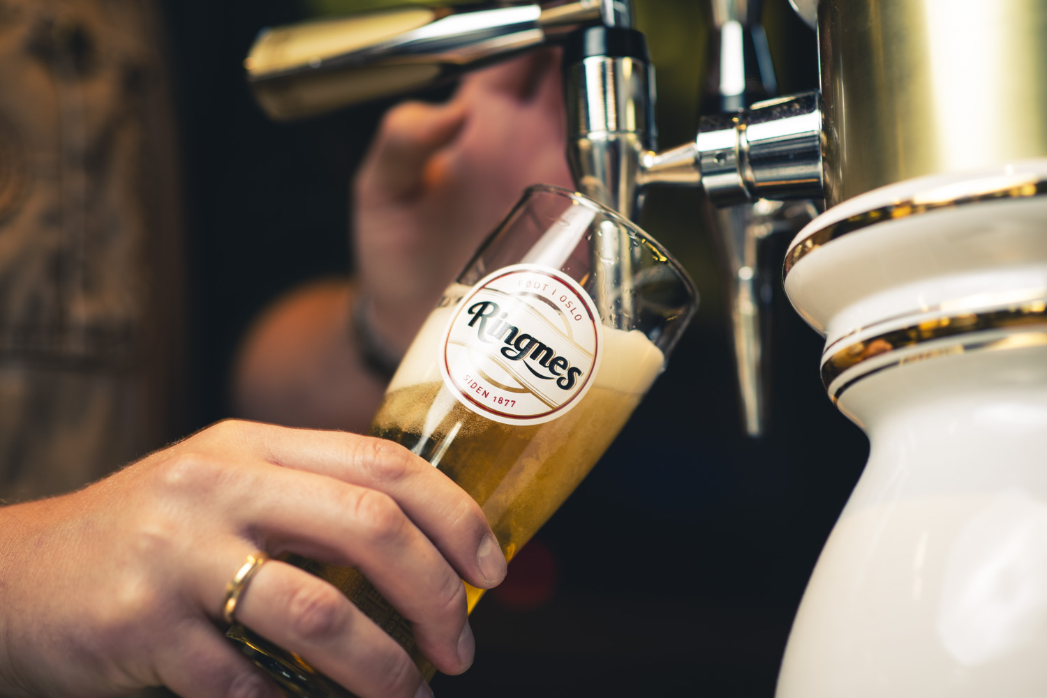
Combatting the many restrictions around the marketing of alcohol in Norway, the team recognised the importance of the pack design as the single most important touchpoint with consumers.
Making the transition to a more ‘social’ brand, whilst upholding its Oslovian heritage, the rebrand is a remarkable transformation for the Carlsberg-owned brand.
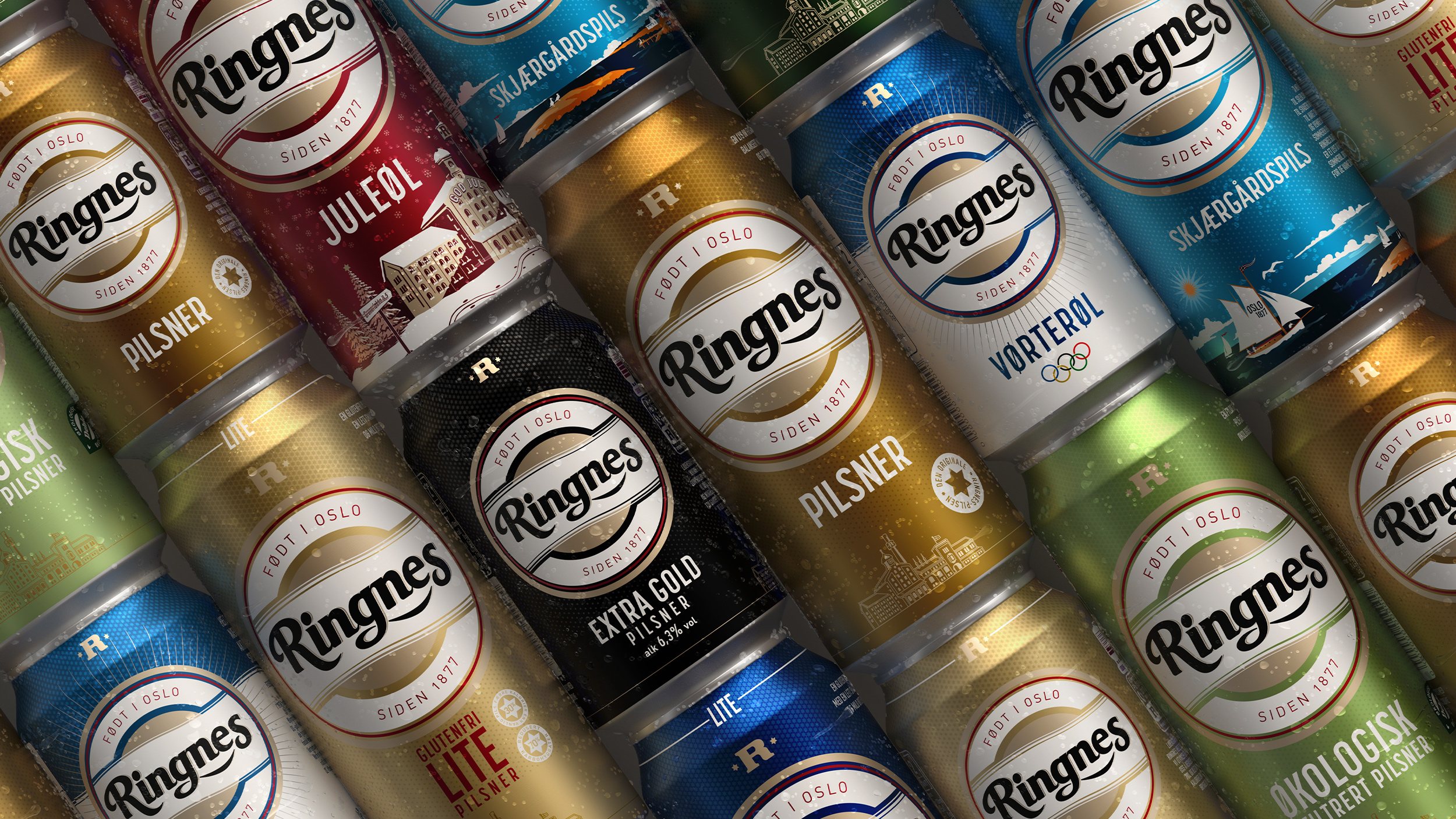
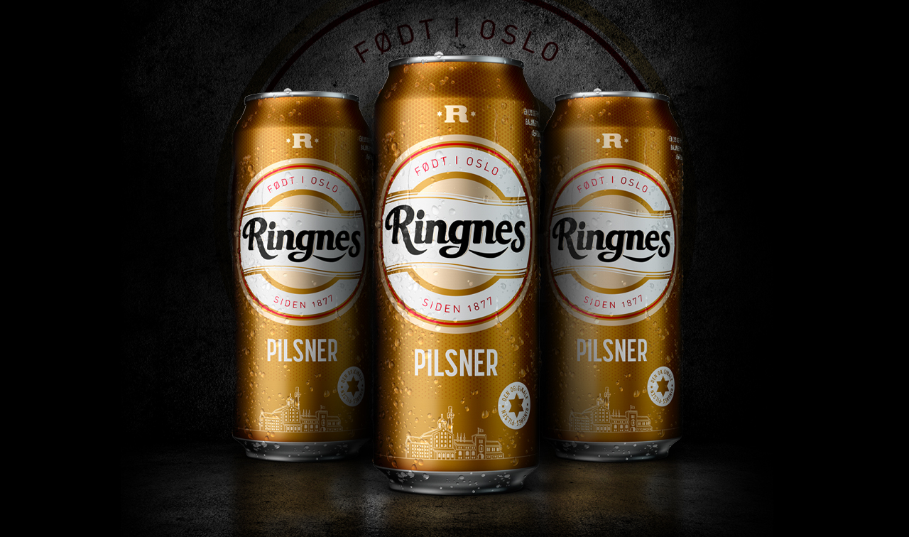
For the design to work, Missouri did a deep dive into the brand history. Icons from historical designs were reimagined to create the new hero roundel, the refined white wave, as well as the textural star pattern that runs across all variants. Inspiration was also drawn from the iconic Oslo skyline, known as ‘The Barcode’, which Missouri integrated into the pack barcode – a ‘Barcode barcode’ if you will!
In total there are 14 variants, 3 core pack formats (0,5l cans, 0,3l cans and 0,33l bottles) as well as full secondary pack designs. With all 14 variants launching into the market throughout 2021, the new identity has been applied across all packaging, glassware and on and off-trade communication.
Missouri’s Creative Director and Founder, Stuart Wood says; “Working with such a cherished brand as Ringnes as well as the pressure of working within a dark market, we knew the designs had to be eye-catching, stunning and create impact on shelf immediately. We’re incredibly proud of the outcome and are looking forward to seeing the full range launch into market.”
Senior Brand Manager for Ringnes, Martine Aaland commented; “Given that Norway is a dark market, the pack is the most important touchpoint and Missouri has created a design that communicates history, quality and sociability.”
Source: Missouri Creative
You must be logged in to post a comment Login