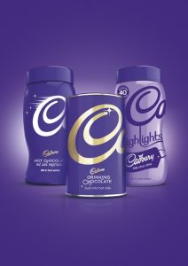
 Bulletproof has revamped the packaging for Cadbury’s hot drink range.
Cadbury’s hot drink range includes instant hot chocolate and drinking chocolate as well as the Highlights range. Bulletproof says it wanted to create a more recognisable product that does justice to the reputation of Cadbury.
The redesign follows a new look for Cadbury Dairy Milk, which was created by Pearlfisher.
The new designs retain the distinctive purple that is so strongly linked with Cadbury but eschew the chocolate imagery which dominated the old packaging.
Cadbury was recently defeated in a legal battle in which it attempted to secure exclusive rights to use the Pantone 2685c purple.
Instead, Bulletproof has opted for a less cluttered, more stylish approach. New, fonts have been used to allow the product to communicate more clearly on the shelves and the team has opted for a more prominent logo to capitalise on the iconic status of the chocolate company.
Bulletproof says it feels that the hot beverage range now has a brand aesthetic on a par with Cadbury’s other iconic products.
With the Highlights range Bulletproof aimed to clearly define the separate drinks while leaving the range open for extension. The packaging now features labels from the chocolate bars that flavour the drinks and coloured lids corresponding to the different flavours.
Bulletproof has previously worked with Cadbury on projects including designing bold packaging for its Marvellous Creations sub-brand and bitesize range.
Bulletproof says, ‘We feel that not only have we created a beautiful design with incredible shelf presence and confidence, but we’ve also revived an icon that will be around for generations to come.’
The design team won the pitch in December 2012 and has been working on the packaging with Cadbury since then. The new designs will be introduced in January.

You must be logged in to post a comment Login