
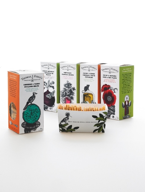
 Big Fish has created new branding and packaging for bakery brand Fudges, renaming it as Thomas J Fudge’s Remarkable Bakery.
Caitlin Carter, account manager at Big Fish, says, ‘The key word for the rebrand was “remarkable”, the biscuits are remarkable, the packaging is remarkable and the brand is remarkable.’
The new look was developed by Big Fish founder and creative director Perry Haydn Taylor and design director Victoria Sawdon.
Packaging uses Victorian-style illustrations, with biscuit ingredients indicated by a ‘hat’. Beetroot and horseradish shards feature a beetroot ‘hat’ for example, while Stilton melts feature a wheel of cheese.
Carter says, ‘The “hat” motif gives longevity – it can be adapted for future ranges – and it’s also a nice way of highlighting the key ingredient.’
The new packs also contain slide-out trays, which Carter says ‘gives it table-ready packaging’.
She adds, ‘One of the key aspects to the project was to change the name – so that people don’t think they’re producing fudge.’ The brand is now named after the family’s first baker – Thomas J Fudge.
The new look is rolling out to savoury biscuits from October, and sweet biscuits from next year.
You must be logged in to post a comment Login