
B&B studio has partnered with premium ingredient company Belazu on a strategic repositioning and rebrand, designed to elevate the brand’s presence on- and off-shelf, optimise its portfolio and design system, and bring distinctiveness to a crowded retail category.
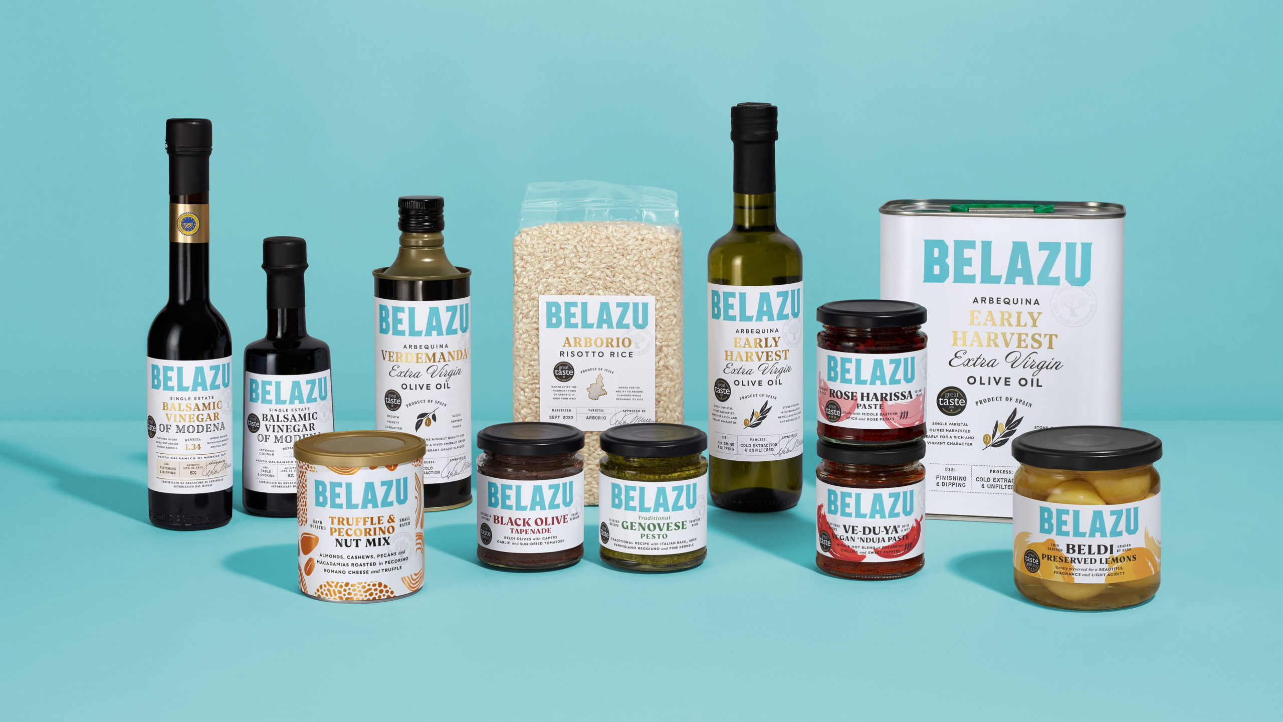
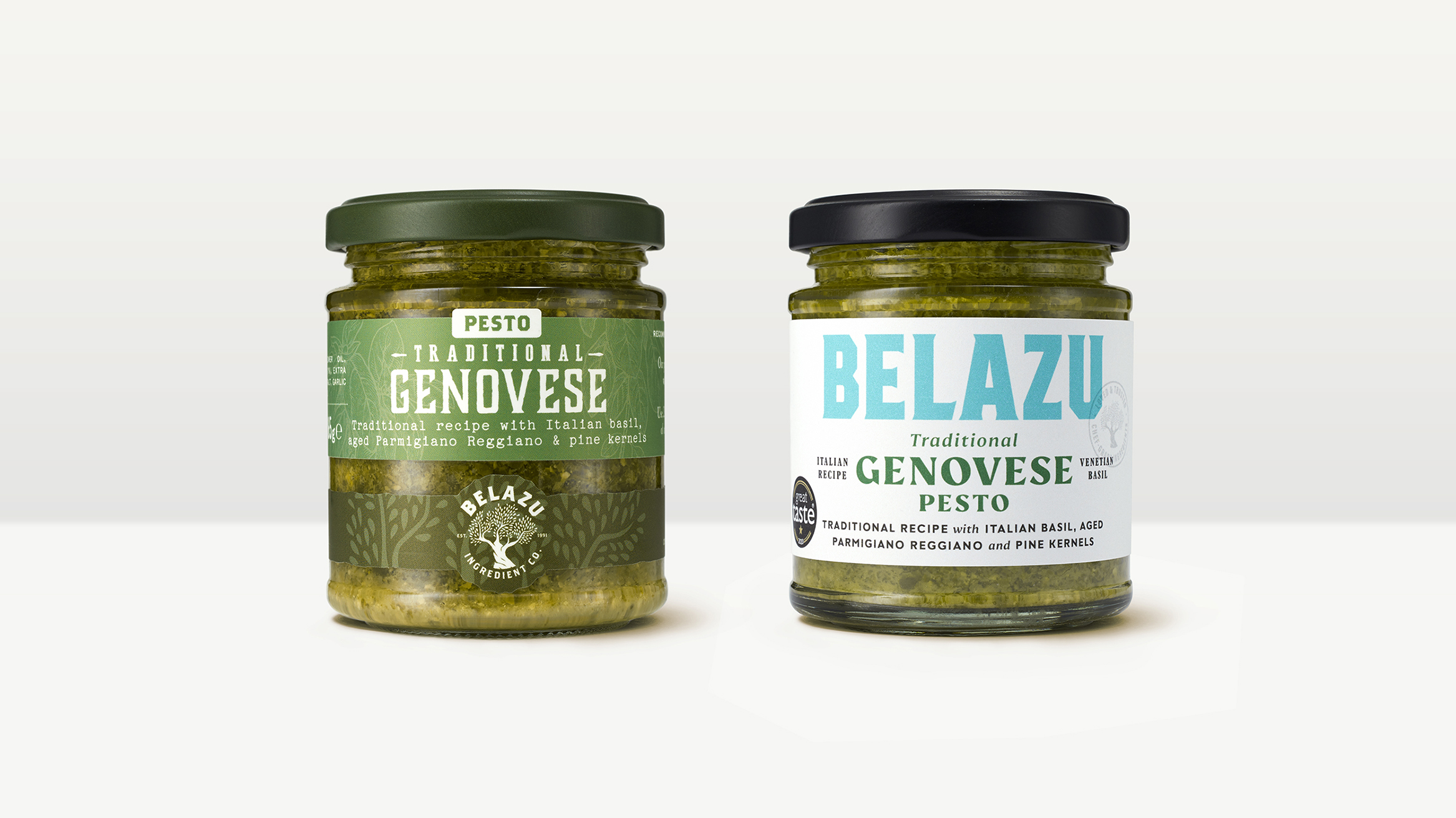
In keeping with its strong heritage as a premium ingredient supplier to chefs, Belazu had developed a very product-led look and feel across its broad consumer retail offer with the brand’s logo often the smallest thing on pack. Consequently, brand awareness was low – even among fans of Belazu’s hero products – and the decision was taken to upweight the impact of the brand. Initially engaged to solve that problem through an updated packaging design, B&B was keen to take a step back and get under the skin of Belazu strategically, better understanding the nature of the business and how its dual role in both food service and grocery was impacting brand behaviour. The outcome was a refreshed brand positioning, designed to celebrate Belazu’s relationship with chefs more boldly, bringing the two sides of the business closer together, and ensuring its rich heritage, unique expertise and extraordinary stories were brought to the fore.
Chef-Grade Ingredients
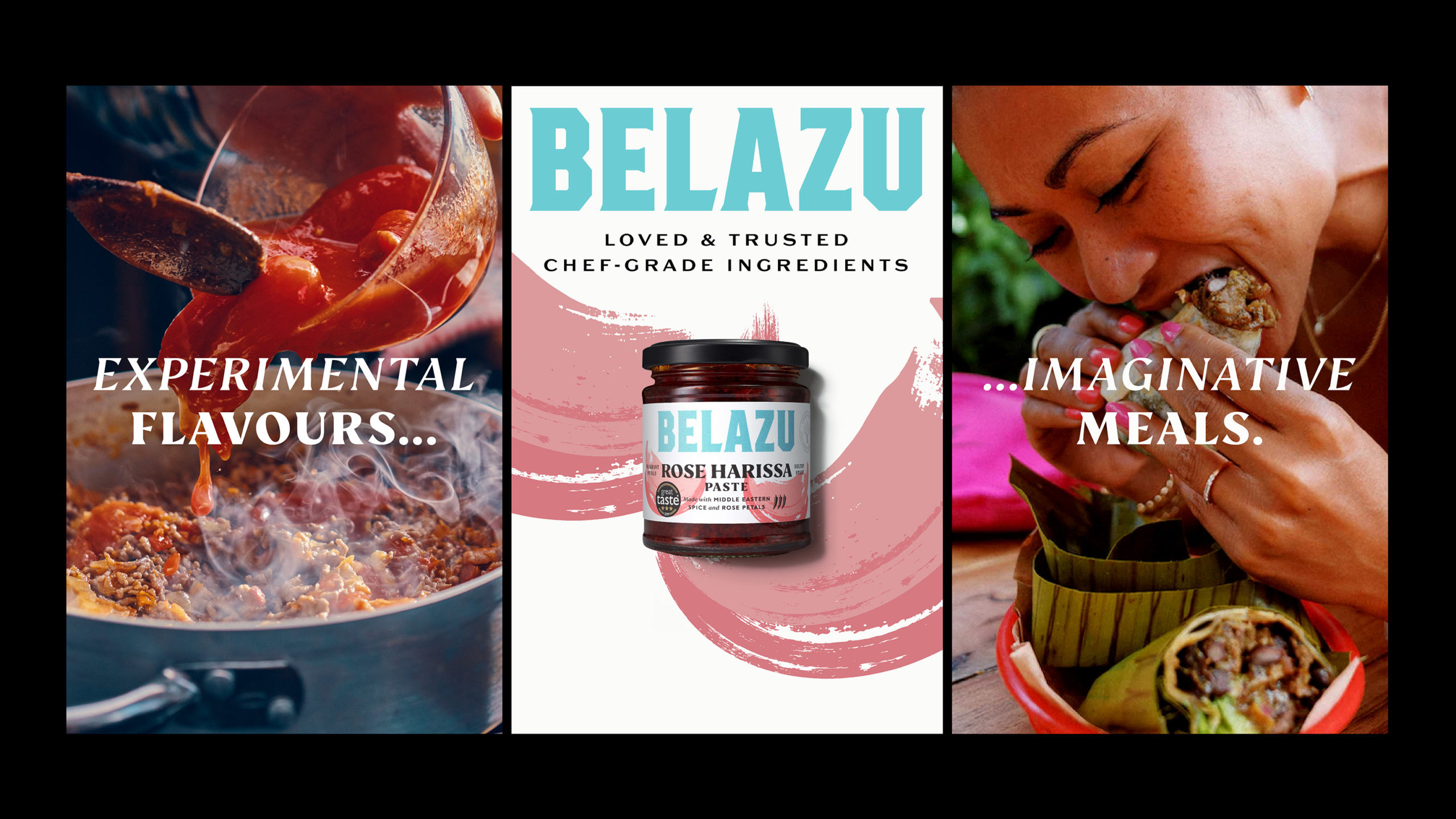
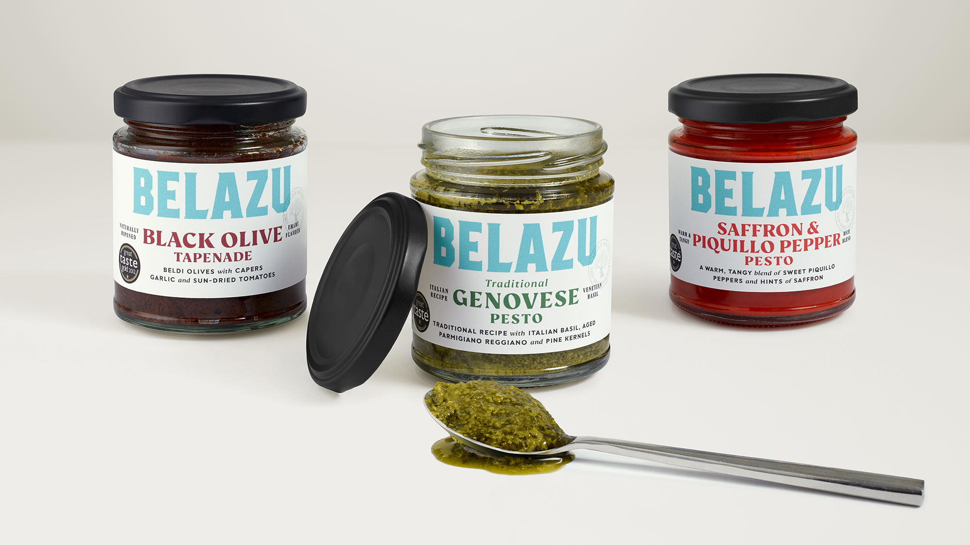
A proposition of ‘Loved & Trusted Chef-Grade Ingredients’ was created to enrich consumer understanding of the heritage that makes Belazu unique among its competitors. By boldly stating that consumers can enjoy exactly the same ingredients that top chefs use in their kitchens, the proposition helps unite both aspects of the business – retail and food service – around a common vision. Locked up with the brand identity, this new line is strongly featured across the Belazu brand world to reinforce this key message.
Beautiful Blue
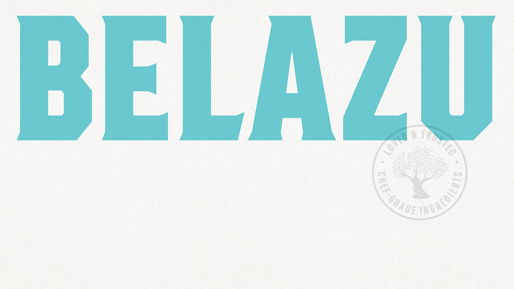
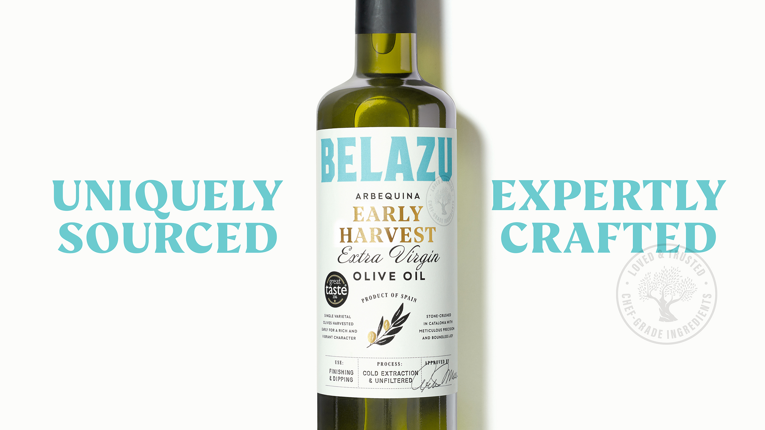
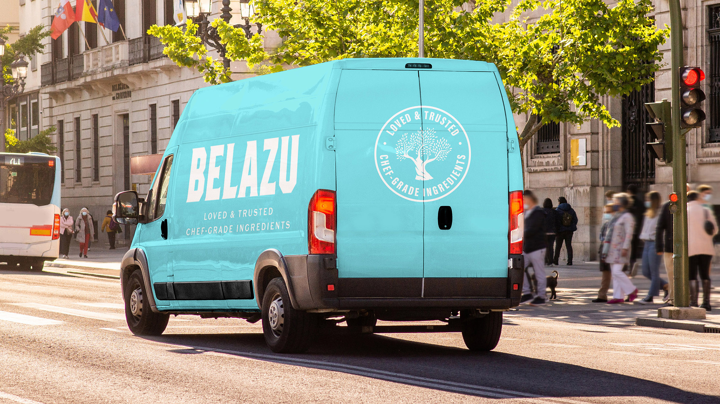
As the brand came more vividly to life through strategy, it became clearer that a more revolutionary approach to brand identity would be required. B&B‘s design team was eager to update the olive green colour that was camouflaging the brand on shelf, and created a bold new blue logo, inspired by the brand’s name – originally a contraction of beautiful (bella) and blue (azure). Reminiscent of seas and skies, the colour captures the brand’s heritage of travelling around the world to seek out the finest ingredients. The letterforms are an evolution of the existing identity and maintains its bold upper case feel, but now the logo is freed from a lock-up with an olive tree illustration, it is able to be presented far bigger on pack for increased brand impact.
Adventurous Navigation
As part of the packaging update, B&B created a new range architecture for the brand’s broad retail portfolio of over 80 SKUs, and its’ vast foodservice range, building three core product pillars inspired by in-depth research into Belazu‘s consumers. Rather than a simple good, better, best system, the new architecture recognises the role that each product range plays in its consumer’s life and is designed accordingly with the perfect balance of visual expression and verbal information.
Jack Gibbons, Design Director at B&B comments “The new packaging design enables us to show off the Belazu brand identity at its best, while still retaining all the product-based storytelling of its existing packs. While the bold logo and off-white background harmonises the range for clear brand recognition in-store, the experience-based ranges are demarked by different design styles, from simple typography, to expressive illustration, to crafted storytelling.”
“Our journey with Belazu has been a truly rewarding experience for everyone involved,” comments Kerry Bolt, co-founder of B&B studio. “It represents how we love to work, collaborating with passionate brand stakeholders and finding opportunities as we go to make a deeper, more impactful, difference through creative and strategic thinking. We’re proud of the redesign, and feel confident that it’s just the first step of a strong and beneficial relationship for us both.”

David Balmer, Managing Director at Belazu adds: “B&B’s commitment to understanding, defining and expressing our brand has made the rebrand a more impactful project than we could have imagined. It feels like a fresh start for the business, with stronger foundations than ever.”
Belazu’s new look and feel is currently rolling out across the brand’s range.
Source: B&B studio
You must be logged in to post a comment Login