
![]() Six months after receiving a Michelin star and shooting to fame on TV’s the Great British Menu, Leeds-based Bloom Agency reflects on the challenges of branding the most eccentric restaurant in the UK –where even the chef has rock star looks.
Six months after receiving a Michelin star and shooting to fame on TV’s the Great British Menu, Leeds-based Bloom Agency reflects on the challenges of branding the most eccentric restaurant in the UK –where even the chef has rock star looks.
Integrated marketing agency, Bloom Agency, created everything from the menus to the website, to specially commissioned art – even sourcing special knives and forks – all to enhance the look and feel of the restaurant.
Chef Patron and restaurant owner, Michael O’Hare, combines food with art; creating dishes with titles such as ‘My mum is single and looking for a well-dressed man’.
 On winning the TV programme’s fish course, he created ‘Emancipation’, a black dish of cod and squid ink powder – one which was painted rather than plated and which he described as an homage to his life growing up near the industry of Teesside.
When reviewing the food in 2015, the Guardian described it as defying logic: ‘it’s bonkers but engagingly so’.
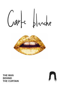
Situated above a posh clothes shop in central Leeds, The Man Behind the Curtain is accessed via a lift through the rails of suits.
The name of the restaurant comes from The Wizard of Oz: ‘Pay no attention to the man behind the curtain’ where the wizard creates his magic – the notion being that chefs should work their magic behind the scenes.
To truly reflect the experience of the restaurant, the Bloom team played on a theme of magic and surprise and a stunning visual identity was created – one which is as bold and distinctive as the restaurant itself.
Encompassing everything from the menus to the website, the design incorporated collage-style retro images applied in vinyl throughout the interior of the restaurant, together with elegant graphics printed on to beautiful paper stock.
The team at Bloom worked closely with O’Hare to create the visual identity for the restaurant which was the only new Yorkshire entry in the 2016 Michelin Guide.
 Bloom’s Creative Director, Joe Mason, said: “We knew that the visual identity of the restaurant would play a large part in the complete sensory experience that Michael was trying to create. The menu, the presentation of the food and the look and feel of the restaurant, combined with commissioned art and specially sourced crockery and cutlery, all reflect the brand. The whole team, including designers Lee Fairclough and Chris Dean, enjoyed working on the project because of the sense of fun and innovative character of the client and the restaurant.”
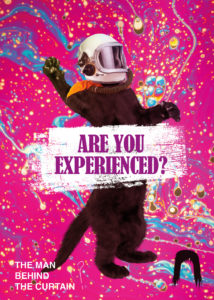
O’Hare said: “The creative process was very loose which was great. I wanted androgyny and rock and roll, and to produce something that didn’t look like a restaurant. I wanted to pull away from what other people were doing.
We took out everything that was restaurant-related from the website so there is no menu or fancy photos of food, and that means people who come here get to experience the food for itself. Once the website had been created, I knew we were heading in the right direction and it set the tone for everything else.”
“Bloom are branding mavericks. They understand that, creatively, you can do whatever you want. We decided we wanted an image of a cat in a space suit, so we have one. I’m really pleased with the end result,” added O’Hare.
You must be logged in to post a comment Login