
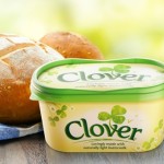
 BrandOpus has created new designs for Clover spreads, with new branding using a ‘countryside horizon’ graphic.
The consultancy began work on the project in April this year, having previously worked with parent company Dairy Crest on previous projects including Country Life butter.
BrandOpus created a new identity that aims to appeal to new consumers, while remaining recognisable to existing customers.
Paul Taylor, BrandOpus creative director and partner, says, ‘The designs wanted to bring to life the very core of the brand name, Clover.
‘We wanted to represent the idea of real clover – a natural-growing ingredient that lives within the pastures – in the context of a pasture or field.’
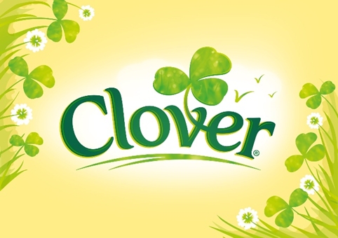
The new logotype is ‘softer’, according to BrandOpus, with a Clover symbol that is made to appear to grown from the typographic marque.
The name is positioned on an illustrative ‘countryside horizon’, surrounded by pastures of clover with birds shown in the distance.
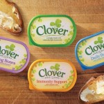
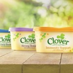
Clover is also launching three new Clover Additions products – Clover Strong Bones, Clover Daily Boost and Clover Immunity Support, with designs created by BrandOpus.
The Additions range is distinguished form the core range using images of coloured wildflowers.
You must be logged in to post a comment Login