
 BrandOpus, a global strategic brand design agency, has unveiled a bold, iconic redesign of Rowse honey. The work continues the five-year relationship between agency and brand, and comes shortly after The Grocer revealed that Rowse has toppled Marmite as Britain’s best-selling spread.
Following the original redesign of Rowse Honey by BrandOpus in 2010, the brand saw a significant uplift in sales. Now the nation’s best-selling spread and leading honey brand, it was time to create an iconic new presentation for Rowse that would underpin their status as the foremost experts in honey, and which would help educate consumers about the different usage occasions that Rowse Honey has to offer.
The 2010 redesign established key visual equities that the consumer uses to recognise the brand such as the bee, which comes to the fore in the new design, allowing the brand to behave confidently and like the market leader it has become.
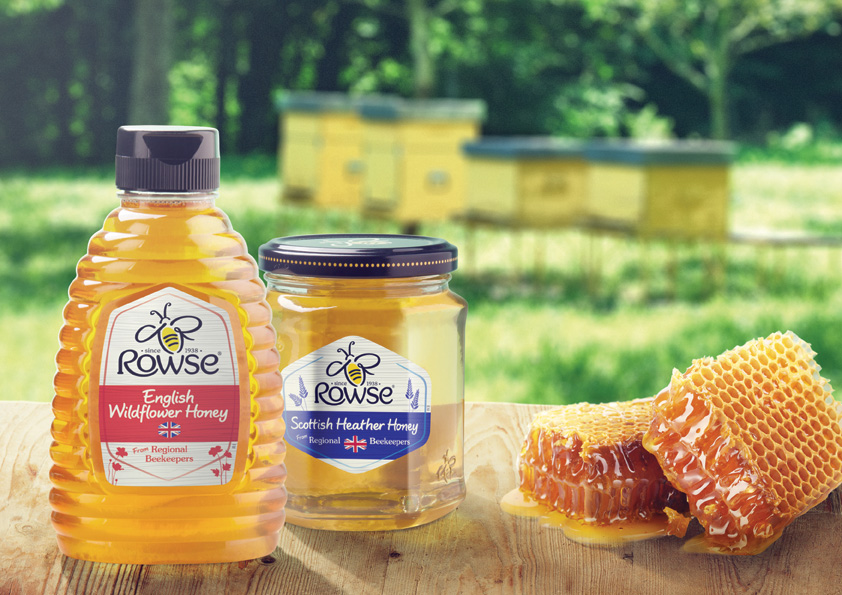 The hexagon device on the label is established as a visual framework, adapted stylistically, and used across the entire portfolio to communicate the traits of each range in a unified manner.
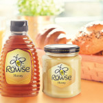
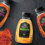
The portfolio itself has been organised by usage occasions to help the consumer not only find their favourite breakfast honey, but also to explore new varieties, such as honeys selected specifically for use in cooking, or Supahoney, a comforting winter warmer.
Kirstie Jamieson, marketing director at Rowse Honey says of the new look, “Rowse Honey has enjoyed amazing success over the last 5 years and it is critical that we maintain the brand momentum. Our continued partnership with BrandOpus is integral to this to increase consumer understanding of the many exciting and varied uses for honey.”
New look Rowse hits the shelves of stores nationwide in the UK in March 2014.

You must be logged in to post a comment Login