REAL Sparkling Fermented Tea was launched in 2017 to cater for foodies who were increasingly choosing an alcohol-free lifestyle. Until then the only choices had been sugary soft drinks, water or alcohol-free alcohols(!) – which neither satisfied their palette or complemented their food. Using only the finest loose-leaf teas, naturally fermented with no added flavourings, means that REAL has a sophisticated nose and mouth-feel that is on par with premium sparkling wines and Champagnes. Since its launch, REAL has experienced strong growth, reflecting the fact that 40% of consumers are now cutting back on alcohol consumption and one in four 18-24 year olds going completely alcohol free.
Whilst the design to date had worked well for the start-up phase of the brand it needed to better reflect the level of sophistication of the 60+ Michelin star restaurants in which it was now stocked.
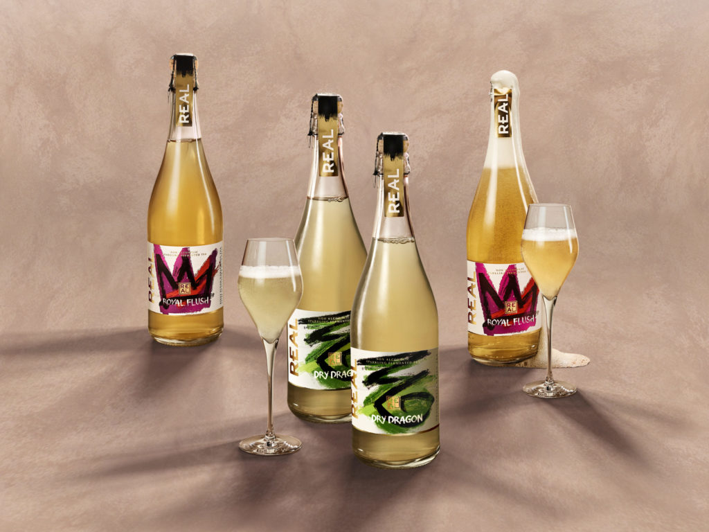
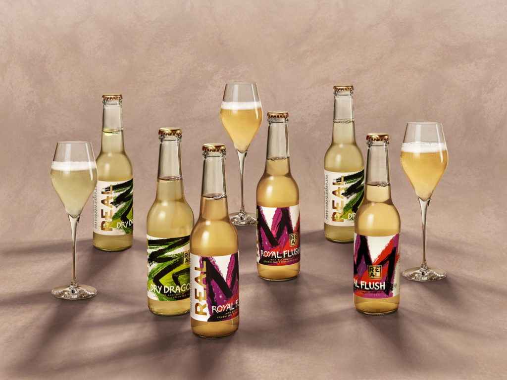
Butterfly Cannon was challenged to balance the brand’s raw, radical and disruptive, individualistic nature with the refinement of its carefully crafted products and the world in which it is now consumed. The design needed to be adaptable across the REAL range, working in harmony with the newly introduced full-size Champagne bottle and in a more leading role with the smaller single-serve format.
Working hand in hand with a very passionate and creative client team we quickly identified the ‘primal’ quality of the brand to be our leading inspiration. Inspired by Founder, David Begg’s love of art, progressive contemporary (street) art was our vehicle to capture this with the requisite level of sophistication.

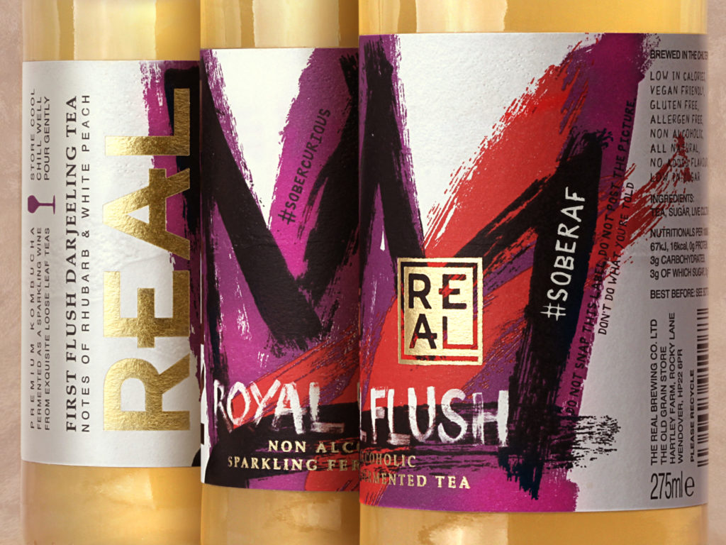
The bottle labels became our canvas, with each variant’s name and character articulated by a single brush stroke icon; such as the crown for Royal Flush – made from first flush Darjeeling tea, often referred to as the ‘Champagne of Teas’ and the lizard eye for Dry Dragon – produced using an exquisite pan-roasted Dragonwell green tea from China. These were emblazoned over clashing textural colours inspired by the flavour profile of the liquids, overall representing the bold, expressive and pioneering attitude of the brand that goes into making the sparkling fermented teas themselves.
REAL is a brand with something to say, so intertwined into each design in a bespoke hand scratched typeface, are updateable and challenging topical messages that reflect the brand’s activist mentality and help promote positive change, using hashtags such as #SoberAF and #BreaktheMould.
The new company logo is inspired by Japanese Inkans and Chinese Chops; artistic signature seals that pay respect to the origin of some of its teas and the individualist nature of the brand. Gold foil is overlaid sparingly over the primal icons as a seal of quality and the heavy canvas-like embossed paper is a signifier of authenticity and craftsmanship.

A truly artful piece of design.
“Working collaboratively with us, Butterfly Cannon took the time to understand and get to the heart of what we are all about; we are not interested in imitating our traditional alcoholic cousins and believe we are as good as, if not better than, most sparkling wines, and we wanted to reflect that. Their exceptional work has given us a new brand identity and packaging that reflects our own unique personality, speaks to our origins and approach to life and stands us in good stead for our future innovations.”
David Begg, Founder of REAL Kombucha

“It’s not often that you come across a brand that is as innovative and different as REAL, with the vision to allow us to create such a bold, expressive, multi-layered design that feels truly different to anything else out there; we are exceptionally proud of the end result.”
Hannah Watkinson, Senior Designer at Butterfly Cannon
Source: Butterfly Cannon

You must be logged in to post a comment Login