
 Leahy Brand Design has created the branding and packaging for new honey brand Clarks Clear Honey.
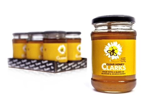
Clarks produces maple syrup is now aiming to move into the honey market and claims its product is the first blended British honey.
Leahy Brand Design was appointed after creating the identity for Clarks maple syrup, which is based on a maple leaf ‘splat’.
This ‘splat’ motif has been extended on to the honey packaging, which features an illustrated flower and a bee.
The consultancy was tasked with developing an identity that would differentiate the honey from Clarks maple syrup, as well as competitors Rowse and Gales, and would show support of British bee farmers.
Tim Leahy managing director of Leahy Brand Design, says, ‘We created a simple, approachable, fun design and tone of voice for a category that has become rather worthy and “stuck together” on purity messaging.’
The new honey is launching in shops from this month.
You must be logged in to post a comment Login