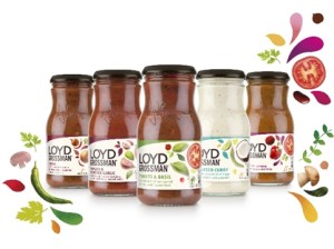
 Coley Porter Bell has created new packaging for Loyd Grossman’s range of cooking sauces, aiming to reflect the brand’s ‘vibrant flavours’ positioning.
The consultancy began work on the project in August last year, having won the account for parent company Premier Foods that summer.
According to Stuart Humm, creative director at Coley Porter Bell, the new packs look to better reflect the flavours of the sauces, and the ‘strong, animated and interesting’ character of former Masterchef presenter Grossman.
Humm says, ‘Ultimately, creating an adaptable and functional identity is the primary consideration, so it’s important that the branding stands out for Loyd Grossman as a brand name, but also be something that fits with the industry.’
The consultancy retained the existing jar structure, creating a new photography style and graphics to be used across the packs.
The previous image of Grossman’s face on the front of the packs has been changed to show more ingredient illustrations, with the face image moved to the back of the packs, according to Coley Porter Bell.
The label shape – previously designed to look like an open recipe book – has been changed to straight edges, with accent colours reflecting the sauce flavour within.
The existing brand marque has also been retained, and Coley Porter Bell introduced new ‘rich accent colours’, which it says ‘reflect the vibrant flavours of the product range.’
Humm says, ‘It’s about heroing the ingredients of the sauces and what’s good about them.’
He adds, ‘The new look is dynamic and takes cues from the quality ingredients in the sauces and targets people who are passionate about food, but don’t necessarily have the time to cook a meal from scratch.
The new designs are shown across all the Loyd Grossman sauce products, which include Italian, Thai, Indian and Tex-Mex ranges.

You must be logged in to post a comment Login