
 Which style should you go with?
As a brand, you can either choose to create packaging that is bursting full of colour or the complete opposite with a stripped back minimalistic design. This decision heavily depends on what you want your brand to portray and your positioning within the market.
Today we will be looking at the pros and cons of both.
Colour
What words do people associate with big, bold and colourful packaging?
- Fun
- Creative
- Confident
- Delicious
 Brands exploding with colour and bold print on pack will appear confident in their product and sure of the claims they make. The colours on pack may also help increase appetite appeal by representing the flavours inside. Something that is bright on shelf will also help achieve shelf stand out from a distance.
Risks
When using colour, it is important to ensure the colours used don’t look too artificial as this can actually put people off. Anything too artificial will appear unhealthy. Another risk is your competitors on shelf potentially using bold colours too and you fading into the background. This is why at Slice we do brand positioning for our clients before starting any design work so we can have an extensive look at your competitors.
Minimalist
What words do people associate with minimalistic packaging?
- Luxury
- Simple
- Elegant
- Healthy
 There are many different variants of minimalist packaging, from simplistic monochrome packaging to a design that is completely stripped back to just the brand name. There has definitely been a trend in muted packaging recently from chocolate bars to alcohol.
People often associate minimalistic packaging with premium. We’ve had many clients come to us and say they want their brand to appear expert so they want black, white and gold packaging. So what are the risks of this?
Risks
Your first risk is not standing out on shelf. If your packaging is too simple and stripped back, there’s the chance that it may not stand out against your bolder competitors. If you want to position your brand as ‘premium’ but priced competitively, your customer may be put off by thinking it is far more expensive than it actually is at first glance. Also, if you want a clear front of pack with just the brand name, the consumer may end up searching for the claims themselves on pack – something they will not want to do!
Examples of Both
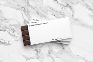 Mandarin natural chocolate is an example packaging that is very minimalist. The front of pack simply includes the brand name and the intensity level of the cocoa – something that is a key USP for them.
We asked one of our team their thoughts on the packaging below…
Answer: This pack is quite striking as it’s so unusual. I am not sure how well it would work on shelf though as there is no appetite appeal
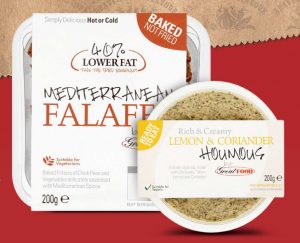
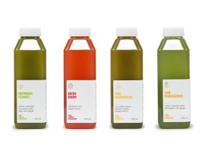
The Juice Cleanse are another brand who have opted for simple packaging. The packaging clearly states the benefit of the product before you even see the brand name – a bold move but hopefully one that pays off if you grab the consumer by the clear benefit. This type of packaging emulates transparency and honesty. Listing the ingredients on the front of pack proves they have nothing to hide.
 We asked one of our team their thoughts on the packaging below…
Answer: This pack gives off an earthy, organic vibe straight away. I like that it tells you the benefit before the flavour to capture your attention.
Now onto colour. Pukka are known for their intricate details on pack to emphasise the heritage of their flavours. This certainly stands out on shelf against their competitors. The use of patterns instead of block colour grabs your attention and clearly shows that the reason you should pick them up is taste. Whereas other tea brands focus on tradition – Pukka are all about the flavour!
We asked one of our team their thoughts on the packaging below…
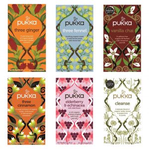 Answer: I love the Infusion of colours, it’s somewhat mesmerising to look at! I can imagine this wouldn’t be everyone’s cup of tea though (ba-dum-ch)
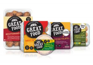
When we redesigned Great Food’s range we wanted to really emphasise how great the product tasted and created a design that is bold, impactful and proves Great Food is ‘Braver with Flavour’! You can see below the effect colour and bold type makes comparing the old and new designs.
We asked one of our team their thoughts on the packaging below…
Answer: Great Food automatically shouts “tasty” to me and is full of impact. I would definitely pick this up on shelf to read more.
In conclusion, there is no right or wrong option. You should work out exactly what your brand stands for and how you want consumers to see this. If you do go with minimalist packaging you have to be sure that the product/brand can rely on this.
As Kevin Keating at PKG states: “Exceptional minimalist design often has a single feature that stands out above all else. In the food realm, this requires understanding of a brand’s unique value proposition (UVP). In other words, designers must understand why their customers typically choose their products, and make this concept the focal point of their design.”
The opportunity you have with both is to be clear to the consumer, whether that’s through bold type, colour, highlighting the USP or flavour differentiation.
 Which type of packaging do you prefer?
Article by Charlotte Burrows, Account Manager at Slice Design Ltd.
About Charlotte:
Charlotte Burrows has been an Account Manager at Slice Design for over a year now and oversees all client relationships, strategy & planning as well as ensuring all work in the studio is delivered to it’s deadline.
Source: Slice Design Ltd.
You must be logged in to post a comment Login