
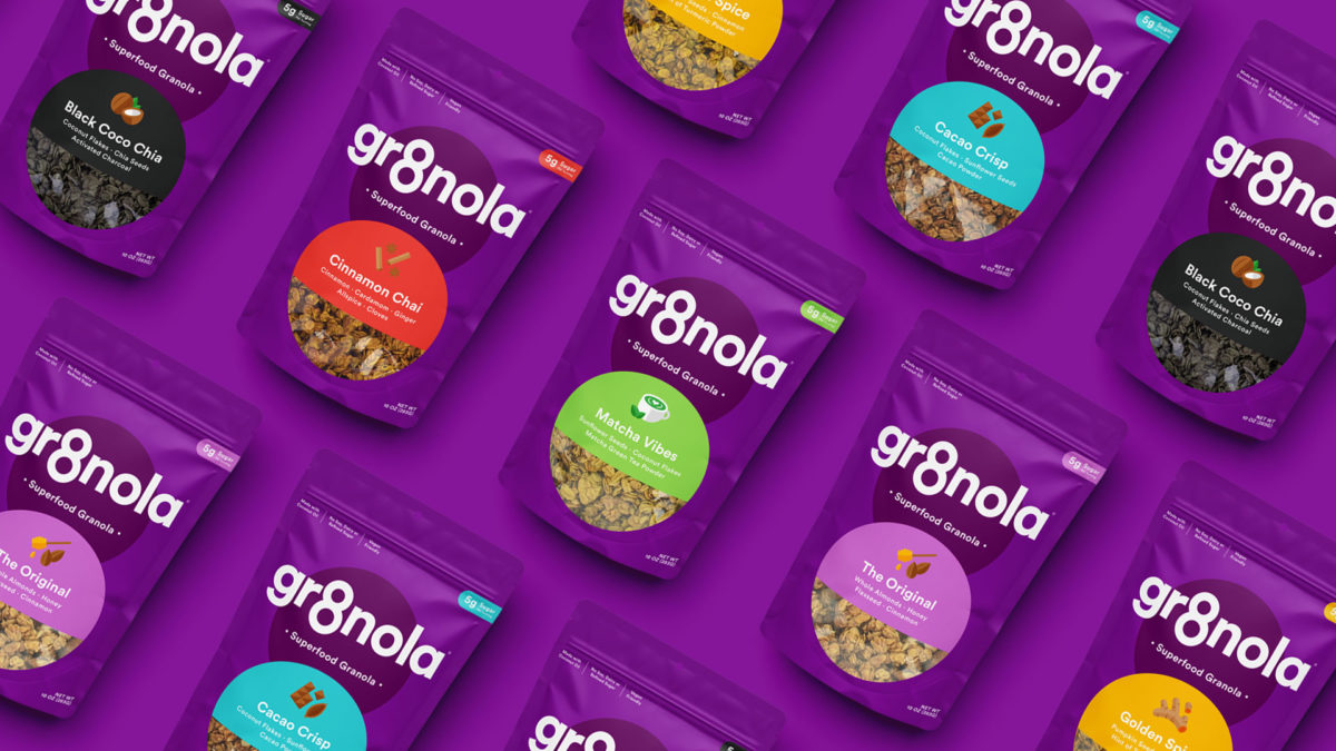
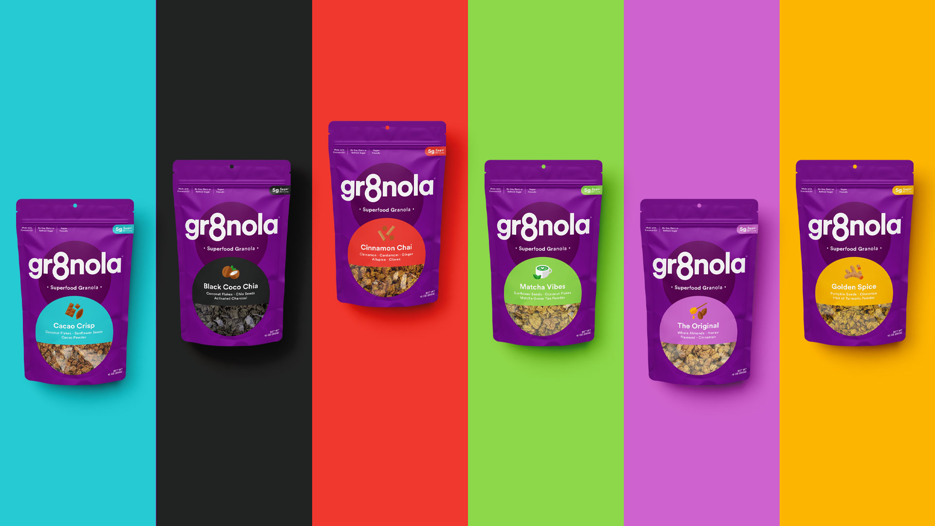
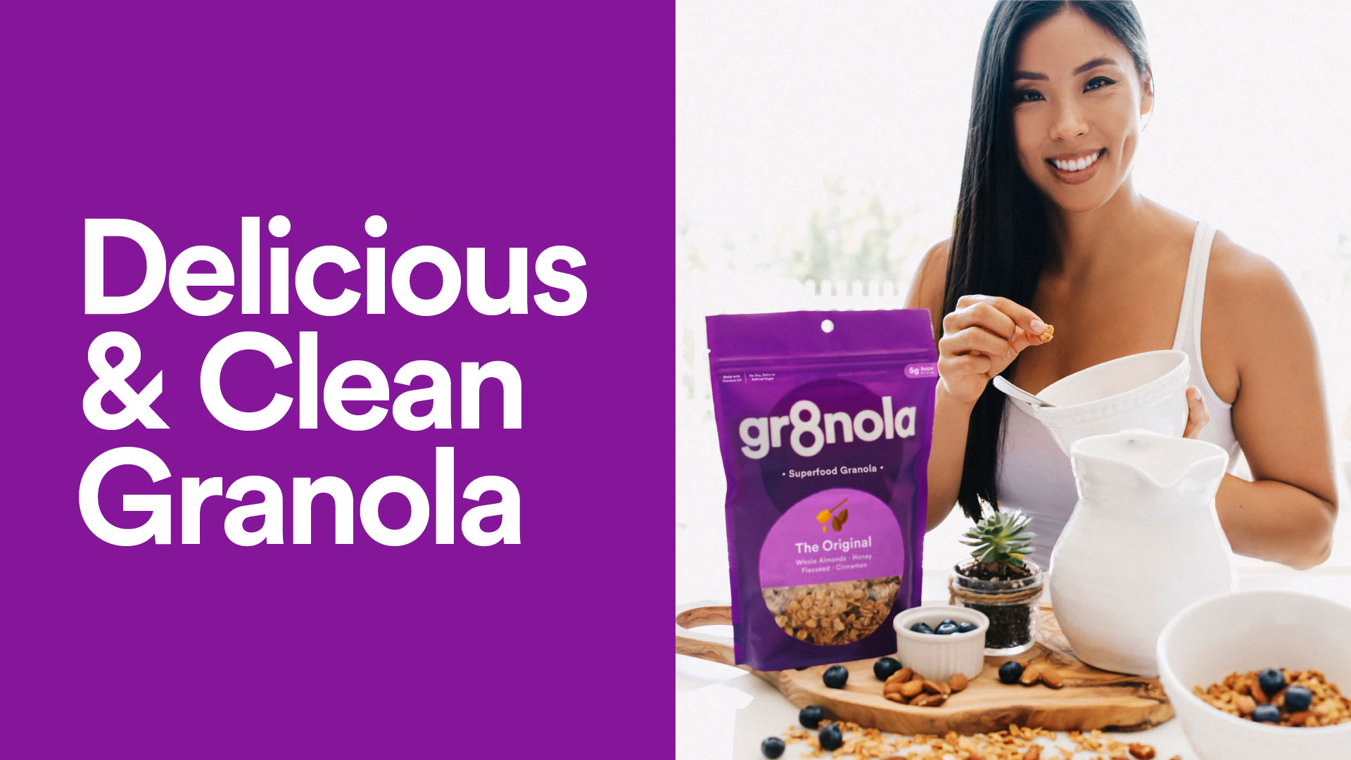
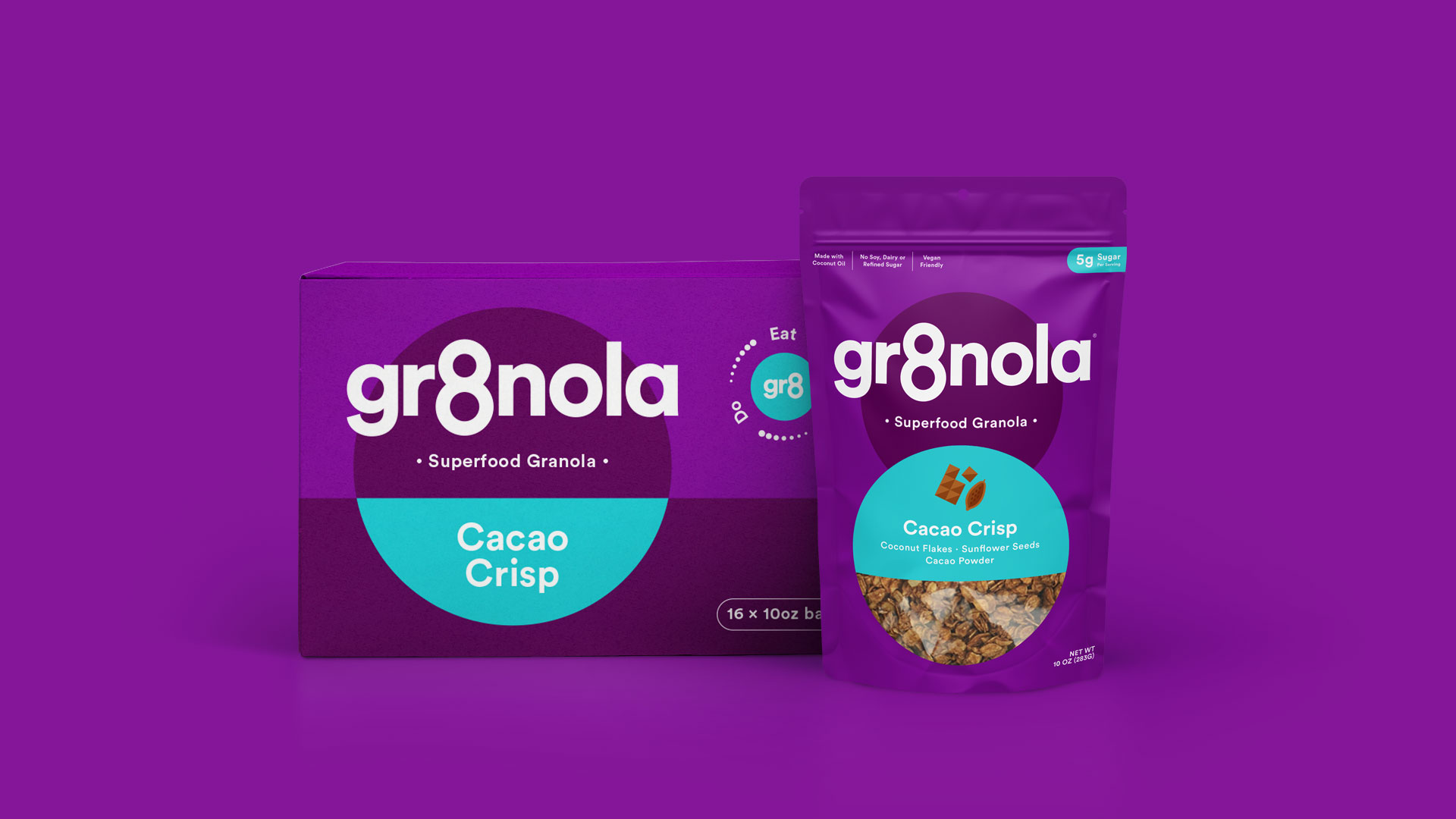
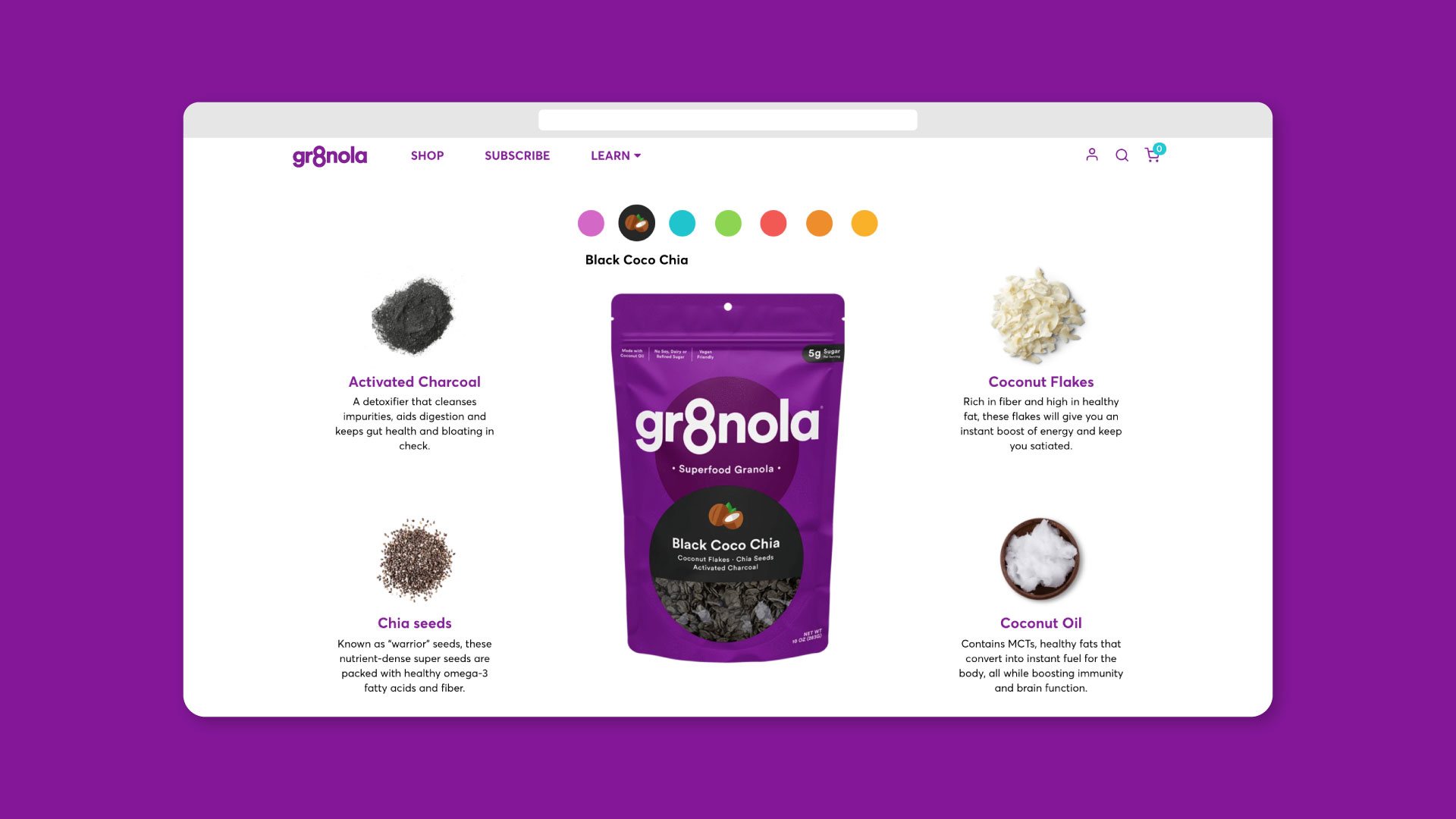
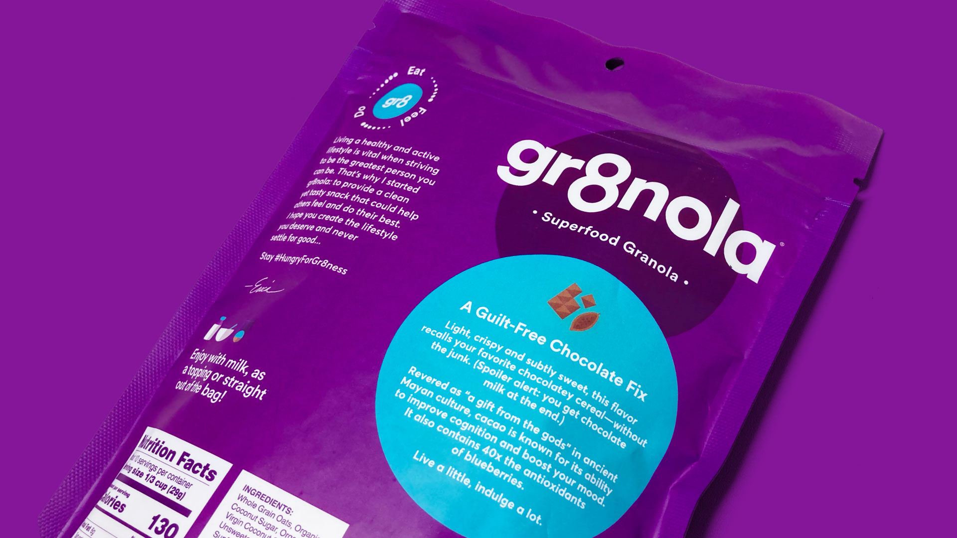
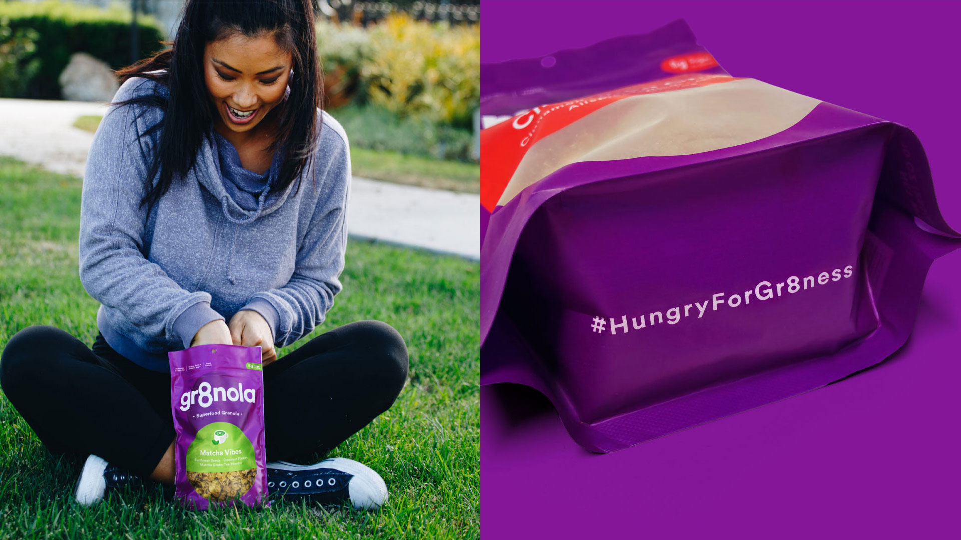
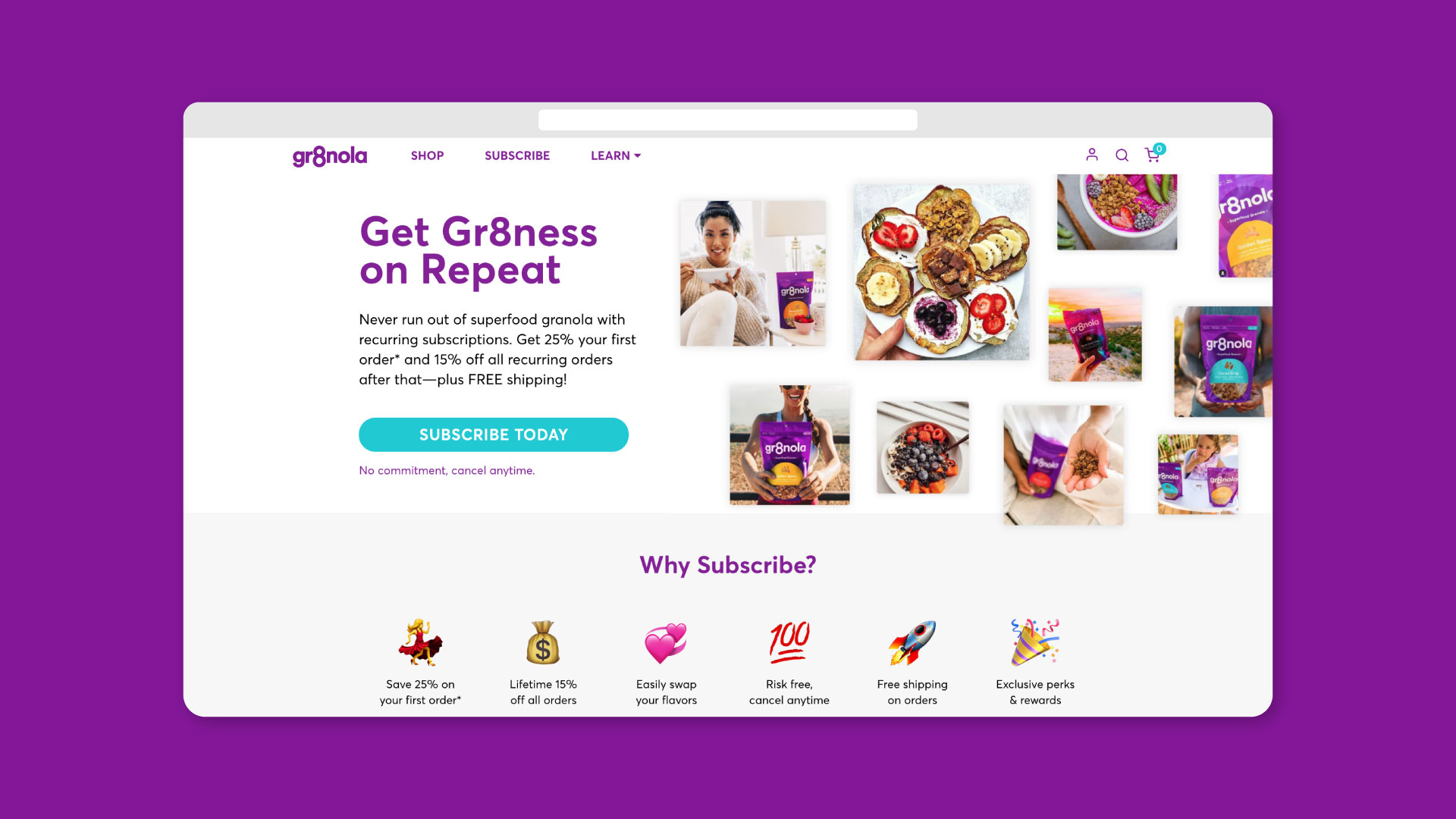
Deuce Studio have been working with Gr8nola for over 4 years, when they first rebranded the US based superfood granola brand, building upon that rebrand the agency has added some extra taste appeal and approachability with a set of fun flavour illustrations and extra helping of colour in the form of a semi circle device.
The original rebrand introduced a new and stand out predominately purple colour scheme for the cereal category combined with an honest and aspirational tone of voice, to inspire consumers to eat, be and do gr8 things. The overall brand design language is simple and bold to help cut through the noise of the overly fussy category to create real standout on shelf.
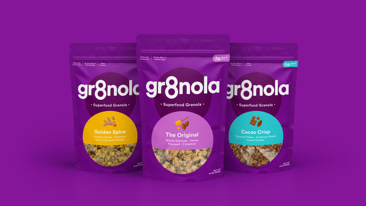
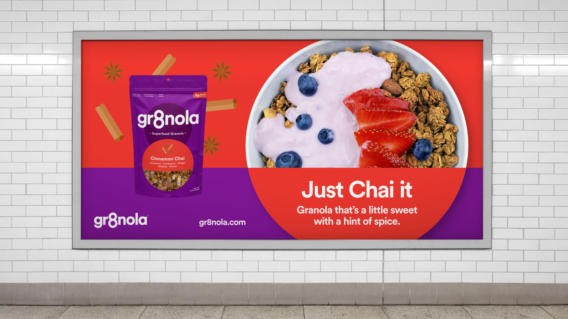
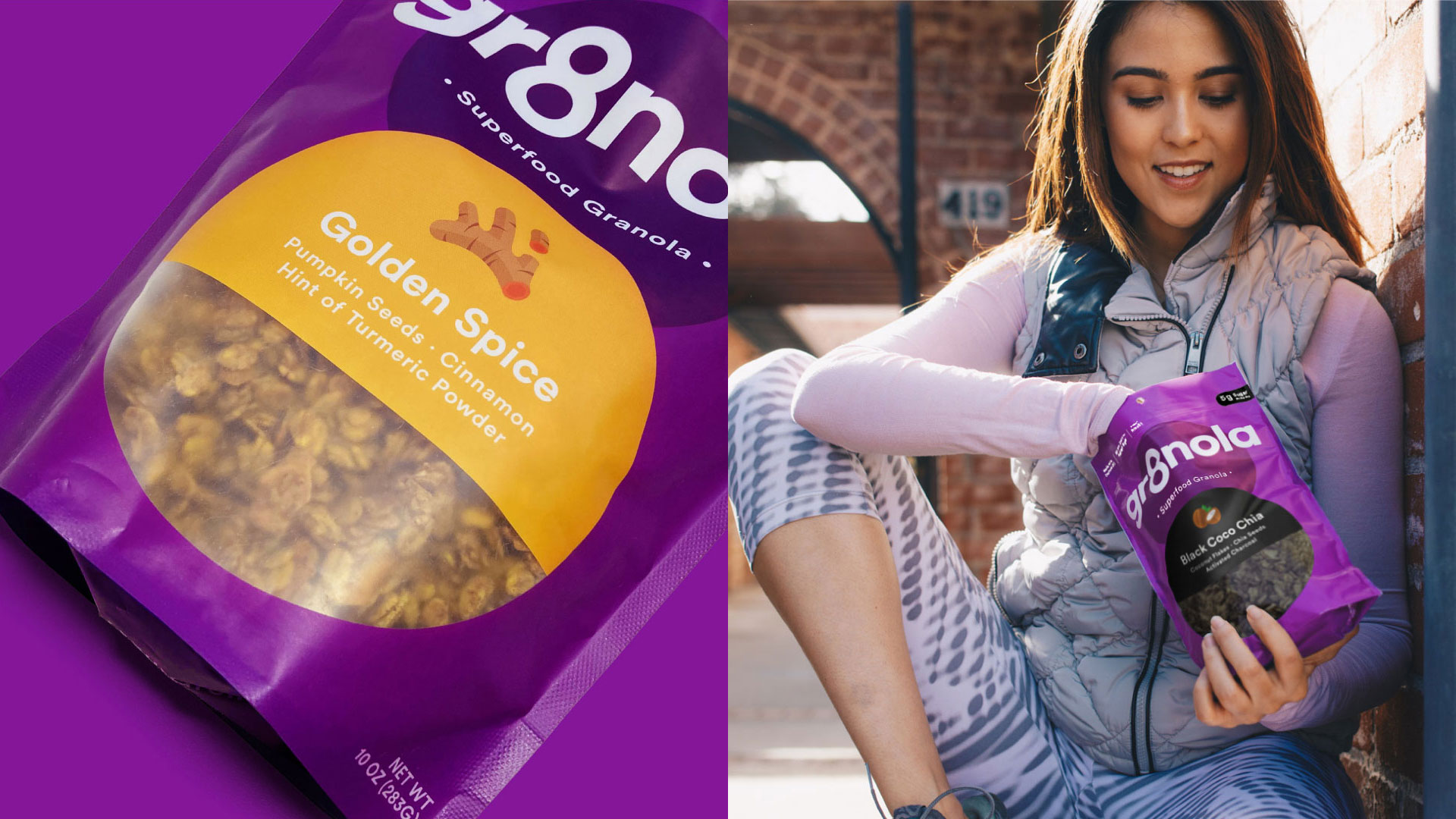
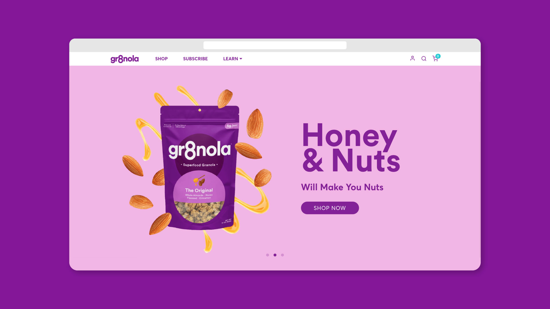
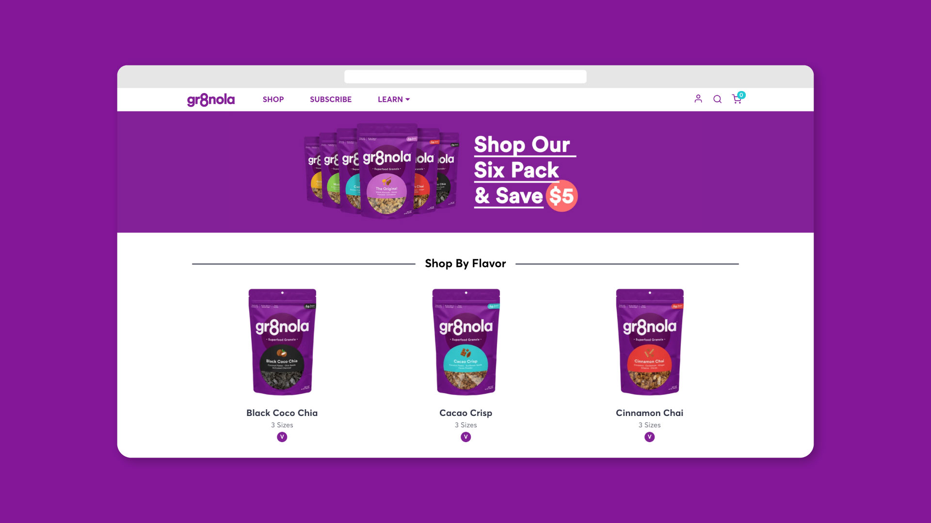
The packaging refresh confidently restates these original values and introduces new elements to push this further by adding an extra level of personality and enticing elements such as the new flavour naming system and fun illustrative icon set.
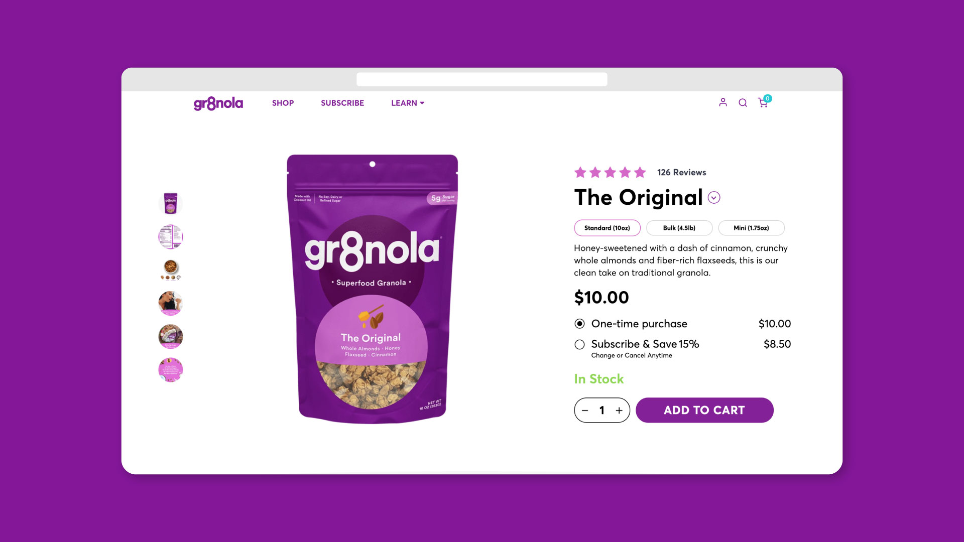
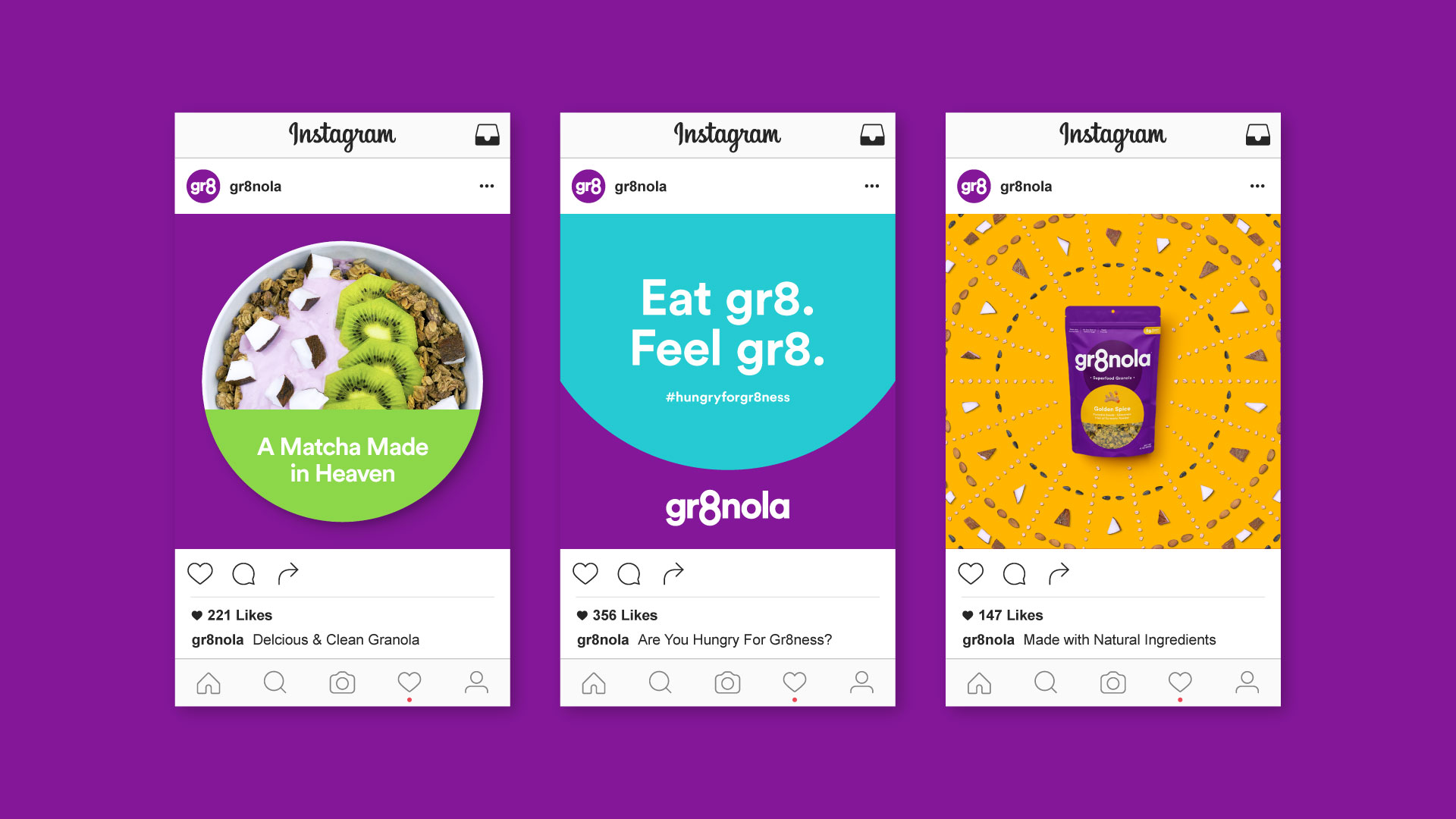
Deuce Studio not only look after Gr8nola’s brand and packaging, but all of their communications including e-commerce website, advertising and general up keep of the brand across print and digital touchpoints.


Source: Deuce Studio
You must be logged in to post a comment Login