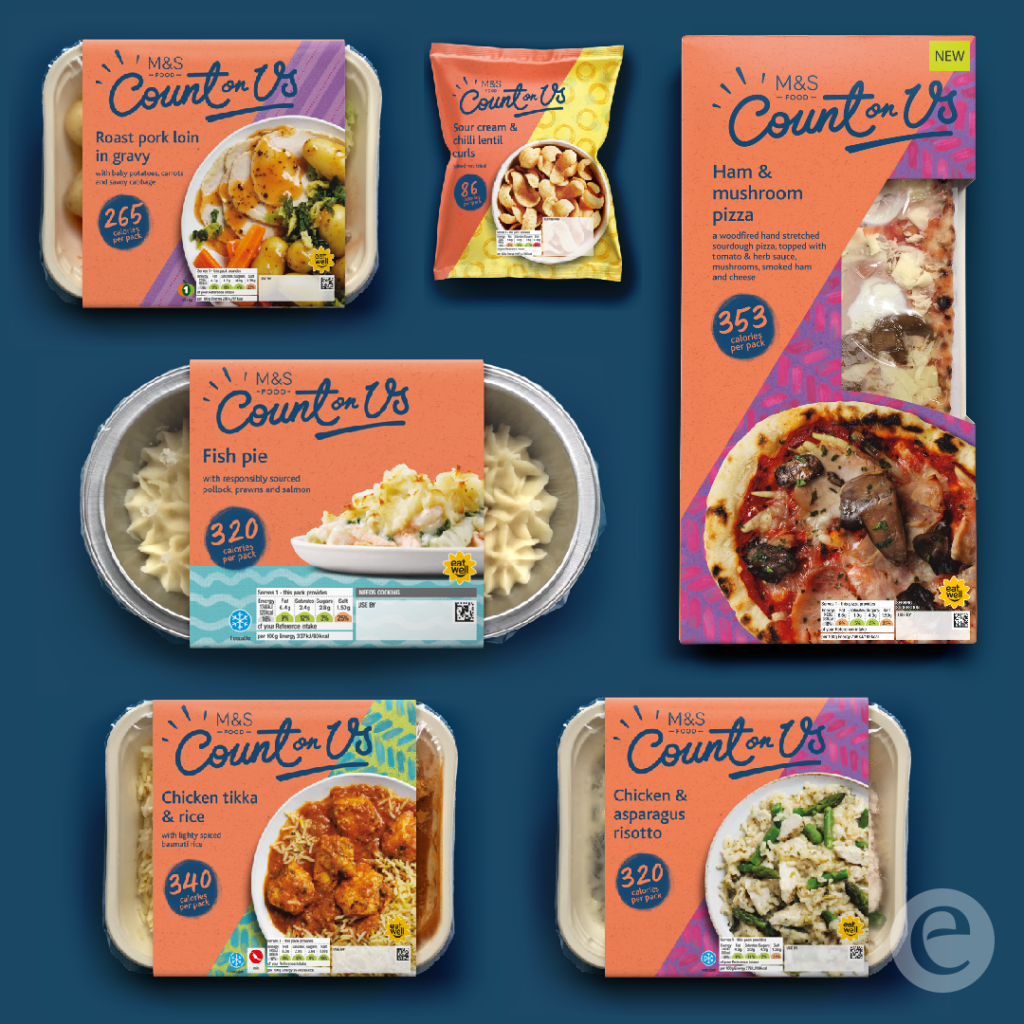
M&S’s low calorie food range ‘Count on Us’ is successfully countering declining interest in traditional calorie counting with a re-brand created by Elmwood that resonates with health conscious consumers.
M&S launched its Count on Us low calorie range of food in late 2019, as an array of other weight loss tools and practices evolved. However, consumers came to see calorie control as out-dated and less relevant and as a result, the Count on Us brand was losing appeal and meaning.
Elmwood’s strategy was to evolve the brand’s association with the best taste – so consumers didn’t feel they were compromising on flavour, while continuing to emphasise the range’s low calorie offering. This was driven by insight that consumers seeking a healthier life, shop for visual inspiration – a want unmet by the diet world’s redactive visual language.
To achieve vibrancy and inspiration while also better demonstrating greater food values, a transformation of the category aesthetic was needed.
Elmwood moved Count on Us from a functional calorie-controlled proposition and generic own label offering to an emotional brand which is driven by a strong point of view which provides support and inspiration in a way that was uniquely M&S. ‘Count on us’ was a passive promise, the evolution was epitomised in the idea of the more dynamic and inspiring ‘count on us to …’ and ‘bring flavour to life’.
The brand’s colour palette evolved significantly, from whites and greens to bold vibrant colours that amplified quality, inspiring flavours. Typography was also upgraded from a softer, thin typeface to a font with more personality to tell a story; as was photography – from light, uninspiring imagery to images that are dynamic, appetising and colourful. Elmwood also evolved the graphic language from curves and infographics to imagery with greater playfulness, excitement, inspiration and movement. Presentation of calorie information is also clearer.
The new design solution reflects flavoursome products with taste and goodness bursting to get out. This is achieved by a hand-drawn brand marque and design elements that bring flavour to life through movement and energy. All are set against a coral textured background with bespoke, illustrative background patterns. All is uniquely M&S and aids stand out in store and across the wider market.
Aude Brunel, Senior Brand & Marketing Manager at M&S said: “Elmwood were a breath of fresh air. They really understood the challenge and market, and everything they did was driven by insight. They easily adjusted and reacted positively to any feedback, produced great quality work and nailed the overall brief.”
Source: Elmwood

You must be logged in to post a comment Login