
THE CHALLENGE
Catalyst Cafe and Coffee Roasters had always felt that coffee was unfairly pigeonholed into coffee cups. With its deep-roasted colours, aromas and flavours, there was room for coffee on the plate too, especially as a co-star to flavours of rival intensity.
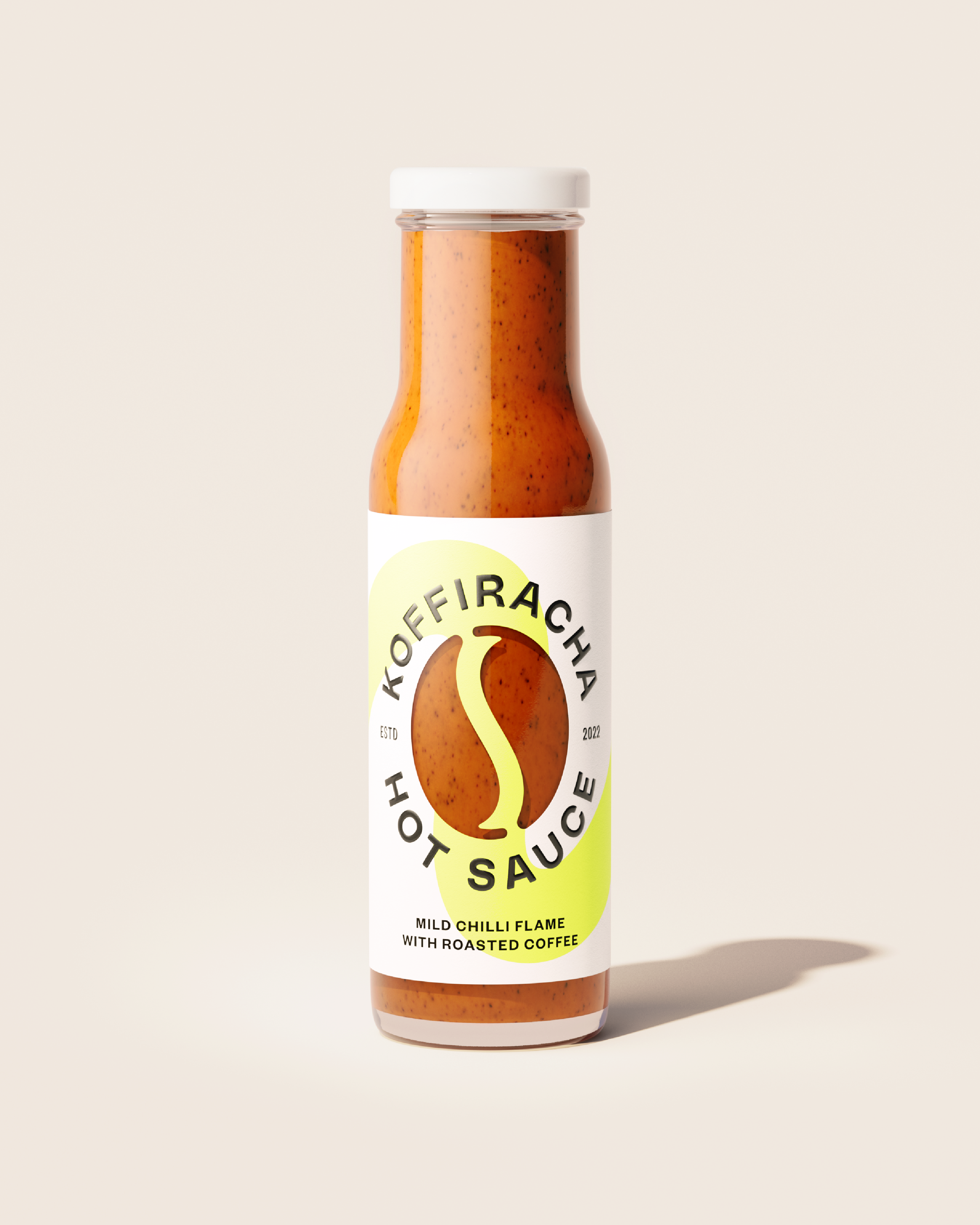
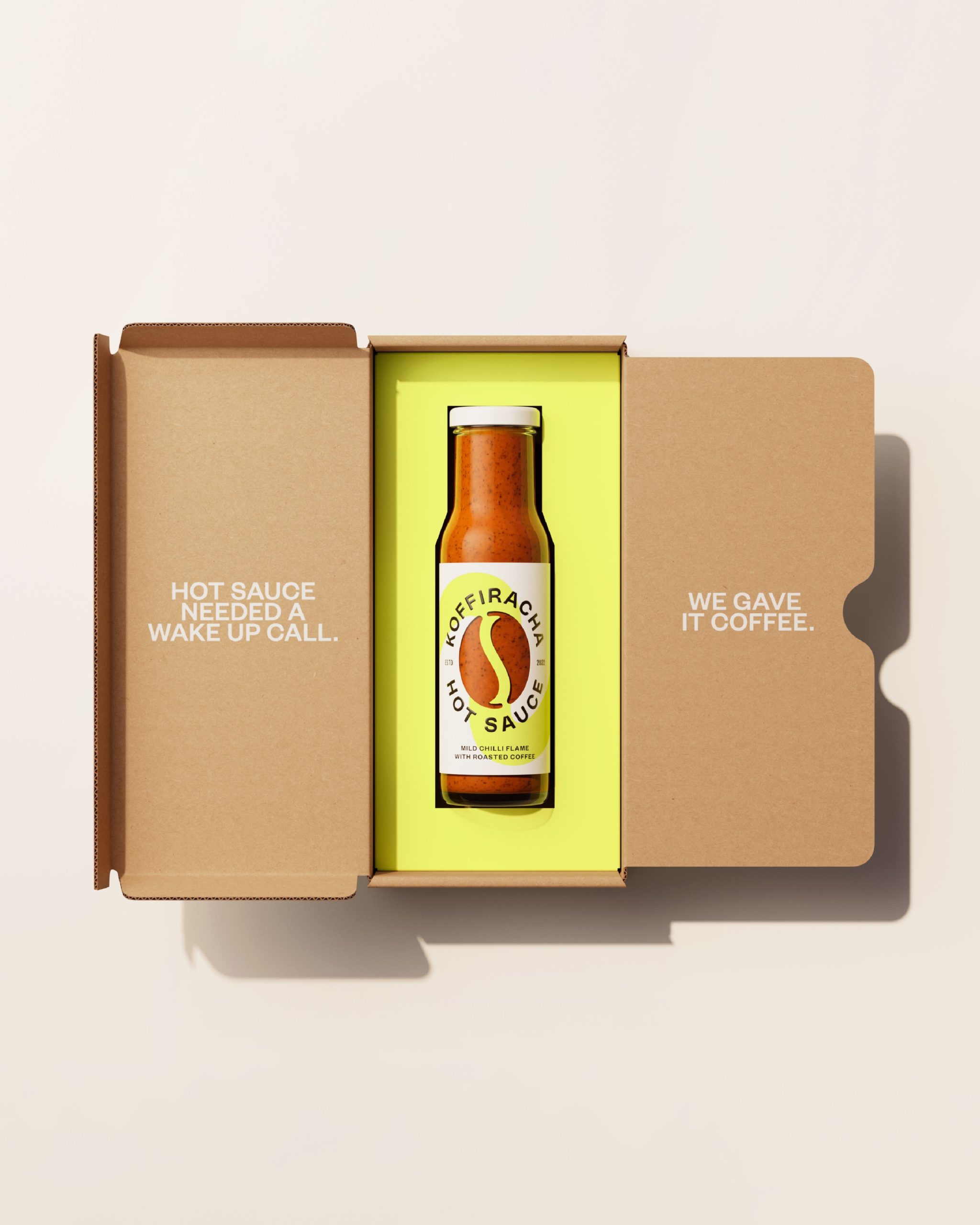
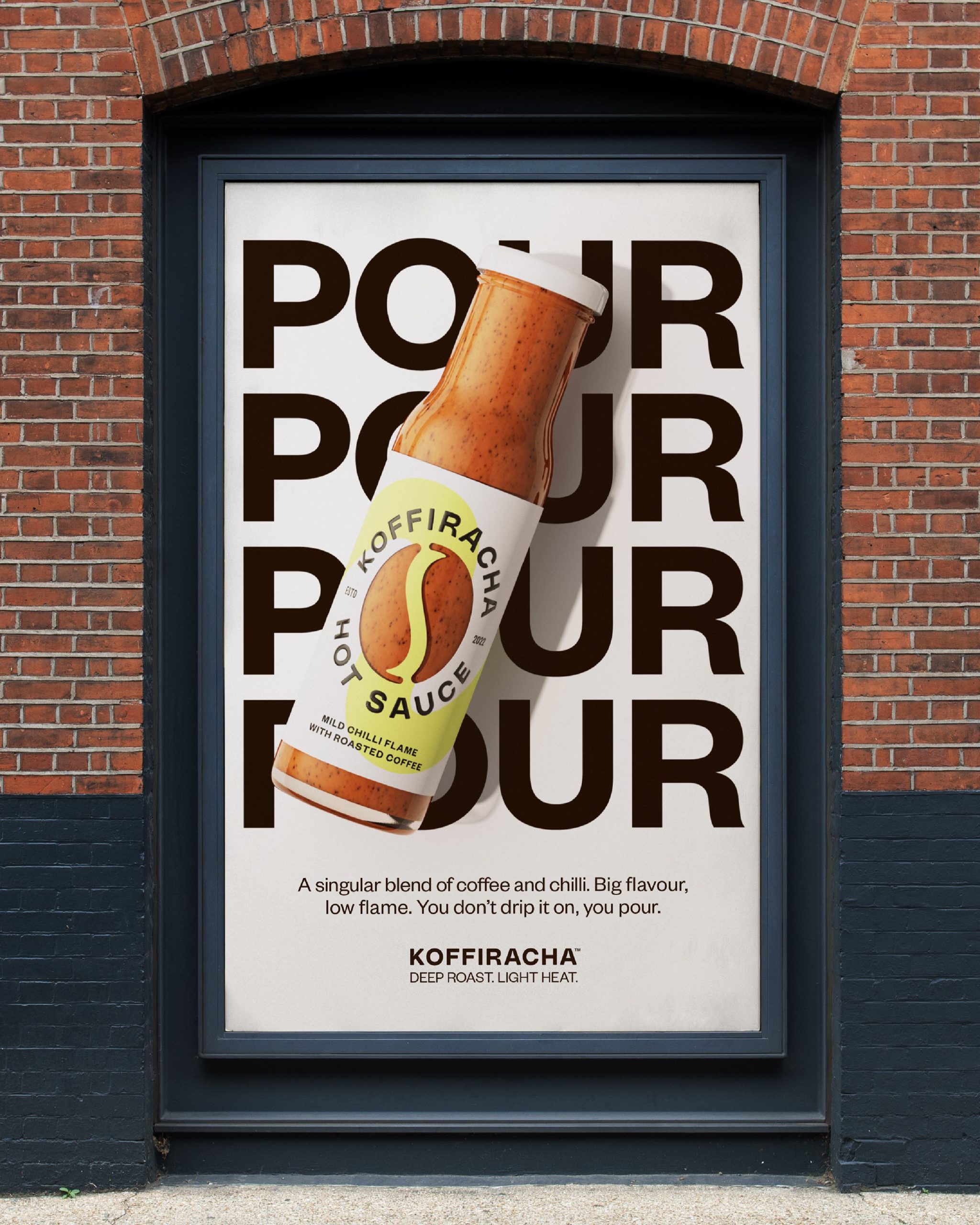
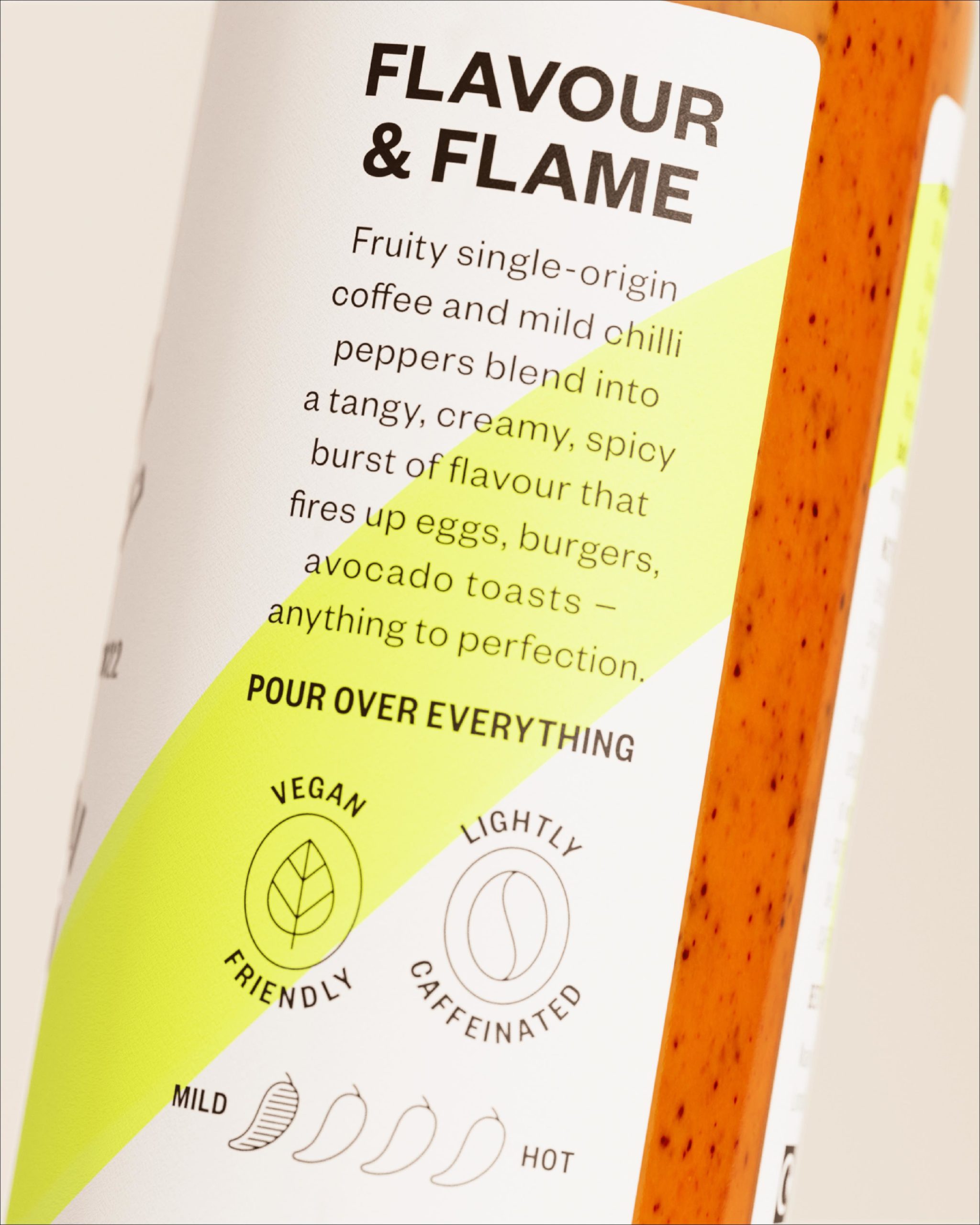
And so was born Koffiracha, Catalyst’s signature blend of coffee and chilli hot sauce. The chilli heats the coffee, the coffee tames the flame. It packs a punch with a mild kick. In a category built around machismo and hellfire, Koffiracha offers something else – a focus on flavour, subtlety and complexity. Less a five-alarm fire, more a bottled duet. You don’t add it drop by drop, you pour it over everything.
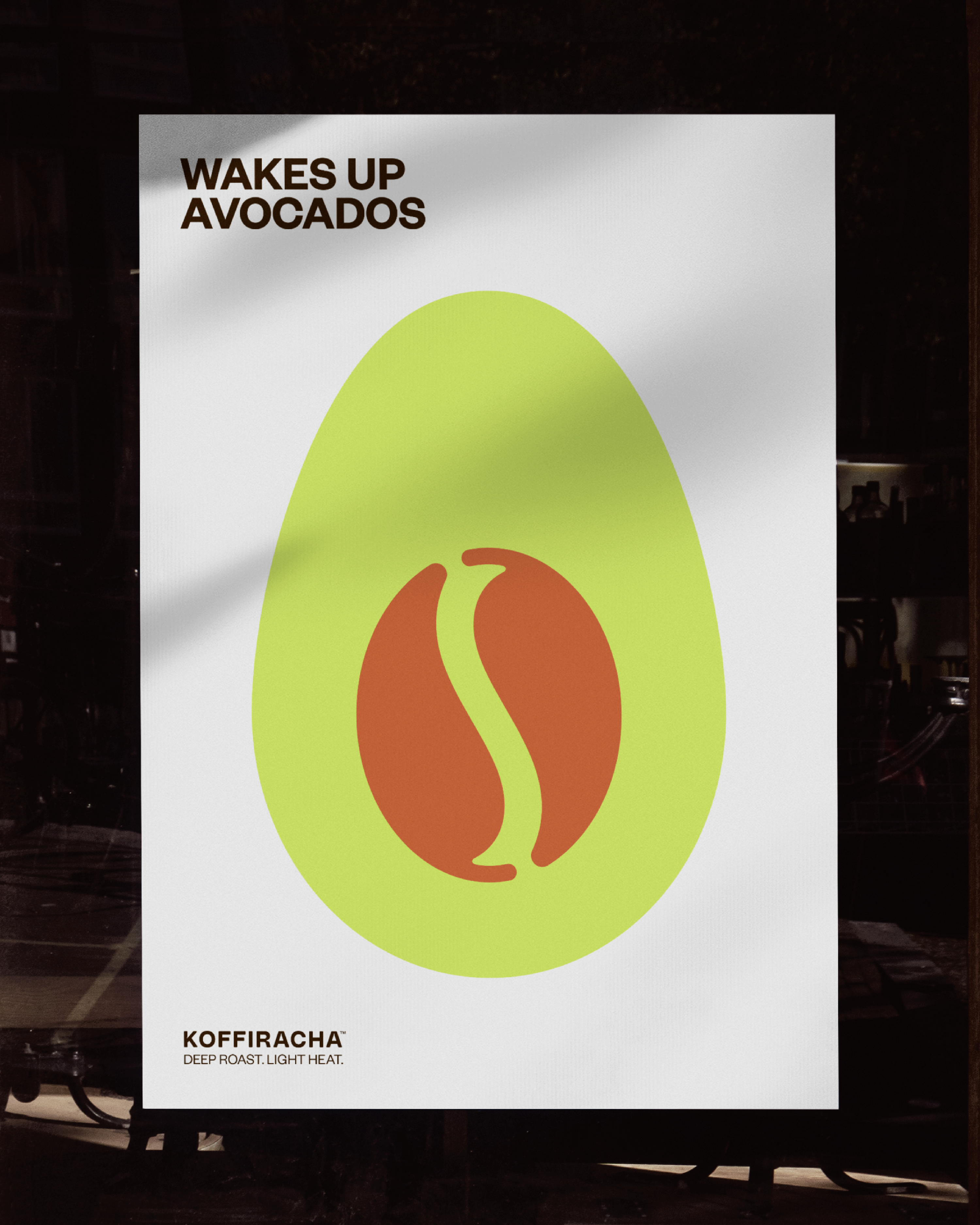
Perfect for eggs, avocados and all sorts of brunch.
Our challenge was to help Catalyst get Koffiracha ready for retail by creating a brand that ditched the flames and mushroom clouds, and stood out as a more flavourful type of hot sauce.
A hot sauce with something for everyone, from the Scoville bros to those looking to experiment with something less vanilla than Ketchup.
THE SOLUTION
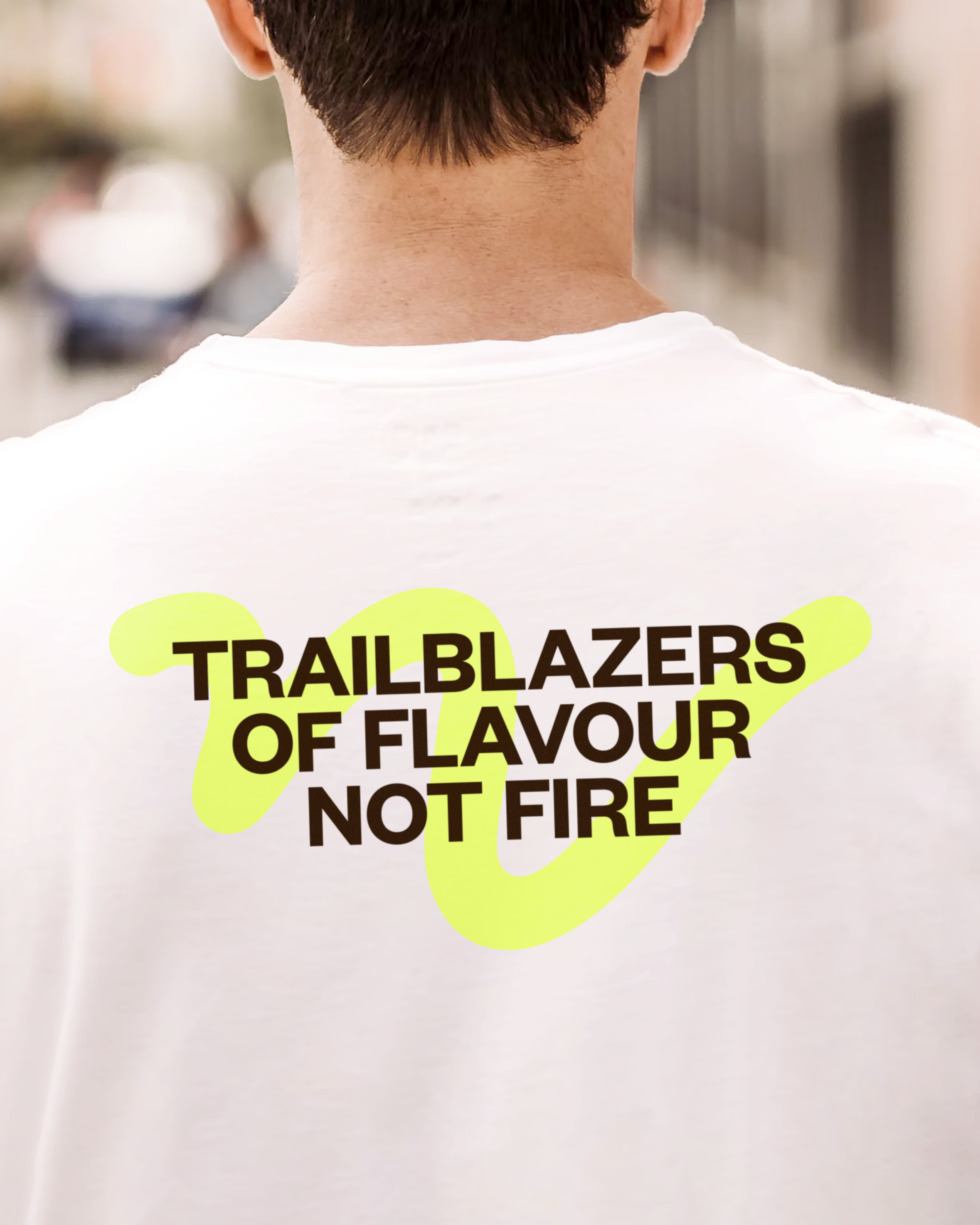
We decided the easiest way to stand out in the game of heat was to play it cool. So instead of fire, we focussed on taste. Like the name implies, this isn’t another invitation to melt your face off, it’s the chance to experience the delight of two lone-wolf flavours working so well together. So, strategically, two unexpected things working in harmony was always a guiding thought.
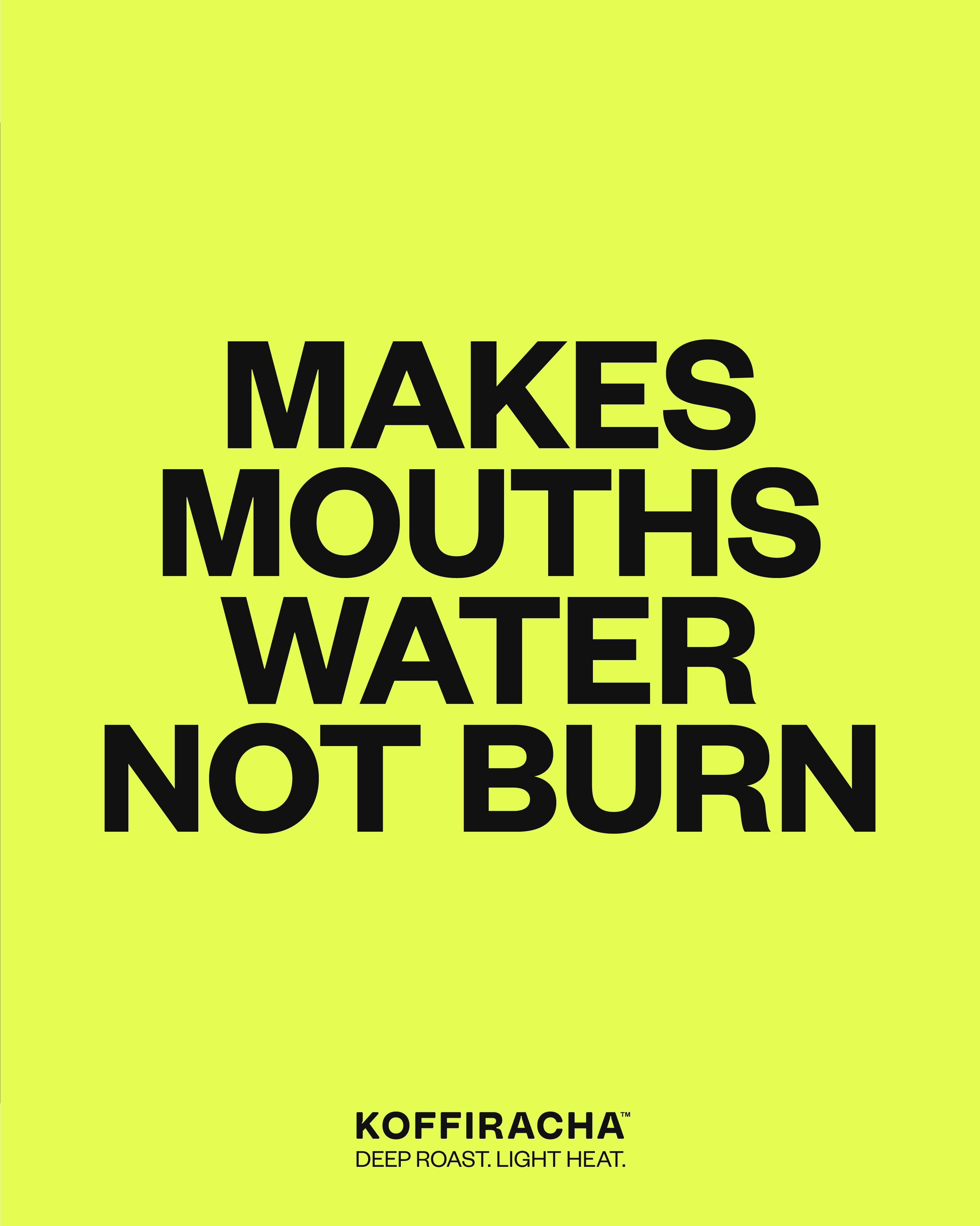
In a category dominated by dark, we went with light.
In a category of explosions, we showed restraint.
In a category of machismo, we added a playful touch.
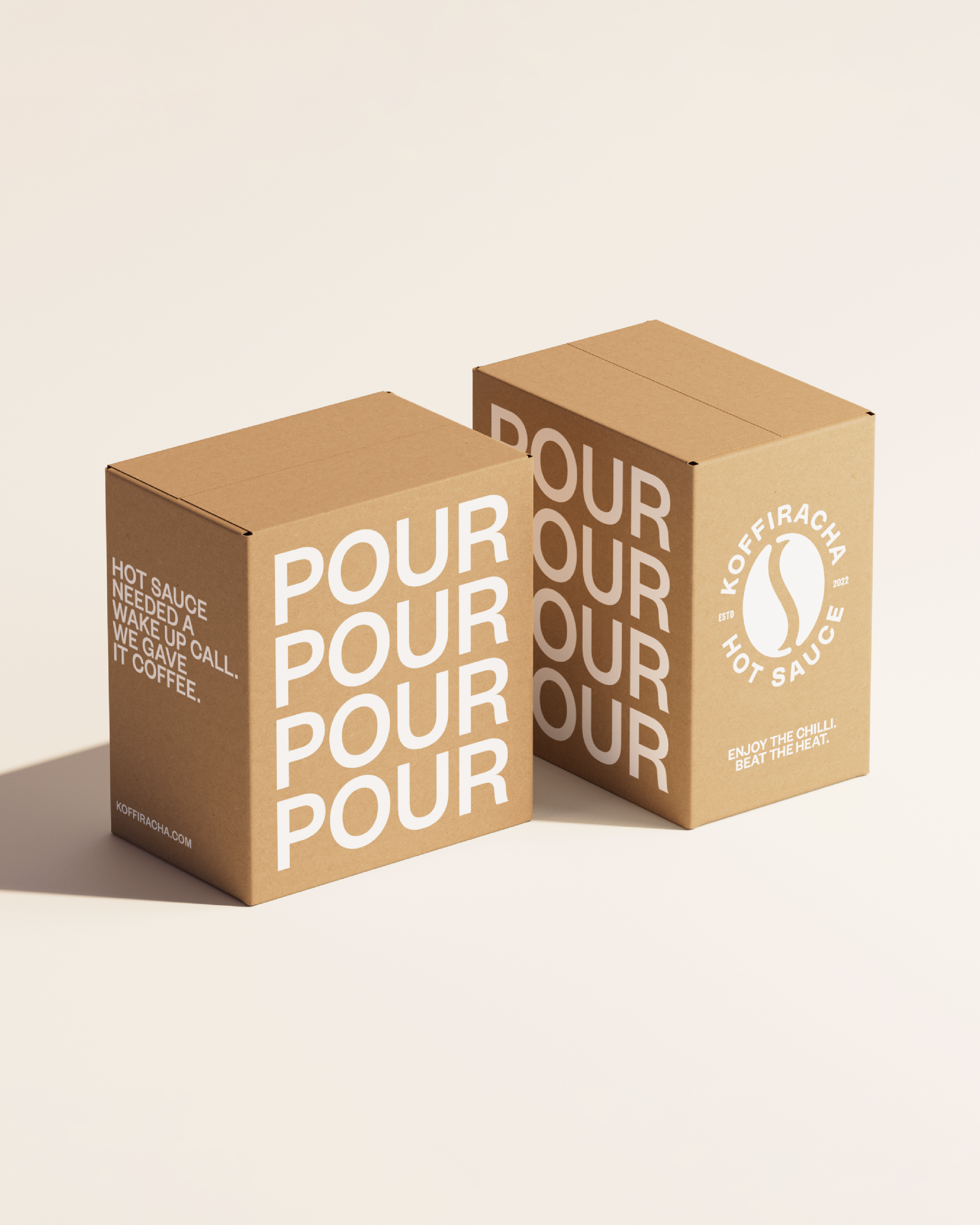
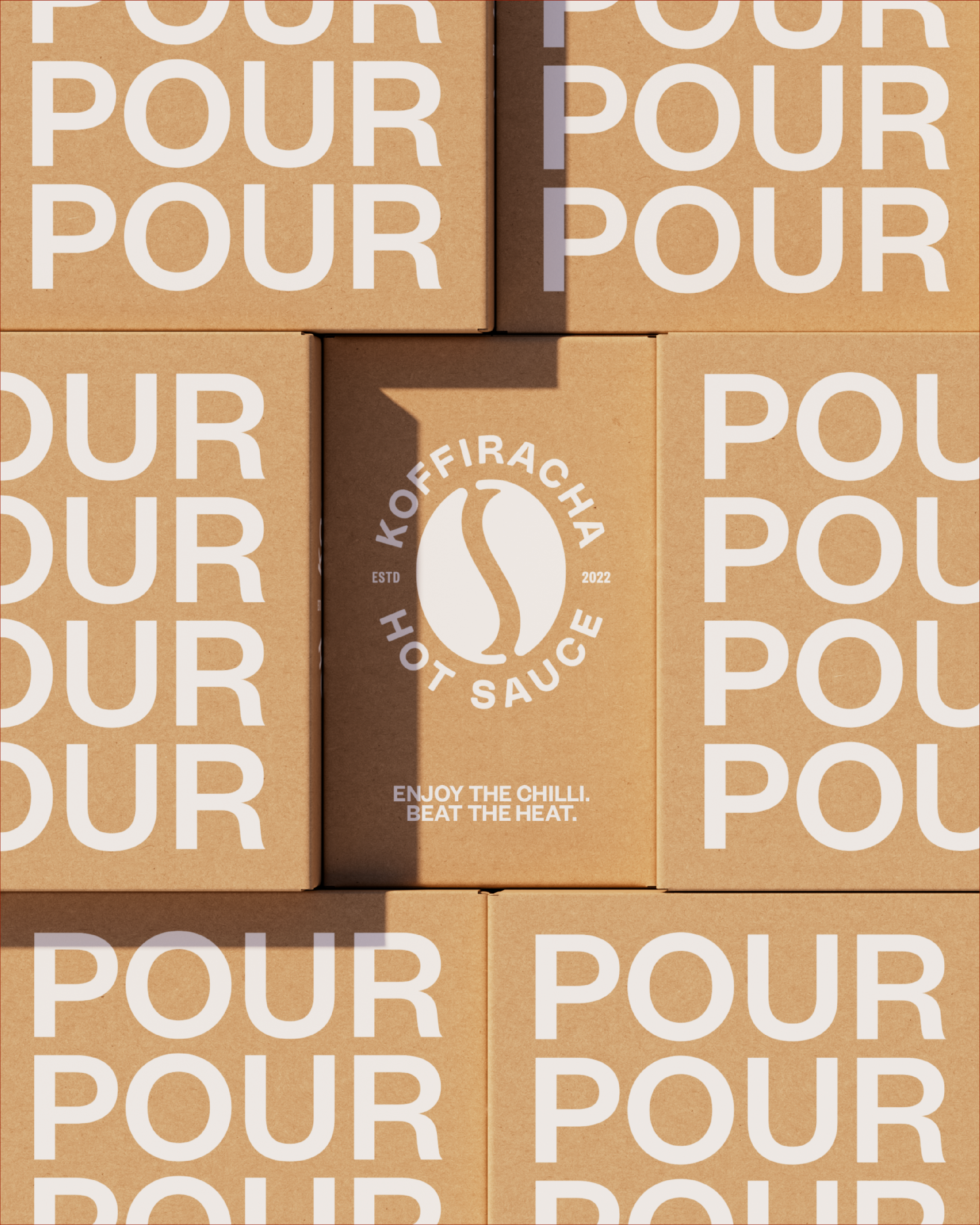
In a category of one or two drops, we encouraged people to pour.
DESIGN NOTES
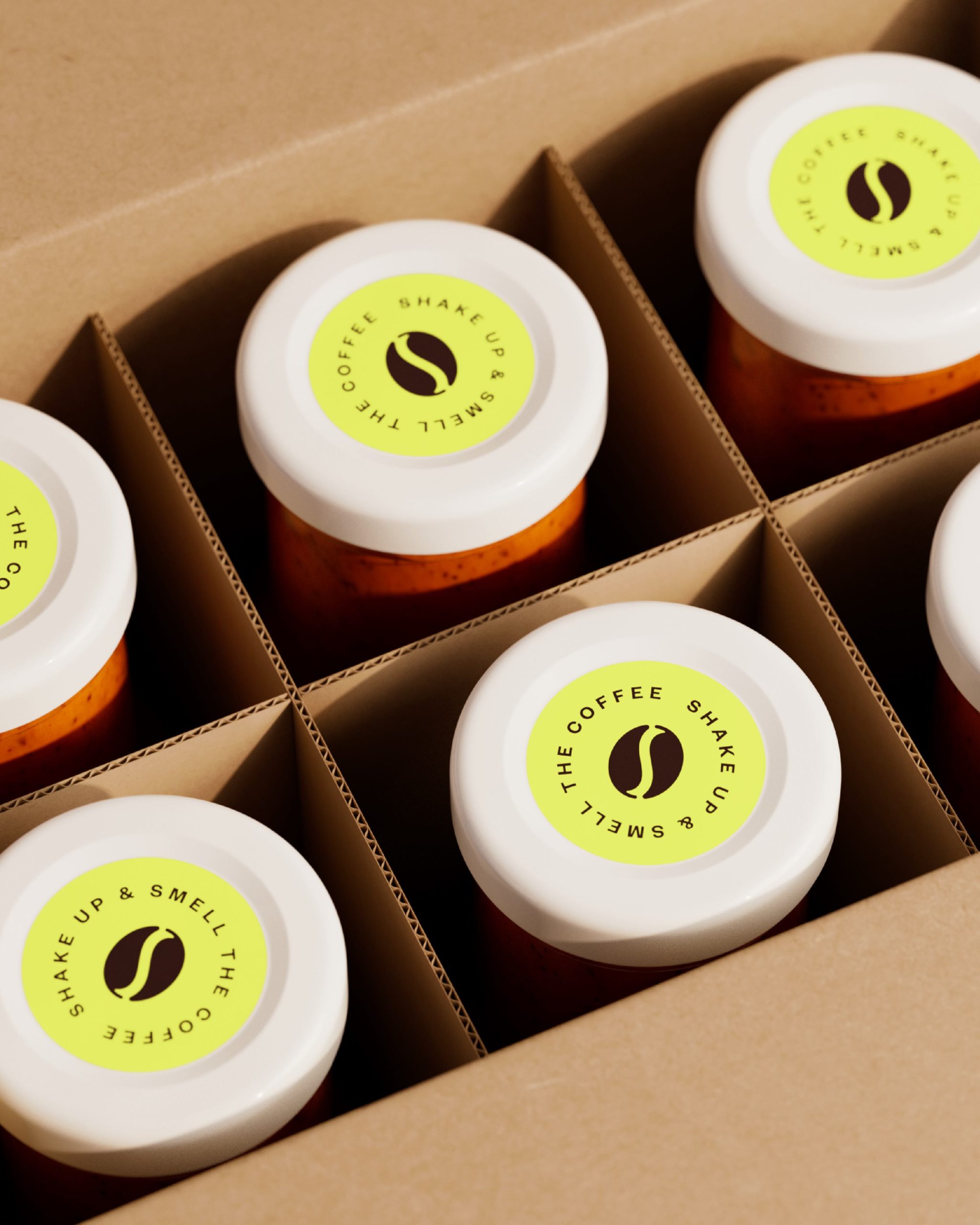
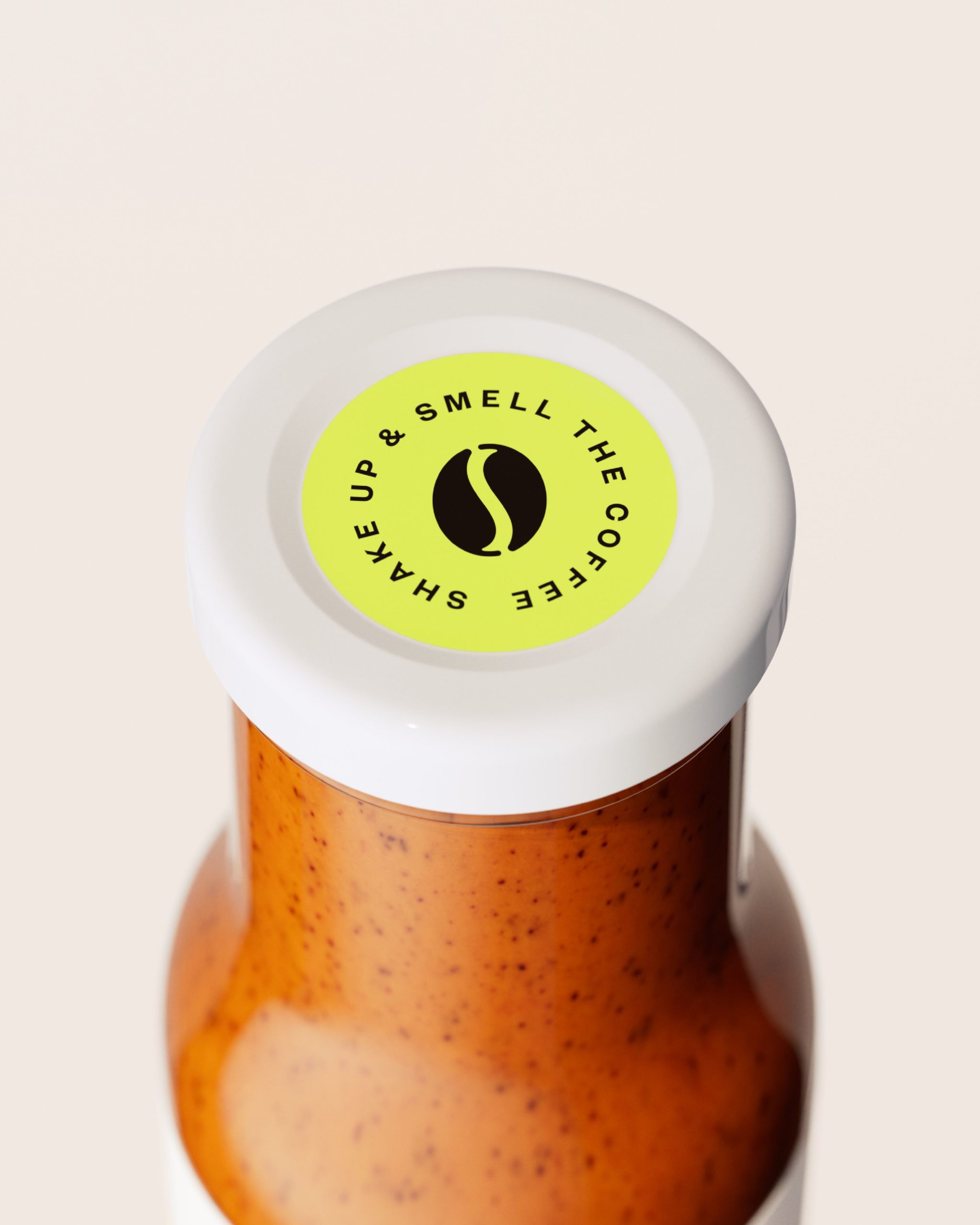
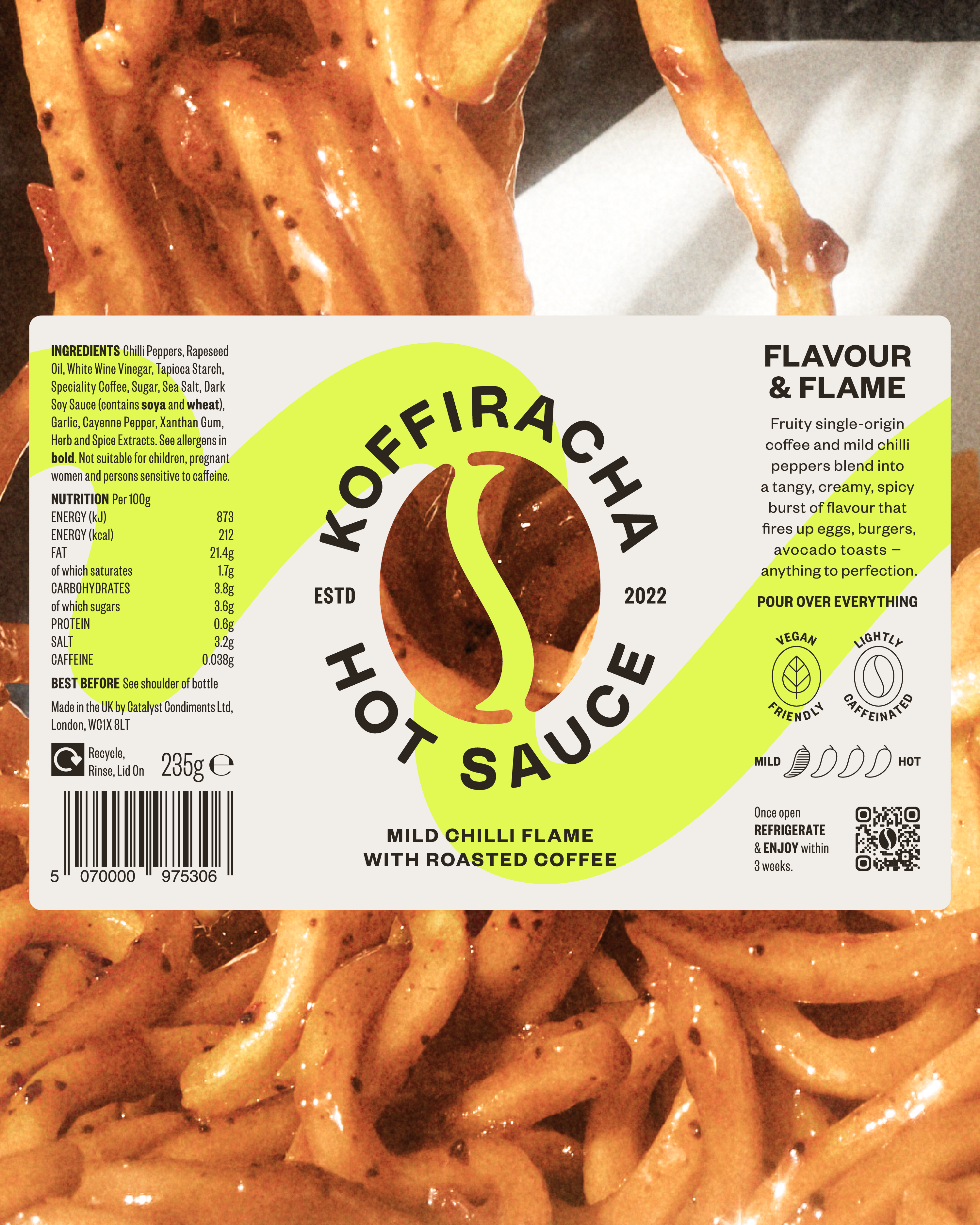
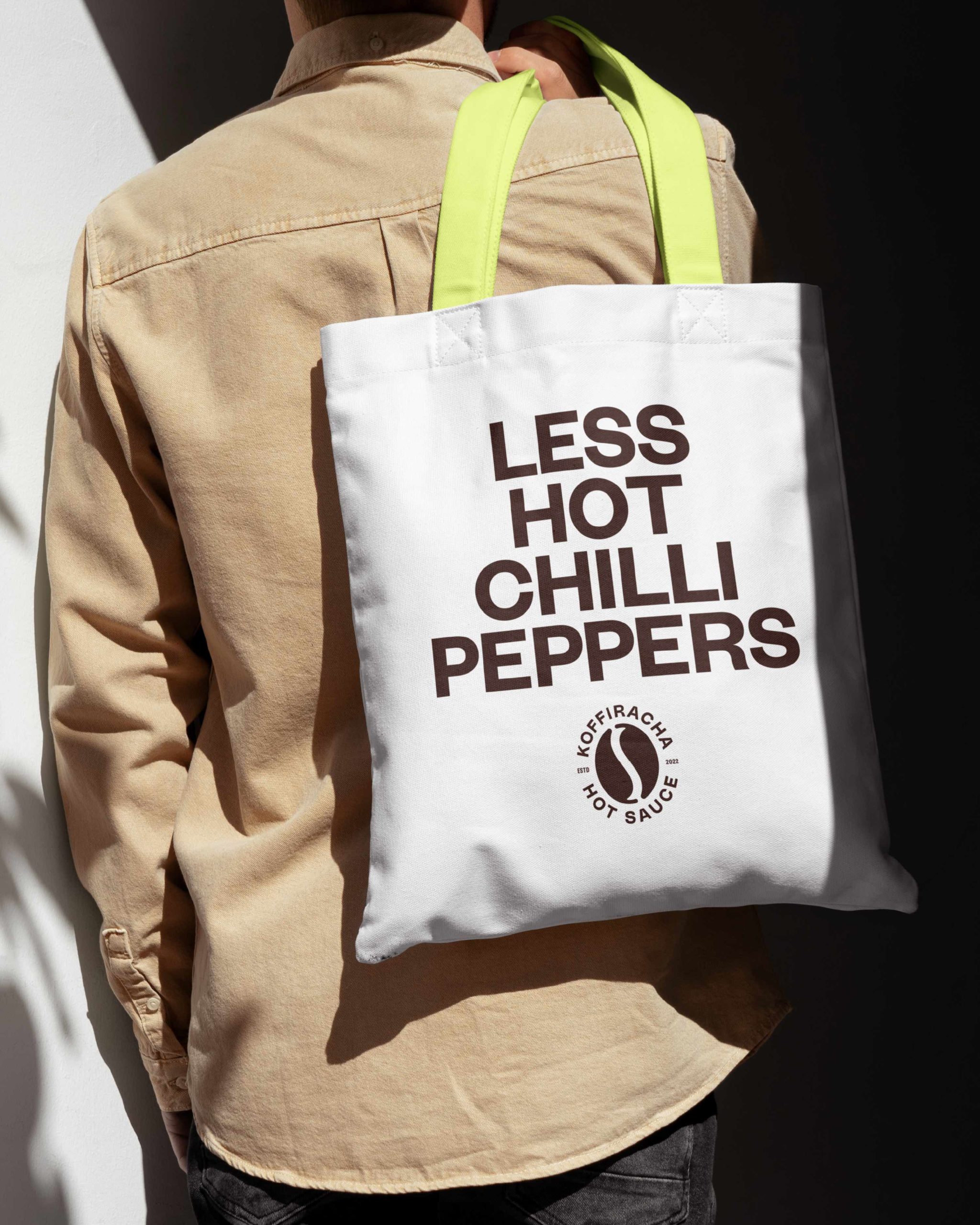
Through restraint and consideration, our design signals that Koffiracha is a brand that puts flavour before flame. Where most hot sauces are black and red, our palette is built around chef’s white to give it an immediate sense of coolheaded precision and sophistication. And, by using a white label on the bottle, we’re letting the rich colour of the sauce stand out.
Our logo reinforces this clever more subtle approach by forming a coffee bean out of two chilli peppers. You don’t see it, then you see it, and it’s all you can see thereafter. Like the sauce itself, the logo is two distinct parts working in perfect tandem and symmetry.
To add some heat without playing into fire we added a yellow neon, and we used it liberally, with calculated chaos, to build in the idea that this isn’t hot sauce you eat like regular hot sauce – it isn’t added by the drip, it’s slathered on by a pour.
To top it off, our tone of voice brings in some power couple confidence and reassures us that though coffee and chilli might seem like a surprising pairing at first, this is a couple that was made for each other.
Source: Only Now
You must be logged in to post a comment Login