
Re-addressing brand positioning on-pack and using new print techniques, unique to the bread fixture are just two ways award-winning packaging design agency Design Activity are helping toreinvent the bread aisle for half carb bread brand LivLife.
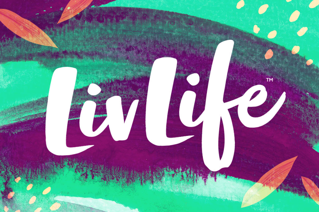
Established in 2013, LivLife ‘half the carbs’ bread was created on an insight that 40% of UK adults wanted to reduce carbs but didn’t want to give up bread. 7yrs later and this insight has become even more relevant, but the consumer and the category has evolved. So, the brand was looking for a redesign that better suited the expectations of today’s aspirational, health conscious consumer, would convey their brand positioning of ‘bread that make you feel good mentally and physically’ and ensure strong shelf stand out.
Shopper Insights led Design Activity to re-address the positioning of the brand logo on-pack, using the consumer shopping experience as the catalyst for the re-orientation.
“We wanted to ensure that the brand logo had maximum visibility on shelf” explains Design Activity’s Design Director Rikki Payne.“Almost all breads have their brand logos positioned on the sides and tops of pack. The issue with this traditional orientation is that the design and the brand logos end up being split by the packaging ‘seal’, and the design is often partially hidden behind the lips on-shelf.”
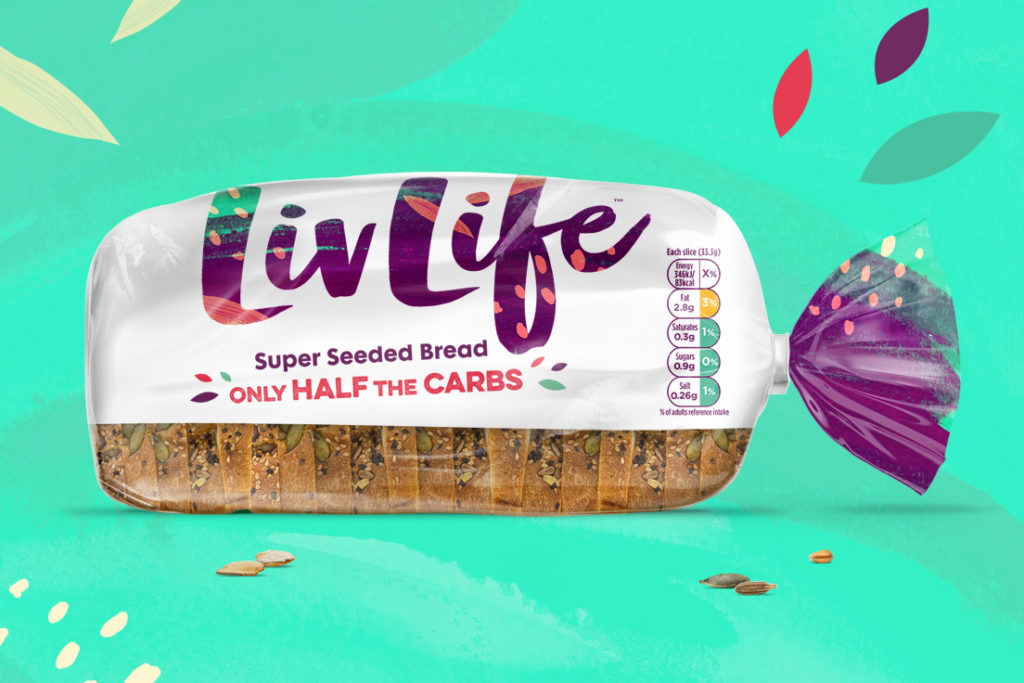
The innovative new layout uses the bottom half of the pack as a window, so no key information is obscured by the shelf lip. By creating two large logos folding over from the side to the top of the pack Design Activity have maximised the visible space when the packaging sits on shelf – facing the brand directly into the consumers line of sight.
A combination of print finishes not seen in the bread aisle before, were also used to increase the vibrancy on pack and maximise colour impact. The combination of both matte and gloss varnishes is unique to the bread fixture. Matte varnish on the white background creates a non-reflective surface, which allows the gloss varnish on the coloured areas to really shine, making the colour contrast really pop.
“Livlife is a great product with so much consumer love” explains Ruth McGrath, LivLife Brand Marketing Manager. “It’s brilliant to have a brand and packaging design that perfectly reflects what we stand for.”
Source: Design Activity
You must be logged in to post a comment Login