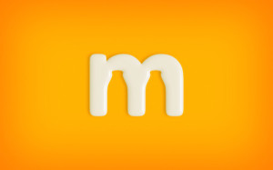
 San Francisco-based designer Justin Ross Tolentino was tasked to “create an identity for a job of yesteryear” for a project in school, and decided to base it on a milkman company named “Mr. Milk”.
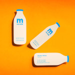
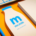
Mr. Milk’s logo consists of a single “M” in a simple san serif font—the designer then makes clever use of the negative space around the letter by incorporating the silhouettes of two classic milk bottles into it.
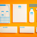
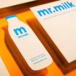
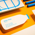
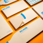
The milk bottle is the central icon of this identity project—for instance, the name card is a 2D paper cut-out of the milk bottle while the closing flaps of the envelopes are shaped like the top part of the milk bottle.
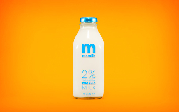 View more images of this outstanding branding identity below and on Tolentino’s website.

You must be logged in to post a comment Login