
Mullin’s approached Simon Pendry Creative to redesign their range of premium Irish ice cream, taking it from ‘tired and old fashioned’ to a fresh and contemporary brand.
Mullin’s has a long and proud history, so Simon Pendry Creative respected the brand’s tradition and visual equities, and gave them a fresh new edge.Mullin’s use only locally sourced Irish milk from their Irish farmer owned co-operative, together with locally sourced ingredients to create their delicious ice cream.
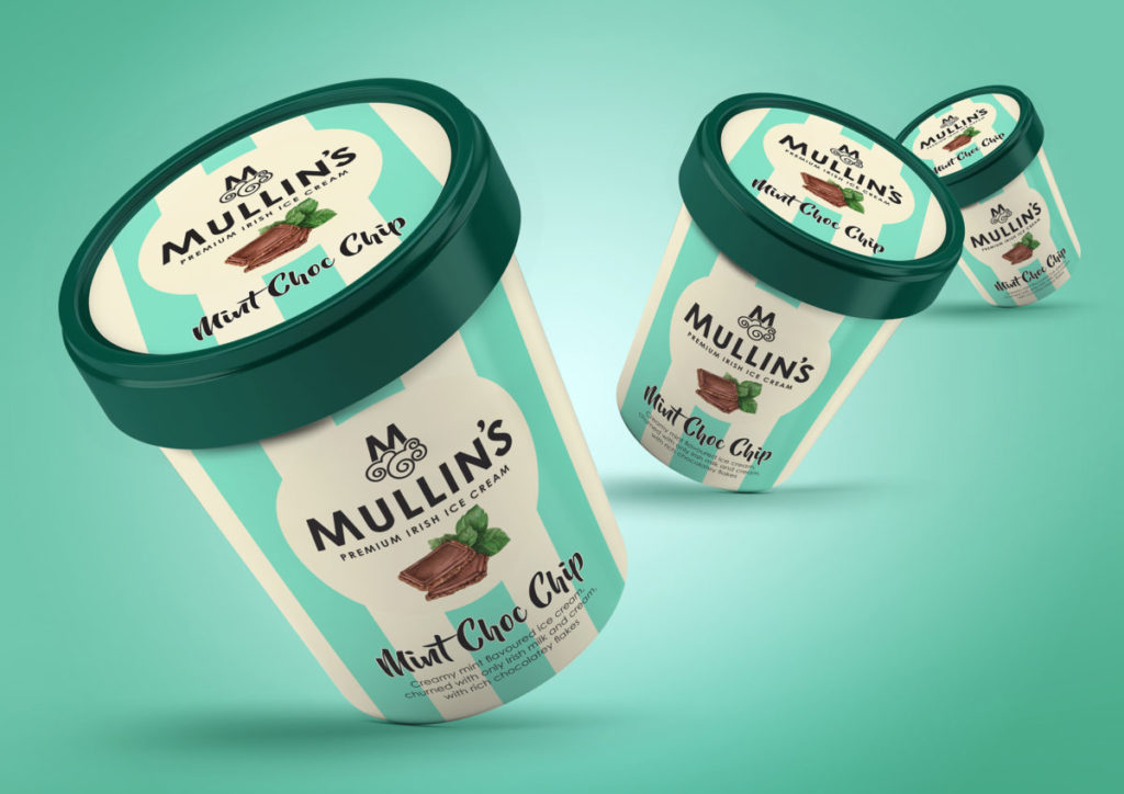
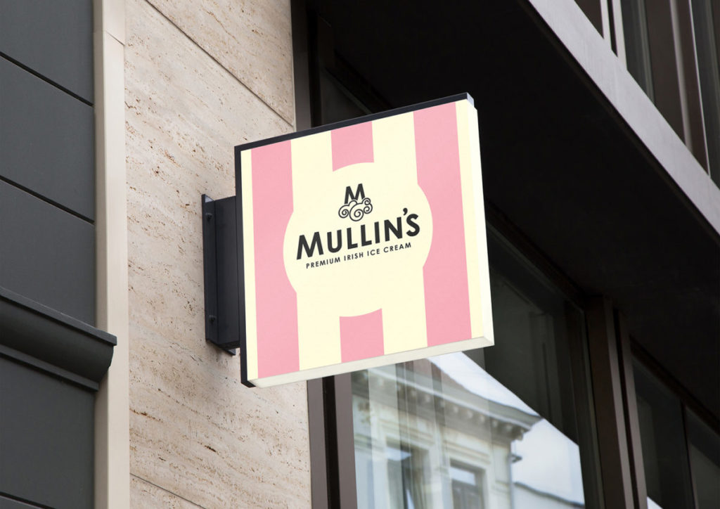
Simon Pendry Creative reflected this craftsmanship visually with hand drawn typography and illustrations, and utilised the brands equity of the colourful stripes to deliver huge impact and blocking on shelf.
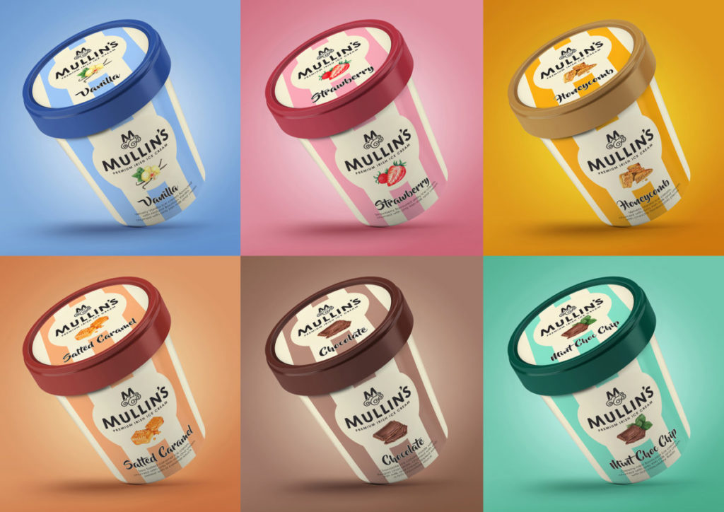
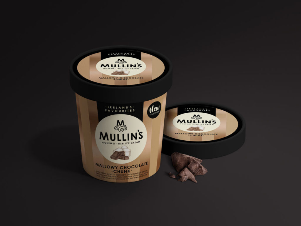
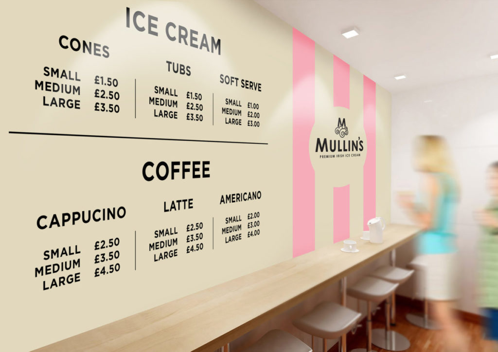
The redesign encompassed both the colourful core range of flavours, and the more premium ‘Ireland’s favourites’ range that employed deeper and darker colours together with metallics to unite this range and elevate it from the core. Both on-pack and off-pack communication were also considered to create harmony throughout the whole consumer journey. A fresh little redesign!
Client: Dale Farm
Region: Ireland


Source: Simon Pendry Creative
You must be logged in to post a comment Login