
 Pearlfisher has created new packaging designs for ice-cream brand Ben & Jerry’s, which are set to roll out internationally.
The designs were developed by Pearlfisher’s New York office and aim to “elevate” some of Ben & Jerry’s existing brand elements, including the blue sky with clouds and the green pastures.
The consultancy says that these were previously being “overshadowed by increasingly complex and layered flavour combinations.”
Pearlfisher says it has also created a “flavour tower” motif that can be used across all packaging.
One of the challenges, according to the consultancy, was to make the branding and packaging “more coherent” across the different countries Ben & Jerry’s is sold in.
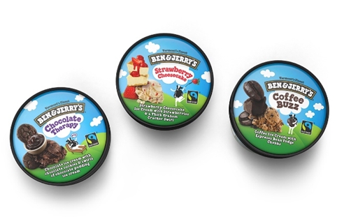 Pearlfisher creative director Hamish Campbell says: “The flavour towers play with gravity and scale, creating indulgent larger-than-life taste expressions.
“The iconic Ben & Jerry’s cow frees the brand to convey the [brand’s] spirit, joy and whimsical nature.”


You must be logged in to post a comment Login